
Analyze tracing data
To further analyze the filtered spans, use the dynamically changing tabs, Comparison, Structure, Root cause analysis, Exceptions (Errors only), and Trace list.
When you select a RED metric, the tabs change to match the context.
Each tab provides a brief explanation about the information provided.
Use the Breakdown tab
The Breakdown tab splits the selected metric by the values of a chosen resource or span attribute. When you’re using Duration metrics, Breakdown shows the 90th percentile duration for every value of the selected attribute orders the sequence of attributes by their average duration. When you select Rate, Breakdown orders the sequence of attributes by their rate of requests per second, with errors colored red.
You can change the Scope to show Resource or Span.
Using the Attributes sidebar, you can group the selected metric by different attributes.
For example, if you have selected Errors as a metric type and then choose the service.name attribute, the displayed results show the number of errors sorted by the service.name with the most matches.
Use the Attributes sidebar to select the attribute for Group by. You can search, scope by Resource or Span, and use Favorites for quick access. Attributes already in your Filters are listed at the top of the Attribute sidebar.
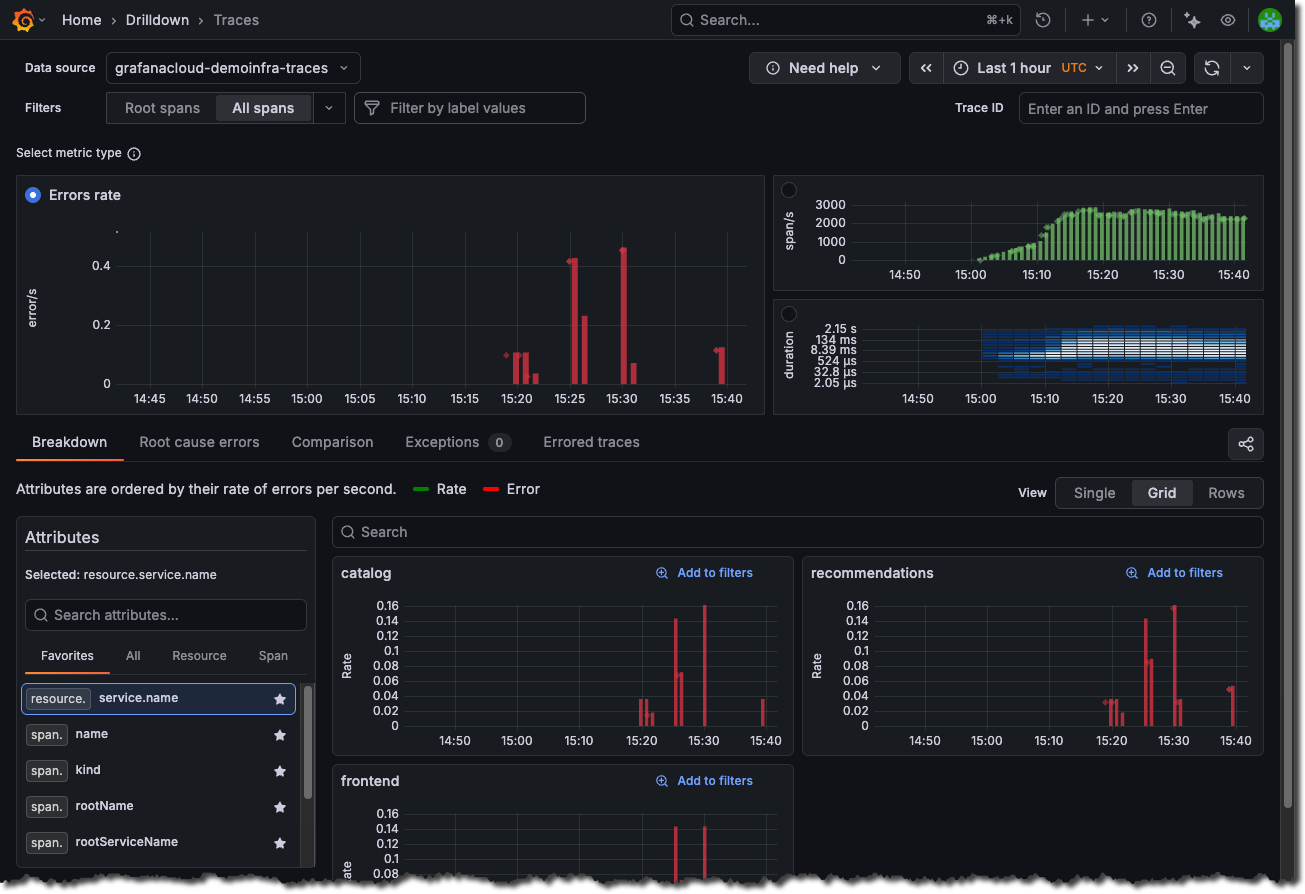
By default, the selected attribute is your first Favorite or resource.service.name.
You can reorder Favorites to change this default.
The Attributes sidebar displays other commonly used resource level attributes such as cluster, environment, and namespace.
Choose percentiles (Duration only)
When you select the Duration metric, use the Percentiles selector to choose which duration percentiles to plot and aggregate against.
The default is 90th percentile (p90). You can select one or more of: p50, p75, p90, p95, p99.
If you deselect all values, Traces Drilldown applies p90 by default.
The percentile choice drives what Duration values are summarized and shown in the Breakdown tab. The selector appears only when Duration is selected.
Use the Comparison tab
The Comparison tab helps you surface and rank which span attributes are most correlated with the selected metric so you can immediately spot what’s driving your trace-level issues.
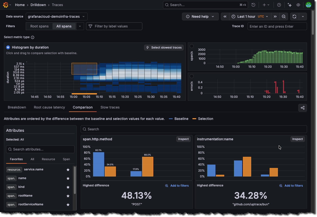
Upon selecting a metric, the tab computes, for each resource or span attribute, how strongly that attribute value differs between the selected subset (selection) and all other spans (baseline). It lists attribute‑value pairs in descending order of that difference, so the top entries are those most uniquely associated with your signal of interest.
If you’re viewing the Span rate or Errors metrics, the selection contains all spans with errors, while the baseline contains all spans without errors.
If you’re viewing the Duration metric, by default the selection contains the slowest spans above the 90th percentile, while the baseline contains all other spans. You can manually adjust the selection on the duration heatmap.
The behavior of the comparison also differs depending upon the RED metric you’ve chosen. For example, if you’re viewing Errors metrics, the comparison shows the attribute values that correlate with errors. However, if you’re viewing Duration metrics, the comparison shows the attributes that correlate with high latency.
Use the Attributes sidebar to switch between All (overall differences) and a specific attribute (per‑value differences). Favorites, search, and scope controls work the same as in Breakdown.
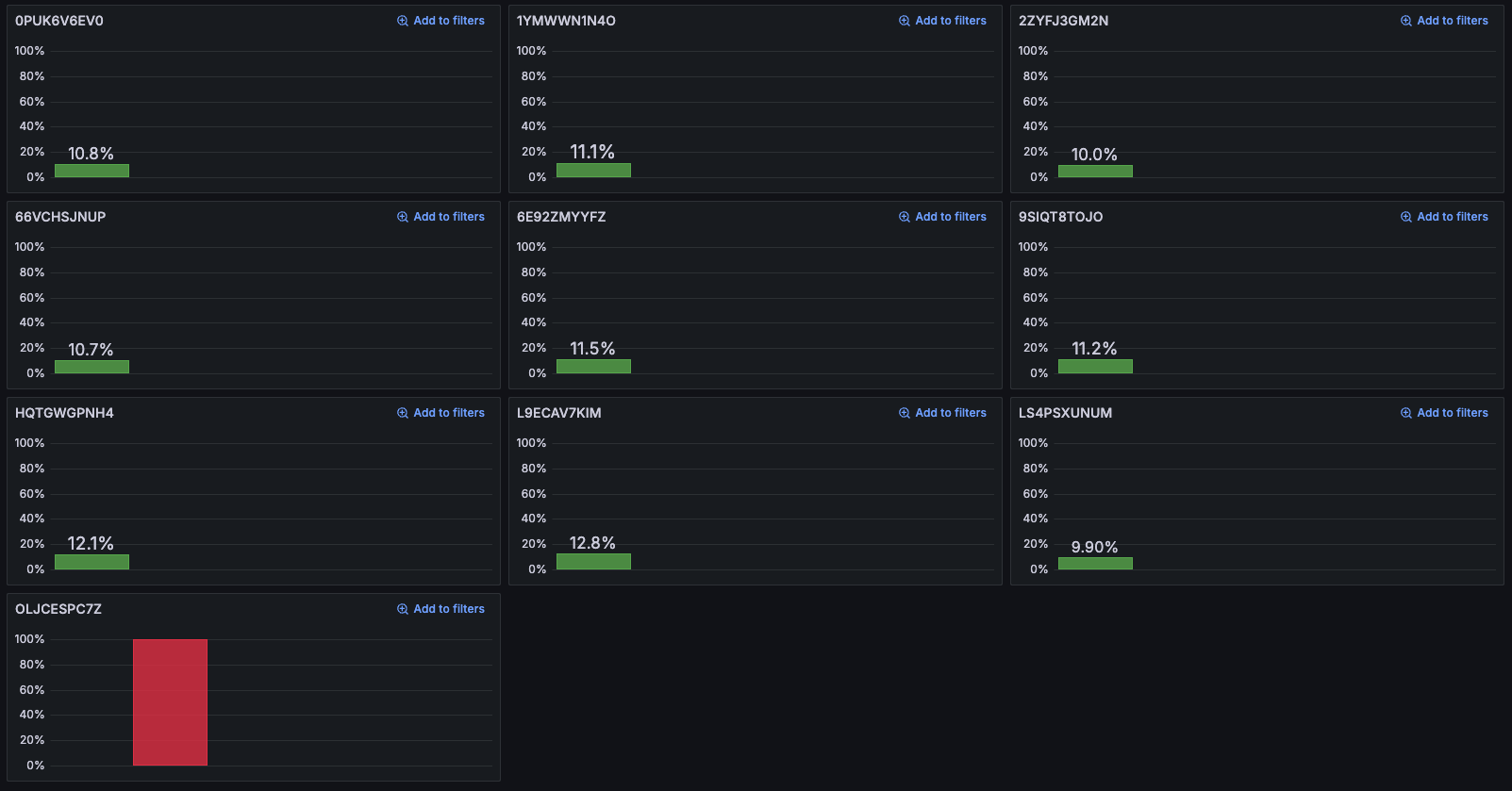
Focus on individual attributes with Inspect
Inspect lets you breakdown and see the individual attribute values from a given comparison
If you have a comparison like this, you can highlight the value with the highest difference (here, attribute=value is span.app.product.id=OLJCESPC7Z ), but you can’t easily see all other values.
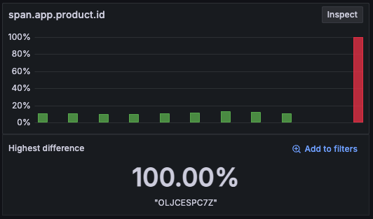
When selecting Inspect, the app shows only one attribute, span.app.product.id, but with a visualization for every value.
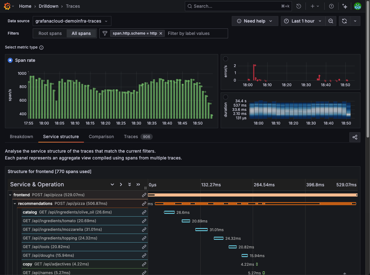
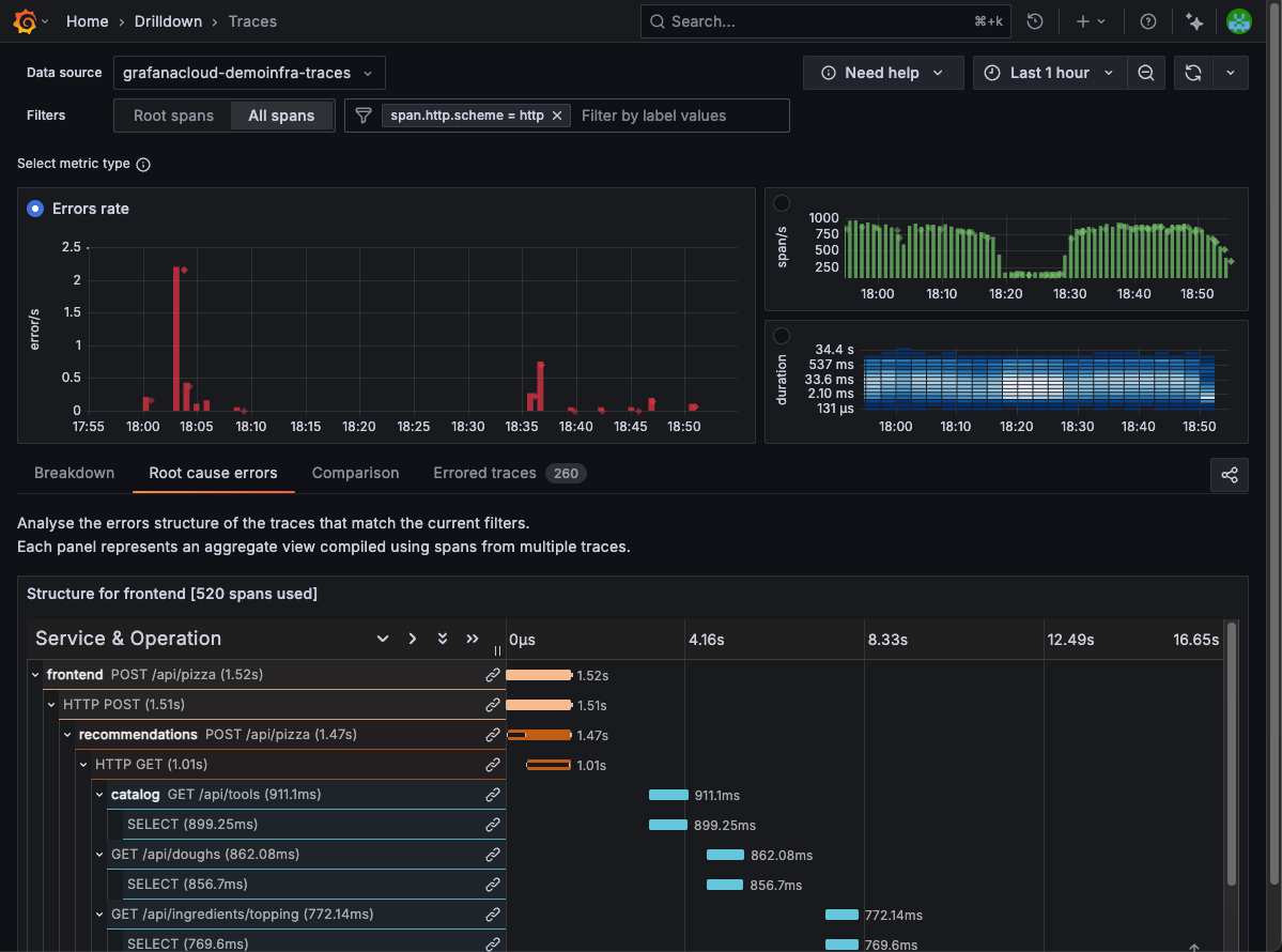
Use the Structure tab
The Structure tab lets you extract and view aggregate data from your traces. The name of the tab differs depending on the metric you are viewing:
- Rate provides Service structure
- Errors provides Root cause errors
- Duration metrics provides Root cause latency
For Rate, the Service structure tab shows you how your applications talk to each other to fulfill requests. Use this tab to analyze the service structure of the traces that match the current filters.
For Errors, the Root cause errors tab shows the structure of errors beneath your selected filters. Use this tab to immediately see the chain of errors that are causing issues higher up in traces.
When you select Duration metrics, the Root cause latency tab shows the structure of the longest running spans so you can analyze the structure of slow spans.
The pictured spans are an aggregated view compiled using spans from multiple traces.
Use the Exceptions tab (Errors metric only)
Use the Exceptions tab to see which exception messages are occurring within your current filters and time range. Exceptions are grouped by message so you can identify the most frequent failures and access the affected traces.
Examples:
- Inspect individual exceptions by clicking a message to open the Trace list pre-filtered for that message, so you can inspect individual traces immediately.
- Narrow exceptions by service, environment, namespace, or any span/resource attribute by combining with the Filters bar.
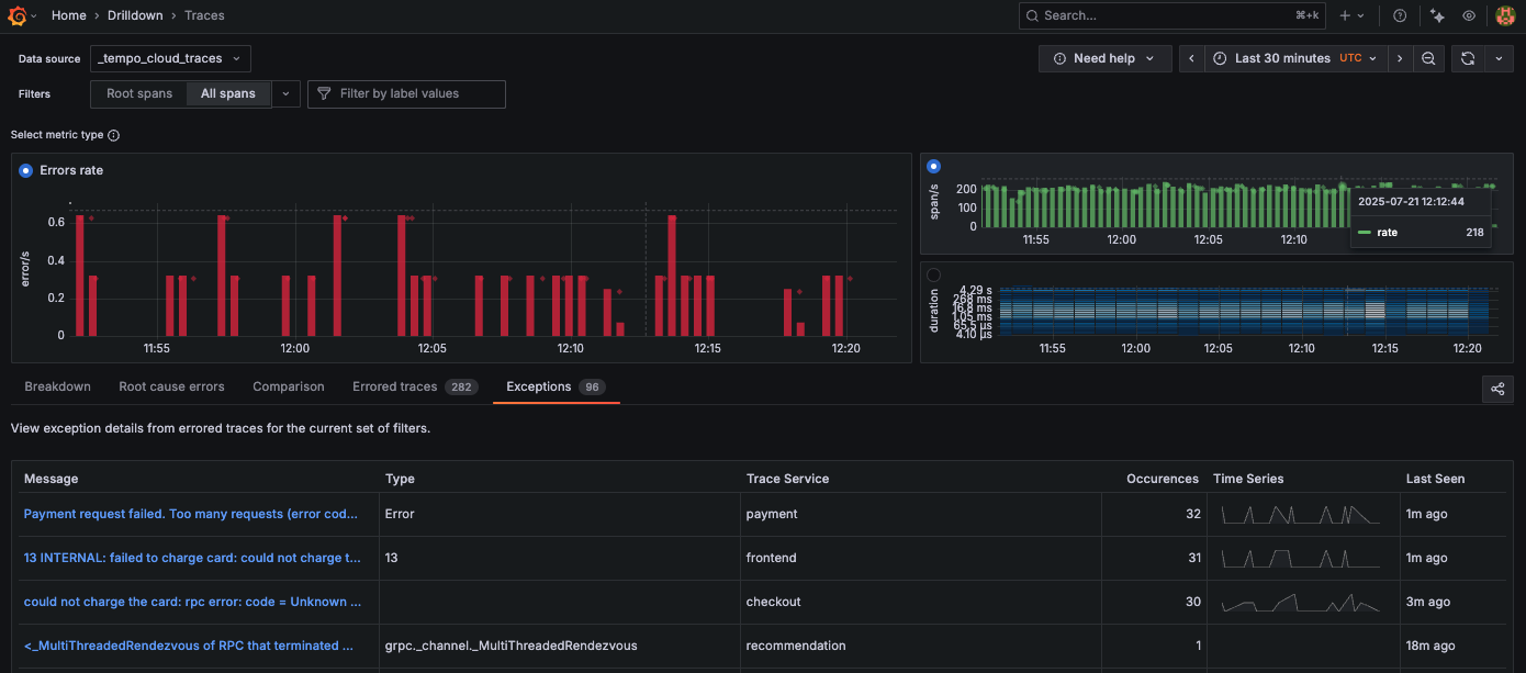
The Exceptions tab has a table with the following columns:
- Message: Exception text grouped by unique message
- Type: Exception class or code when available
- Trace service: Service emitting the exception
- Occurrences: Count of matching exceptions for the selected range
- Frequency: Sparkline of occurrences over time
- Last seen: The most recent occurrence
The Exceptions tab is available when the Errors metics is selected and exceptions are present. The tab respects the current time range and filters. For example, when Errors are selected, Exceptions works with both Root spans and All spans selections. The results reflect the data in scope.
If you notice a rise in the Errors metric, you can use the Exceptions tab to investigate the issue.
- Select Errors as the metric.
- Open the Exceptions tab.
- The top row shows
Payment request failed. Too many requests (error code 429)with rising occurrences and a spiky sparkline. - Click the message to jump to the Trace list pre-filtered by that exception.
- Sort by Duration to find the most impacted requests, then open a trace to inspect retries and upstream dependencies.
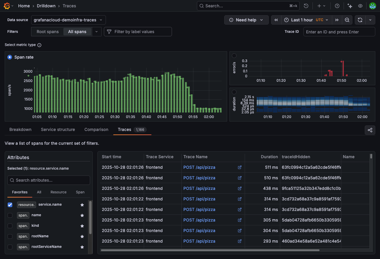
Use the Trace list tab
Each RED metric has a trace list:
- Rate provides a tab that lists Traces.
- Errors provides a list of traces with errors.
- Duration (spans) lists Slow traces.
From this view, you can add additional attributes to new columns using Add extra columns.
Use the Attributes sidebar to add columns. Select multiple attributes to include them as table columns. Use Search attributes and Favorites to find attributes. Attributes already in your Filters are listed at the top of the Attribute sidebar.
Change the selected time range
Use the time picker at the top right to modify the data shown in Traces Drilldown.
You can select a time range of up to 24 hours in duration. This time range can be any 24-hour period in your configured trace data retention period. The default is 30 days.
For more information about the time range picker, refer to Use dashboards.
Open a trace by ID
Use the header’s Trace ID input to open a specific trace:
- Paste a trace ID into the Trace ID input in the header.
- Press Enter or click Submit to open the trace in the drawer.
- Click Clear to remove the current value.
The Clear and Submit buttons appear only when the input contains text. When you open a trace from the results list, the Trace ID input clears to avoid stale values.
If a time range is selected, Traces Drilldown searches within the currently selected time range. Otherwise, it searches across all time. If a trace isn’t found, an error message appears—verify the ID and widen the time range if necessary.
This behavior depends on the Tempo data source configuration. Refer to Tempo data source configuration for more information.


