Application Observability service overview
The overview page provides a health overview for a service with RED metrics (Request rates, Errors, and Duration) for:
- The service as a whole
- Related inbound and outbound services
- Operations performed on the service
Navigate to various child tabs and pages to uncover further details:
- View Traces and Logs
- View the service in the Service map
- View RED metrics for each Operation
- View Runtime specific performance metrics
- On most panels, click Explore to view the queries used
Un-instrumented services display limited metrics, from what the plugin is able to discover.
Header
Like other Application Observability pages, the service overview page has a header with a title, sub-tabs to navigate to, an action bar to change the data source and time-related filters and refresh intervals, and an environment selector.
The header on the service overview page also includes technology icons, alongside the service name, with contextual menus.

Technology icons
Application Observability can show the following icons alongside a service name:
- Technology icon, inferred from
telemetry.sdk.languageof the trace span - Kubernetes icon, if the service is using Kubernetes
- Cloud icon, for services deployed on a cloud environment
If the service uses Kubernetes, hover over the Kubernetes icon to view the environment labels and navigate to Kubernetes monitoring.
For services deployed on a cloud environment, you can hover over the Cloud icon to view the environment labels.
Action bar
Use the action bar to change the data source or source, time-related filters, refresh intervals, and manipulate your data to fit your needs:
- The default time range for all panels is 30 mins
- If Application Observability shows no data, try and change the time range
- Set a time frame to compare metrics
- Set the environment to show metrics deployed in that particular environment
- Set an attribute to group by your data
- Use the dynamic filters to further refine your search
- Use the refresh interval drop-down to select an automatic refresh interval
- Click the refresh icon to toggle a manual refresh
- On the Logs tab, click Live to toggle log streaming
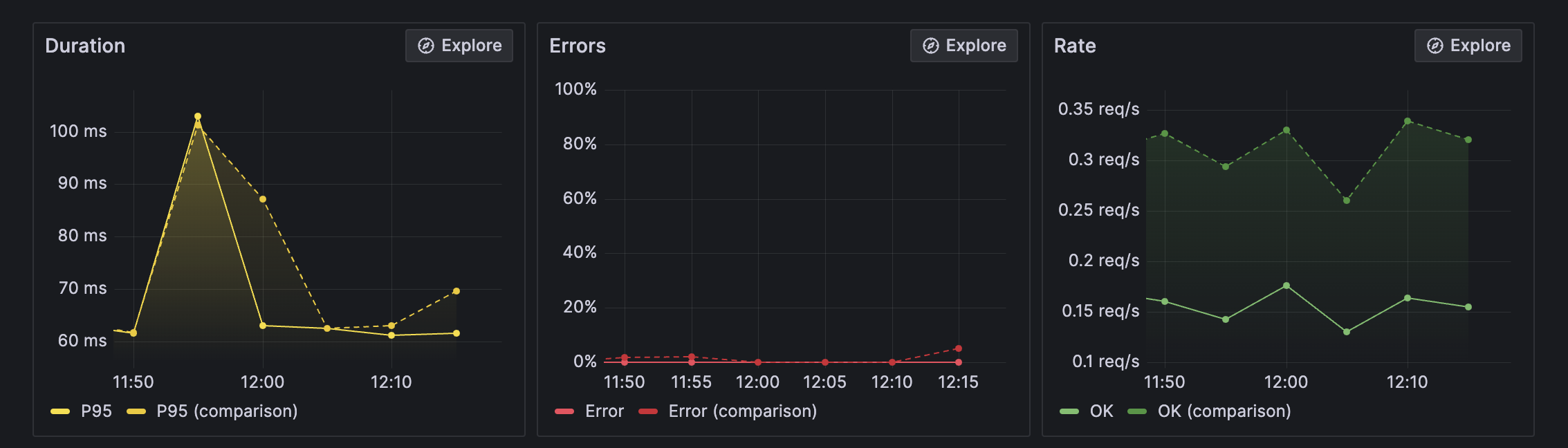
Time frame comparison
Use the time frame comparison to compare RED metrics and duration distribution for the current time frame to the previous period or a selection of days, weeks, months, or a year before.
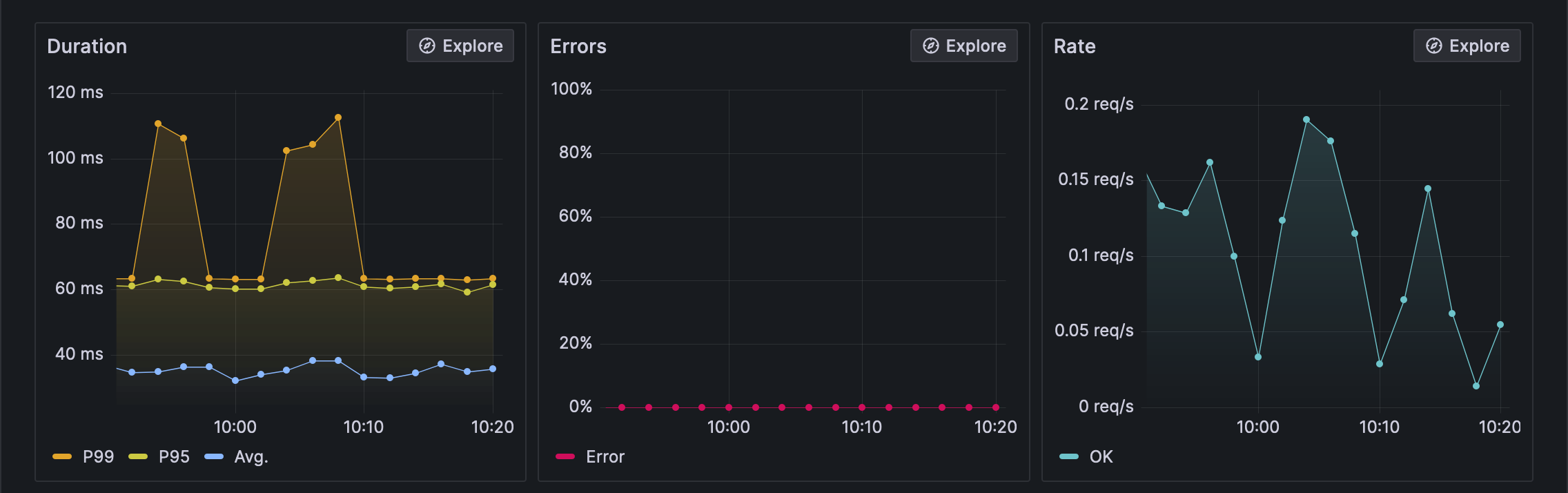
Service health
The three panels in the top row show the RED method trends for monitoring service health:
- Rate: the number of requests per second
- Errors: the number of errors per second
- Duration: the 95th percentile request duration
And with a time frame comparison the RED metrics panels show the current period with a solid line and the comparison time period with a dotted line.
Note the Duration metric for time frame comparisons only shows the p95 values.
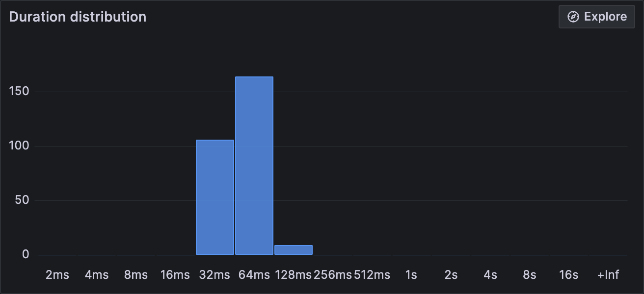
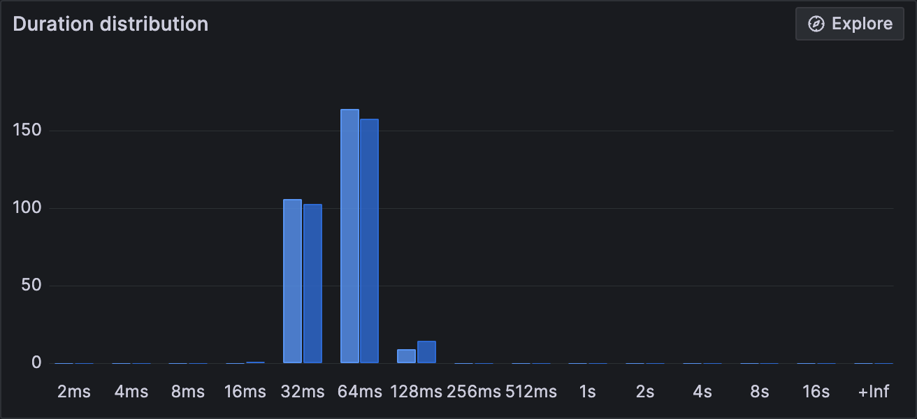
The Distribution duration panel shows a histogram for request duration.
And with a time frame comparison the distribution duration panel shows the current period in a dark blue and the comparison time period in a light blue.
Connected services
The Outbound & databases and Inbound panels show a table of connected services and databases.
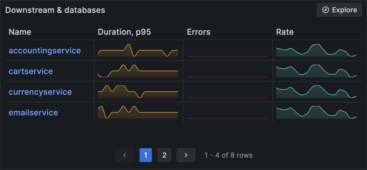
Each row shows the RED metrics trends for request rate, errors, and 95th percentile duration.
Click a service row to navigate to the service overview page for further details.
Operations
The Operations panel shows a table of operations within the service, derived from the span_name.
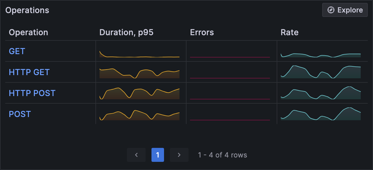
Each row shows the RED metrics trends for request rate, errors, and 95th percentile duration.
Click an operation row to navigate to the Operation overview page for detailed RED metrics.
Operation Overview
The Operation overview page shows the RED metrics trends for a specific operation.
Navigate to the Traces tab to search and view traces for the operation.
Traces
Navigate to the Traces tab to search and view traces for the service.
Search
Search for traces with the Trace query language (TraceQL).
By default, Application Observability filters traces by the service and service namespace. There are two ways to customize search queries:
- Click TraceQL to use the Trace query language (TraceQL)
- Click Search to use the visual TraceQL query builder
View
Click a Trace ID in the search results to inspect a trace using the trace view. Consult the trace view documentation to learn how to navigate the trace view and filter spans.
Logs
Navigate to the Logs tab to search and view logs for the service.
Search
Search for logs with the Log Query Language (LogQL).
By default, Application Observability filters logs by the service and service namespace. There are two ways to customize search queries:
- Click Code to use the Log Query Language (LogQL)
- Click Builder to use the the visual query builder
View
Application Observability displays log search results in the logs Volume and a Logs panels. Consult the Logs visualization documentation to learn more.
Runtime
Services that use the OpenTelemetry auto-instrumentation SDKs for .NET, Go, or Java have access to a Runtime tab with various CPU and memory utilization graphs.
To populate this view, you need the following:
traces_target_info- Application Observability generates this label- Your span metrics require the following resource attributes:
telemetry.sdk.languagetelemetry.sdk.nametelemetry.sdk.version
For for information, see required metrics and labels documentation.


