Table
Tables are a highly flexible visualization designed to display data in columns and rows. The table visualization can take multiple datasets and provide the option to switch between them. With this versatility, it’s the preferred visualization for viewing multiple data types, aiding in your data analysis needs.

You can use a table visualization to show datasets such as:
- Common database queries like logs, traces, metrics
- Financial reports
- Customer lists
- Product catalogs
Any information you might want to put in a spreadsheet can often be best visualized in a table.
Tables also provide different styles to visualize data inside the table cells, such as colored text and cell backgrounds, gauges, sparklines, data links, JSON code, and images.
Note
Annotations and alerts are not currently supported for tables.
Configure a table visualization
The following video provides a visual walkthrough of the options you can set in a table visualization. If you want to see a configuration in action, check out the video:
With Grafana Play, you can explore and see how it works, learning from practical examples to accelerate your development. This feature can be seen on Table Visualizations in Grafana.
Supported data formats
The table visualization supports any data that has a column-row structure.
Note
If you’re using a cell type such as sparkline or JSON, the data requirements may differ in a way that’s specific to that type. For more info refer to Cell type.
Example
This example shows a basic dataset in which there’s data for every table cell:
Column1, Column2, Column3
value1 , value2 , value3
value4 , value5 , value6
value7 , value8 , value9
If a cell is missing or the table column-row structure is not complete, as in the following example, the table visualization won’t display any of the data:
Column1, Column2, Column3
value1 , value2 , value3
gap1   , gap2
value4 , value5 , value6
If you need to hide columns, you can do so using data transformations, field overrides, or by building a query that returns only the needed columns.
Column filtering
You can temporarily change how column data is displayed using column filtering. For example, you can show or hide specific values.
Turn on column filtering
To turn on column filtering, follow these steps:
- In Grafana, navigate to the dashboard with the table with the columns that you want to filter.
- Hover over any part of the panel to which you want to add the link to display the actions menu on the top right corner.
- Click the menu and select Edit.
- In the panel editor pane, expand the Table options section.
- Toggle on the Column filter switch.
A filter icon (funnel) appears next to each column title.
Filter column values
To filter column values, follow these steps:
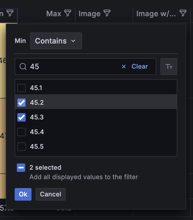
Click the filter icon (funnel) next to a column title.
Grafana displays the filter options for that column.
![Filter column values]()
Click the checkbox next to the values that you want to display or click Select all.
Enter text in the search field at the top to show those values in the display so that you can select them rather than scroll to find them.
Choose from several operators to display column values:
- Contains - Matches a regex pattern (operator by default).
- Expression - Evaluates a boolean expression. The character
$represents the column value in the expression (for example, “$ >= 10 && $ <= 12”). - The typical comparison operators:
=,!=,<,<=,>,>=.
Click the checkbox above the Ok and Cancel buttons to add or remove all displayed values to and from the filter.
Clear column filters
Columns with filters applied have a blue filter displayed next to the title.
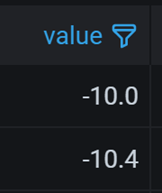
To remove the filter, click the blue filter icon and then click Clear filter.
Apply filters from the table
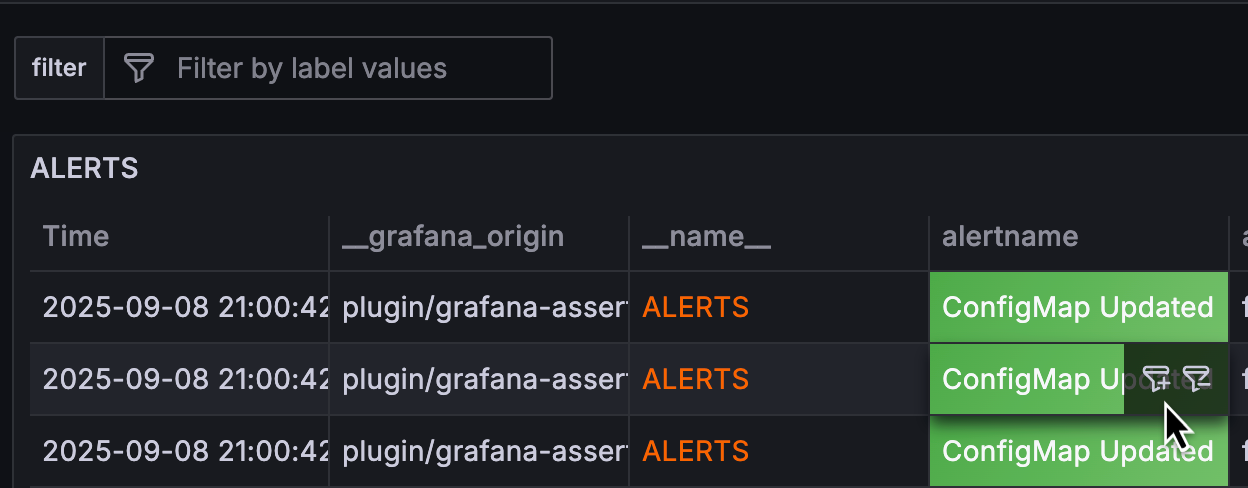
In tables, you can apply filters directly from the visualization with one click.
To display the filter icons, hover your cursor over the cell that has the value for which you want to filter:
For more information about applying filters this way, refer to Dashboard drilldown with filters.
Sort columns
Click a column title to change the sort order from default to descending to ascending.
Each time you click, the sort order changes to the next option in the cycle.
You can sort multiple columns by holding the Cmd or Ctrl key
and clicking the column name.
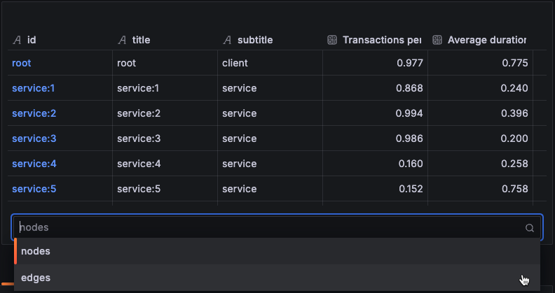
Dataset selector
If the data queried contains multiple datasets, a table displays a drop-down list at the bottom, so you can select the dataset you want to visualize. This option is only available when you’re editing the panel.
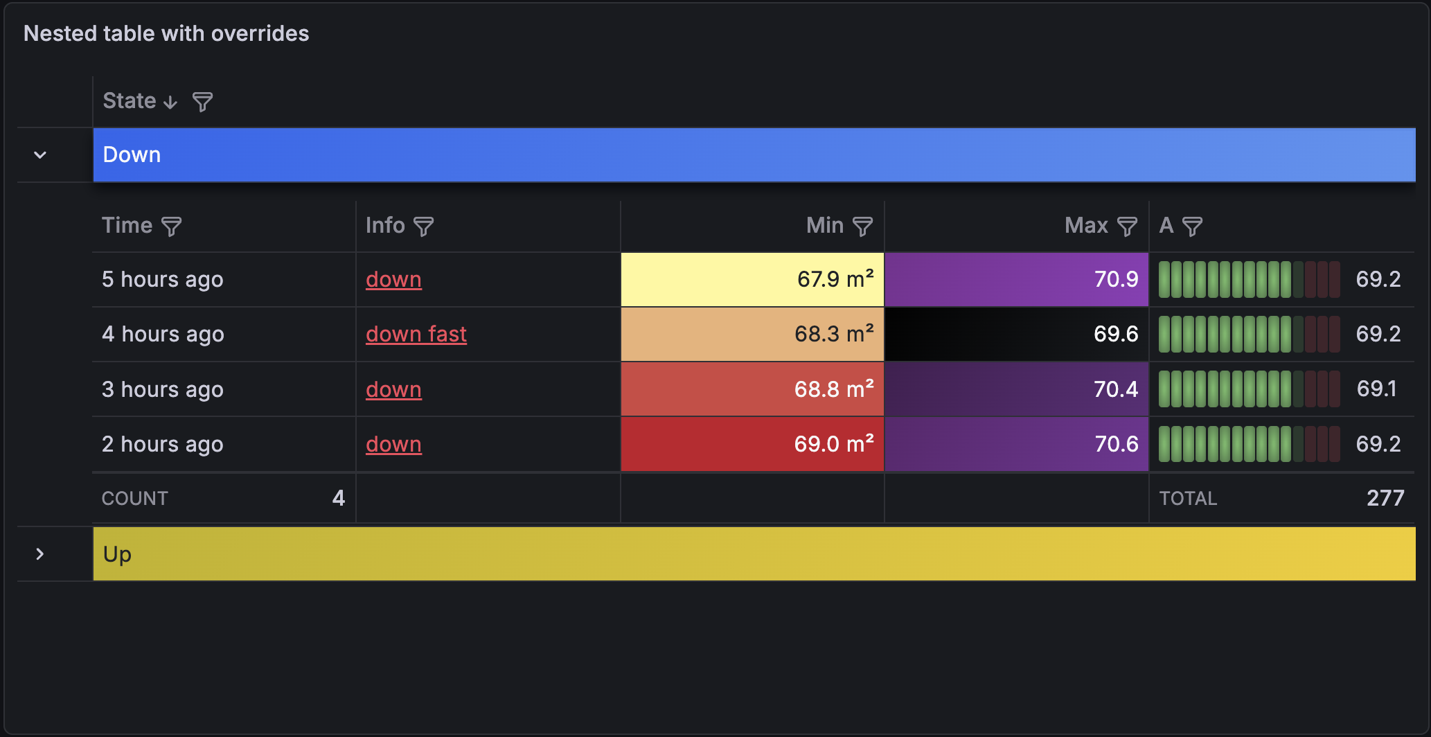
Nested tables
Note
The new transformation editor for nested tables and the nested table overrides feature are currently in public preview. Grafana Labs offers limited support, and breaking changes might occur prior to the feature being made generally available.
To use these features, enable the
groupToNestedTableV2andnestedFramesFieldOverridesfeature toggles in your Grafana configuration file or contact Support.
A table can display sub-tables inside expandable rows. You can add these nested tables using the Group to nested tables transformation, which groups rows by one or more fields, and can summarize nested row data by applying calculations.
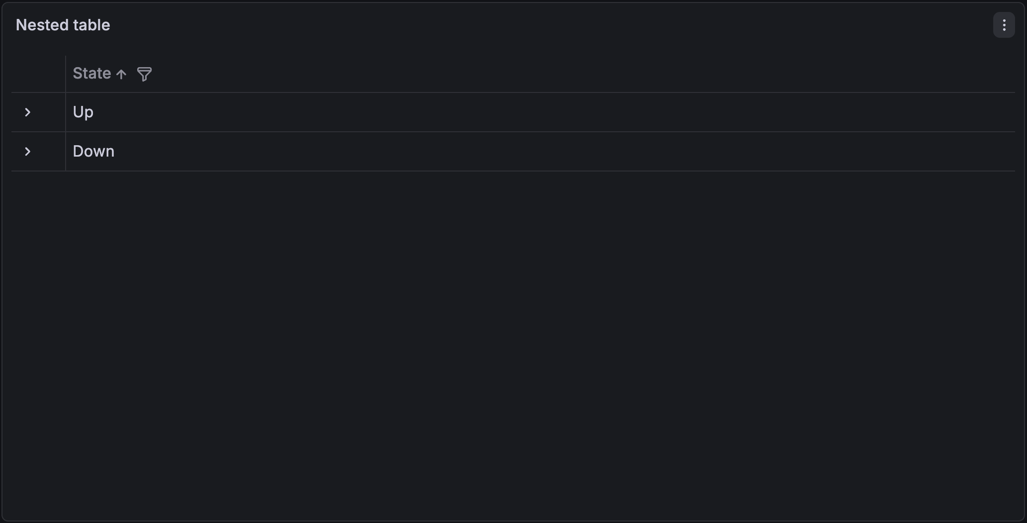
Click the expand icon on a row to toggle the visibility of its nested table:
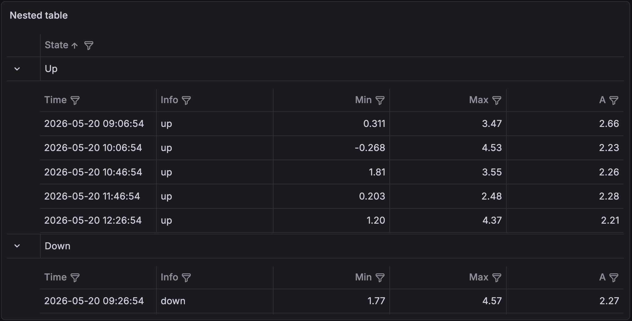
To sort nested and top-level rows in nested tables, click a column title to change the sort order from default to descending to ascending.
Each time you click, the sort order changes to the next option in the cycle.
You can sort multiple columns by holding the Cmd or Ctrl key and clicking the column name.
To control the display of fields inside a nested table—for example, to apply thresholds, units, or a different cell type—use field overrides with the Target fields option set to Nested. For more information, refer to Apply overrides to nested table fields.
Configuration options
Panel options
In the Panel options section of the panel editor pane, set basic options like panel title and description, as well as panel links. To learn more, refer to Configure panel options.
Table options
Table footer options
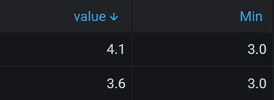
The table footer displays the results of calculations (and reducer functions) on fields. The footer is only displayed after you select an option in the Calculation drop-down list:
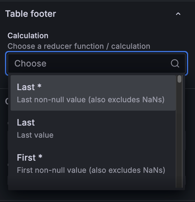
There are several calculations you can choose from including minimum, maximum, first, last, and total. For the full list of options, refer to Calculations.
In the table footer:
- You can apply multiple calculations at once.
- The calculations and reducer functions apply to all fields in the table, by default. To control which fields have a calculation or function applied, add the table footer in an override instead.
- If you enable a mathematical function for a non-numeric field, nothing for that function is displayed for that field.
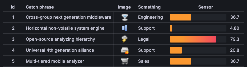
In the following image, multiple calculations—Mean, Max, and Last—have been applied:
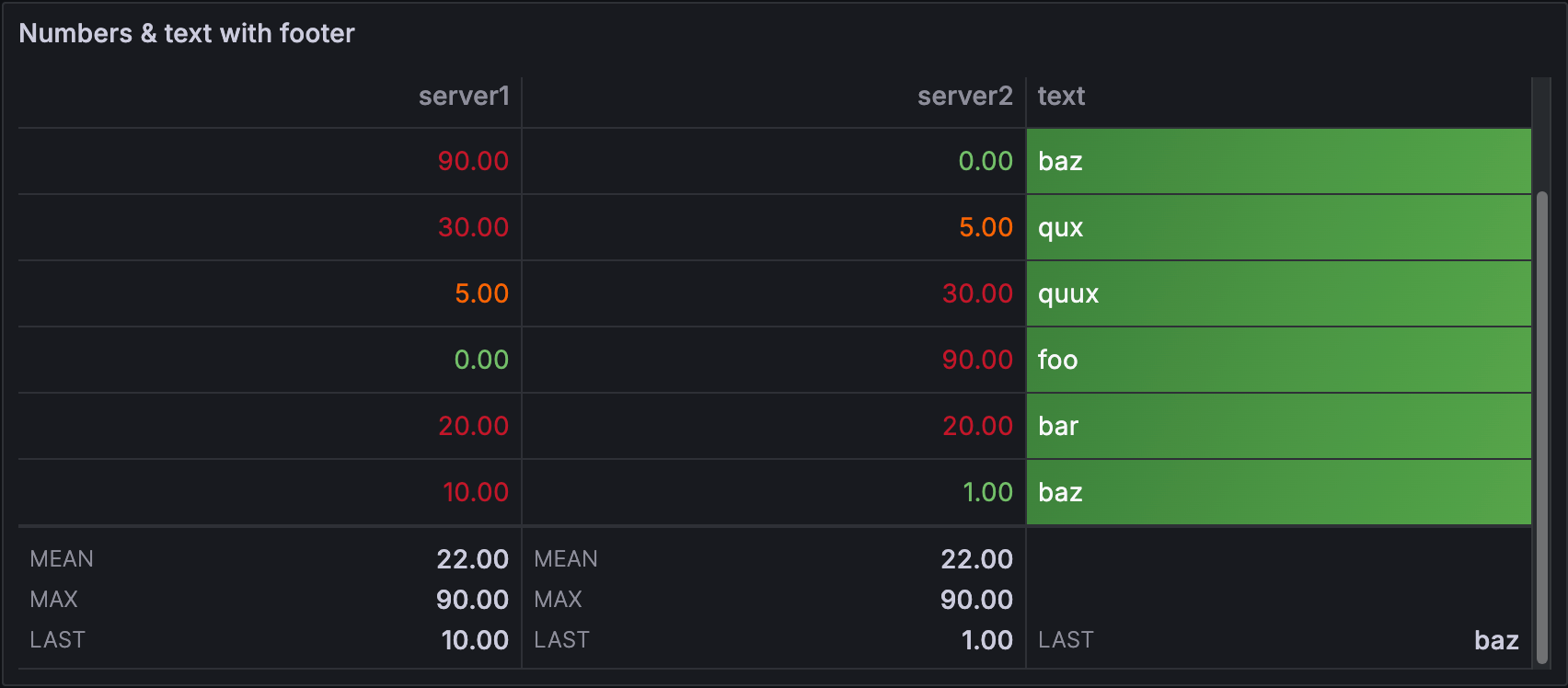
You can also see in the previous image that the mathematical functions, Mean and Max, haven’t been applied to the text field in the table. Only the Last function has been applied to that field.
Note
Calculations applied to cell types like Markdown + HTML might have unexpected results.
Cell options
Cell options allow you to control how data is displayed in a table. The options are differ based on the cell type that you select and are outlined within the descriptions of each cell type. The following table provides short descriptions for each cell type and links to a longer description and the cell type options.
Cell type
By default, Grafana automatically chooses display settings. You can override these settings by choosing one of the following cell types to control the default display for all fields. Additional configuration is available for some cell types.
If you want to apply a cell type to only some fields instead of all fields, you can do so using the Cell options > Cell type field override.
Auto
This is a basic text and number cell.
It has the following cell options:
Colored text
If thresholds, value mappings, or color schemes are set, the cell text is displayed in the appropriate color.
The colored text cell type has the following options:
Colored background
If thresholds, value mappings, or color schemes are set, the cell background is displayed in the appropriate color.
You can also set background cell color by row:

The colored background cell type has the following options:
Data links
If you’ve configured data links, when the cell type is Auto, the cell text becomes clickable. If you change the cell type to Data links, the cell text reflects the titles of the configured data links. To control the application of data link text more granularly, use a Cell option > Cell type > Data links field override.
Gauge
With this cell type, cells can be displayed as a graphical gauge, with several different presentation types.
The gauge cell type has the following options:
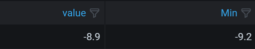
Note
The maximum and minimum values of the gauges are configured automatically from the smallest and largest values in your whole dataset. If you don’t want the max/min values to be pulled from the whole dataset, you can configure them for each column using field overrides.
Gauge display mode
You can set three gauge display modes.
| Option | Description |
|---|---|
| Basic | Shows a simple gauge with the threshold levels defining the color of gauge.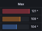 |
| Gradient | The threshold levels define a gradient.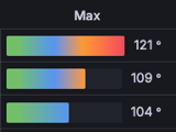 |
| Retro LCD | The gauge is split up in small cells that are lit or unlit.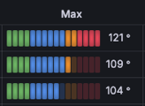 |
Value display
Labels displayed alongside of the gauges can be set to be colored by value, match the theme text color, or be hidden.
| Option | Description |
|---|---|
| Value color | Labels are colored by value.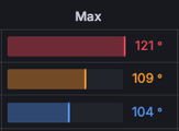 |
| Text color | Labels match the theme text color.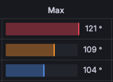 |
| Hidden | Labels are hidden.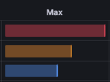 |
Sparkline
This cell type shows values rendered as a sparkline. To show sparklines on data with multiple time series, use the Time series to table transformation to process it into a format the table can show.
You can color sparklines using thresholds by setting the field’s color scheme to From thresholds (by value) in the standard color scheme options, using an override. When thresholds are defined, the sparkline automatically uses the Scheme gradient mode to reflect threshold levels along the line.
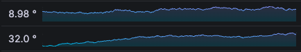
The sparkline cell type options are described in the following table. For more detailed information about all of the sparkline styling options (except Hide value), refer to the time series graph styles documentation.
JSON View
This cell type shows values formatted as code. If a value is an object, the JSON object will appear on hover.
It has the following cell options:
Pill
The Pill cell type displays each item in a comma-separated string in a colored block.

The colors applied to each piece of text are maintained throughout the table. For example, if the word “test” is first displayed in a red pill, it will always be displayed in a red pill.
The following data formats are supported for the pill cell type:
- Comma-separated values (
cows,chickens,goats) - JSON arrays of uniform (
(["cows","chickens","goats"])) or mixed ([1,2,3,"foo",42,"bar"]) types
Toggle on the Tooltip from field switch to use the values from another field (or column) in a tooltip. For more information, refer to Tooltip from field.
Markdown + HTML
The Markdown + HTML cell type displays rich Markdown or HTML content, rendered using the GitHub-Flavored Markdown spec. This is useful if you need to display customized, pre-formatted information alongside tabular data, such as formatted strings, lists of links, or other dynamic cases.
For this cell type, you can toggle the Dynamic height switch, which allows the cell to resize dynamically based on the cell content. If you use dynamic height, we strongly recommend that you also toggle on Pagination to avoid performance issues in larger tables, since enabling Dynamic height disables table virtualization.
By default, the HTML rendered is sanitized, and un-sanitized HTML can only be rendered
in these cells if the
disable_sanitize_html option is set to true for your Grafana instance.
Toggle on the Tooltip from field switch to use the values from another field (or column) in a tooltip. For more information, refer to Tooltip from field.

Image
If you have a field value that is an image URL or a base64 encoded image, this cell type displays it as an image.
It has the following options:
Actions
Actions add a button to a cell that triggers a basic, unauthenticated API call when clicked. Configure actions from Data links and actions or with field overrides.
Tooltip from field
Toggle on the Tooltip from field switch to use the values from another field (or column) in a tooltip.
When you toggle the switch on, you can select from a drop-down list any of the fields in the table to be used as the source of the tooltip content. All table fields are included in the drop-down list, whether visible or hidden.
When a tooltip from a field has been added to a cell, a chip is displayed in the top-right or top-left corner of the cell:
Hover your mouse over the chip to display the tooltip.
When you toggle on the switch, the Tooltip placement option, which controls where the tooltip box opens upon hover, is also displayed. Select one of the following options: Auto, Top, Right, Bottom, and Left.
The content of the tooltip is determined by the values of the source field and can’t be directly edited. However, you can affect the display of the value using overrides like value mappings, as shown in the Example: Tooltip from field with value mappings section.
While you can turn on this option under Cell options and have it applied to all cells in the table, it’s typically used as an override on a sub-set of cells instead. This is demonstrated in the example in the following section.
Example: Tooltip from field using overrides
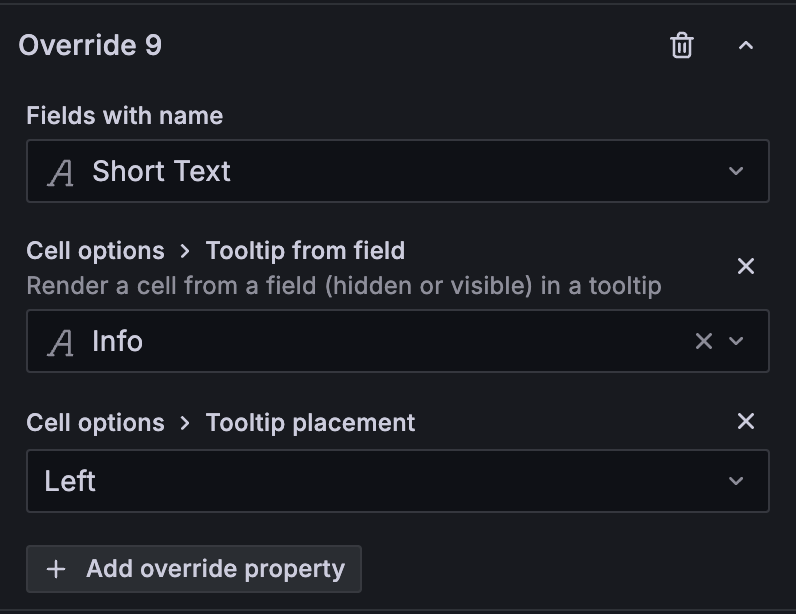
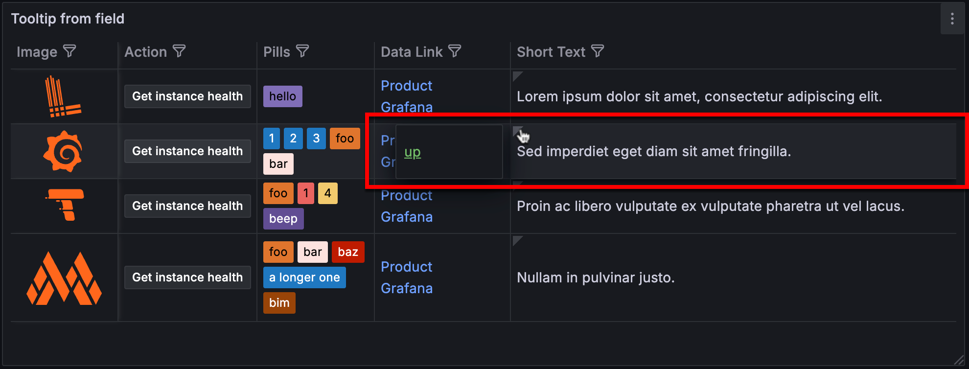
The following table has five visible fields (columns) as well as a hidden field called “Info”:
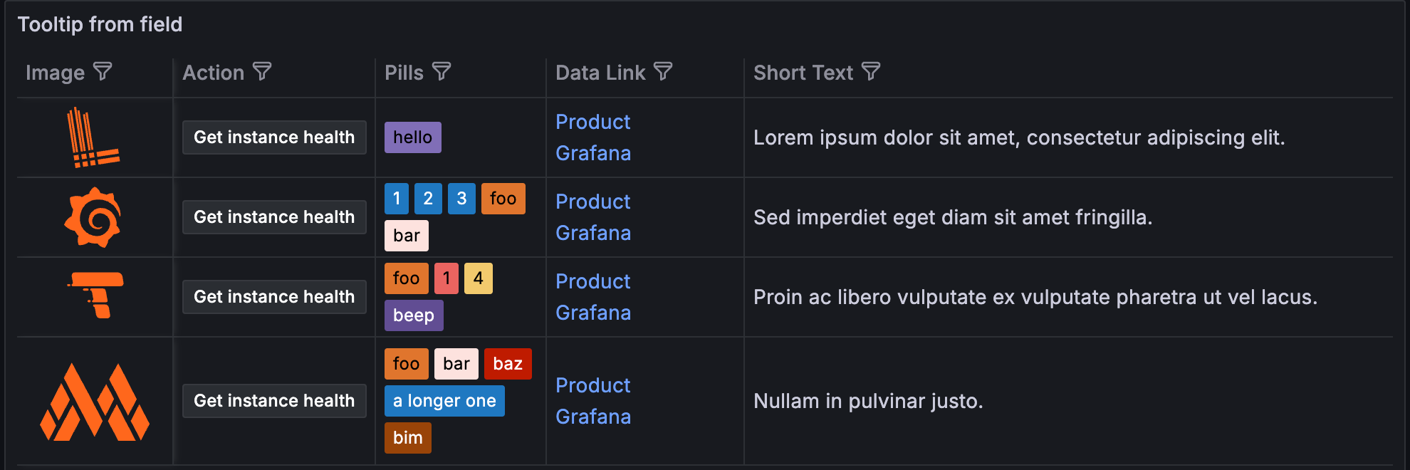
- The “Info” field is hidden using the Table > Hide in table override property.
- The following overrides have been applied to the “Short text” field:
- The values from the “Info” field are used as tooltip text for the “Short text” cells using the Cell options > Tooltip from field override property.
- The Cell options > Tooltip placement override property is set to control the placement of the tooltip.
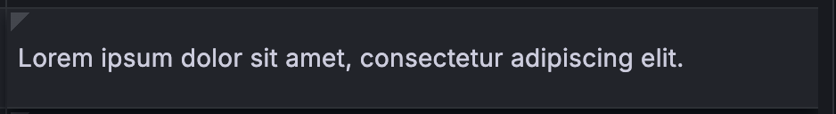
Now, when you hover the cursor over the chip in the “Short text” column, the corresponding values from the “Info” column appear in the tooltip:
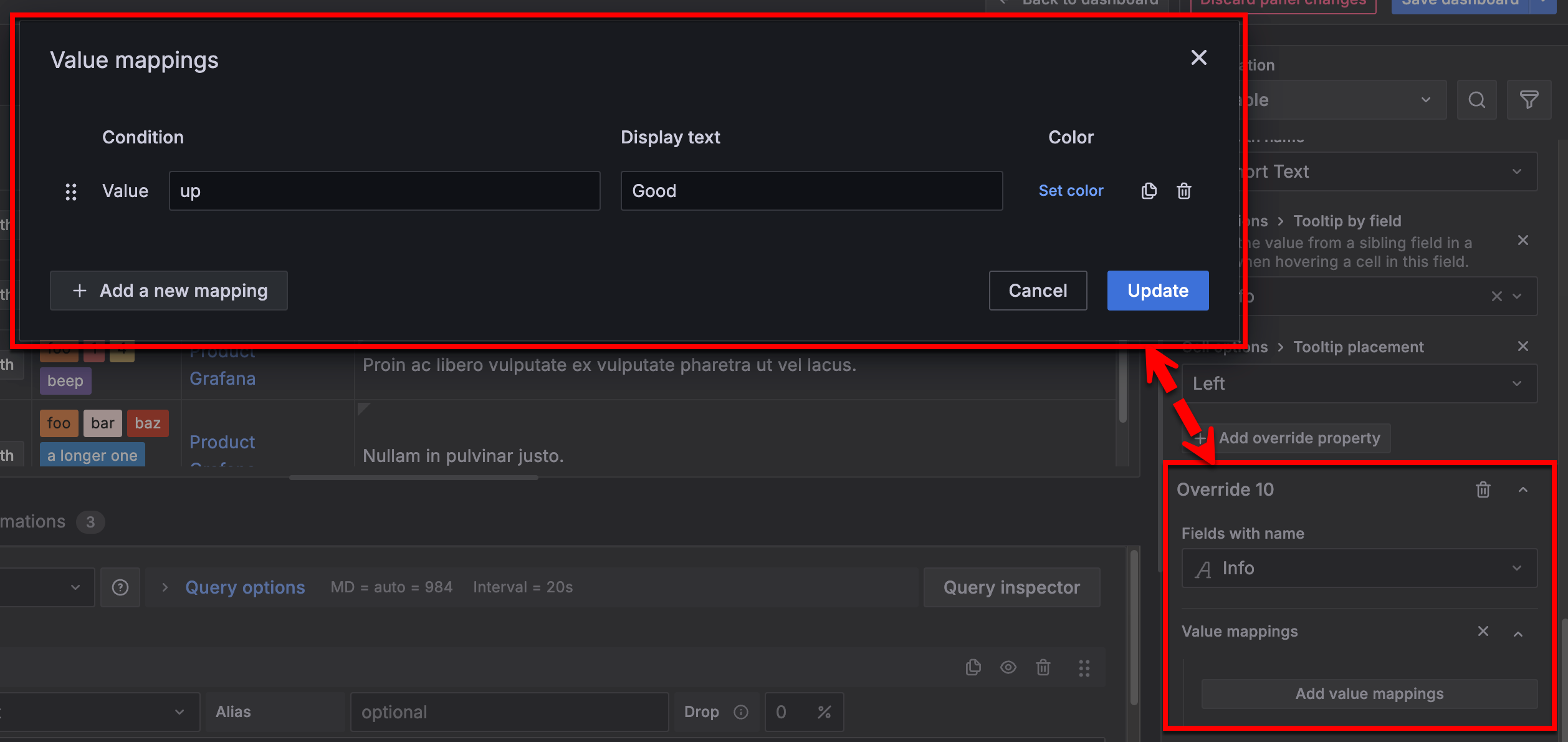
Example: Tooltip from field with value mappings
While the content of the tooltip is determined by the values of the source field and can’t be directly edited, you can use field overrides on the source field to manipulate the display of that value.
For example, if the “Info” column is being used as the source field for the tooltip values, you could set up a value mapping. In this case, the value “up” is mapped to the word “Good”:
Now, when you hover the cursor over the chip in the “Short text” cell, the mapped value appears in the tooltip:
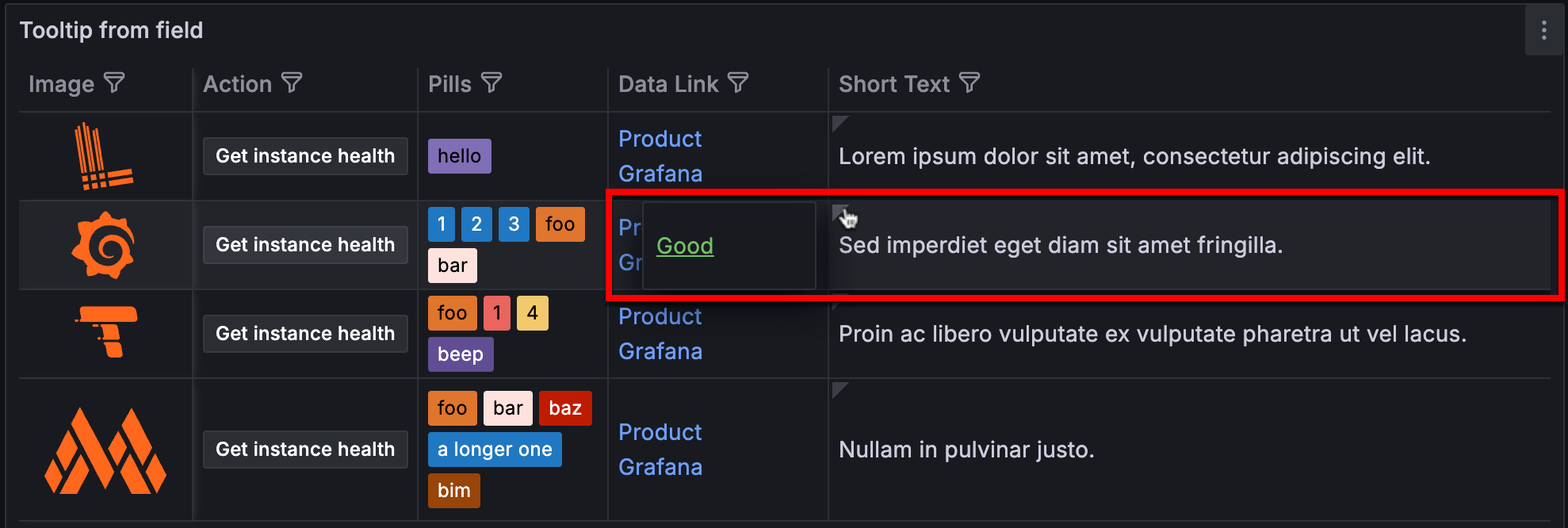
You can use all field overrides to affect the display of the tooltip. For example, the Table > Column width or Cell options > Cell type overrides can change the cell width or visual display of the data.
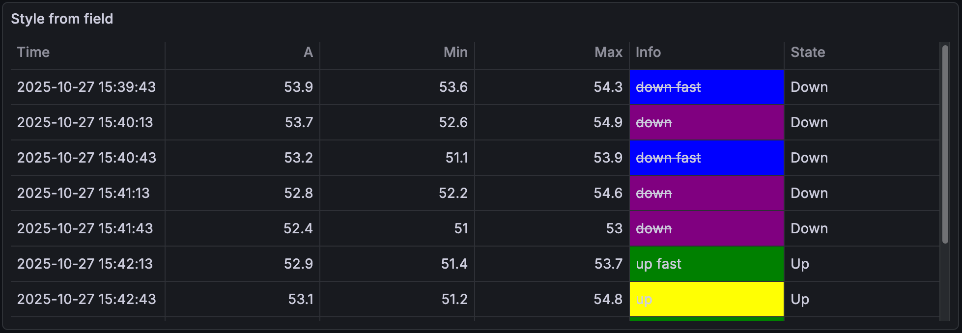
Styling from field
Toggle on the Styling from field switch to apply the styling from another field (or column). The referenced field must contain CSS properties formatted in JSON object syntax. For example:
{"marginLeft":12, "text-decoration": "underline"}While you can turn on this option under Cell options and have it applied to all cells in the table, it’s typically used as an override on a sub-set of cells instead. This is demonstrated in the following example.
The following table has six visible fields (columns) as well as a hidden field called “Style”:
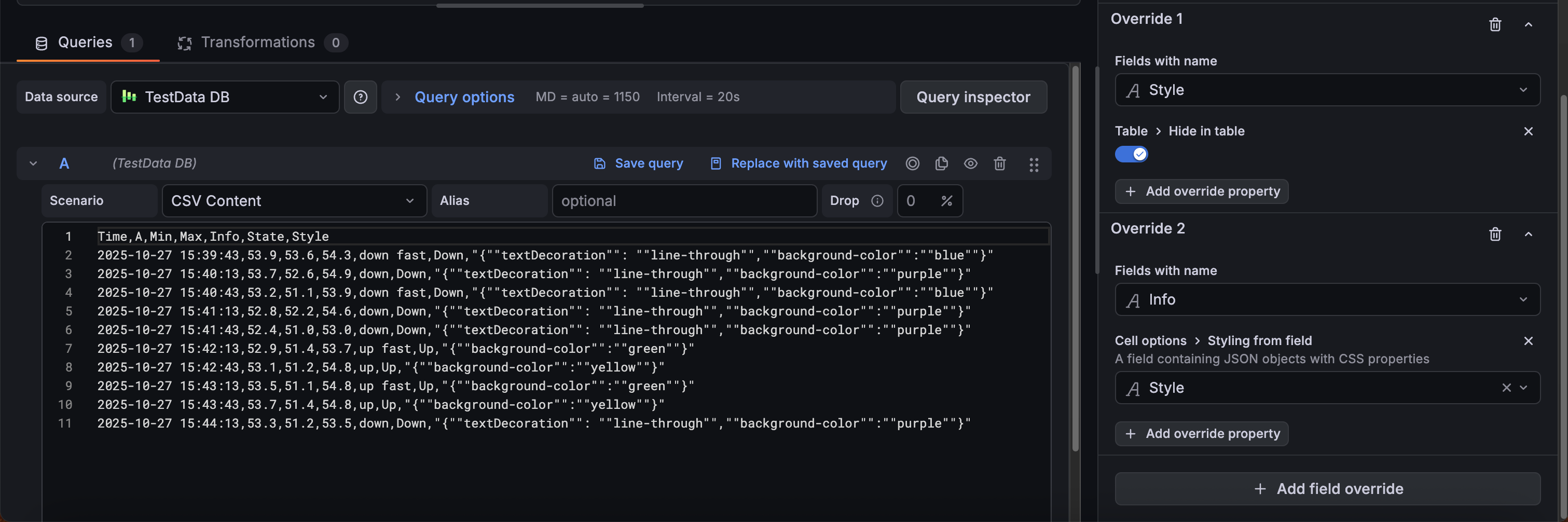
- The “Style” field has JSON objects with CSS properties. (Note that they are formatted for use in CSV format in this example.)
- The “Style” field is hidden using the Table > Hide in table override property.
- The “Info” field is using the Cell options > Styling from field override property with the “Style” field as the source.
The following image shows the “Info” field with the styling from the “Style” field applied:
Standard options
Standard options in the panel editor pane let you change how field data is displayed in your visualizations. When you set a standard option, the change is applied to all fields or series. For more granular control over the display of fields, refer to Configure overrides.
To learn more, refer to Configure standard options.
Data links and actions
Data links allow you to link to other panels, dashboards, and external resources and actions let you trigger basic, unauthenticated, API calls. In both cases, you can carry out these tasks while maintaining the context of the source panel.
For each data link, set the following options:
- Title
- URL
- Open in new tab
Data links for this visualization don’t include the One click switch, however, if there’s only one data link configured, that data link has single-click functionality. If multiple data links are configured, then clicking the visualization opens a menu that displays all the data links.
For each action, define the following API call settings:
To learn more, refer to Configure data links and actions.
Value mappings
Value mapping is a technique you can use to change how data appears in a visualization.
For each value mapping, set the following options:
- Condition - Choose what’s mapped to the display text and (optionally) color:
- Value - Specific values
- Range - Numerical ranges
- Regex - Regular expressions
- Special - Special values like
Null,NaN(not a number), or boolean values liketrueandfalse
- Display text
- Color (Optional)
- Icon (Canvas only)
To learn more, refer to Configure value mappings.
Thresholds
A threshold is a value or limit you set for a metric that’s reflected visually when it’s met or exceeded. Thresholds are one way you can conditionally style and color your visualizations based on query results.
For each threshold, set the following options:
To learn more, refer to Configure thresholds.
Field overrides
Overrides allow you to customize visualization settings for specific fields or series. When you add an override rule, it targets a particular set of fields and lets you define multiple options for how that field is displayed.
Choose from the following override options:
To learn more, refer to Configure field overrides.
Apply overrides to nested table fields
Note
The new transformation editor for nested tables and the nested table overrides feature are currently in public preview. Grafana Labs offers limited support, and breaking changes might occur prior to the feature being made generally available.
To use these features, enable the
groupToNestedTableV2andnestedFramesFieldOverridesfeature toggles in your Grafana configuration file or contact Support.
By default, field overrides apply only to columns in the parent table. To target columns inside a nested table, set the Target fields option on the override to Nested:
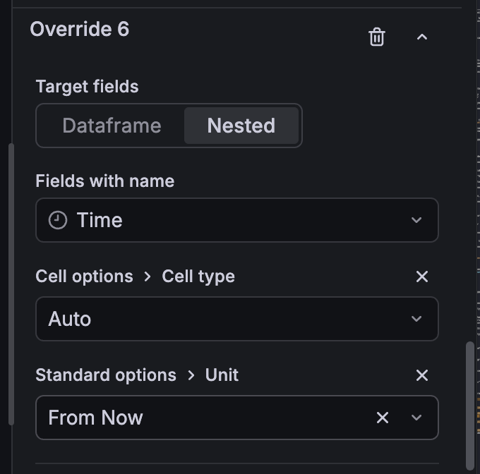
All standard override properties—including thresholds, value mappings, units, data links, and cell type—apply the same way to nested fields.


