Choose a view
The available views in Grafana Profiles Drilldown correspond to how you move through your data: from broader to more specific. For example, you can start with All services and then move to Profile types or Labels for more specific views into your data.
This matches the hierarchy of the profiling data.
After you choose a view, you can Investigate trends and spikes.
Select a view
Select a view by choosing an Exploration tab: All services, Profile types, Labels, Flame graph, Diff flame graph, or Favorites.
You can refine a selected view by selecting a service, profile type, label, or flame graph from one of the charts. Click and drag on an area of interest to see more detail.
Available views
Determining which view to use frames the rest of your investigation.
| View | What it shows | Used for |
| All services | Overview of all services for any given profile metric |
|
| Profile types | Overview of all the profile metrics for a single service |
|
| Labels | Single service label exploration and filtering |
|
| Flame graph | Single service flame graph |
|
| Diff flame graph | Compare the differences between two flame graphs |
|
| Favorites | List of visualizations saved as favorites |
|
Exploration type examples
All services view
The All services view is the default view when you first open Profiles Drilldown.
Use the Filters bar to narrow the services shown in this view. When you open a service in the Flame graph view, the filters you set here are applied there too, so you can keep exploring without losing your place. Your All services filters stay in place when you return. These filters apply only to the All services view, not to the Labels or Diff flame graph views.
Profile types
The Profile types view shows one chart for each profile type available for the selected service. You can select to display the charts in a grid or one chart per row.
Labels
The Labels view lets you navigate and analyze performance data through labels. This feature is crucial for identifying performance anomalies and understanding the behavior of different application segments under various conditions.
Flame graphs
The Flame graph view visualizes profiling data of a single service in a flame graph format, helping you identify resource-intensive functions.
On views with a flame graph, you can use Analyze with Assistant (Grafana Cloud) or Explain Flame Graph (Grafana open source) to get an AI-generated analysis of bottlenecks, likely root causes, and recommended fixes. For more information, refer to Flame graph AI.
You can also use line-level insights from the GitHub integration.
In this view, you can also:
- Search for functions in the flame graph.
- Change the color scheme.
- Expand or collapse all call stacks.
- Toggle between the top table, flame graph, and call tree, or show a combination of views.
- Export profile data.
Export profile data
To export profile data, click the Export profile data download icon above the flame graph. The options depend on the view:
- Flame graph: Download png, json, or pprof, or select gcx command to copy a
gcx profiles querycommand that downloads the profile as a pprof file. - Diff flame graph: Download png or json, or select gcx commands to copy two
gcx profiles querycommands that download the baseline and comparison profiles as pprof files.
png is only available when the flame graph is showing.
Span heatmap (Profiles to Traces)
Use the span heatmap to spot changes in resource usage across trace spans and find spans with unusually high profile values. Inspect an individual span’s flame graph to identify resource-intensive functions, or open its associated trace to understand request timing and relationships between services.
The span heatmap is a visualization within the Flame graph view, not a separate Exploration tab. It requires span profiles in Pyroscope; viewing associated traces also requires matching trace data in Tempo.
For the complete walkthrough and troubleshooting guidance, refer to Move from profiles to traces.
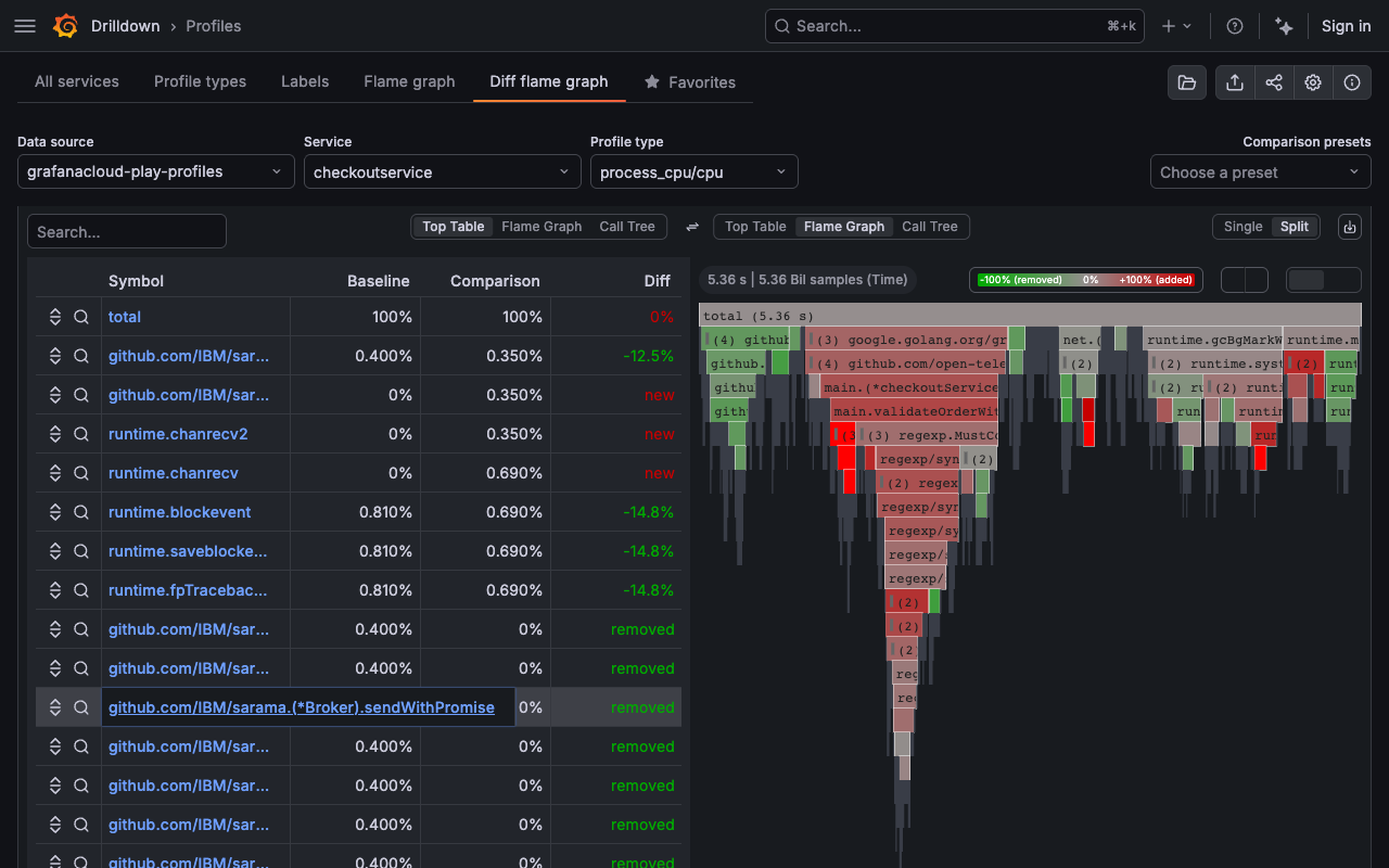
Diff flame graph
The Diff flame graph view shows the differences between two profiling datasets. It normalizes the data by comparing the percentage of total time spent in each function so that the resulting flame graph is comparing the share of time spent in each function rather than the absolute amount of time spent in each function. This lets you compare two different queries that may have different total amounts of time spent in each function.
Similar to a git diff, it takes the selected flame graphs and highlights the differences between them.
To configure comparisons more quickly, you can use:
- Auto-select to choose a comparison range automatically.
- Comparison presets to apply saved or predefined comparisons.
- Sync time ranges to keep baseline and comparison windows aligned.
To export a diff flame graph, refer to Export profile data.
Favorites
The Favorites view shows all your saved favorite visualizations. Clicking on the star (⭐️) at the top-right corner of a visualization saves it as a favorite.
Using favorites, you can create an overview of what’s important, as well as jump to the Flame graph view or the Labels view.
In this view, you can also use:
- Quick filter to find saved items.
- Grid or Rows layout options.
- Hide panels without data to simplify the display.
Was this page helpful?
Related resources from Grafana Labs