 Grafana documentation
Visualize data
Panels and visualizations
Visualizations
Time series
Grafana documentation
Visualize data
Panels and visualizations
Visualizations
Time seriesTime series
Time series visualizations are the default way to show the variations of a set of data values over time. Each data point is matched to a timestamp and this time series is displayed as a graph. The visualization can render series as lines, points, or bars and it’s versatile enough to display almost any type of time-series data.
Note
When you open a dashboard with a legacy Graph visualization, Grafana migrates it automatically to time series or another supported visualization based on the old panel settings.
A time series visualization displays an x-y graph with time progression on the x-axis and the magnitude of the values on the y-axis. This visualization is ideal for displaying large numbers of timed data points that would be hard to track in a table or list.
You can use the time series visualization if you need track:
- Temperature variations throughout the day
- The daily progress of your retirement account
- The distance you jog each day over the course of a year
Configure a time series visualization
The following video guides you through the creation steps and common customizations of time series visualizations, and is great for beginners:
With Grafana Play, you can explore and see how it works, learning from practical examples to accelerate your development. This feature can be seen on Time Series Visualizations in Grafana.
Supported data formats
Time series visualizations require time-series data—a sequence of measurements, ordered in time, and formatted as a table—where every row in the table represents one individual measurement at a specific time. Learn more about time-series data.
The dataset must contain at least one numeric field, and in the case of multiple numeric fields, each one is plotted as a new line, point, or bar labeled with the field name in the tooltip.
Time series data is expected to contain unique timestamps for each data point within a series. If multiple points in the same series share the same timestamp, the visualization might not render or behave as expected.
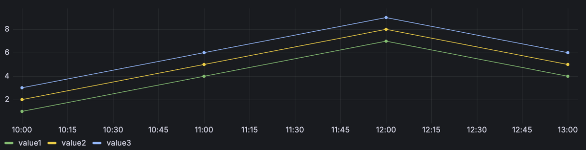
Example 1
In the following example, there are three numeric fields represented by three lines in the chart:
If the time field isn’t automatically detected, you might need to convert the data to a time format using a data transformation.
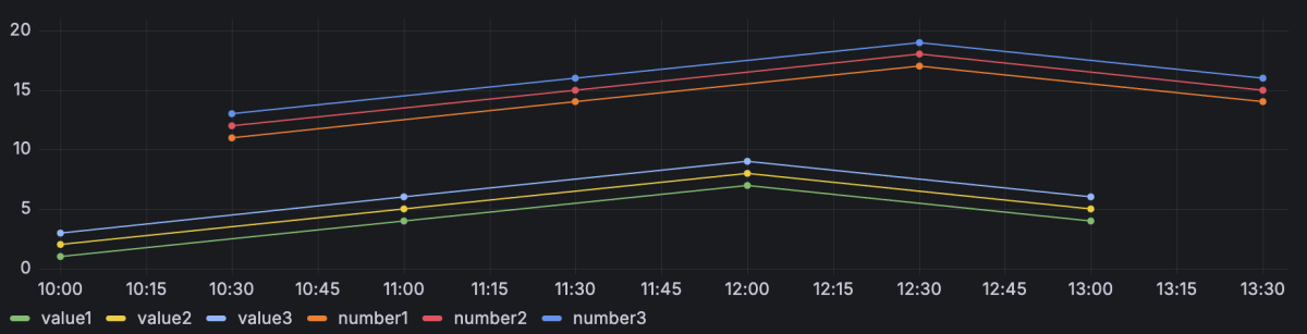
Example 2
The time series visualization also supports multiple datasets. If all datasets are in the correct format, the visualization plots the numeric fields of all datasets and labels them using the column name of the field.
Query1
Query2
Example 3
If you want to more easily compare events between different, but overlapping, time frames, you can do this by using a time offset while querying the compared dataset:
Query1
Query2
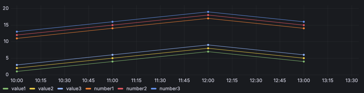
When you add the offset, the resulting visualization makes the datasets appear to be occurring at the same time so that you can compare them more easily.
Alert rules
You can link alert rules to time series visualizations in the form of annotations to observe when alerts fire and are resolved. In addition, you can create alert rules from the Alert tab within the panel editor.
Special overrides
The following overrides help you further refine a time series visualization.
Transform override property
Use the Graph styles > Transform override property to transform series values without affecting the values shown in the tooltip, context menu, or legend. Choose from the following transform options:
- Constant - Show the first value as a constant line.
- Negative Y - Flip the results to negative values on the y-axis.
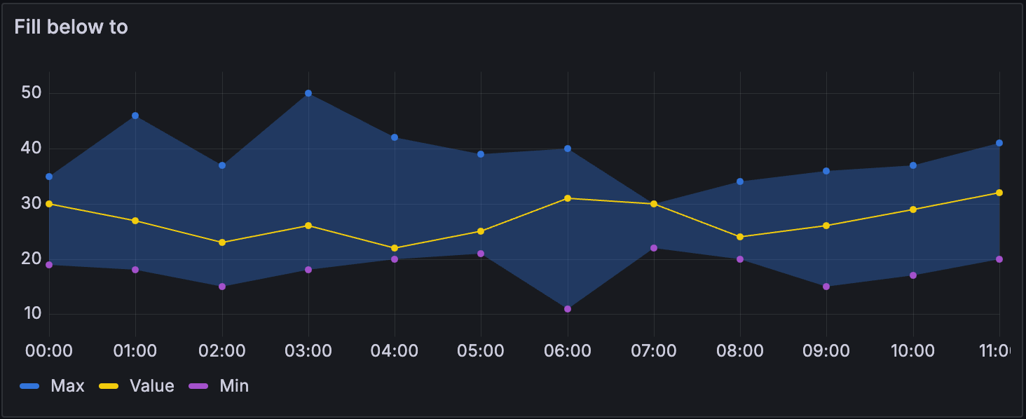
Fill below to override property
The Graph styles > Fill below to override property fills the area between two series. When you configure the property, select the series for which you want the fill to stop.
The following example shows three series: Min, Max, and Value. The Min and Max series have Line width set to 0. Max has a Fill below to override set to Min, which fills the area between Max and Min with the Max line color.
Multiple y-axes
In some cases, you might want to display multiple y-axes. For example, if you have a dataset showing both temperature and humidity over time, you might want to show two y-axes with different units for the two series.
You can configure multiple y-axes and control where they’re displayed in the visualization by adding field overrides. This example of a dataset that includes temperature and humidity describes how you can configure that. Repeat the steps for every y-axis you wish to display.
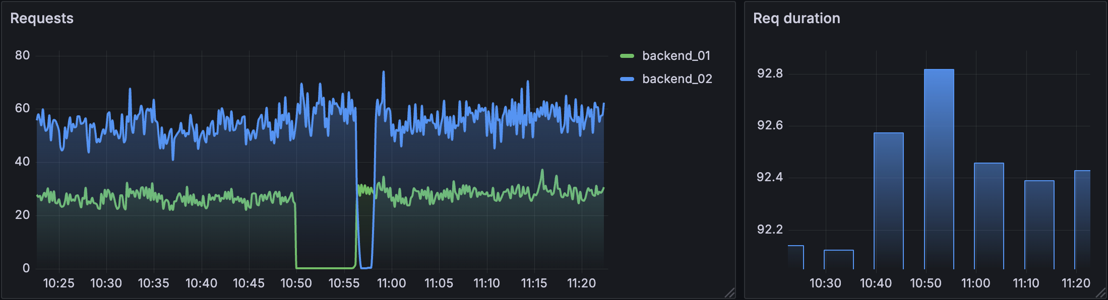
Pan and zoom panel time range
You can pan the panel time range left and right, and zoom it and in and out. This, in turn, changes the dashboard time range.
Zoom in - Click and drag on the panel to zoom in on a particular time range.
Zoom out - Double-click anywhere on the panel to zoom out the time range.
When you zoom out, the range doubles with each double-click, adding equal time to each side of the range. For example, if the original time range is from 9:00 to 9:59, the time range changes as follow with each double-click:
- Next range: 8:30 - 10:29
- Next range: 7:30 - 11:29
Pan - Click and drag the x-axis area of the panel to pan the time range.
The time range shifts by the distance you drag. For example, if the original time range is from 9:00 to 9:59 and you drag 30 minutes to the right, the time range changes to 9:30 to 10:29.
For screen recordings showing these interactions, refer to the Panel overview documentation.
Configuration options
The following section describes the configuration options available in the panel editor pane for this visualization. These options are, as much as possible, ordered as they appear in Grafana.
Panel options
In the Panel options section of the panel editor pane, set basic options like panel title and description, as well as panel links. To learn more, refer to Configure panel options.
Tooltip options
Tooltip options control the information overlay that appears when you hover over data points in the visualization.
Tooltip mode
When you hover your cursor over the visualization, Grafana can display tooltips. Choose how tooltips behave.
- Single - The hover tooltip shows only a single series, the one that you are hovering over on the visualization.
- All - The hover tooltip shows all series in the visualization. Grafana highlights the series that you are hovering over in bold in the series list in the tooltip.
- Hidden - Do not display the tooltip when you interact with the visualization.
Use an override to hide individual series from the tooltip.
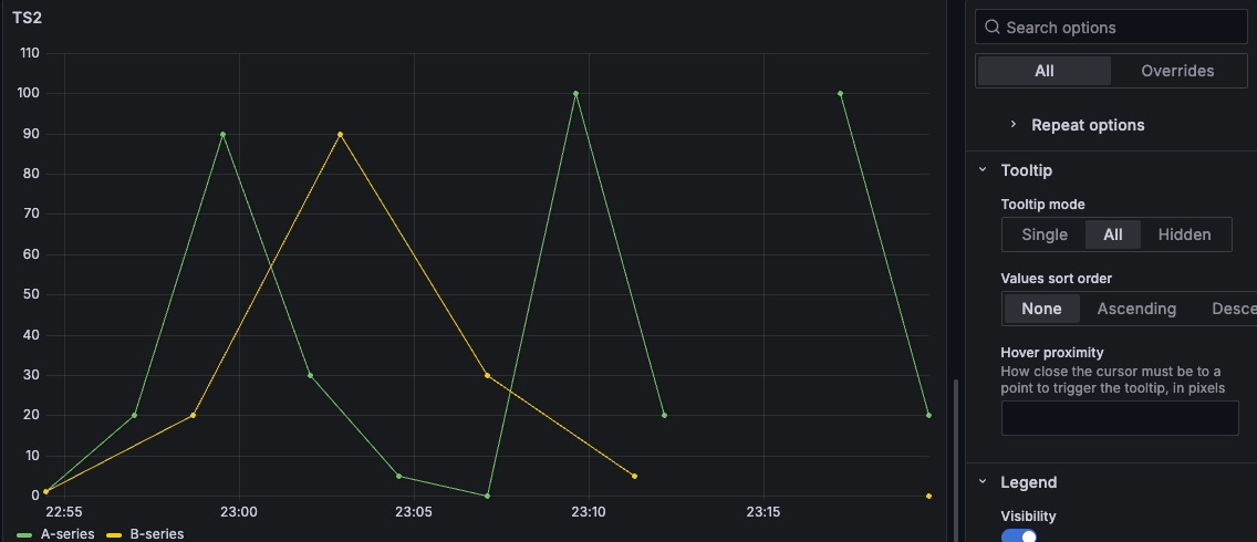
Values sort order
When you set the Tooltip mode to All, the Values sort order option is displayed. This option controls the order in which values are listed in a tooltip. Choose from the following:
- None - Grafana automatically sorts the values displayed in a tooltip.
- Ascending - Values in the tooltip are listed from smallest to largest.
- Descending - Values in the tooltip are listed from largest to smallest.
Hover proximity
Set the hover proximity (in pixels) to control how close the cursor must be to a data point to trigger the tooltip to display. The following screen recording shows this option in a time series visualization:
Legend options
Legend options control the series names and statistics that appear under or to the right of the graph. For more information about the legend, refer to Configure a legend.
Series visibility
Toggle the Series visibility switch on to add the control next to or above the legend.
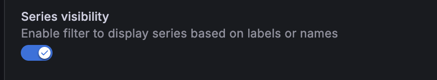
This lets you narrow the visible series by name or by label. Use the series visibility filter when a panel renders many series and you want to focus on a subset without editing the query.
After you’ve toggled the switch on, click the Series visibility icon to open a tooltip. Depending on your dataset, you can filter:
- By name: Lists each unique series name. Select one or more names to limit the visualization to those series.
- By labels: Lists each label key with its values. Select label values to filter series that match.
The tooltip also provides the following options:
- Select all and Deselect all: Toggle every value in a section.
- Clear all: Reset the filter.
- Pin to sidebar: Dock the filter alongside the panel so it stays open while you explore.
For more information, refer to the Configure legend documentation.
Axis options
Options under the Axis section control how the x- and y-axes are rendered. Some options don’t take effect until you click outside of the field option box you’re editing. You can also press Enter.
Placement
Select the placement of the y-axis. Choose from the following:
- Auto - Automatically assigns the y-axis to the series. When there are two or more series with different units, Grafana assigns the left axis to the first unit and the right axis to the units that follow.
- Left - Display all y-axes on the left side.
- Right - Display all y-axes on the right side.
- Hidden - Hide all axes. To selectively hide axes, Add a field override that targets specific fields.
Scale
Set the y-axis values scale. Choose from:
- Linear - Divides the scale into equal parts.
- Logarithmic - Use a logarithmic scale. When you select this option, a list appears for you to choose a binary (base 2) or common (base 10) logarithmic scale.
- Symlog - Use a symmetrical logarithmic scale. When you select this option, a list appears for you to choose a binary (base 2) or common (base 10) logarithmic scale. The linear threshold option allows you to set the threshold at which the scale changes from linear to logarithmic.
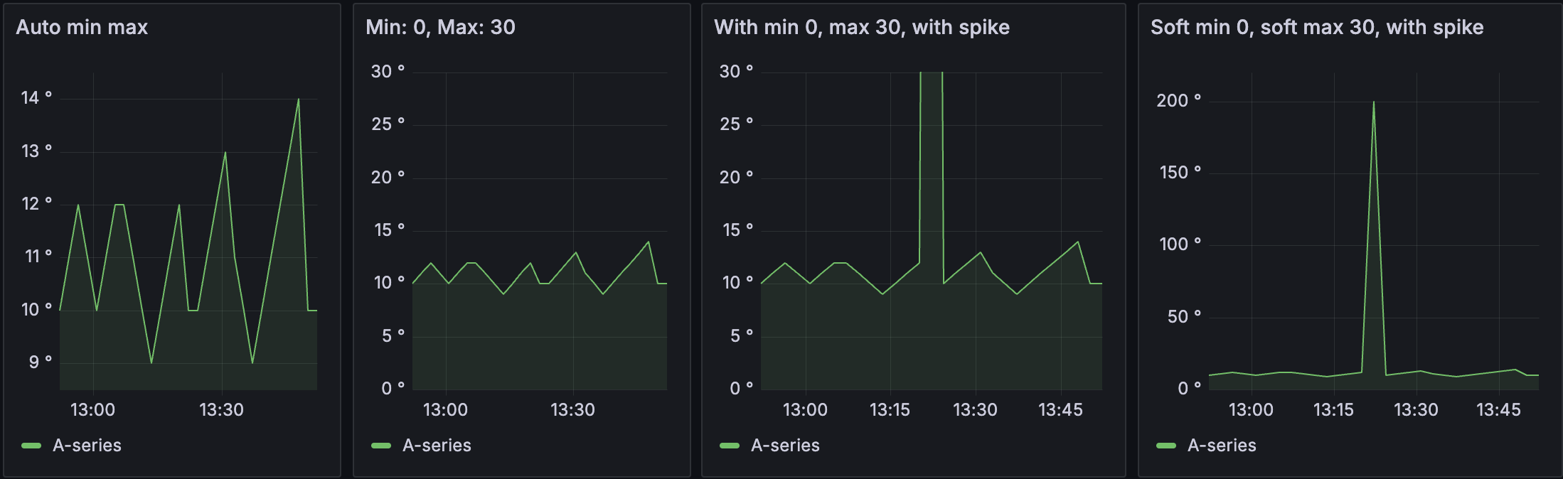
Soft min and soft max
Set a Soft min or soft max option for better control of y-axis limits. By default, Grafana sets the range for the y-axis automatically based on the dataset.
Soft min and soft max settings can prevent small variations in the data from being magnified when it’s mostly flat. In contrast, hard min and max values help prevent obscuring useful detail in the data by clipping intermittent spikes past a specific point.
To define hard limits of the y-axis, set standard min/max options. For more information, refer to Configure standard options.
Annotation options
Graph styles options
The options under the Graph styles section let you control the general appearance of the graph, excluding color.
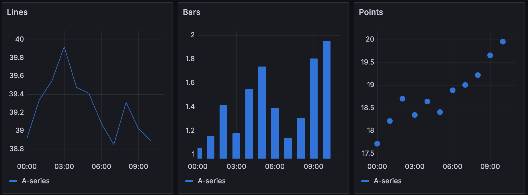
Style
Choose whether to display your time-series data as Lines, Bars, or Points. You can use overrides to combine multiple styles in the same graph. Choose from the following:
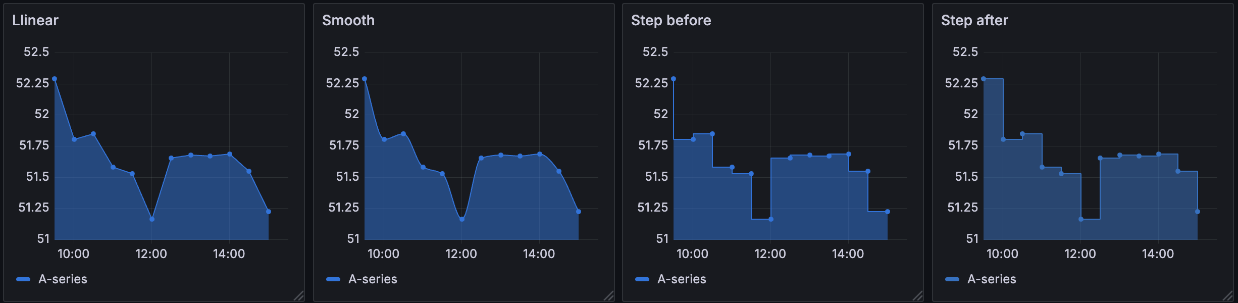
Line interpolation
Choose how the graph interpolates the series line:
- Linear - Points are joined by straight lines.
- Smooth - Points are joined by curved lines that smooths transitions between points.
- Step before - The line is displayed as steps between points. Points are rendered at the end of the step.
- Step after - The line is displayed as steps between points. Points are rendered at the beginning of the step.
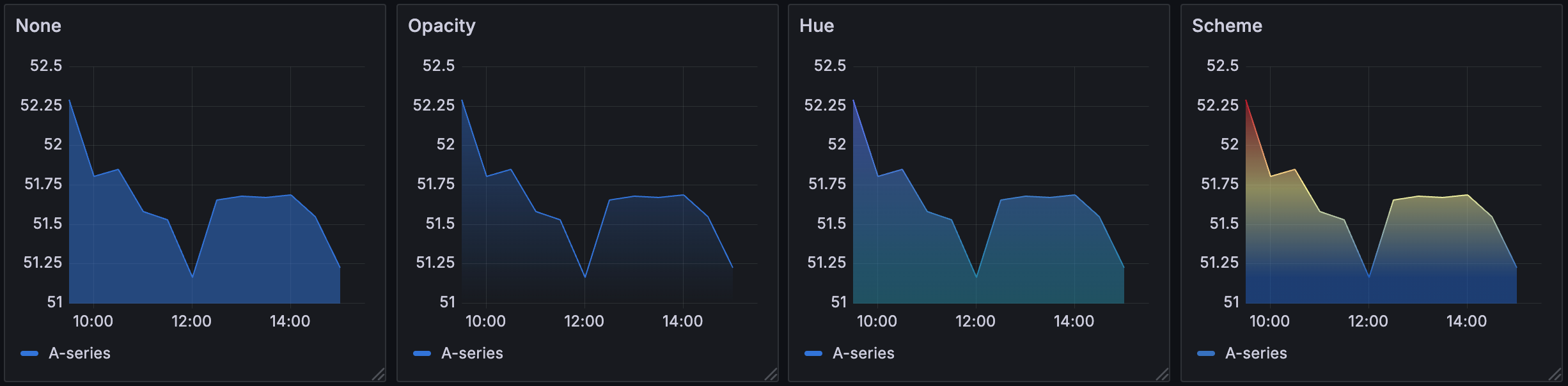
Gradient mode
Choose a gradient mode to control the gradient fill, which is based on the series color. To change the color, use the standard color scheme field option. For more information, refer to Color scheme.
- None - No gradient fill. This is the default setting.
- Opacity - An opacity gradient where the opacity of the fill increases as y-axis values increase.
- Hue - A subtle gradient that’s based on the hue of the series color.
- Scheme - A color gradient defined by your Color scheme. This setting is used for the fill area and line. For more information about scheme, refer to Scheme gradient mode.
Gradient appearance is influenced by the Fill opacity setting. The following image shows the Fill opacity set to 50.
Scheme gradient mode
In Scheme gradient mode, the line or bar receives a gradient color defined from the selected Color scheme option in the visualization’s Standard options.
The following image shows a line chart with the Green-Yellow-Red (by value) color scheme option selected:
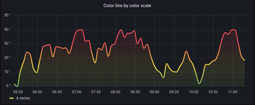
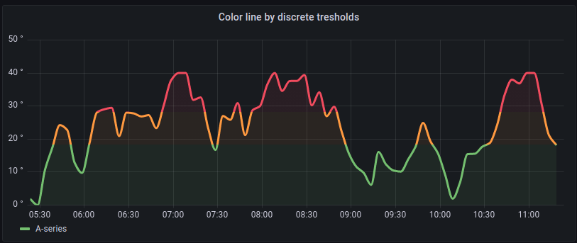
If the Color scheme is set to From thresholds (by value) and Gradient mode is set to Scheme, then the line or bar color changes as it crosses the defined thresholds:
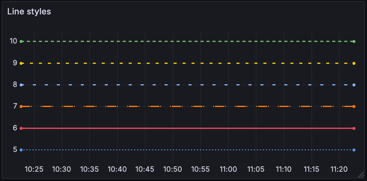
Line style
Choose a solid, dashed, or dotted line style:
- Solid - Display a solid line. This is the default setting.
- Dash - Display a dashed line. When you choose this option, a list appears for you to select the length and gap (length, gap) for the line dashes. Dash spacing is 10, 10 by default.
- Dots - Display dotted lines. When you choose this option, a list appears for you to select the gap (length = 0, gap) for the dot spacing. Dot spacing is 0, 10 by default.
Connect null values
Choose how null values, which are gaps in the data, appear on the graph. Null values can be connected to form a continuous line or set to a threshold above which gaps in the data are no longer connected.
- Never - Time series data points with gaps in the data are never connected.
- Always - Time series data points with gaps in the data are always connected.
- Threshold - Specify a threshold above which gaps in the data are no longer connected. This can be useful when the connected gaps in the data are of a known size and/or within a known range, and gaps outside this range should no longer be connected.
Disconnect values
Choose whether to set a threshold above which values in the data should be disconnected.
- Never - Time series data points in the data are never disconnected.
- Threshold - Specify a threshold above which values in the data are disconnected. This can be useful when desired values in the data are of a known size and/or within a known range, and values outside this range should no longer be connected.
To change the color, use the standard color scheme field option.
Show points
Set whether to show data points as lines or bars. Choose from the following:
- Auto - Grafana determines a point’s visibility based on the density of the data. If the density is low, then points appear.
- Always - Show the points regardless of how dense the dataset is.
- Never - Don’t show points.
Stack series
Set whether Grafana stacks or displays series on top of each other. Be cautious when using stacking because it can create misleading graphs. To read more about why stacking might not be the best approach, refer to The issue with stacking. Choose from the following:
- Off - Turns off series stacking. When Off, all series share the same space in the visualization.
- Normal - Stacks series on top of each other.
- 100% - Stack by percentage where all series add up to 100%.
Stack series in groups
The stacking group option is only available as an override. For more information about creating an override, refer to Configure field overrides.
Edit the panel and click Overrides.
Create a field override for the Stack series option.
In stacking mode, click Normal.
Name the stacking group in which you want the series to appear.
The stacking group name option is only available when you create an override.
Bar alignment
Set the position of the bar relative to a data point. In the examples below, Show points is set to Always which makes it easier to see the difference this setting makes. The points don’t change, but the bars change in relationship to the points. Choose from the following:
- Before
![Bar alignment before icon]() The bar is drawn before the point. The point is placed on the trailing corner of the bar.
The bar is drawn before the point. The point is placed on the trailing corner of the bar. - Center
![Bar alignment center icon]() The bar is drawn around the point. The point is placed in the center of the bar. This is the default.
The bar is drawn around the point. The point is placed in the center of the bar. This is the default. - After
![Bar alignment after icon]() The bar is drawn after the point. The point is placed on the leading corner of the bar.
The bar is drawn after the point. The point is placed on the leading corner of the bar.
 The bar is drawn before the point. The point is placed on the trailing corner of the bar.
 The bar is drawn around the point. The point is placed in the center of the bar. This is the default.
 The bar is drawn after the point. The point is placed on the leading corner of the bar.
Standard options
Standard options in the panel editor pane let you change how field data is displayed in your visualizations. When you set a standard option, the change is applied to all fields or series. For more granular control over the display of fields, refer to Configure overrides.
To learn more, refer to Configure standard options.
Data links and actions
Data links allow you to link to other panels, dashboards, and external resources and actions let you trigger basic, unauthenticated, API calls. In both cases, you can carry out these tasks while maintaining the context of the source panel.
For each data link, set the following options:
- Title
- URL
- Open in new tab
- One click - Opens the data link with a single click. Only one data link can have One click enabled at a time.
For each action, define the following API call settings:
To learn more, refer to Configure data links and actions.
Value mappings
Value mapping is a technique you can use to change how data appears in a visualization.
For each value mapping, set the following options:
- Condition - Choose what’s mapped to the display text and (optionally) color:
- Value - Specific values
- Range - Numerical ranges
- Regex - Regular expressions
- Special - Special values like
Null,NaN(not a number), or boolean values liketrueandfalse
- Display text
- Color (Optional)
- Icon (Canvas only)
To learn more, refer to Configure value mappings.
Thresholds
A threshold is a value or limit you set for a metric that’s reflected visually when it’s met or exceeded. Thresholds are one way you can conditionally style and color your visualizations based on query results.
For each threshold, set the following options:
To learn more, refer to Configure thresholds.
Field overrides
Overrides allow you to customize visualization settings for specific fields or series. When you add an override rule, it targets a particular set of fields and lets you define multiple options for how that field is displayed.
Choose from the following override options:
To learn more, refer to Configure field overrides.


