Important: This documentation is about an older version. It's relevant only to the release noted, many of the features and functions have been updated or replaced. Please view the current version.
Apply color to series and fields
In addition to specifying color based on thresholds, you can configure the color of series and field data. The color options and their effect on the visualization depends on the visualization you are working with. Some visualizations have different color options.
You can specify a single color, or select a continuous (gradient) color schemes, based on a value. Continuous color interpolates a color using the percentage of a value relative to min and max.
Before you begin
To apply color to series and fields:
In panel display options, scroll to the Standard options or override section.
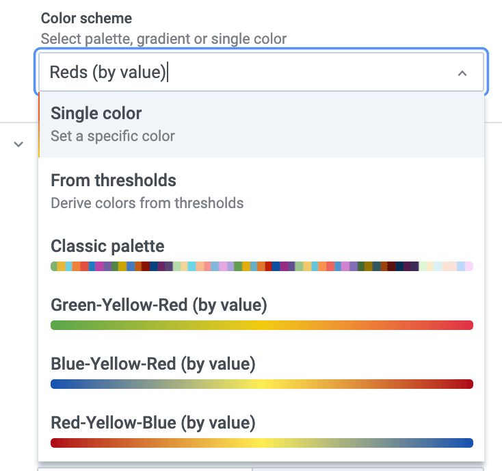
Click the Standard options Color scheme drop-down, and select one of the following palettes:


