
Important: This documentation is about an older version. It's relevant only to the release noted, many of the features and functions have been updated or replaced. Please view the current version.
Change axis display
Note: This is a beta feature. Time series panel is going to replace the Graph panel in the future releases.
This section explains how to use Time series field options to control the display of axes in the visualization and illustrates what the axis options do.
Use the following field settings to refine how your axes display.
Some field options will not affect the visualization until you click outside of the field option box you are editing or press Enter.
Placement
Select the placement of the Y-axis.
Auto
Grafana automatically assigns Y-axis to the series. When there are two or more series with different units, then Grafana assigns the left axis to the first unit and right to the following units.
Left
Display all Y-axes on the left side.
Right
Display all Y-axes on the right side.
Hidden
Hide the Y-axes.
Label
Set a Y-axis text label.
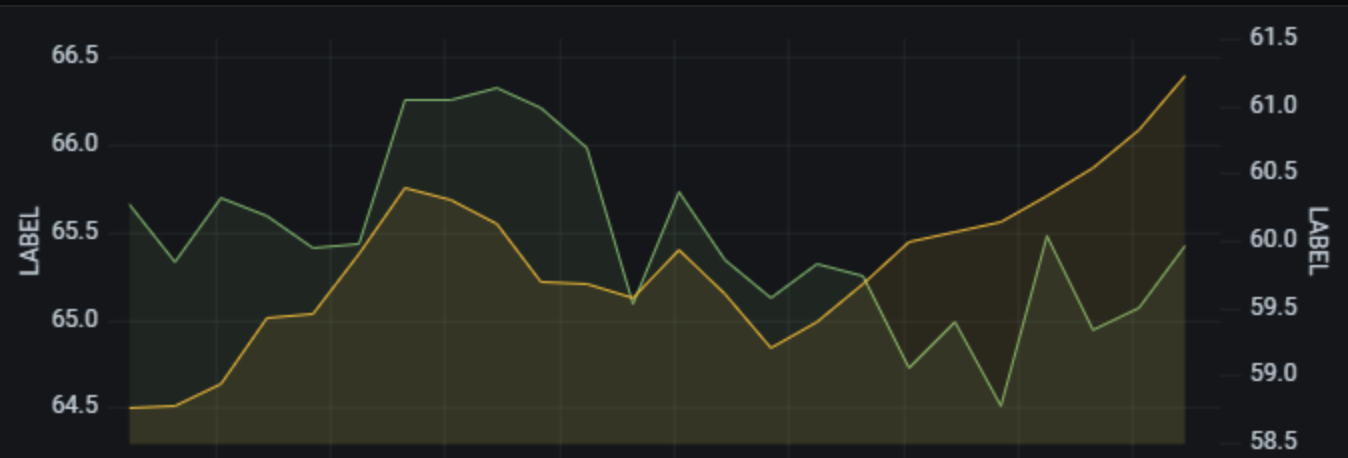
If you have more than one Y-axis, then you can give assign different labels in the Override tab.
Width
Set a fixed width of the axis. By default, Grafana dynamically calculates the width of an axis.
By setting the width of the axis, data whose axes types are different can share the same display proportions. This makes it easier to compare more than one graph’s worth of data because the axes are not shifted or stretched within visual proximity of each other.
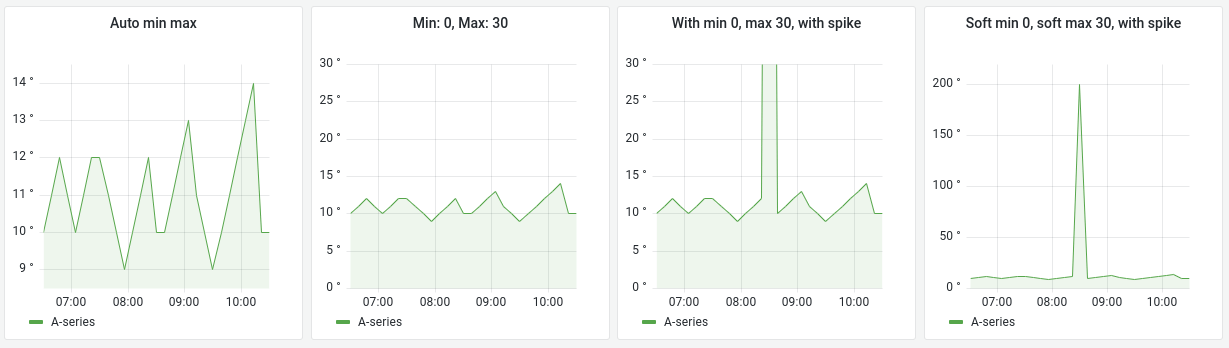
Soft min and soft max
Set a Soft min or soft max option for better control of Y-axis limits. By default, Grafana sets the range for the Y-axis automatically based on the dataset.
Soft min and soft max settings can prevent blips from turning into mountains when the data is mostly flat, and hard min or max derived from standard min and max field options can prevent intermittent spikes from flattening useful detail by clipping the spikes past a defined point.
You can set standard min/max options to define hard limits of the Y-axis. For more information, refer to Standard field options.
Scale
Set the scale to use for the Y-axis values.
Linear
Use scale divided into equal parts.
Logarithmic
Use a logarithmic scale. When this option is chosen, a list appears where you can choose binary (base 2) or common (base 10) logarithmic scale.
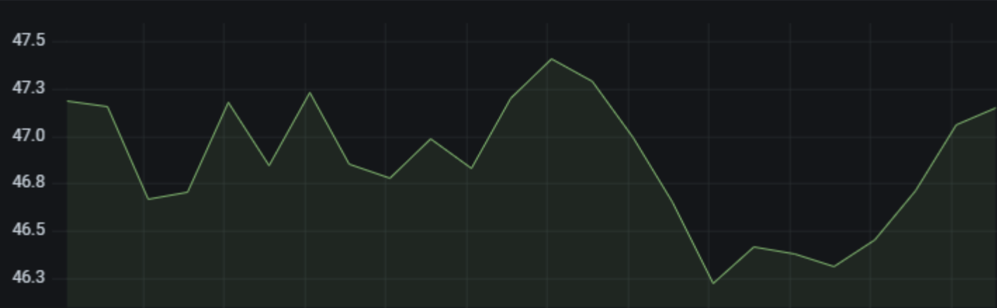
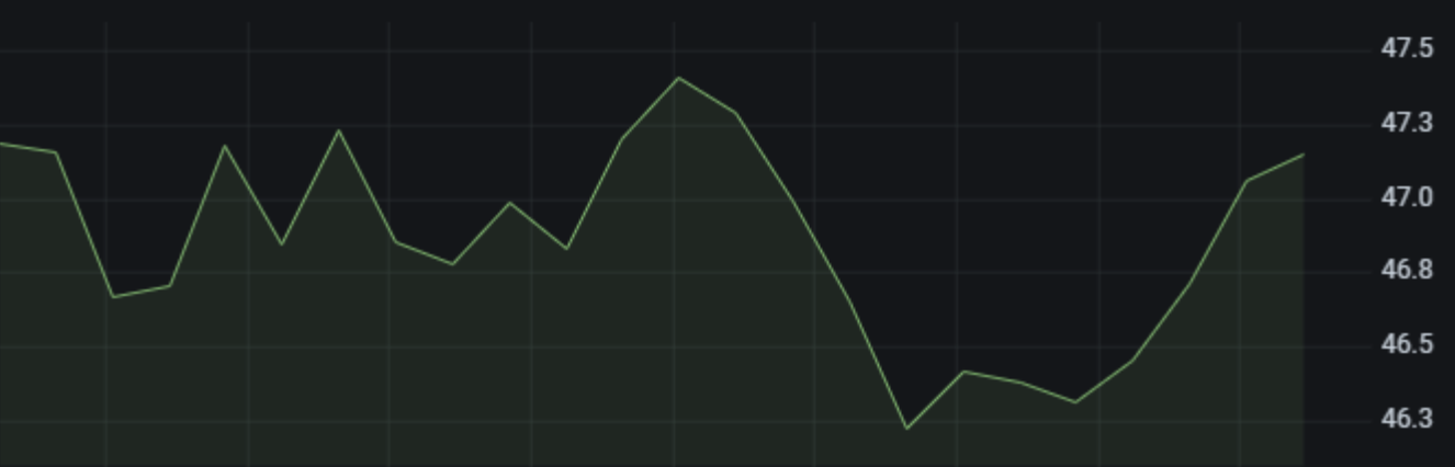
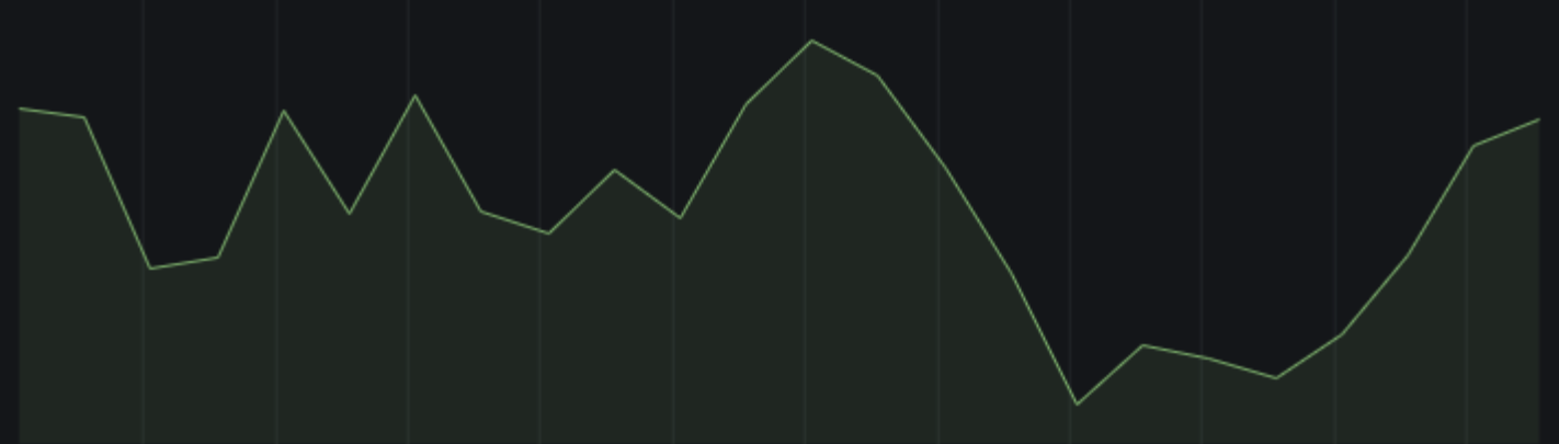
Axis examples
For examples, refer to the Grafana Play dashboard New Features in v7.4.
Was this page helpful?
Related resources from Grafana Labs


