
Important: This documentation is about an older version. It's relevant only to the release noted, many of the features and functions have been updated or replaced. Please view the current version.
Graph time series as lines
Note: This is a beta feature. Time series panel is going to replace the Graph panel in the future releases.
This section explains how to use Time series field options to visualize time series data as lines and illustrates what the options do.
Create the panel
- Add a panel. Select the Time series visualization.
- In the Panel editor side pane, click Graph styles to expand it.
- In Style, click Lines.
Style the lines
Use the following field settings to refine your visualization.
Some field options will not affect the visualization until you click outside of the field option box you are editing or press Enter.
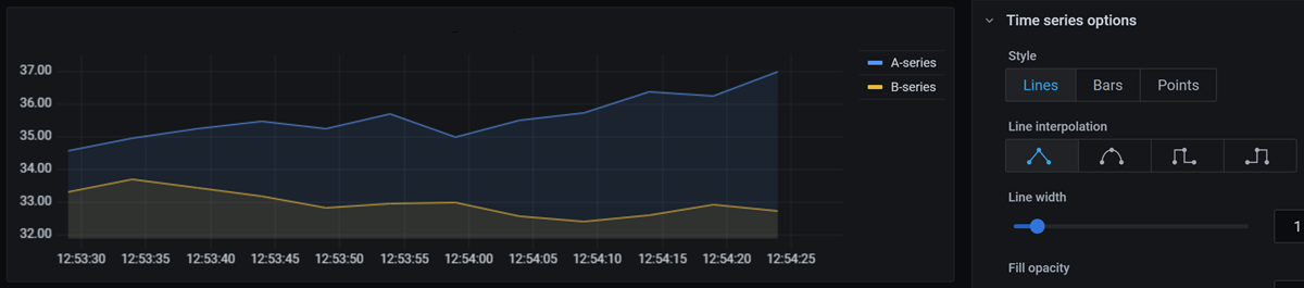
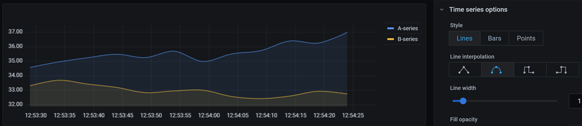
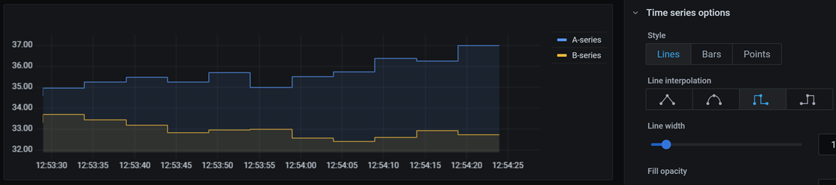
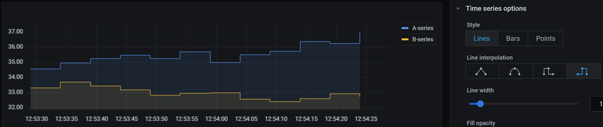
Line interpolation
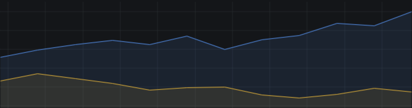
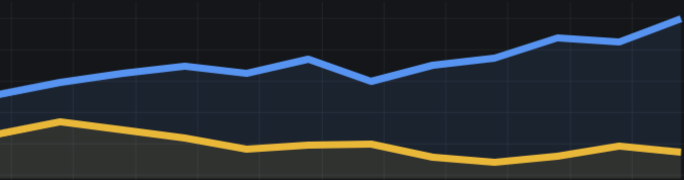
Choose how Grafana interpolates the series line. The screenshots below show the same data displayed with different line interpolations.
Linear
![]()
Points are joined by straight lines.
Smooth
![]()
Points are joined by curved lines resulting in smooth transitions between points.
Step before
![]()
The line is displayed as steps between points. Points are rendered at the end of the step.
Step after
![]()
Line is displayed as steps between points. Points are rendered at the beginning of the step.
Line width
Set the thickness of the series line, from 0 to 10 pixels.
Line thickness set to 1:
Line thickness set to 7:
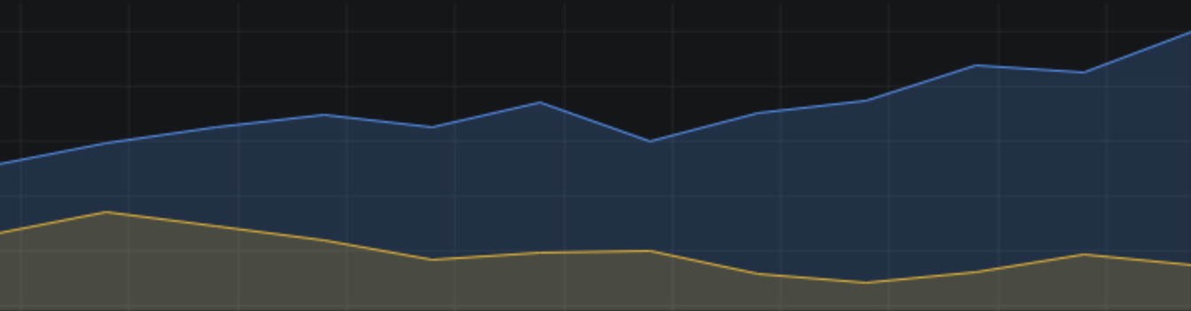
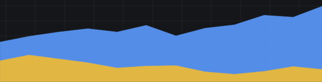
Fill opacity
Set the opacity of the series fill, from 0 to 100 percent.
Fill opacity set to 20:
Fill opacity set to 95:
Gradient mode
Set the mode of the gradient fill. Fill gradient is based on the line color. To change the color, use the standard color scheme field option.
Gradient appearance is influenced by the Fill opacity setting. In the screenshots below, Fill opacity is set to 50.
None
No gradient fill. This is the default setting.
Opacity
Transparency of the gradient is calculated based on the values on the y-axis. Opacity of the fill is increasing with the values on the Y-axis.
Hue
Gradient color is generated based on the hue of the line color.
Line style
Set the style of the line. To change the color, use the standard color scheme field option.
Line style appearance is influenced by the Line width and Fill opacity settings. In the screenshots below, Line width is set to 3 and Fill opacity is set to 20.
Solid
Display solid line. This is the default setting.

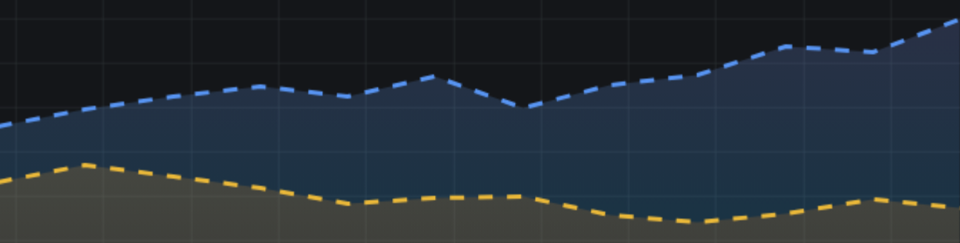
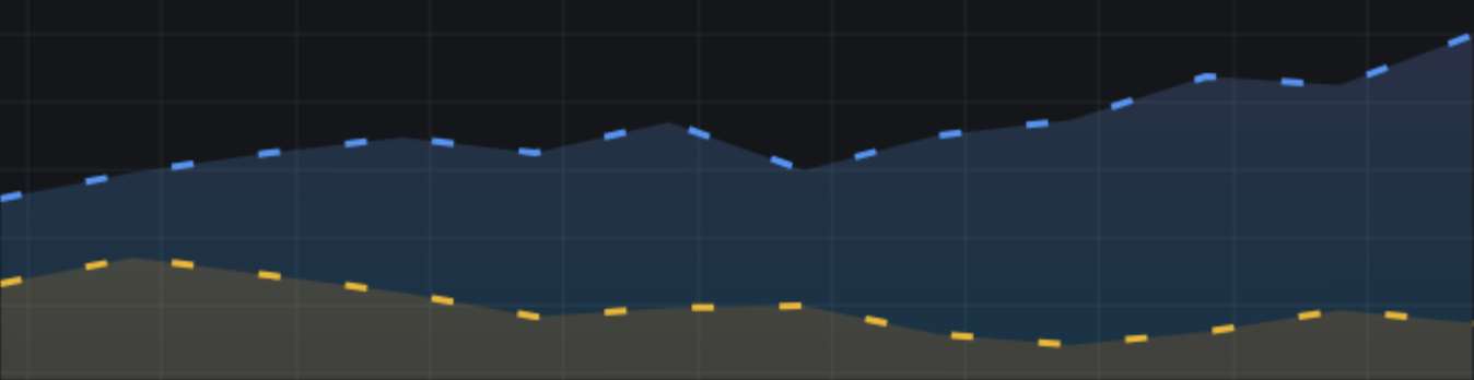
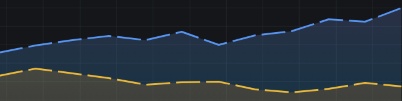
Dash
Display a dashed line. When you choose this option, a list appears so that you can select the length and gap (length, gap) for the line dashes.
Dash spacing set to 10, 10 (default):
Dash spacing set to 10, 30:
Dash spacing set to 40, 10:
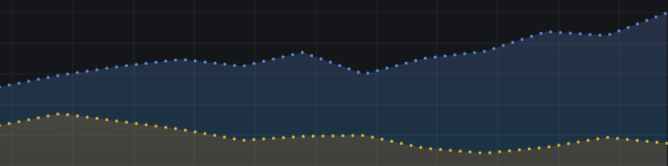
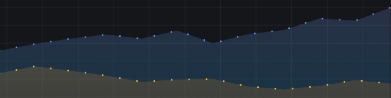
Dots
Display dotted lines. When you choose this option, a list appears so that you can select the gap (length = 0, gap) for the dot spacing.
Dot spacing set to 0, 10 (default):
Dot spacing set to 0, 30:
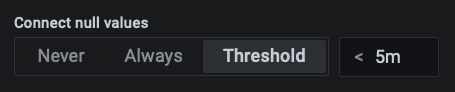
Connect null values
Choose how null values (gaps in the data) are displayed on the graph. Null values can be connected to form a continuous line or, optionally, set a threshold above which gaps in the data should no longer be connected.
Never
Time series data points with gaps in the the data are never connected.
Always
Time series data points with gaps in the the data are always connected.
Threshold
A threshold can be set above which gaps in the data should no longer be connected. This can be useful when the connected gaps in the data are of a known size and/or within a known range and gaps outside this range should no longer be connected.
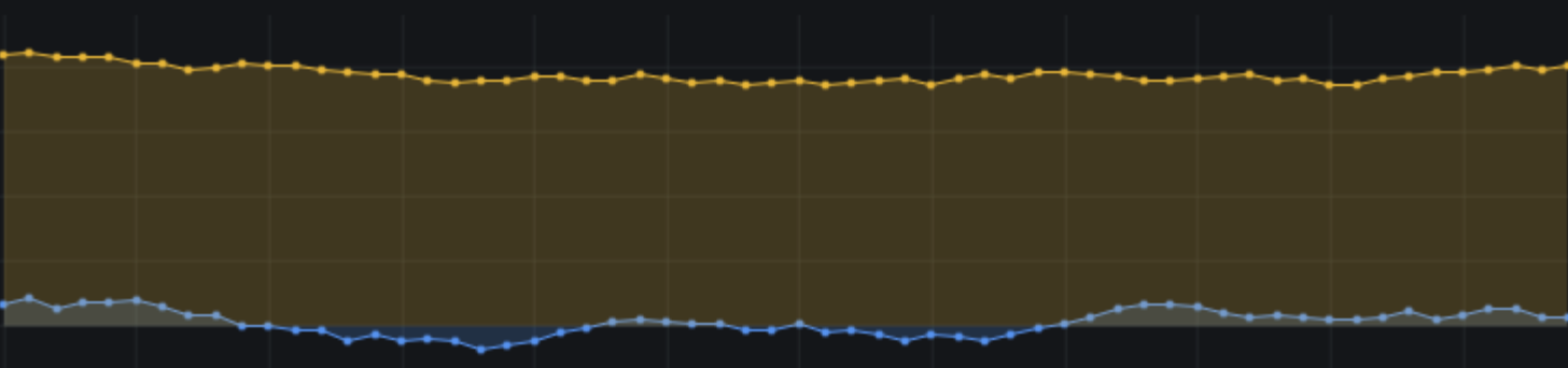
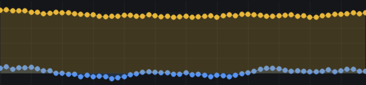
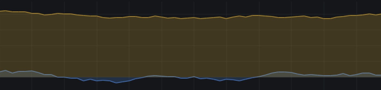
Show points
Choose when the points should be shown on the graph.
Auto
Grafana automatically decides whether or not to show the points depending on the density of the data. If the density is low, then points are shown.
Always
Show the points no matter how dense the data set is. This example uses a Line width of 1 and 50 data points. If the line width is thicker than the point size, then the line obscures the points.
Point size
Set the size of the points, from 1 to 40 pixels in diameter.
Point size set to 4:
Point size set to 10:
Never
Never show the points.
Stack series
For full instructions, refer to Graph stacked time series.
Axis
For full instructions, refer to Change axis display.
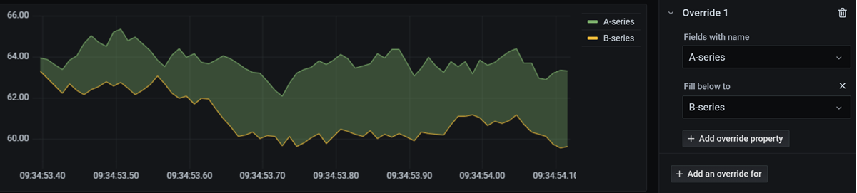
Fill below to
This option is only available as in the Overrides tab.
Fill the area between two series. On the Overrides tab:
- Select the fields to fill below.
- In Add override property, select Fill below to.
- Select the series that you want the fill to stop at.
A-series filled below to B-series:
Line graph examples
Below are some line graph examples to give you ideas.
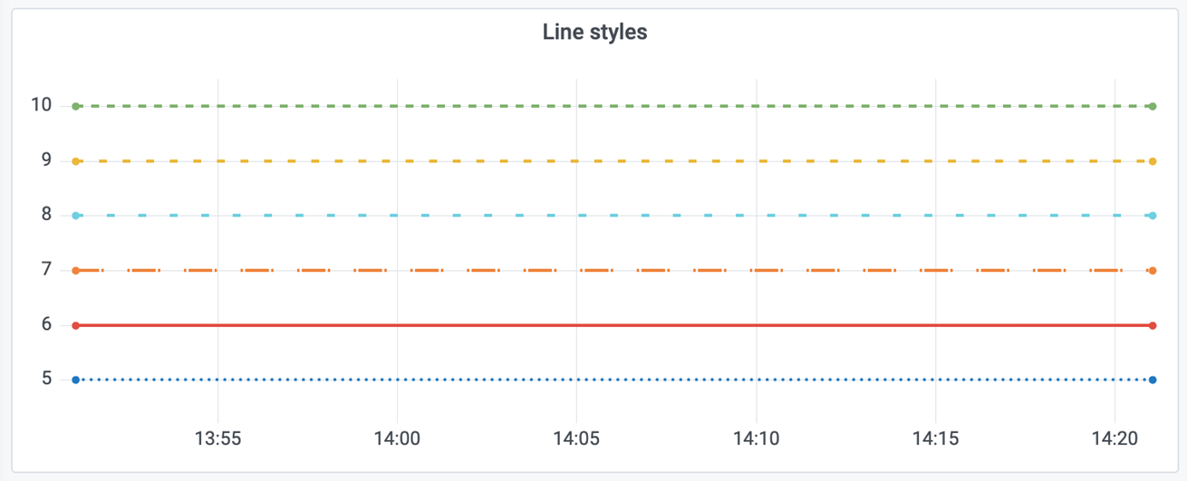
Various line styles
This is a graph with different line styles and colors applied to each series and zero fill.
Interpolation modes examples

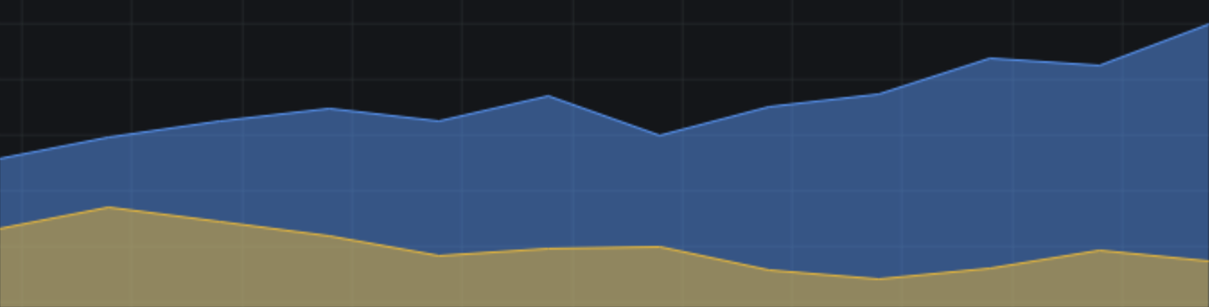
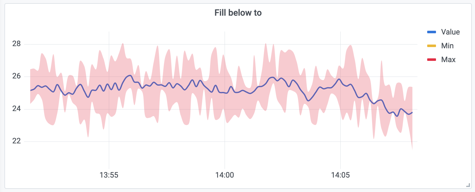
Fill below example
This graph shows three series: Min, Max, and Value. The Min and Max series have Line width set to 0. Max has a Fill below to override set to Min, which fills the area between Max and Min with the Max line color.
Was this page helpful?
Related resources from Grafana Labs


