Plugins 〉Interactive Tree Panel

- Grafana, of course
- 10k series Prometheus metrics
- 50 GB logs
- 50 GB traces
- 2,232 app o11y host hours
- ...and more
No credit card needed, ever.
- Reduce metric cardinality by 30-50%
- Pay only for metrics you use
- Centralize control over your data in Grafana Cloud
Gain insight into unused metrics and optimize metric cardinality with the new cardinality management dashboards and Adaptive Metrics
Interactive Tree Panel


Interactive Tree Plugin
Welcome to the Interactive Tree Plugin, your solution for creating interactive Tree diagrams in Grafana 10.4+.
How it Works
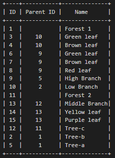
The Interactive Tree Panel is designed to visualize hierarchical data effortlessly. To use it effectively, the following fields need to be mapped:
- Node ID: Identifies each node uniquely.
- Parent ID: Specifies the parent node's ID for each node.
- Node Label: Describes the name or label of each node.
Don't worry if you have additional fields; the panel can handle them seamlessly. In the panel settings, you can customize the column names corresponding to Node ID, Parent ID, and Node Name.
The panel starts by identifying rows with NULL in the Parent ID field; these are considered root nodes. It then recursively adds child nodes by matching the Node ID of a root node with the Parent ID of other nodes.
Panel options
When configuring the panel, you have several customization options at your disposal:
Tree options
Node ID field name: Every row of data results in a node. Set the field containing the ID of the node.
Node label field name: Set the field that will be used to render the label of the node.
Node parent ID field name: Set the field that contains the parent ID of the nodes.
Additional fields: Comma separated list of extra field names to display. This will transform the tree into a table.
Support disabled nodes: Disabled nodes will be displayed greyed-out and are neither selectable nor expandable.
Node disabled field name: Set the field that indicates if a node is disabled. Supports: boolean = true, string = true, both indicating a disabled node.
Expanded levels: Number of levels that are initially expanded. Applied after save and apply (page refresh).
Show item count: Display the number of first-level child nodes between parenthesis after the label.
Order in each level: Ascending, descending or source.
Search options
- Show Search: @@TODO
- Search input placeholder text: Placeholder text to display in the search input field.
- Icon filter: Enables a toggle button that will filter on nodes containing icons and their parents.
- Icon filter label: Label to display for this toggle button.
Toggle and select options
- Toggle mode: How Chevron and Label clicking is handled. with
no togglemake sureExpanded levelsis high enough. - Allow multi select using Ctrl-Click or Shift-Click: Select different nodes by holding down the Ctrl key or visible ranges using the Shift key.
- Click mode: How interaction with the tree is handled.
Set dashboard variablewill store the id of the clicked node(s) in a dashboard variable.Data linkwill open a URL when a node is clicked.Bothwill store the id of the clicked node(s) in a dashboard variable and shows an icon that will open a URL when clicked. - Dashboard variable name: Name of the dashboard variable in which the id of the clicked node(s) is/are stored.
- Data link URL: URL to open when a node is clicked. Use the
__datavariable to access the node data. for example:${__data.fields.link:raw}${__data.fields.label:percentencode}. - Open in new tab: When selected, clicking a link will open in a new tab instead of navigating away.
Table options
- Show grid lines: When selected, the grid lines will be visible.
- Show column headers: When selected, the column headers will be visible.
- Compact mode: Reduce the amount of space around table cells to make the table more compact.
Value mapping
- Value mappings: Map values to text and/or colors using one or more mappings.
Icon mapping
An icon can be displayed in front of a node, based on a field and criteria. This allows showing different icons based on different criteria. The icon color can be set using a different field and/or other criteria, allowing different colors for the same icon. The first match will be used.
- Icon field name: Field name that contains the data to calculate the icon.
- Value to icon mappings: Map values to icons using one or more mappings.
- Icon color field name: Field name that contains the data to calculate the icon color.
- Value to icon color mappings: Map values to icon colors using one or more mappings.
Parent icon mapping
A second icon, referred to as parent icon can be used to show a different icon on parent nodes, mainly useful when a node is collapsed. This icon is only visible when the node or one of the children already contains an icon.
- Icon field name: Field name that contains the data to calculate the parent icon.
- Parent icon map condition(s): Map values to parent icons using one or more mappings.
- Parent icon color field name: Field name that contains the data to calculate the parent icon color.
- Parent icon color map condition(s): Map values to parent icon colors using one or more mappings.
- Click mode: Action to perform when an icon on a parent node is clicked.
Expandexpands the node until all values that satisfy the parent icon map condition(s) are visible.Selectselects all enabled children that satisfy the parent icon map condition(s). - Click tooltip: Placeholder text to display in the search input field.
With the Interactive Tree Plugin, you can effortlessly create interactive and informative tree diagrams to visualize your hierarchical data. Explore the possibilities and make your data come to life!