Important: This documentation is about an older version. It's relevant only to the release noted, many of the features and functions have been updated or replaced. Please view the current version.
Node graph panel
Note: This panel is currently in beta. Expect changes in future releases.
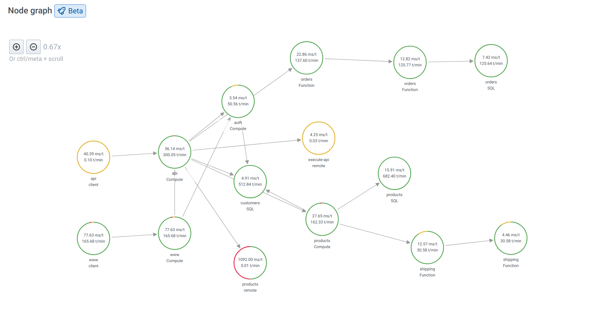
The Node graph can visualize directed graphs or networks. It uses directed force layout to effectively position the nodes so it can help with displaying complex infrastructure maps, hierarchies or execution diagrams.
Data requirements
The Node graph panel requires specific shape of the data to be able to display it’s nodes and edges. This means not every data source or query can be visualized in this panel. If you want to use this as a data source developer see the section about data API.
The Node graph visualization consists of nodes and edges.
- A node is displayed as a circle. A node might represent an application, a service, or anything else that is relevant from an application perspective.
- An edge is displayed as a line that connects two nodes. The connection might be a request, an execution, or some other relationship between the two nodes.
Both nodes and edges can have associated metadata or statistics. The data source defines what information and values is shown, so different data sources can show different type of values or not show some values.
Nodes
Note: At this moment node graph can show only 1,500 nodes. If this limit is crossed a warning will be visible in upper right corner.
Usually, nodes show two statistical values inside the node and two identifiers just below the node, usually name and type. Nodes can also show another set of values as a color circle around the node, with sections of different color represents different values that should add up to 1.
For example you can have percentage of errors represented by red portion of the circle. Additional details can be displayed in a context menu when which is displayed when you click on the node. There also can be additional links in the context menu that can target either other parts of Grafana or any external link.
Edges
Edges can also show statistics when you hover over the edge. Similar to nodes, you can open a context menu with additional details and links by clicking on the edge.
The first data source supporting this visualization is X-Ray data source for it’s Service map feature. For more information, refer to the X-Ray plugin documentation.
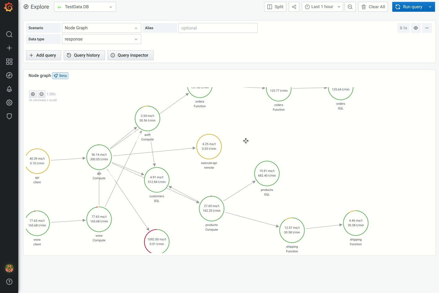
Navigating the node graph
You can pan and zoom in or out the node graph.
Pan
You can pan the view by clicking outside of any node or edge and dragging your mouse.
Zoom in or out
Use the buttons on the upper left corner or use the mouse wheel, touch pad scroll, together with either Ctrl or Cmd key to zoom in or out.
Data API
This visualization needs a specific shape of the data to be returned from the data source in order to correctly display it.
Data source needs to return two data frames, one for nodes and one for edges and you also have to set frame.meta.preferredVisualisationType = 'nodeGraph' on both data frames.
Node parameters
Required fields:
Optional fields:
Edge parameters
Required fields:
Optional fields:


