You should know about… transformations in Grafana
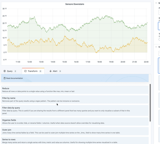
Transformations were introduced in Grafana v7.0, and I’d like to remind you that you can use them to do some really nifty things with your data. All performed right in the browser! Transformations process the result set of a query before it’s passed on for visualization. They allow you to join separate time series together, do maths across queries, and more.
My number one use case is usually doing maths across multiple data sources.
Here’s an example of two separate data sources being combined into one.
But that’s not all!
I’ve reached out to a few members of the Solutions Engineering team to share some of their favorite transformations that we feel you should know about!
From Aengus
Transforms in Grafana 7 bring the ability to manipulate data in a dashboard. Up to now, the transformations would need to be performed on the data itself; now, if you do not have access to transform the data itself, you can do it in the visualization layer. Some of my colleagues are speaking about some of the common operations with transforming data, like aggregation, computation, grouping and filtering. I like the join transformation, as you can now manipulate both time series and “static” relational data to render it more readable in a dashboard, and to prepare it for downstream calculations. Take, for example, a query on a simple time series metric, `node_cpu_seconds_total`. Even for one machine with one CPU, this query will return many dimensions, for all CPU modes (user, system, iowait, nice, etc). A tabular visualization of this data (useful, for example, prior to calculating the sum of all modes) will present the data as a list of time series, with all dimensions. To transform this data to a more usable format for calculations, use the join transformation to transform the data to display all modes on a single line, per timestamp. Now you can calculate the sum of all modes per timestamp!
View of data before join, in time series format:

View of data after join, in columnar format:

Similarly for “static” relational data, you can transpose multiple results into one line, again for readability and downstream calcs.
View of static / relational data before join:

View of static / relational data joined together in one result:

From Ronald
My favorites are actually the same as Eldin’s and Aengus’s — I use these a lot in combining and manipulating data from multiple sources to be able to derive new insights from this data.
So instead I’ll talk about one other that I use frequently: group by.
This is a method to take data with multiple different values that all apply to the same series — not necessarily a time series — and collapse them into a smaller subset of data based on one of the columns. SQL has this natively, and it’s used there frequently as it’s a great way of distilling patterns out of large sets of data.
But not all data sources understand SQL. Sometimes this would be handy to do with simpler data sources. Enter the group by transformation! Applied to data in Grafana, it can let you change a lot of individual data points…

…into a much more manageable set of calculated data:

Here we’ve taken students’ scores for a number of subjects and reduced them to an average per student. Time to send out those report cards!
From Christine
Like Ronald, I have a soft spot for the oft-used group by, for taking advantage of the SQL-like capabilities of transformations to fundamentally change your data set. But sometimes all your panels may need is a small tweak to drastically clean up how the data is visualized.
Using the organize fields transformation, you can reorder your table columns, rename fields, and even hide fields you do not want to visualize.
In the example below, I’ve added another transformation after organize fields called sort by which enables you to sort a specific field in ascending order. Yes, you can absolutely layer different transformations on top of each other. But keep in mind that transformations are applied one after the other, so the order in which you add transformations may affect your final output.

In my case, I’ve altered the below left table so severity is my first column, sorted the rows based on the severity field value, and hidden the impact field to create the below right table. This results in a much easier way for me to quickly understand which tickets are the top severity ones, don’t you think?

Pro tip
Transformations sometimes result in data that cannot be graphed. When that happens, Grafana displays a suggestion on the visualization that you can click to switch to table visualization. This often helps you better understand what the transformation is doing to your data.
I’d like to also add that you can see the input and the output result sets of the transformation. If you click the bug icon on the right side of the transformation row, Grafana displays the transformation debug view below the transformation row.

Final thoughts
To wrap up today’s post, I’d like to announce that we have some new transformations that came out in 7.4, and you should check them out! Make sure to read the full docs on transformations, too. We hope you get to apply some in your beautiful dashboards!

Ba dum tss.
The easiest way to get started with Grafana, Prometheus, Loki for logging, and Tempo for tracing is Grafana Cloud, and we’ve recently added a new free plan and upgraded our paid plans. If you’re not already using Grafana Cloud, sign up today for free and see which plan meets your use case.