Transform data
Transformations are a powerful way to manipulate data returned by a query before the system applies a visualization. Using transformations, you can:
- Rename fields
- Join time series/SQL-like data
- Perform mathematical operations across queries
- Use the output of one transformation as the input to another transformation

Grafana Learning Paths provide a clear, structured path that leads you from beginner concepts to advanced use cases. Learn about this Grafana feature on Transform data in a Grafana Cloud dashboard.
For users that rely on multiple views of the same dataset, transformations offer an efficient method of creating and maintaining numerous dashboards.
You can also use the output of one transformation as the input to another transformation, which results in a performance gain.
Sometimes the system cannot graph transformed data. When that happens, click the
Table viewtoggle above the visualization to switch to a table view of the data. This can help you understand the final result of your transformations.
Transformation types
Grafana provides a number of ways that you can transform data. For a complete list of transformations, refer to Transformation functions.
Order of transformations
When there are multiple transformations, Grafana applies them in the order they are listed. Each transformation creates a result set that then passes on to the next transformation in the processing pipeline.
The order in which Grafana applies transformations directly impacts the results. For example, if you use a Reduce transformation to condense all the results of one column into a single value, then you can only apply transformations to that single value.
Dashboard variables in transformations
All text input fields in transformations accept variable syntax:
When you use dashboard variables in transformations, the variables are automatically interpolated before the transformations are applied to the data.
For an example, refer to Use a dashboard variable in the Filter fields by name transformation.
Add a transformation function to data
The following steps guide you in adding a transformation to data. This documentation does not include steps for each type of transformation. For a complete list of transformations, refer to Transformation functions.
- Navigate to the panel where you want to add one or more transformations.
- Hover over any part of the panel to display the actions menu on the top right corner.
- Click the menu and select Edit.
- Click the Transform tab.
- Click a transformation. A transformation row appears where you configure the transformation options. For more information about how to configure a transformation, refer to Transformation functions. For information about available calculations, refer to Calculation types.
- To apply another transformation, click Add transformation.
This transformation acts on the result set returned by the previous transformation.
![Transform tab in the panel editor]()
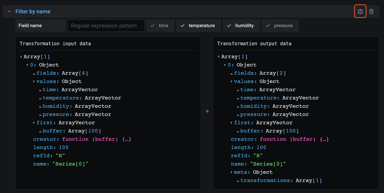
Debug a transformation
To see the input and the output result sets of the transformation, click the bug icon on the right side of the transformation row.
The input and output results sets can help you debug a transformation.
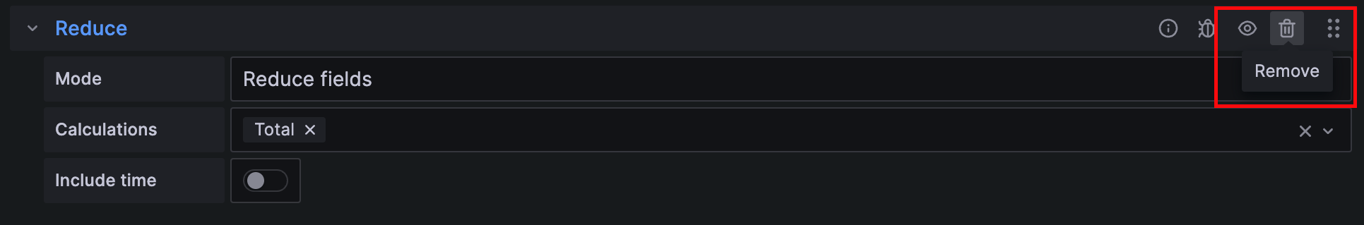
Disable a transformation
You can disable or hide one or more transformations by clicking on the eye icon on the top right side of the transformation row. This disables the applied actions of that specific transformation and can help to identify issues when you change several transformations one after another.

Filter a transformation
If your panel uses more than one query, you can filter these and apply the selected transformation to only one of the queries. To do this, click the filter icon on the top right of the transformation row. This opens a drop-down with a list of queries used on the panel. From here, you can select the query you want to transform.
You can also filter by annotations (which includes exemplars) to apply transformations to them. When you do so, the list of fields changes to reflect those in the annotation or exemplar tooltip.
The filter icon is always displayed if your panel has more than one query or source of data (that is, panel or annotation data) but it may not work if previous transformations for merging the queries’ outputs are applied. This is because one transformation takes the output of the previous one.
Delete a transformation
We recommend that you remove transformations that you don’t need. When you delete a transformation, you remove the data from the visualization.
Before you begin:
- Identify all dashboards that rely on the transformation and inform impacted dashboard users.
To delete a transformation:
- Open a panel for editing.
- Click the Transform tab.
- Click the trash icon next to the transformation you want to delete.
Transformation functions
You can perform the following transformations on your data.
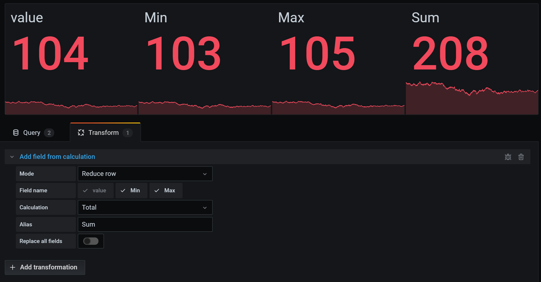
Add field from calculation
Use this transformation to add a new field calculated from two other fields. Each transformation allows you to add one new field.
- Mode - Select a mode:
- Reduce row - Apply selected calculation on each row of selected fields independently.
- Binary operation - Apply basic binary operations (for example, sum or multiply) on values in a single row from two selected fields.
- Unary operation - Apply basic unary operations on values in a single row from a selected field. The available operations are:
- Absolute value (abs) - Returns the absolute value of a given expression. It represents its distance from zero as a positive number.
- Natural exponential (exp) - Returns e raised to the power of a given expression.
- Natural logarithm (ln) - Returns the natural logarithm of a given expression.
- Floor (floor) - Returns the largest integer less than or equal to a given expression.
- Ceiling (ceil) - Returns the smallest integer greater than or equal to a given expression.
- Cumulative functions - Apply functions on the current row and all preceding rows.
- Total - Calculates the cumulative total up to and including the current row.
- Mean - Calculates the mean up to and including the current row.
- Window functions - Apply window functions. The window can either be trailing or centered.
With a trailing window the current row will be the last row in the window.
With a centered window the window will be centered on the current row.
For even window sizes, the window will be centered between the current row, and the previous row.
- Mean - Calculates the moving mean or running average.
- Stddev - Calculates the moving standard deviation.
- Variance - Calculates the moving variance.
- Row index - Insert a field with the row index.
- Field name - Select the names of fields you want to use in the calculation for the new field.
- Calculation - If you select Reduce row mode, then the Calculation field appears. Click in the field to see a list of calculation choices you can use to create the new field. For information about available calculations, refer to Calculation types.
- Operation - If you select Binary operation or Unary operation mode, then the Operation fields appear. These fields allow you to apply basic math operations on values in a single row from selected fields. You can also use numerical values for binary operations.
- All number fields - Set the left side of a Binary operation to apply the calculation to all number fields.
- As percentile - If you select Row index mode, then the As percentile switch appears. This switch allows you to transform the row index as a percentage of the total number of rows.
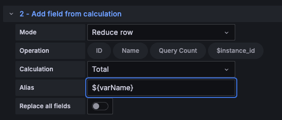
- Alias - (Optional) Enter the name of your new field. If you leave this blank, then the field will be named to match the calculation.
Note: If a variable is used in this transformation, the default alias will be interpolated with the value of the variable. If you want an alias to be unaffected by variable changes, explicitly define the alias.
- Replace all fields - (Optional) Select this option if you want to hide all other fields and display only your calculated field in the visualization.
In the example below, we added two fields together and named them Sum.
Concatenate fields
Use this transformation to combine all fields from all frames into one result.
For example, if you have separate queries retrieving temperature and uptime data (Query A) and air quality index and error information (Query B), applying the concatenate transformation yields a consolidated data frame with all relevant information in one view.
Consider the following:
Query A:
Query B:
After you concatenate the fields, the data frame would be:
This transformation simplifies the process of merging data from different sources, providing a comprehensive view for analysis and visualization.
Config from query results
Use this transformation to select a query and extract standard options, such as Min, Max, Unit, and Thresholds, and apply them to other query results. This feature enables dynamic visualization configuration based on the data returned by a specific query.
Options
- Config query - Select the query that returns the data you want to use as configuration.
- Apply to - Select the fields or series to which the configuration should be applied.
- Apply to options - Specify a field type or use a field name regex, depending on your selection in Apply to.
Field mapping table
Below the configuration options, you’ll find the field mapping table. This table lists all fields found in the data returned by the config query, along with Use as and Select options. It provides control over mapping fields to config properties, and for multiple rows, it allows you to choose which value to select.
Example
Input[0] (From query: A, name: ServerA)
Input[1] (From query: B)
Output (Same as Input[0] but now with config on the Value field)
Each row in the source data becomes a separate field. Each field now has a maximum configuration option set. Options such as Min, Max, Unit, and Thresholds are part of the field configuration. If set, they are used by the visualization instead of any options manually configured in the panel editor options pane.
Value mappings
You can also transform a query result into value mappings. With this option, every row in the configuration query result defines a single value mapping row. See the following example.
Config query result:
In the field mapping specify:
Grafana builds value mappings from your query result and applies them to the real data query results. You should see values being mapped and colored according to the config query results.
Note: When you use this transformation for thresholds, the visualization continues to use the panel’s base threshold.
Convert field type
Use this transformation to modify the field type of a specified field.
This transformation has the following options:
- Field - Select from available fields
- as - Select the FieldType to convert to
- Numeric - attempts to make the values numbers
- String - will make the values strings
- Time - attempts to parse the values as time
- The input will be parsed according to the Moment.js parsing format
- It will parse the numeric input as a Unix epoch timestamp in milliseconds. You must multiply your input by 1000 if it’s in seconds.
- Will show an option to specify a DateFormat as input by a string like yyyy-mm-dd or DD MM YYYY hh:mm:ss
- Boolean - will make the values booleans
- Enum - will make the values enums
- Will show a table to manage the enums
- Other - attempts to parse the values as JSON
For example, consider the following query that could be modified by selecting the time field as Time and specifying Date Format as YYYY.
Sample Query
The result:
Transformed Query
This transformation allows you to flexibly adapt your data types, ensuring compatibility and consistency in your visualizations.
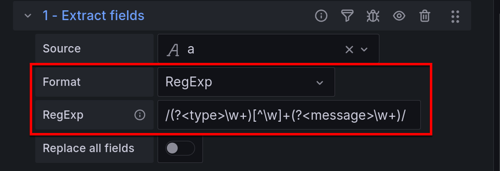
Extract fields
Use this transformation to select a source of data and extract content from it in different formats. This transformation has the following fields:
- Source - Select the field for the source of data.
- Format - Choose one of the following:
- JSON - Parse JSON content from the source.
- Key+value pairs - Parse content in the format ‘a=b’ or ‘c:d’ from the source.
- RegExp - Parse content using a regular expression with named capturing group(s) like
/(?<NewField>.*)/.![Example of a regular expression]()
- Auto - Discover fields automatically.
- Replace All Fields - (Optional) Select this option to hide all other fields and display only your calculated field in the visualization.
- Keep Time - (Optional) Available only if Replace All Fields is true. Keeps the time field in the output.
Consider the following dataset:
Dataset Example
You could prepare the data to be used by a Time series panel with this configuration:
- Source: json_data
- Format: JSON
- Field: value
- Alias: my_value
- Replace all fields: true
- Keep time: true
This will generate the following output:
Transformed Data
This transformation allows you to extract and format data in various ways. You can customize the extraction format based on your specific data needs.
Lookup fields from resource
Use this transformation to enrich a field value by looking up additional fields from an external source.
This transformation has the following fields:
- Field - Select a text field from your dataset.
- Lookup - Choose from Countries, USA States, and Airports.
This transformation currently supports spatial data.
For example, if you have this data:
Dataset Example
With this configuration:
- Field: location
- Lookup: USA States
You’ll get the following output:
Transformed Data
This transformation lets you augment your data by fetching additional information from external sources, providing a more comprehensive dataset for analysis and visualization.
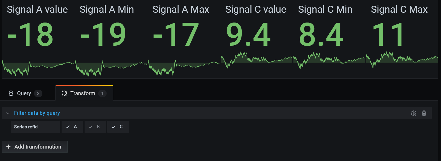
Filter data by query refId
Use this transformation to hide one or more queries in panels that have multiple queries.
Grafana displays the query identification letters in dark gray text. Click a query identifier to toggle filtering. If the query letter is white, then the results are displayed. If the query letter is dark, then the results are hidden.
Note: This transformation is not available for Graphite because this data source does not support correlating returned data with queries.
In the example below, the panel has three queries (A, B, C). We removed the B query from the visualization.
Filter data by values
Use this transformation to selectively filter data points directly within your visualization. This transformation provides options to include or exclude data based on one or more conditions applied to a selected field.
This transformation is very useful if your data source does not natively filter by values. You might also use this to narrow values to display if you are using a shared query.
The available conditions for all fields are:
- Is Null - Match if the value is null.
- Is Not Null - Match if the value is not null.
- Equal - Match if the value is equal to the specified value.
- Not Equal - Match if the value is not equal to the specified value.
- Regex - Match a regex expression.
The available conditions for string fields are:
- Contains substring - Match if the value contains the specified substring (case insensitive).
- Does not contain substring - Match if the value doesn’t contain the specified substring (case insensitive).
The available conditions for number fields are:
- Greater - Match if the value is greater than the specified value.
- Lower - Match if the value is lower than the specified value.
- Greater or equal - Match if the value is greater or equal.
- Lower or equal - Match if the value is lower or equal.
- In between - Match a range between a specified minimum and maximum, min and max included.
The available conditions for time fields are:
- In between - Match a range between a specified minimum and maximum. The min and max values will pre-populate with variables to filter by selected time.
Consider the following dataset:
Dataset Example
If you Include the data points that have a temperature below 30°C, the configuration will look as follows:
- Filter Type: ‘Include’
- Condition: Rows where ‘Temperature’ matches ‘Lower Than’ ‘30’
And you will get the following result, where only the temperatures below 30°C are included:
Transformed Data
You can add more than one condition to the filter. For example, you might want to include the data only if the altitude is greater than 100. To do so, add that condition to the following configuration:
- Filter type: ‘Include’ rows that ‘Match All’ conditions
- Condition 1: Rows where ‘Temperature’ matches ‘Lower’ than ‘30’
- Condition 2: Rows where ‘Altitude’ matches ‘Greater’ than ‘100’
When you have more than one condition, you can choose if you want the action (include/exclude) to be applied on rows that Match all conditions or Match any of the conditions you added.
In the example above, we chose Match all because we wanted to include the rows that have a temperature lower than 30°C AND an altitude higher than 100. If we wanted to include the rows that have a temperature lower than 30°C OR an altitude higher than 100 instead, then we would select Match any. This would include the first row in the original data, which has a temperature of 32°C (does not match the first condition) but an altitude of 101 (which matches the second condition), so it is included.
Conditions that are invalid or incompletely configured are ignored.
This versatile data filtering transformation lets you to selectively include or exclude data points based on specific conditions. Customize the criteria to tailor your data presentation to meet your unique analytical needs.
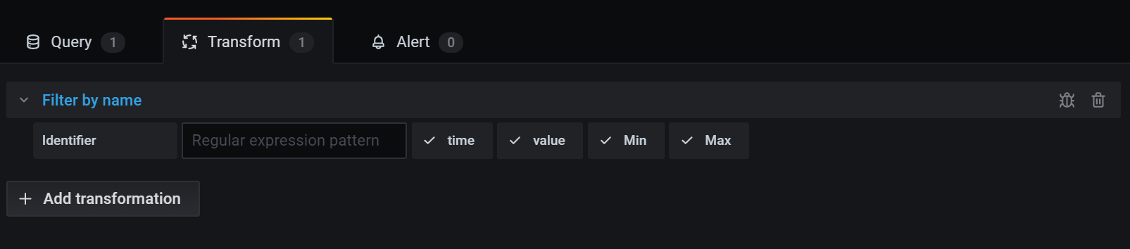
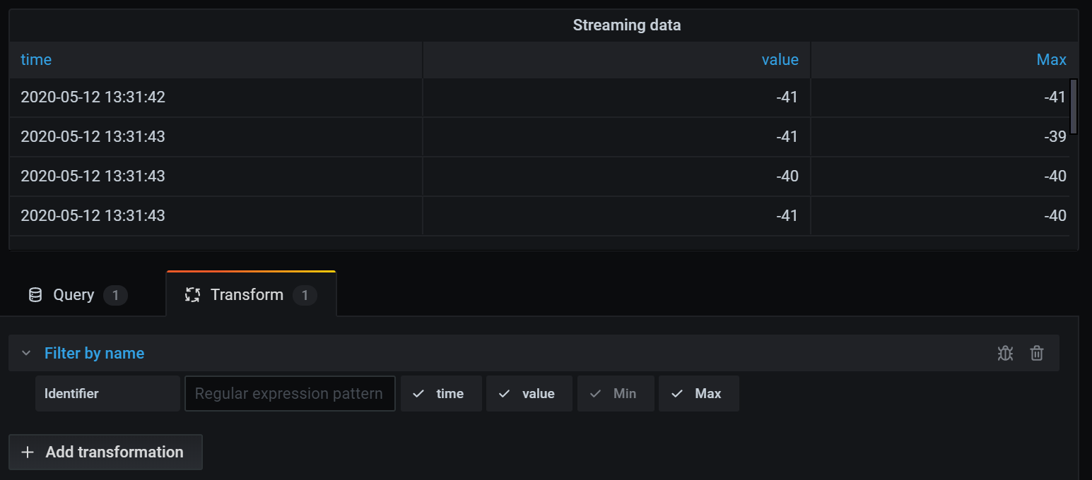
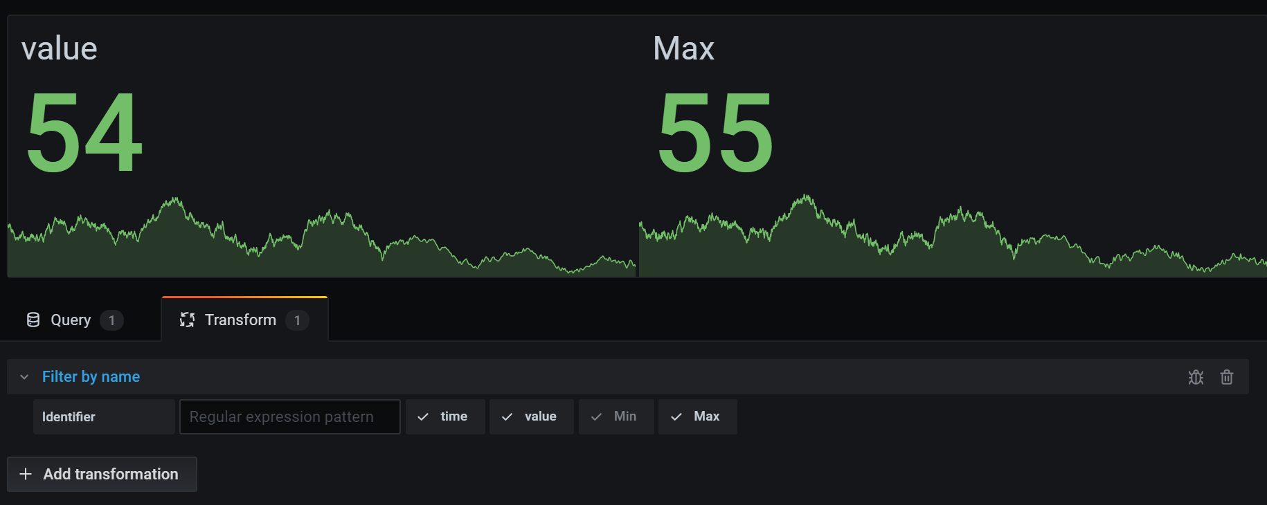
Filter fields by name
Use this transformation to selectively remove parts of your query results. There are three ways to filter field names:
Use a regular expression
When you filter using a regular expression, field names that match the regular expression are included.
For example, from the input data:
The result from using the regular expression ‘prod.*’ would be:
The regular expression can include an interpolated dashboard variable by using the ${variableName} syntax.
Manually select included fields
Click and uncheck the field names to remove them from the result. Fields that are matched by the regular expression are still included, even if they’re unchecked.
Use a dashboard variable
Enable ‘From variable’ to let you select a dashboard variable that’s used to include fields. By setting up a dashboard variable with multiple choices, the same fields can be displayed across multiple visualizations.
Here’s the table after we applied the transformation to remove the Min field.
Here is the same query using a Stat visualization.
This transformation provides flexibility in tailoring your query results to focus on the specific fields you need for effective analysis and visualization.
Format string
Use this transformation to customize the output of a string field. This transformation has the following fields:
- Upper case - Formats the entire string in uppercase characters.
- Lower case - Formats the entire string in lowercase characters.
- Sentence case - Formats the first character of the string in uppercase.
- Title case - Formats the first character of each word in the string in uppercase.
- Pascal case - Formats the first character of each word in the string in uppercase and doesn’t include spaces between words.
- Camel case - Formats the first character of each word in the string in uppercase, except the first word, and doesn’t include spaces between words.
- Snake case - Formats all characters in the string in lowercase and uses underscores instead of spaces between words.
- Kebab case - Formats all characters in the string in lowercase and uses dashes instead of spaces between words.
- Trim - Removes all leading and trailing spaces from the string.
- Substring - Returns a substring of the string, using the specified start and end positions.
This transformation provides a convenient way to standardize and tailor the presentation of string data for better visualization and analysis.
Format time
Use this transformation to customize the output of a time field. Output can be formatted using Moment.js format strings. For example, if you want to display only the year of a time field, the format string ‘YYYY’ can be used to show the calendar year (for example, 1999 or 2012).
Before Transformation:
After applying ‘YYYY-MM-DD HH:mm:ss’:
This transformation lets you tailor the time representation in your visualizations, providing flexibility and precision in displaying temporal data.
Note: This transformation is available in Grafana 10.1+ as an alpha feature.
Group by
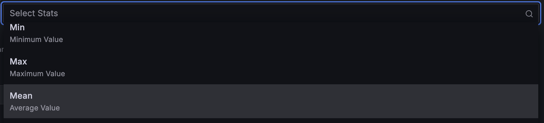
Use this transformation to group the data by a specified field (column) value and process calculations on each group. Click to see a list of calculation choices. For information about available calculations, refer to Calculation types.
Here’s an example of original data.
This transformation goes in two steps. First you specify one or multiple fields to group the data by. This will group all the same values of those fields together, as if you sorted them. For instance if we group by the Server ID field, then it would group the data this way:
All rows with the same value of Server ID are grouped together. Optionally, you can add a count of how may values fall in the selected group.
After choosing which field you want to group your data by, you can add various calculations on the other fields, and apply the calculation to each group of rows. For instance, we could want to calculate the average CPU temperature for each of those servers. So we can add the mean calculation applied on the CPU Temperature field to get the following:
If you had added the count stat to the group by transformation, there would be an extra column showing that the count of each server from above was 3.
And we can add more than one calculation. For instance:
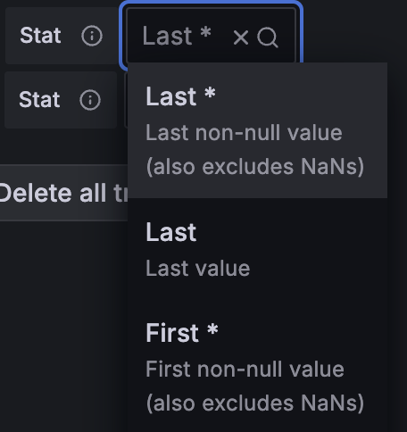
- For field Time, we can calculate the Last value, to know when the last data point was received for each server
- For field Server Status, we can calculate the Last value to know what is the last state value for each server
- For field Temperature, we can also calculate the Last value to know what is the latest monitored temperature for each server
We would then get:
This transformation allows you to extract essential information from your time series and present it conveniently.
Grouping to matrix
Use this transformation to combine three fields—which are used as input for the Column, Row, and Cell value fields from the query output—and generate a matrix. The matrix is calculated as follows:
Original data
We can generate a matrix using the values of ‘Server Status’ as column names, the ‘Server ID’ values as row names, and the ‘CPU Temperature’ as content of each cell. The content of each cell will appear for the existing column (‘Server Status’) and row combination (‘Server ID’). For the rest of the cells, you can select which value to display between: Null, True, False, or Empty.
Output
Use this transformation to construct a matrix by specifying fields from your query results. The matrix output reflects the relationships between the unique values in these fields. This helps you present complex relationships in a clear and structured matrix format.
Group to nested tables
Use this transformation to group the data by a specified field (column) value and process calculations on each group. Records are generated that share the same grouped field value, to be displayed in a nested table.
To calculate a statistic for a field, click the selection box next to it and select the Calculate option:
Once Calculate has been selected, another selection box will appear next to the respective field which will allow statistics to be selected:
For information about available calculations, refer to Calculation types.
Here’s an example of original data:
This transformation has two steps. First, specify one or more fields by which to group the data. This groups all the same values of those fields together, as if you sorted them. For instance, if you group by the Server ID field, Grafana groups the data this way:
After choosing the field by which you want to group your data, you can add various calculations on the other fields and apply the calculation to each group of rows. For instance, you might want to calculate the average CPU temperature for each of those servers. To do so, add the mean calculation applied on the CPU Temperature field to get the following result:
Create heatmap
Use this transformation to prepare histogram data for visualizing trends over time. Similar to the heatmap visualization, this transformation converts histogram metrics into temporal buckets.
X Bucket
This setting determines how the x-axis is split into buckets.
- Size - Specify a time interval in the input field. For example, a time range of ‘1h’ creates cells one hour wide on the x-axis.
- Count - For non-time-related series, use this option to define the number of elements in a bucket.
Y Bucket
This setting determines how the y-axis is split into buckets.
- Linear
- Logarithmic - Choose between log base 2 or log base 10.
- Symlog - Uses a symmetrical logarithmic scale. Choose between log base 2 or log base 10, allowing for negative values.
Assume you have the following dataset:
- With X Bucket set to ‘Size: 15m’ and Y Bucket as ‘Linear’, the histogram organizes values into time intervals of 15 minutes on the x-axis and linearly on the y-axis.
- For X Bucket as ‘Count: 2’ and Y Bucket as ‘Logarithmic (base 10)’, the histogram groups values into buckets of two on the x-axis and use a logarithmic scale on the y-axis.
Histogram
Use this transformation to generate a histogram based on input data, allowing you to visualize the distribution of values.
- Bucket size - The range between the lowest and highest items in a bucket (xMin to xMax).
- Bucket offset - The offset for non-zero-based buckets.
- Combine series - Create a unified histogram using all available series.
Original data
Series 1:
Series 2:
Output
Visualize the distribution of values using the generated histogram, providing insights into the data’s spread and density.
Join by field
Use this transformation to merge multiple results into a single table, enabling the consolidation of data from different queries.
This is especially useful for converting multiple time series results into a single wide table with a shared time field.
Inner join (for Time Series or SQL-like data)
An inner join merges data from multiple tables where all tables share the same value from the selected field. This type of join excludes data where values do not match in every result.
Use this transformation to combine the results from multiple queries (combining on a passed join field or the first time column) into one result, and drop rows where a successful join cannot occur. This is not optimized for large Time Series datasets.
In the following example, two queries return Time Series data. It is visualized as two separate tables before applying the inner join transformation.
Query A:
Query B:
The result after applying the inner join transformation looks like the following:
This works in the same way for non-Time Series tabular data as well.
Students
Enrollments
The result after applying the inner join transformation looks like the following:
The inner join only includes rows where there is a match between the “StudentID” in both tables. In this case, the result does not include “Jennifer” from the “Students” table because there are no matching enrollments for her in the “Enrollments” table.
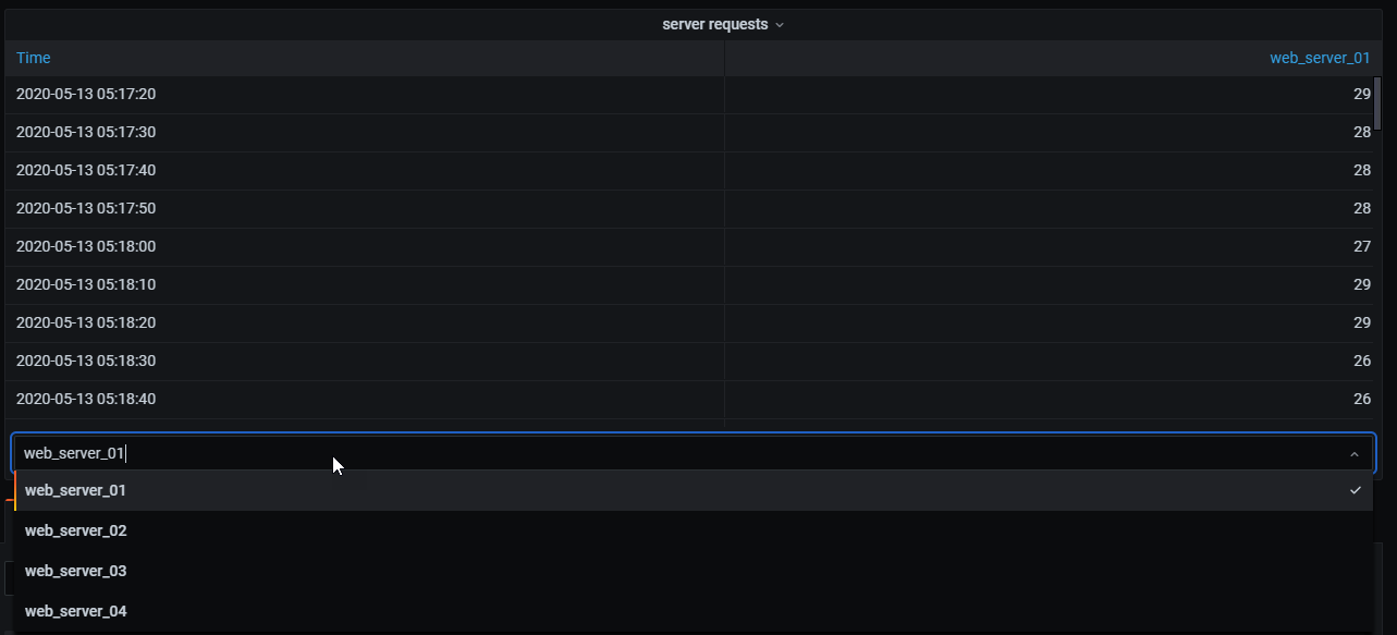
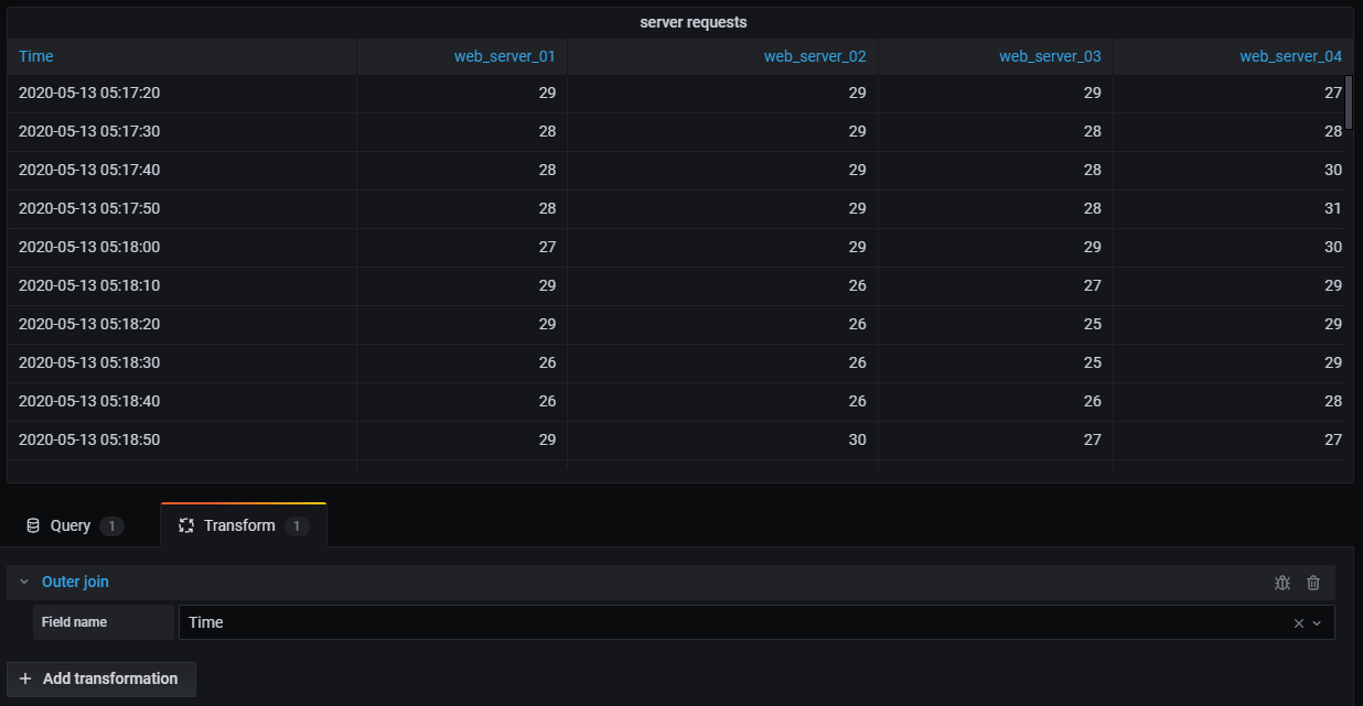
Outer join (for Time Series data)
An outer join includes all data from an inner join and rows where values do not match in every input. While the inner join joins Query A and Query B on the time field, the outer join includes all rows that don’t match on the time field.
In the following example, two queries return table data. It is visualized as two tables before applying the outer join transformation.
Query A:
Query B:
The result after applying the outer join transformation looks like the following:
In the following example, a template query displays time series data from multiple servers in a table visualization. The results of only one query can be viewed at a time.
I applied a transformation to join the query results using the time field. Now I can run calculations, combine, and organize the results in this new table.
Outer join (for SQL-like data)
A tabular outer join combining tables so that the result includes matched and unmatched rows from either or both tables.
Can now be joined with:
The result after applying the outer join transformation looks like the following:
Combine and analyze data from various queries with table joining for a comprehensive view of your information.
Join by labels
Use this transformation to join multiple results into a single table.
This is especially useful for converting multiple time series results into a single wide table with a shared Label field.
- Join - Select the label to join by between the labels available or common across all time series.
- Value - The name for the output result.
Example
Input
series1{what=“Temp”, cluster=“A”, job=“J1”}
series2{what=“Temp”, cluster=“B”, job=“J1”}
series3{what=“Speed”, cluster=“B”, job=“J1”}
Config
value: “what”
Output
Combine and organize time series data effectively with this transformation for comprehensive insights.
Labels to fields
Use this transformation to convert time series results with labels or tags into a table, including each label’s keys and values in the result. Display labels as either columns or row values for enhanced data visualization.
Given a query result of two time series:
- Series 1: labels Server=Server A, Datacenter=EU
- Series 2: labels Server=Server B, Datacenter=EU
In “Columns” mode, the result looks like this:
In “Rows” mode, the result has a table for each series and show each label value like this:
Value field name
If you selected Server as the Value field name, then you would get one field for every value of the Server label.
Merging behavior
The labels to fields transformer is internally two separate transformations. The first acts on single series and extracts labels to fields. The second is the merge transformation that joins all the results into a single table. The merge transformation tries to join on all matching fields. This merge step is required and cannot be turned off.
To illustrate this, here is an example where you have two queries that return time series with no overlapping labels.
- Series 1: labels Server=ServerA
- Series 2: labels Datacenter=EU
This will first result in these two tables:
After merge:
Convert your time series data into a structured table format for a clearer and more organized representation.
Limit
Use this transformation to restrict the number of rows displayed, providing a more focused view of your data. This is particularly useful when dealing with large datasets.
Below is an example illustrating the impact of the Limit transformation on a response from a data source:
Here is the result after adding a Limit transformation with a value of ‘3’:
Using a negative number, you can keep values from the end of the set. Here is the result after adding a Limit transformation with a value of ‘-3’:
This transformation helps you tailor the visual presentation of your data to focus on the most relevant information.
Merge series/tables
Use this transformation to combine the results from multiple queries into a single result, which is particularly useful when using the table panel visualization. This transformation merges values into the same row if the shared fields contain the same data.
Here’s an example illustrating the impact of the Merge series/tables transformation on two queries returning table data:
Query A:
Query B:
Here is the result after applying the Merge transformation.
This transformation combines values from Query A and Query B into a unified table, enhancing the presentation of data for better insights.
Organize fields by name
Use this transformation to provide the flexibility to rename, reorder, or hide fields returned by a single query in your panel. This transformation is applicable only to panels with a single query. If your panel has multiple queries, consider using an “Outer join” transformation or removing extra queries.
Transforming fields
Grafana displays a list of fields returned by the query, allowing you to perform the following actions:
- Set field order mode - If the mode is Manual, you can change the field order by hovering the cursor over a field and dragging the field to its new position. If it’s Auto, use the OFF, ASC, and DESC options to order by any labels on the field or by the field name. For any field that is sorted ASC or DESC, you can drag the option to set the priority of the sorting.
- Change field order - Hover over a field, and when your cursor turns into a hand, drag the field to its new position.
- Hide or show a field - Use the eye icon next to the field name to toggle the visibility of a specific field.
- Rename fields - Type a new name in the “Rename
” box to customize field names.
Example:
Original Query Result
After Applying Field Overrides
This transformation lets you to tailor the display of query results, ensuring a clear and insightful representation of your data in Grafana.
Partition by values
Use this transformation to streamline the process of graphing multiple series without the need for multiple queries with different ‘WHERE’ clauses.
This is particularly useful when dealing with a metrics SQL table, as illustrated below:
With the Partition by values transformation, you can issue a single query and split the results by unique values in one or more columns (fields) of your choosing. The following example uses ‘Region’:
‘SELECT Time, Region, Value FROM metrics WHERE Time > “2022-10-20”’
This transformation simplifies the process and enhances the flexibility of visualizing multiple series within the same time series visualization.
Prepare time series
Use this transformation to address issues when a data source returns time series data in a format that isn’t compatible with the desired visualization. This transformation allows you to convert time series data between wide and long formats, providing flexibility in data frame structures.
Available options
Wide time series
Select this option to transform the time series data frame from the long format to the wide format. If your data source returns time series data in a long format and your visualization requires a wide format, this transformation simplifies the process.
A wide time series combines data into a single frame with one shared, ascending time field. Time fields do not repeat and multiple values extend in separate columns.
Example: Converting from long to wide format
Transformed to:
Multi-frame time series
Multi-frame time series break data into multiple frames that all contain two fields: a time field and a numeric value field. Time is always ascending. String values are represented as field labels.
Long time series
A long time series combines data into one frame, with the first field being an ascending time field. The time field might have duplicates. String values are in separate fields, and there might be more than one.
Example: Converting to long format
Transformed to:
Reduce
Use this transformation to apply a calculation to each field in the data frame and return a single value. This transformation is particularly useful for consolidating multiple time series data into a more compact, summarized format. Time fields are removed when applying this transformation.
Consider the input:
Query A:
Query B:
The reduce transformer has two modes:
- Series to rows - Creates a row for each field and a column for each calculation.
- Reduce fields - Keeps the existing frame structure, but collapses each field into a single value.
For example, if you used the First and Last calculation with a Series to rows transformation, then the result would be:
The Reduce fields with the Last calculation, results in two frames, each with one row:
Query A:
Query B:
This flexible transformation simplifies the process of consolidating and summarizing data from multiple time series into a more manageable and organized format.
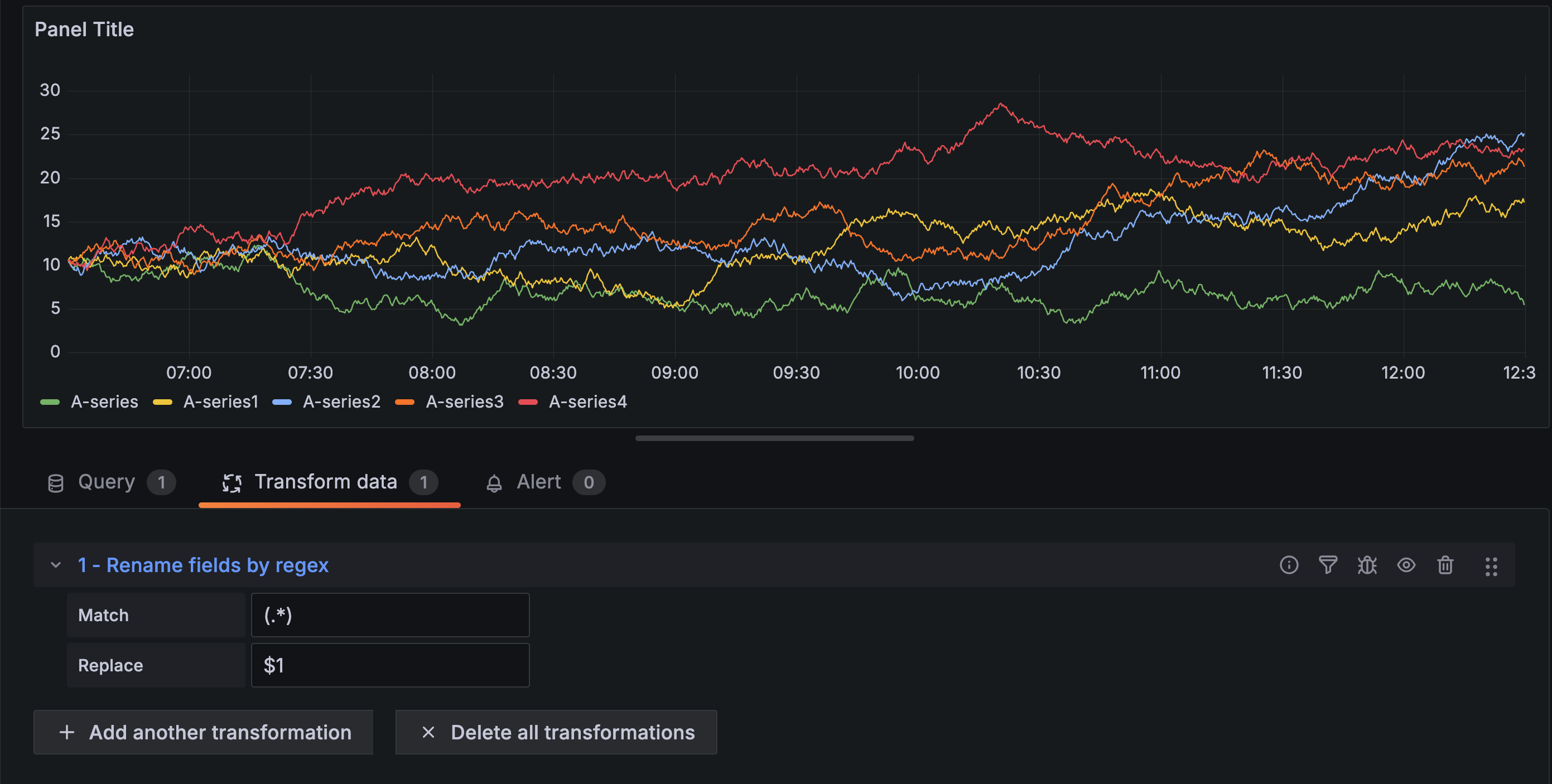
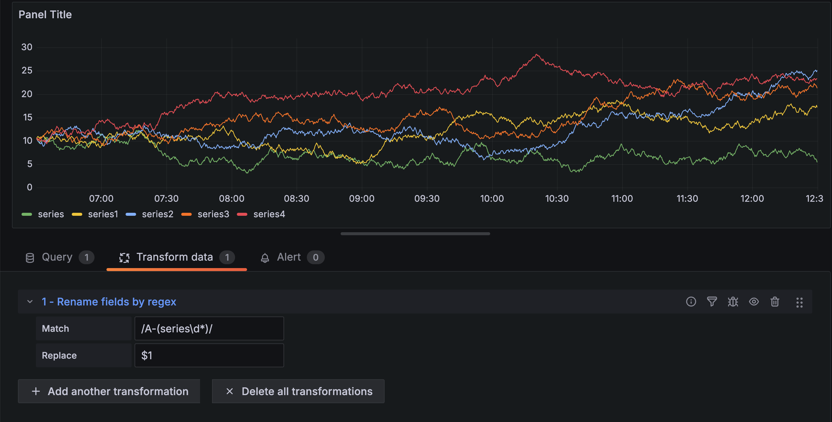
Rename by regex
Use this transformation to rename parts of the query results using a regular expression and replacement pattern.
You can specify a regular expression, which is only applied to matches, along with a replacement pattern that support back references. For example, let’s imagine you’re visualizing CPU usage per host and you want to remove the domain name. You could set the regex to ‘/^([^.]+).*/’ and the replacement pattern to ‘$1’, ‘web-01.example.com’ would become ‘web-01’.
Note: The Rename by regex transformation was improved in Grafana v9.0.0 to allow global patterns of the form ‘/
/g’. Depending on the regex match used, this may cause some transformations to behave slightly differently. You can guarantee the same behavior as before by wrapping the match string in forward slashes ‘(/)’, e.g. ‘(.)’ would become ‘/(.)/’.
In the following example, we are stripping the ‘A-’ prefix from field names. In the before image, you can see everything is prefixed with ‘A-’:
With the transformation applied, you can see we are left with just the remainder of the string.
This transformation lets you to tailor your data to meet your visualization needs, making your dashboards more informative and user-friendly.
Rows to fields
Use this transformation to convert rows into separate fields. This can be useful because fields can be styled and configured individually. It can also use additional fields as sources for dynamic field configuration or map them to field labels. The additional labels can then be used to define better display names for the resulting fields.
This transformation includes a field table which lists all fields in the data returned by the configuration query. This table gives you control over what field should be mapped to each configuration property (the Use as option). You can also choose which value to select if there are multiple rows in the returned data.
This transformation requires:
One field to use as the source of field names.
By default, the transform uses the first string field as the source. You can override this default setting by selecting Field name in the Use as column for the field you want to use instead.
One field to use as the source of values.
By default, the transform uses the first number field as the source. But you can override this default setting by selecting Field value in the Use as column for the field you want to use instead.
Useful when visualizing data in:
- Gauge
- Stat
- Pie chart
Map extra fields to labels
If a field does not map to config property Grafana will automatically use it as source for a label on the output field-
Example:
Output:
The extra labels can now be used in the field display name provide more complete field names.
If you want to extract config from one query and apply it to another you should use the config from query results transformation.
Example
Input:
Output:
As you can see each row in the source data becomes a separate field. Each field now also has a max config option set. Options like Min, Max, Unit and Thresholds are all part of field configuration and if set like this will be used by the visualization instead of any options manually configured in the panel editor options pane.
This transformation enables the conversion of rows into individual fields, facilitates dynamic field configuration, and maps additional fields to labels.
Series to rows
Use this transformation to combine the result from multiple time series data queries into one single result. This is helpful when using the table panel visualization.
The result from this transformation will contain three columns: Time, Metric, and Value. The Metric column is added so you easily can see from which query the metric originates from. Customize this value by defining Label on the source query.
In the example below, we have two queries returning time series data. It is visualized as two separate tables before applying the transformation.
Query A:
Query B:
Here is the result after applying the Series to rows transformation.
This transformation facilitates the consolidation of results from multiple time series queries, providing a streamlined and unified dataset for efficient analysis and visualization in a tabular format.
Sort by
Use this transformation to sort each frame within a query result based on a specified field, making your data easier to understand and analyze. By configuring the desired field for sorting, you can control the order in which the data is presented in the table or visualization.
Use the Reverse switch to inversely order the values within the specified field. This functionality is particularly useful when you want to quickly toggle between ascending and descending order to suit your analytical needs.
For example, in a scenario where time-series data is retrieved from a data source, the Sort by transformation can be applied to arrange the data frames based on the timestamp, either in ascending or descending order, depending on the analytical requirements. This capability ensures that you can easily navigate and interpret time-series data, gaining valuable insights from the organized and visually coherent presentation.
Spatial
Use this transformation to apply spatial operations to query results.
- Action - Select an action:
- Prepare spatial field - Set a geometry field based on the results of other fields.
- Location mode - Select a location mode (these options are shared by the Calculate value and Transform modes):
- Auto - Automatically identify location data based on default field names.
- Coords - Specify latitude and longitude fields.
- Geohash - Specify a geohash field.
- Lookup - Specify Gazetteer location fields.
- Location mode - Select a location mode (these options are shared by the Calculate value and Transform modes):
- Calculate value - Use the geometry to define a new field (heading/distance/area).
- Function - Choose a mathematical operation to apply to the geometry:
- Heading - Calculate the heading (direction) between two points.
- Area - Calculate the area enclosed by a polygon defined by the geometry.
- Distance - Calculate the distance between two points.
- Function - Choose a mathematical operation to apply to the geometry:
- Transform - Apply spatial operations to the geometry.
- Operation - Choose an operation to apply to the geometry:
- As line - Create a single line feature with a vertex at each row.
- Line builder - Create a line between two points.
- Operation - Choose an operation to apply to the geometry:
- Prepare spatial field - Set a geometry field based on the results of other fields.
This transformation allows you to manipulate and analyze geospatial data, enabling operations such as creating lines between points, calculating spatial properties, and more.
Time series to table transform
Use this transformation to convert time series results into a table, transforming a time series data frame into a Trend field which can then be used with the sparkline cell type. If there are multiple time series queries, each will result in a separate table data frame. These can be joined using join or merge transforms to produce a single table with multiple sparklines per row.
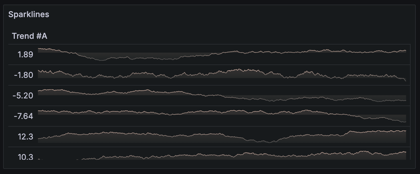
For each generated Trend field value, a calculation function can be selected. This value is displayed next to the sparkline and will be used for sorting table rows.
Note: This transformation is available in Grafana 9.5+ as an opt-in beta feature. Modify the Grafana configuration file to use it.
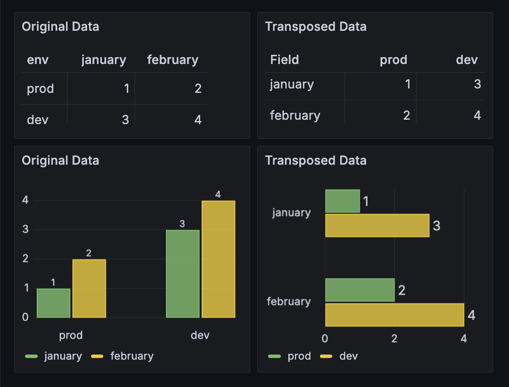
Transpose
Use this transformation to pivot the data frame, converting rows into columns and columns into rows. This transformation is particularly useful when you want to switch the orientation of your data to better suit your visualization needs. If you have multiple types, it will default to string type. You can select how empty cells should be represented.
Before Transformation:
After applying transpose transformation:
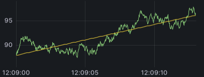
Trendline
Use this transformation to create a new data frame containing values predicted by a statistical model. This is useful for finding a trend in chaotic data. It works by fitting a mathematical function to the data, using either linear or polynomial regression. The data frame can then be used in a visualization to display a trendline.
There are two different models:
- Linear - Fits a linear function to the data.
![A time series visualization with a straight line representing the linear function]()
- Polynomial - Fits a polynomial function to the data.
![A time series visualization with a curved line representing the polynomial function]()
Note: This transformation was previously called regression analysis.
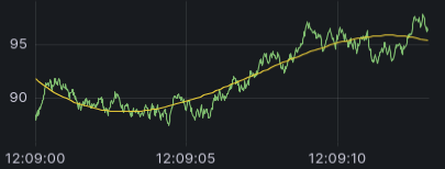
Smoothing
Use this transformation to reduce noise in time series data through adaptive smoothing. This transformation creates smoother, cleaner visualizations while preserving all original time points and important trends and patterns in your data.
The smoothing transformation uses the ASAP (Automatic Smoothing for Attention Prioritization) algorithm internally to generate a smoothed curve, which is then interpolated back onto all original time points. This ensures your visualization maintains continuous lines without gaps while reducing noise.
Available options
- Resolution - Controls smoothing intensity (1-1000). Lower values create more aggressive smoothing, while higher values preserve more detail. The output preserves all original time points.
When to use smoothing
This transformation is useful for:
- Noisy time series data that obscures underlying trends
- Clearer trend analysis and pattern recognition
Example
Consider noisy sensor data with thousands of points:
Before smoothing:
After smoothing (Resolution: 100):
The transformation preserves all original time points while reducing noise, resulting in smoother curves that maintain continuous lines without gaps.


