
New Form Styles Coming to Grafana
We’re always looking for ways to improve the Grafana UX; recently, we’ve been working on redesigning form styles. The three key areas of improvement are accessibility, scannability, and appeal. They’re very much intertwined, and things like inconsistency affect all of them.
Here’s a look at our design process so far.
Label Alignment
One of the first things that stood out to me in Grafana were the label backgrounds in the forms. They always felt heavy and stuck out more than the inputs. That’s largely because we currently use left-aligned labels, and the backgrounds are connecting the labels to the inputs. The problem with left-aligned labels is the distance between label and input.
One solution to this could be to right-align the label. We wouldn’t need the label background, and the labels would be close to the input. But this has a tendency to look a bit messy.
The way to go is to make the form top-aligned. It looks cleaner and also has the advantage that it lets the user see the label and input at the same time.
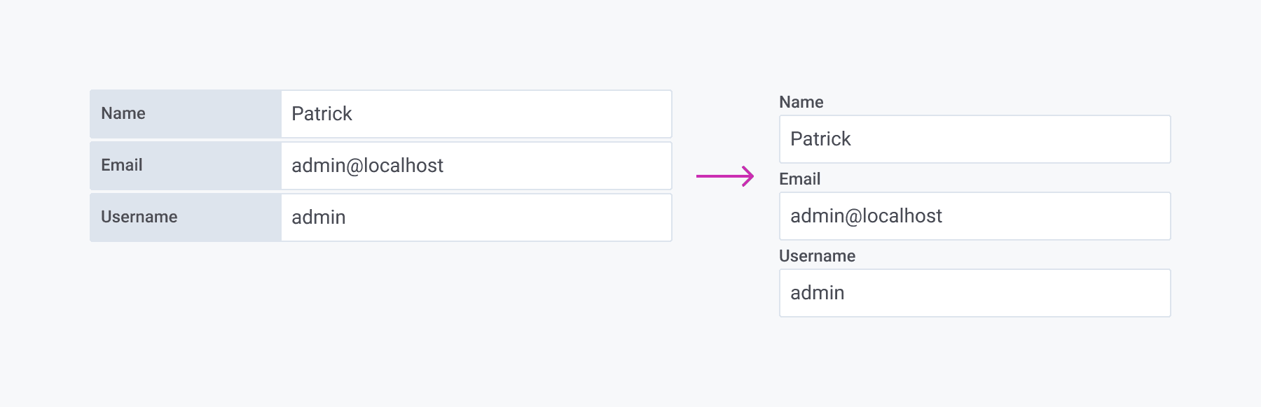
Having the labels top-aligned forced us to look into spacing. First we increased the space between the form elements. We changed the line height of the label and added a small margin under it and a really small indent to it. We also changed input height to match the buttons. This change increased the scannability, and made the form much more appealing.

However, top alignment doesn’t really work with checkboxes. Most commonly, the label is put to the right of the checkbox.
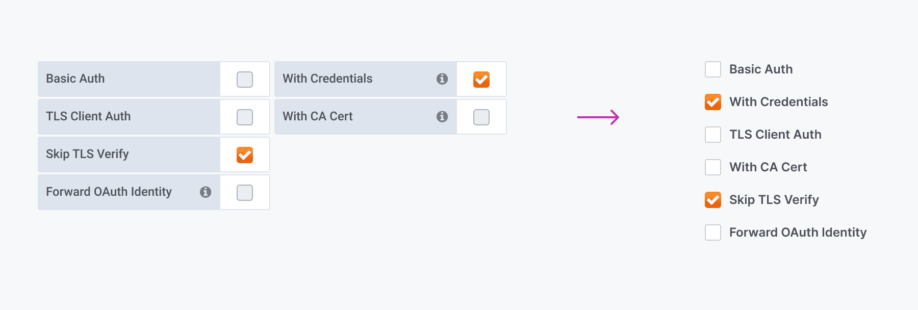
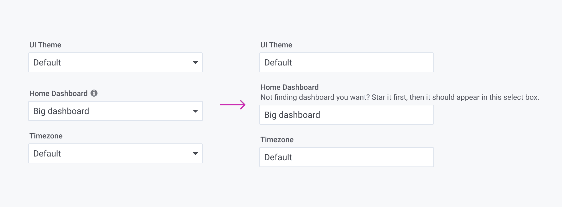
Descriptions
In the current design, a lot of important and helpful information is hidden in tooltips or half-hidden as placeholders. For accessibility reasons, this is not optimal. Users who only use keyboards will not be able to see explanations, and users with impaired vision will have a hard time reading the placeholders.
To solve this, we decided to use written-out descriptions.
Going Blue
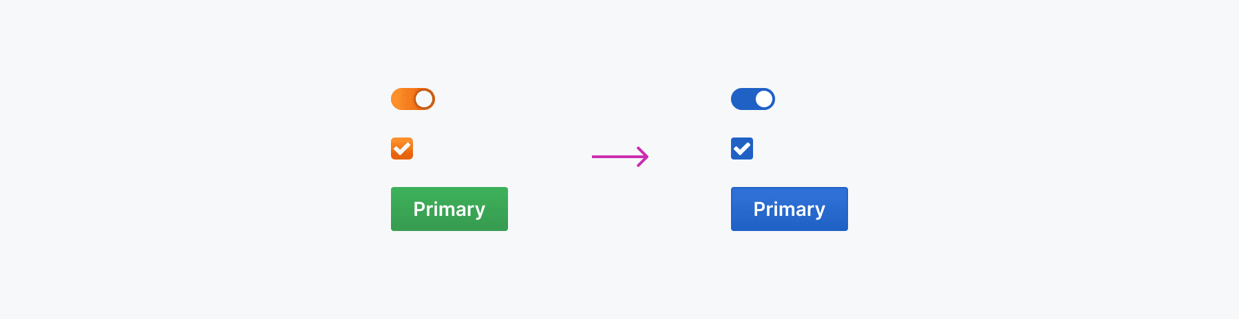
Choosing color for our forms has always been a challenge. For CTAs we have green for primary, blue for secondary, and red for destructive actions like Delete.
In the past, we’ve considered having an orange button. But coming up with a nice, vibrant orange that is accessible and also works with the brand gradient was not going to happen. Our current green CTA buttons also have the problem of not being accessible when it comes to contrast. Trying to find an accessible green for the CTA returned dull results. So we decided that blue is going to become the new primary color. The problem with a blue CTA was that it didn’t pop next to the gradients used in other form components such as the toggle switch and check box. The solution? Make everything blue. This gave it a much clearer look.
Radio Button Group
Right now we have three different radio button groups/segmented controls that we want to merge into one. This was the most challenging component to design. We had decided on using blue. We wanted both states to be easy to read, yet have the active state clearly stand out for everyone, including people who have color blindness. This is what we came up with:
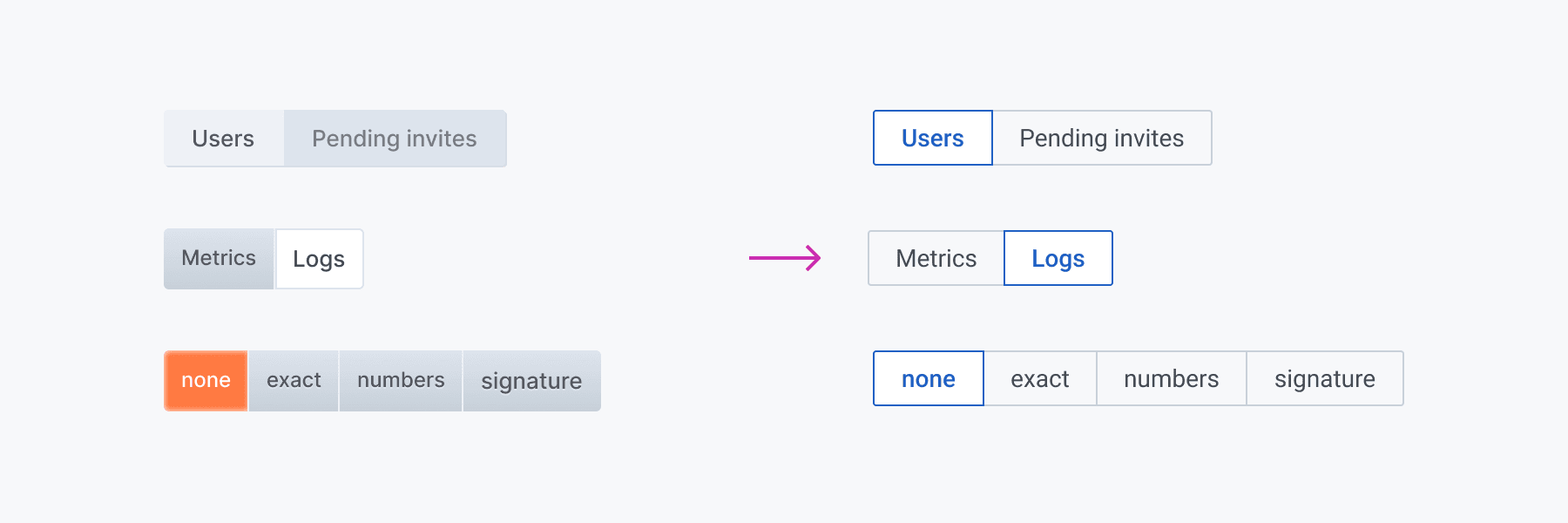
This component has other uses, too. Currently, we use dropdowns when there are only two or three options, and we want to replace them with the new radio component. That way, the options are not hidden, and the user can make a choice faster.

Proper Focus
When it comes to accessibility, Grafana has a long road ahead. One big step in the right direction is making the forms accessible.
The most obvious problem with the current form styles occurs when you use your keyboard instead of a mouse. Checkboxes and toggle switches have no focused state. Radio button groups with focused state are very subtle and do not behave like radio group.
So here is the new focused state. It is also going to be used for toolbar buttons and navigation tabs. This will be a huge improvement for those mostly using keyboard.

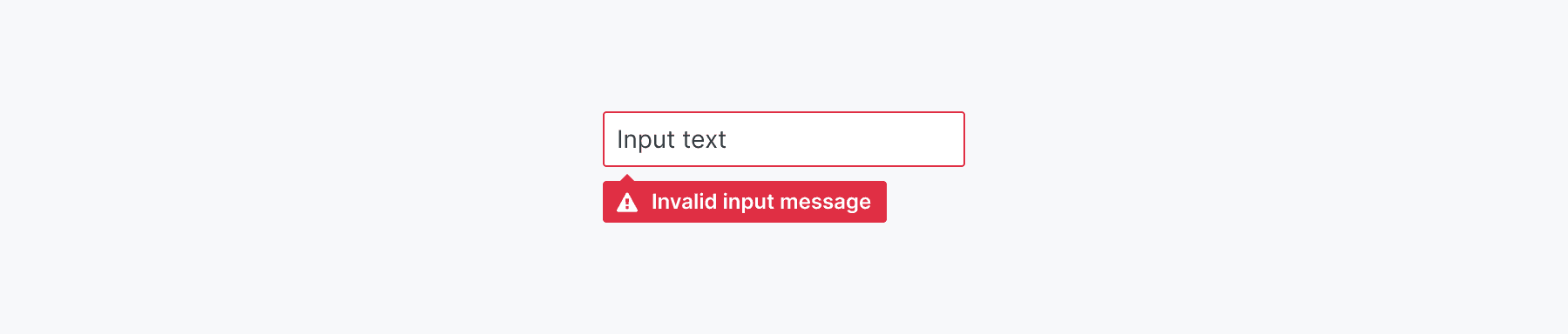
Helpful Errors
Our current forms have a invalid state, but it is not very helpful if it doesn’t let you know what is wrong. So with the new form style, every time the user enters an invalid input, there will be a message describing the problem and what the user can do about it.
What Do You Think?
We haven’t yet implemented the design, so feedback is welcome on the GitHub issue.

