Create a dashboard and add a visualization
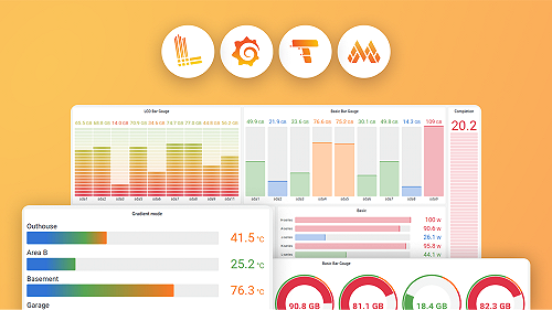
A Grafana dashboard is a set of one or more panels, organized and arranged into one or more rows, that provide an at-a-glance view of related information. These panels are created using components that query and transform raw data from a data source into visualizations.
A data source can be an SQL database, Grafana Loki, Grafana Mimir, or an API endpoint. It can even be a basic CSV file. Data source plugins take a query you want answered, retrieve the data from the data source, and reconcile the differences between the data model of the data source and the data model of Grafana dashboards.
To create a dashboard and add a visualization, complete the following steps:
Sign in to your Grafana Cloud environment (for example,
mystack.grafana.net).Click Dashboards in the main menu.
Click New and select New Dashboard.
In the Add drawer, click the Panel card to add a new visualization to your dashboard.
A new panel is added to your dashboard.
On the new panel, click Configure.
The Edit panel view opens with the default Prometheus data source preselected.
If you want to use a different data source, in the Queries tab, click the Data source drop-down list and select one of your existing data sources.
Did you know? For a Prometheus data source, the default visualization is a time-series graph. You can select another type of visualization from the visualization list in the panel editor. To see the full list of visualizations, click the All visualizations tab.
In your next milestone, you’ll use the Query Builder to write a PromQL query that generates a visualization.