About dashboards and visualizations
Observability is a cornerstone of site reliability engineering (SRE). It enables engineers to gain deep insights into the health, performance, and behavior of complex systems. By collecting and analyzing telemetry data such as logs, metrics, and traces, observability helps identify and resolve issues before they impact users.
Dashboards and visualizations are critical tools in this process. They provide a clear, real-time view of system performance, making it easier to detect anomalies, track trends, and correlate events. For example:
- State timeline visualizations help engineers monitor and analyze changes in states or statuses of various entities over time.

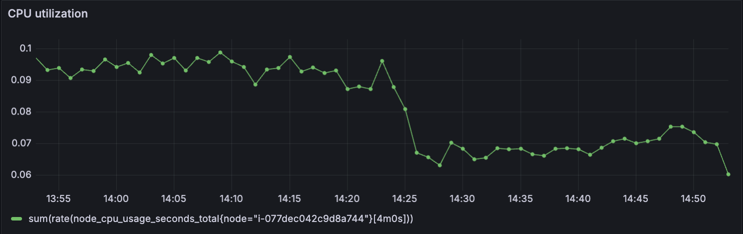
- Time-series visualizations can reveal latency spikes, enabling engineers to address performance degradation proactively.
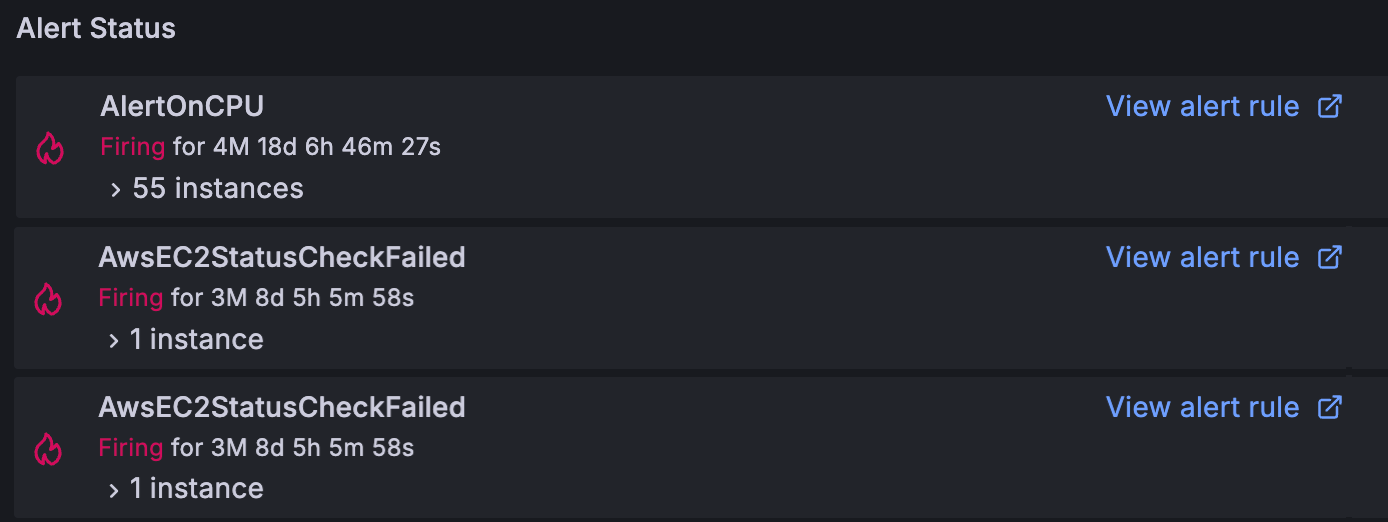
- Alert list visualizations can quickly display a list of important alerts, such as high CPU usage or failed status checks.
Dashboards and visualizations transform raw data into actionable insights, empowering SREs to maintain high availability, optimize resource allocation, and deliver a seamless user experience—all while saving the business money by minimizing disruptions and operational inefficiencies. By leveraging these visualizations, businesses can prevent costly downtime and maintain customer trust.