How to surface trends and make sense of your data with Grafana
There is a Polish proverb: “Co za dużo to niezdrowo,” which more or less translates to “Enough is as good as a feast.” (Or, translated verbatim: “Too much of something can be unhealthy.”) Sometimes this is true for data as well.
At Grafana Labs, we’re always introducing products and features that help you make sense of that abundance of data, either by efficient visualizations, adaptive observability, or apps dedicated to specific workflows and use cases. And recently we’ve gone further by adding features that make it easier to surface trends behind your data, so let’s dive into a few things you might have missed on the topic:
- Visualize sparklines in table visualization using cell overrides and formatting.
- Plot regression lines in your time series visualizations using regression analysis transformation.
- Show the percent change of your data in stat visualizations.
- Visualize continuous data that isn’t time-based with trend visualization.
Table panel and sparklines in cells
The table panel is great for displaying a lot of data, diving into details, and sorting and filtering through raw information across thousands of rows. It can also be great for presenting overviews and guiding your attention to important things. For example, you can display a summary of your RED (rate, error, duration) metrics for services you monitor. For this use case a few table capabilities are invaluable.
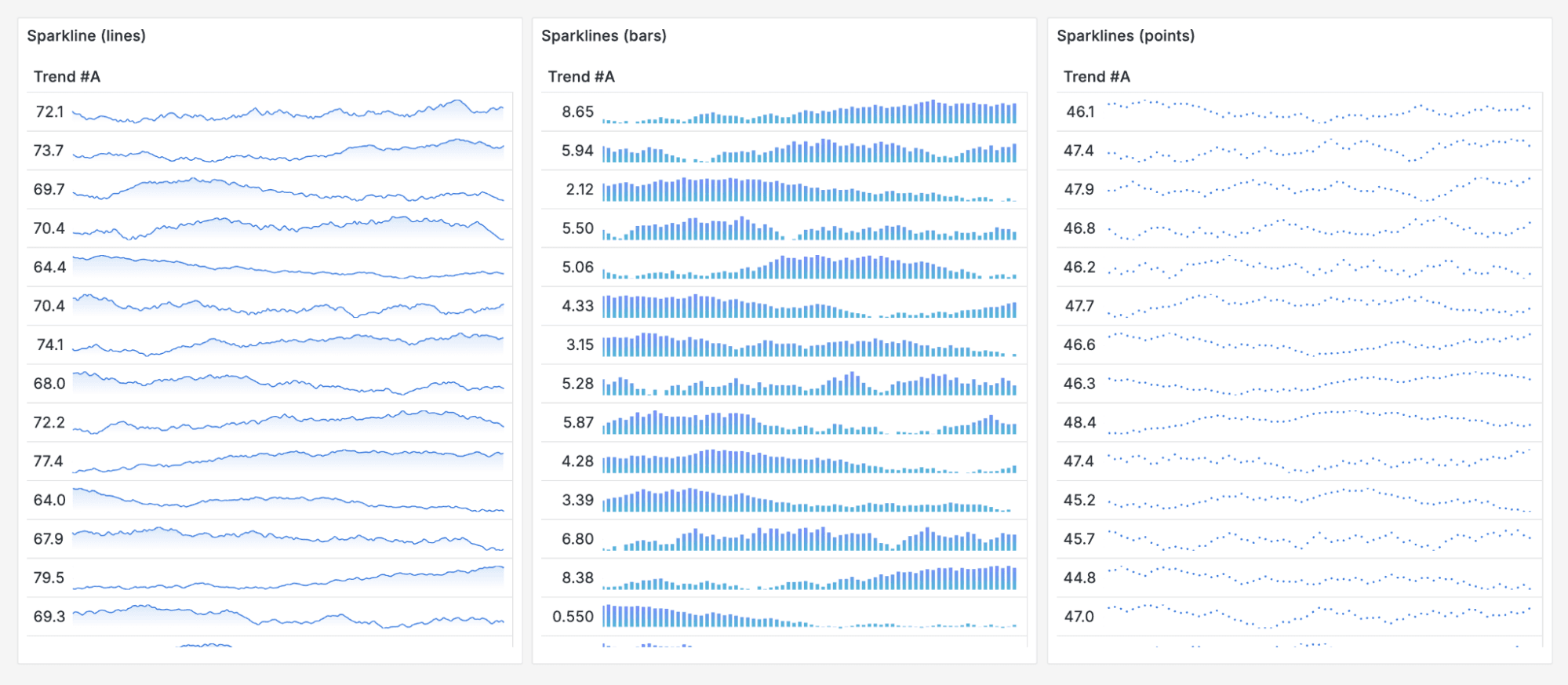
First, you can use the time series-to-table transformation to display a time series field in a sparkline — a tiny time series visualization you can also configure as lines, bars, or points. This is a great way to surface sudden spikes or ongoing trends for your metrics without diving into a specific dashboard. Combine that with a drill down, and you can track the overall health of your infrastructure’s components in one table.

In addition, you can use other cell types to visually compare various information by using gauge cell type. You can also combine cell type overrides with value mappings to change continuous data into categorical indicators (like up/down or words and icons describing the scale of a metric value).
Regression analysis transformation
It can sometimes be hard to interpret general trends with variable time series data. After all, as humans, we tend to focus on the highest spikes or latest results, not to mention false positives, and sometimes we see patterns where there aren’t any.

If you want to understand your time series data over time through the lens of long-term trends, seasonality, and cyclicality, or if you want to compare trends for various series by “smoothing out the extremes,” the regression analysis transformation is a transformation that can help you.

You can choose between linear regression or polynomial models, with the latter offering quadratic, cubic, quartic, and quintic degree options. In addition, you can experiment with fill below to graph style options to mark time frames where metrics go way above the trend.

Stat panel and percent change indicator
Stat panels come in handy when you need to present key metrics or KPIs. But knowing the big number is not always enough — understanding the recent change can be as valuable or even more important. In situations like this, the percentage change indicator option in stat panels comes in handy. With a single switch you can add information about how your metric changed and what is the trend (up/down).

The percentage change indicator option, combined with the existing sparkline feature and the possibility to show and hide values and labels independently, increases the display options for your most important metrics.
Trend panel
The trend panel is very similar to the time series visualization but with an x-axis for any continuous range of values, such as time, temperature, or revenue. Think about the last time you were pulled into an investigation. Your heart rate must have gone up upon receiving an alert. To understand how your heart rate has changed since receiving an alert, we can use a trend visualization, and plot beats per minute along the x-axis of minutes since receiving the alert. (In this case, fortunately, it was a false alarm, so an elevated heart rate quickly stabilized).

You can even use it for non-observability use cases. For example, let’s say you’re really into muscle cars. The next time you wonder about engine power and torque versus speed, where speed is plotted on the x-axis and power and torque are plotted on the y-axis, just use the Trend panel.
Beyond existing telemetry
The features we’ve discussed in this blog post were all released in Grafana 10.0 or later. We’re already seeing teams put these capabilities to use, and we’re excited to see what the rest of the community does with them as more organizations adopt the latest versions of Grafana.
And while these features are great for uncovering trends based on existing data, you can go even further with Grafana Cloud. With our suite of Grafana Incident & Response Management solutions, you can create metric forecasts to help you assess future trends too. So regardless of whether you’re looking back or forward, Grafana Cloud has you covered!
Grafana Cloud is the easiest way to get started with metrics, logs, traces, dashboards, and more. We have a generous forever-free tier and plans for every use case. Sign up for free now!

