
SPC Pareto


The SPC Pareto panel helps you identify the most significant factors contributing to defects, downtime, or any categorical issue — so you can focus improvement efforts where they matter most.
Why SPC Pareto?
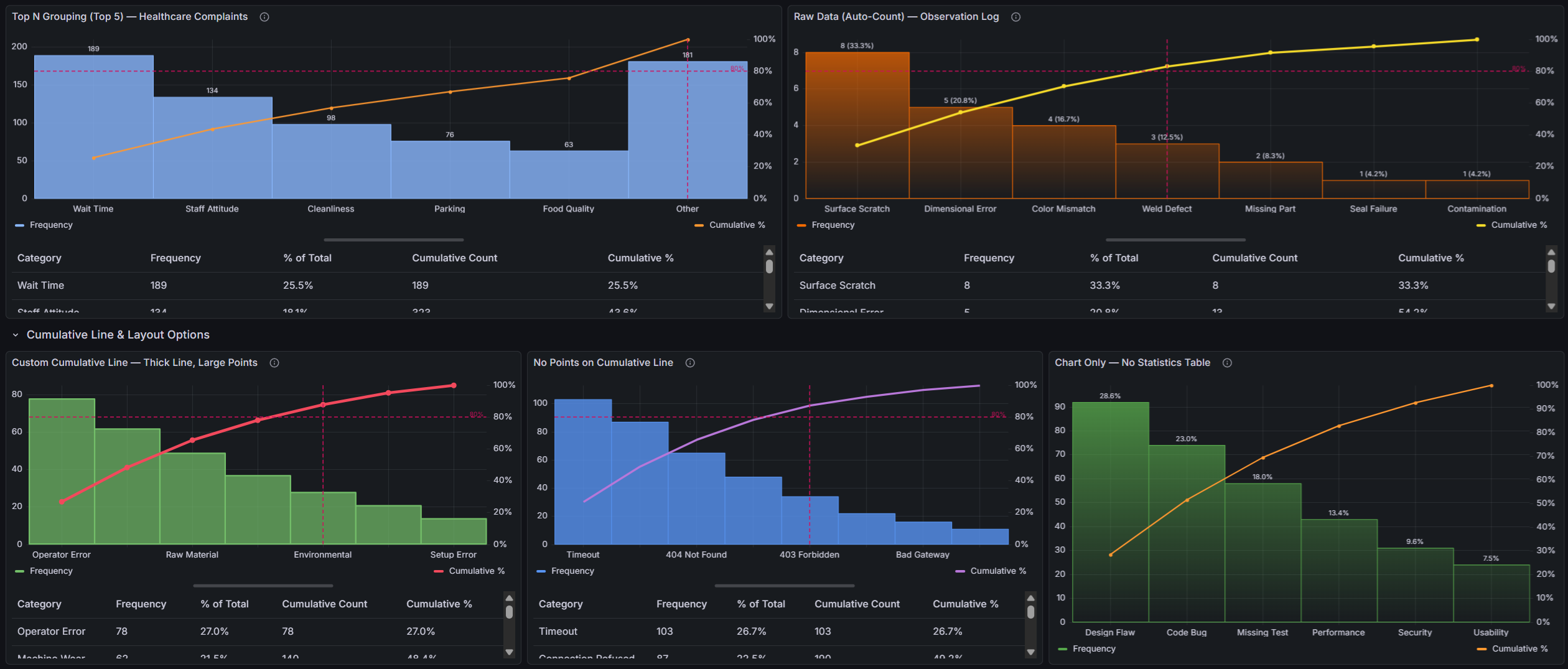
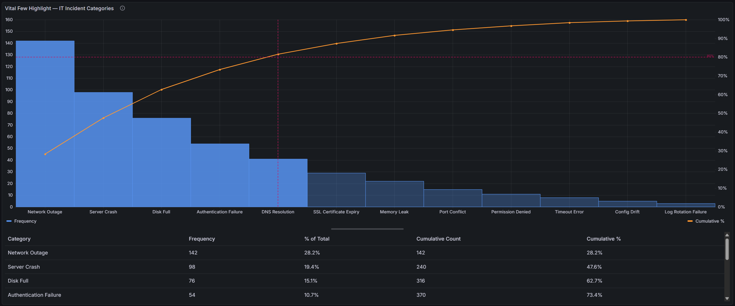
The Pareto principle (80/20 rule) states that roughly 80% of effects come from 20% of causes. This plugin makes that insight instantly visible:
- Bars sorted by impact — categories are automatically ranked from highest to lowest frequency, making the biggest contributors immediately obvious
- Cumulative percentage line — a running total overlay shows how quickly contributions accumulate toward 100%
- 80/20 threshold line — a configurable threshold line highlights where the "vital few" end and the "trivial many" begin
Built for Grafana
SPC Pareto is built using Grafana's native visualization components. This means it inherits the look, feel, and behavior you already know:
- Native theming — automatically adapts to light and dark mode
- Standard panel options — legend placement, tooltip behavior, and field overrides work just like any other Grafana panel
- Resizable statistics table — drag the splitter to balance chart and table space, just like Grafana's built-in panels
- Works with any data source — use it with SQL databases, Prometheus, InfluxDB, CSV files, or any other Grafana data source
Features
| Feature | Description |
|---|---|
| Raw data support | Accepts ungrouped observations and counts occurrences automatically |
| Automatic sorting | Categories are ranked by frequency — no manual ordering needed |
| Dual y-axes | Left axis shows frequency counts, right axis shows cumulative percentage (0–100%) |
| Threshold line | Configurable threshold (default 80%) with horizontal and vertical reference lines |
| Vital few highlight | Bars beyond the threshold crossing point are visually muted, making the vital few stand out |
| Cumulative line | Customizable color, width, and point markers |
| Top N / Other grouping | Collapse low-frequency categories into an "Other" bucket to reduce noise |
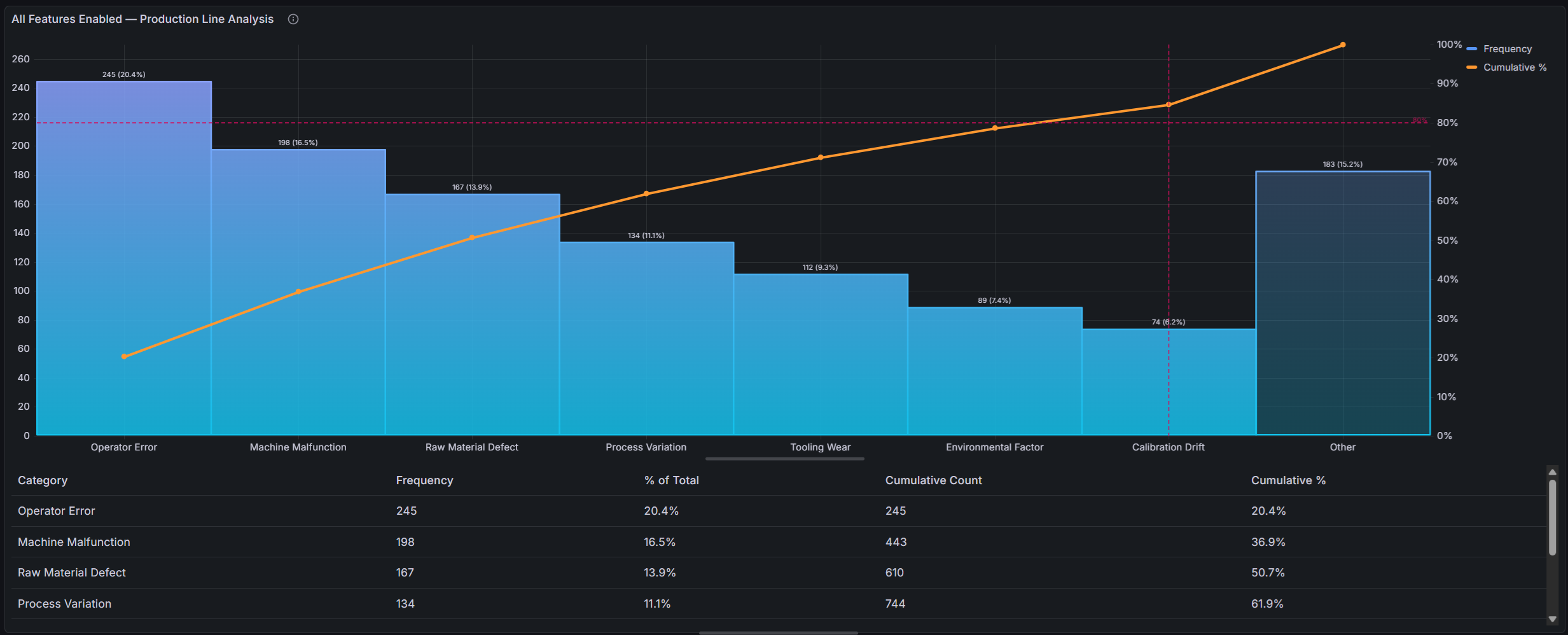
| Value labels | Optional count, percentage, or both displayed above each bar |
| Statistics table | Table with category, frequency, % of total, cumulative count, and cumulative % — always in Pareto order |
| Standard options | Unit, decimals, and display name apply to frequency values across the axis, labels, tooltip, legend, and table |
| Resizable layout | Drag the splitter between chart and table to adjust the view |
Use Cases
- Manufacturing quality — identify top defect types across production lines
- IT operations — rank incident categories to prioritize root cause analysis
- Customer support — surface the most common complaint categories
- Software development — analyze bug categories, test failure reasons, or build errors
- Supply chain — rank supplier issues or shipment delay causes
Requirements
- Grafana 11 or later
Getting Started
- Install the plugin from the Grafana Plugin Catalog
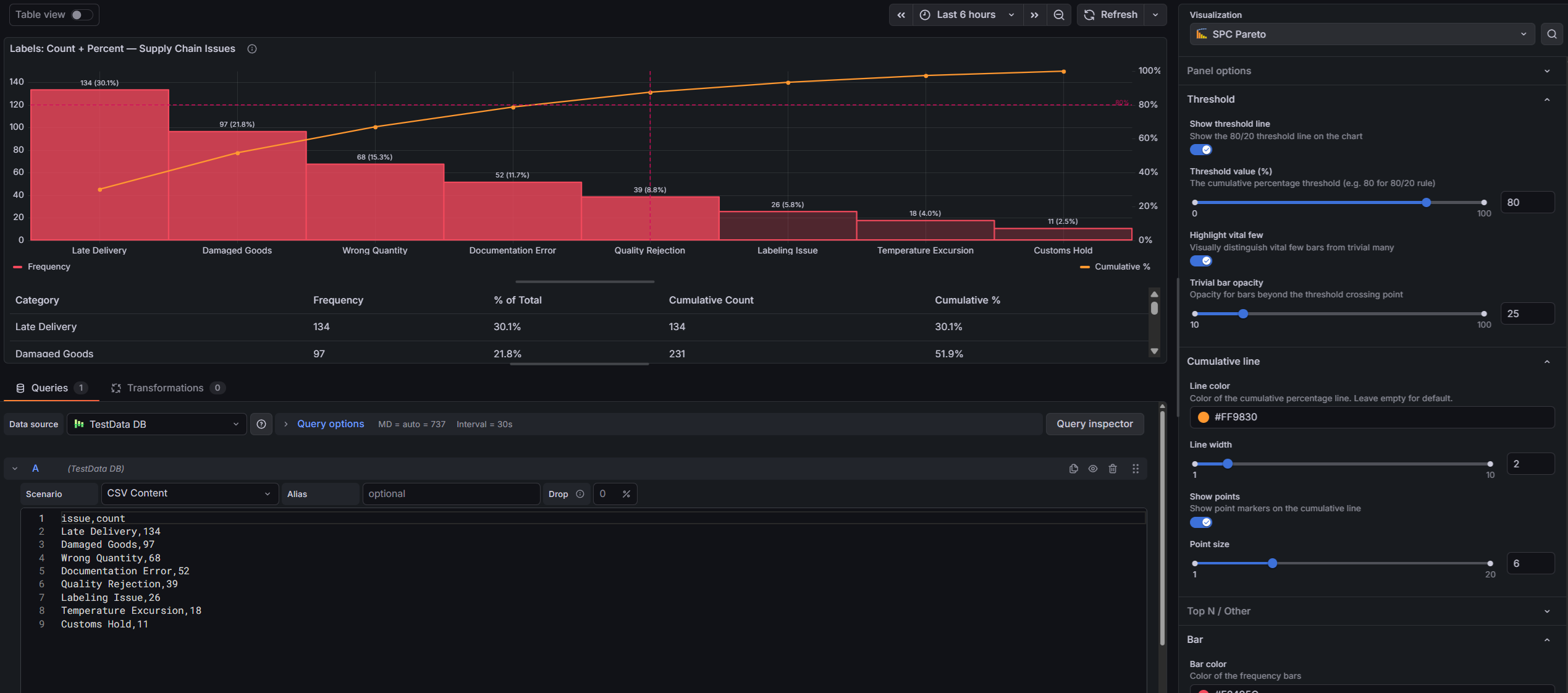
- Add a new panel and select SPC Pareto as the visualization
- Configure a query that returns either:
- A string field + a number field (pre-aggregated categories and counts), or
- A string field only (raw observations — the plugin counts occurrences automatically)
- The chart automatically sorts, calculates cumulative percentages, and renders the Pareto view
Example Query (SQL — pre-aggregated)
SELECT defect_type AS category, COUNT(*) AS count
FROM inspections
WHERE $__timeFilter(inspection_time)
GROUP BY defect_type
Example Query (SQL — raw observations)
SELECT defect_type
FROM inspections
WHERE $__timeFilter(inspection_time)
The plugin counts occurrences of each unique defect_type value automatically.
Data handling rules
- The first string field in each query result is used as the category, and the first number field (if present) as the value. If a query returns multiple number fields, reorder or remove columns so the intended value comes first.
- Query results with both a string and a number field are treated as pre-aggregated; results with only a string field are counted as raw observations. Multiple queries can be combined.
- Rows with a missing category or missing value (null, NaN) are excluded from the analysis. When rows are excluded, a note appears below the statistics table.
- Negative values are not valid for Pareto analysis. If the data contains a negative value, the panel shows an error instead of a misleading chart.
Example Query (TestData)
For a quick demo, use the TestData data source with the CSV Content scenario:
category,count
Scratch,45
Dent,38
Contamination,29
Misalignment,22
Color Defect,15
Crack,12
Burr,8
Warping,6
Porosity,4
Panel Options
Threshold
| Option | Description | Default |
|---|---|---|
| Show threshold line | Display the 80/20 reference lines | On |
| Threshold value | Cumulative percentage threshold | 80% |
| Highlight vital few | Visually mute bars beyond the threshold crossing point | Off |
| Trivial bar opacity | Opacity for the muted "trivial many" bars (10–100%) | 40% |
Cumulative line
| Option | Description | Default |
|---|---|---|
| Line color | Color of the cumulative percentage line | Orange |
| Line width | Stroke width of the cumulative line | 2 |
| Show points | Show point markers on the cumulative line | On |
| Point size | Size of point markers | 5 |
Top N / Other
| Option | Description | Default |
|---|---|---|
| Limit categories | Group low-frequency categories into an "Other" bucket | Off |
| Show top N categories | Number of categories to show before grouping the rest | 10 |
Bar
| Option | Description | Default |
|---|---|---|
| Bar color | Color of the frequency bars | Blue |
| Fill opacity | Bar fill opacity (0–100%) | 80% |
| Line width | Bar border width | 1 |
| Gradient mode | None, Opacity, or Hue | None |
| Show value labels | Display labels above each bar | Off |
| Label content | Count, % of Total, or Both | Count |
Statistics table
| Option | Description | Default |
|---|---|---|
| Show statistics table | Display the statistics table below the chart | On |
Standard options
| Option | Description |
|---|---|
| Unit | Unit applied to frequency values (y-axis, bar labels, tooltip, table) |
| Decimals | Number of decimal places for frequency values; when set explicitly, it also applies to the computed percentage columns (default: 1 decimal) |
| Display name | Renames the value series in the legend, tooltip, and table column header (default "Frequency") |
Documentation
For detailed documentation, configuration guides, and examples, see the full documentation.
Part of the KensoBI SPC Suite
SPC Pareto is part of a growing family of Statistical Process Control plugins for Grafana by Kenso Software:
SPC Chart Panel — Control charts for monitoring process stability over time. Supports Xbar-R, Xbar-S, and XmR charts with automatic calculation of control limits. If you're tracking whether a process is staying in control, this is your starting point.
SPC Histogram Panel — Distribution analysis with histograms, bell curves, and a built-in statistics table showing Cp, Cpk, Pp, and Ppk. Use it to understand process capability: is your process producing results within specification limits?
SPC CAD Panel — Brings 3D geometry into the picture, letting you bind the data from control charts and histograms to physical features on your parts.
License
This software is distributed under the AGPL-3.0-only license — see LICENSE for details.
Support
If you have any questions or feedback, you can:
- Ask a question on the KensoBI Discord channel.
- GitHub Issues: https://github.com/kensobi/spc-pareto/issues
Grafana Cloud
Connect any plugin in Grafana Cloud.
- 150+ data source integrations
- Grafana Assistant - AI that correlates your data, builds queries, and answers questions
- 10k Prometheus metrics + 50 GB logs, traces, and profiles on the free tier
- ...and more
Insights
- Adoption
Running on 386 active Grafana instances.
- Activity
Last updated 14 Jul 2026.
2 releases in the past year.
- Version
- 1.1.0
- Dependencies
- Grafana >=11.6.12
- Developer
- Kenso Software
Grafana Cloud
Connect any plugin in Grafana Cloud.
- 150+ data source integrations
- Grafana Assistant - AI that correlates your data, builds queries, and answers questions
- 10k Prometheus metrics + 50 GB logs, traces, and profiles on the free tier
- ...and more