
DigitalRCS-TimeOverlay-Panel
Measure time spans and keep the explanation right on your graph. DigitalRCS-TimeOverlay-Panel combines a time-series visualization with multiple highlighted ranges and visible, editable notes.
Select a range to display its elapsed time, then repeat to mark additional intervals on the same graph. Add notes to explain what happened, move and resize them as needed, and save the dashboard to keep your ranges and notes for the next visit.
Use it to document incidents, compare recovery times, highlight test windows, explain changes in measurements, or add context to any time-series data. Series names come from your queries; the panel is not limited to a particular industry, naming convention, or data source.
See the panel in action
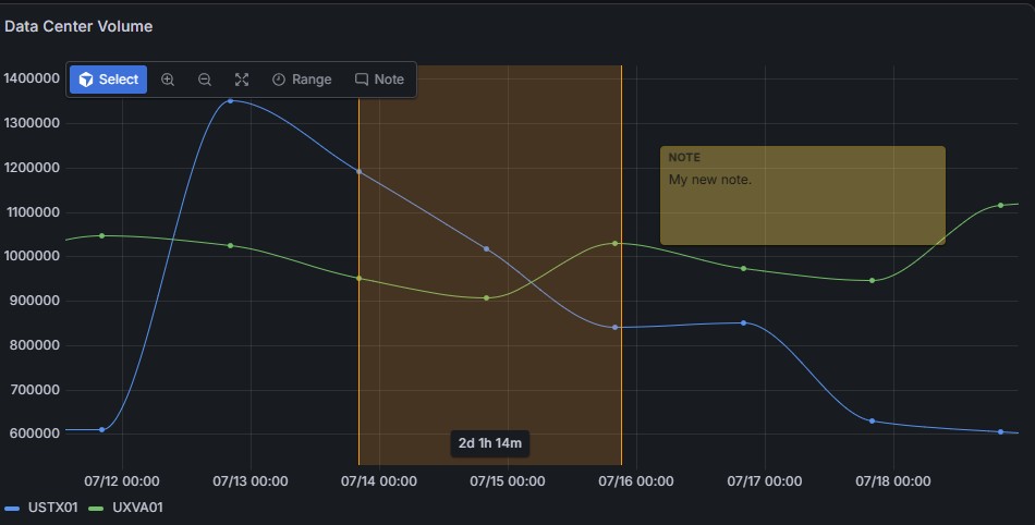
An example of a range and note over two series. The screenshots show an earlier layout; the current version places the editable duration box below the highlighted range so narrow selections remain readable.
Key capabilities
- Measure multiple intervals: add separate range overlays as needed, each with its own elapsed-time label.
- Adjust a range visually or precisely: move it, resize either edge, or enter a duration such as
2d 1h 14m. - Keep visible notes on the graph: add multiple text notes with movable, resizable boxes and adjustable background transparency.
- Save your context: ranges and notes persist with the saved dashboard, rather than disappearing when you stop dragging or reload the page.
- Explore the data: drag to zoom, use zoom controls, and hover over data points to inspect timestamps and values.
- Customize the chart: choose straight or curved lines, point markers, a legend, and individual series colors.
- Include overlays in reports: saved ranges and notes are panel content and can appear in Grafana-rendered images and PDF reports.
Example: explain an incident on the graph
Highlight the interruption with one range, the recovery period with a second, and a later validation window with a third. Each range displays its own elapsed time. Add visible notes such as "Deployment started," "Service restored," and "Validation complete," then save the dashboard so the next person can see both the measurements and their context.
The same workflow works for experiments, equipment measurements, business activity, and other time-series data. No domain-specific field names are required.
Choose your data
The panel requires Grafana 12.3 or later. Use a data source that returns Grafana data frames containing a time field and one or more numeric fields. Multiple numeric series and multiple query frames are supported.
For example, a query could return:
| time | requests | errors |
|---|---|---|
| 2026-08-01T20:00:00Z | 1250 | 3 |
| 2026-08-01T20:05:00Z | 1420 | 8 |
| 2026-08-01T20:10:00Z | 1310 | 2 |
Here, requests and errors become separate plotted series. They can have any names. A field already typed as time by Grafana does not need a specific name; the panel also recognizes common time and _time fields and supports conversion of common timestamp and numeric-string values.
Configure CSV, Splunk, SQL, or other queries in their respective data sources. The panel visualizes query results; it does not upload CSV files or connect directly to those systems. If the graph is empty, check that your query returns time and numeric values and that the dashboard time range includes those timestamps. Use Grafana transformations when field types need conversion.
Get started
- In a dashboard, select Add visualization and choose your data source.
- Configure the query, then choose DigitalRCS-TimeOverlay-Panel in the visualization picker.
- Confirm your series appear and adjust the dashboard time range if necessary.
- Use the Range and Note controls over the graph to add context.
- Save the dashboard to retain your changes. You need permission to save that dashboard.
Add and adjust time ranges
- Select Range, then press and drag across the graph from the desired start to the desired end.
- Read the elapsed time in the box below the highlighted range. Labels use days, hours, minutes, seconds, or milliseconds as appropriate.
- Select and drag the range to move it, or drag either edge handle to resize it.
- For an exact span, click its duration box, enter a value such as
45m,6h 30m, or2d 1h 14m, and press Enter. - Select Range again and repeat for each additional interval you want to measure. Each range has its own duration.
Entering a duration keeps the start time fixed when possible, shifting or capping the range to fit the original timeline. Invalid or zero durations are not applied.
Ranges store fixed start and end timestamps. Changing the dashboard's time window can move a saved range outside the visible graph; it does not turn the range into a rolling relative interval.
Add persistent notes
- Select Note and enter text in the new note's text area.
- Drag its header to move it over the graph.
- Drag its lower-right handle to resize it.
- Select Note again to add another note as needed.
Notes stay visible without hovering. Their positions and sizes are relative to the plot area, not attached to an individual data point. To remove a range or note, select it and use Delete on the overlay toolbar.
Save the dashboard after creating, editing, moving, resizing, or deleting overlays. Unsaved changes will not persist across reloads or be available to a separate report-rendering session.
Inspect and zoom
Use Select and drag horizontally to zoom to an interval without creating a saved range. Zoom in narrows the displayed time window, Zoom out expands it, and Zoom all restores the original dashboard time range. Zoom out is capped at that original range.
Enable Show points and hover over a point to see its timestamp and series values.
Configure the appearance
The panel editor provides these options:
| Setting | What it controls |
|---|---|
| Time range color / Time range opacity | Highlight background color and opacity, from 0% transparent to 100% opaque. |
| Note color / Note opacity | Note background color and opacity, independently of the range background. |
| Show points / Point size | Visibility and size of data-point markers. |
| Line style | Straight segments or curved lines. |
| Show legend | Visibility of the series legend. |
| Show overlay toolbar | Visibility of the interactive overlay controls. |
Background opacity does not fade the overlay text. For individual series colors, open Overrides in the panel editor, match the desired field, and set its color. Colors do not need to be threshold-based. Supported standard field options also include unit, decimals, and display name.
Save and share the result
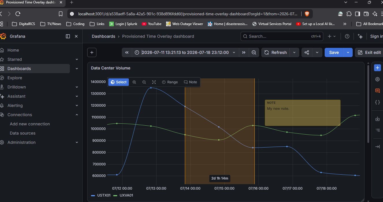
Ranges, notes, and appearance settings are stored in the dashboard's panel options. Other users viewing that saved dashboard can see the same context.
For images and PDF reports, use your Grafana instance's configured rendering or reporting facilities. The plugin itself does not supply a standalone PDF exporter. The renderer must have access to the plugin and the data sources, and the dashboard must be saved first. The overlay toolbar is automatically hidden on Grafana render routes. Test your organization's export route before relying on it for reports.
More information
- User guide
- Panel configuration
- Project documentation for installation, deployment, and development
- DigitalRCS
Grafana Cloud
Connect any plugin in Grafana Cloud.
- 150+ data source integrations
- Grafana Assistant - AI that correlates your data, builds queries, and answers questions
- 10k Prometheus metrics + 50 GB logs, traces, and profiles on the free tier
- ...and more
Insights
- Adoption
Running on 9 active Grafana instances.
- Activity
Last updated 24 Sep 2026.
1 release in the past year.
- Version
- 1.1.3
- Dependencies
- Grafana >=12.3.0
- Developer
- DigitalRCS
Grafana Cloud
Connect any plugin in Grafana Cloud.
- 150+ data source integrations
- Grafana Assistant - AI that correlates your data, builds queries, and answers questions
- 10k Prometheus metrics + 50 GB logs, traces, and profiles on the free tier
- ...and more