

The 2026 Golden Grot Awards finalists are here: It’s time to vote!
Every year, the Golden Grot Awards celebrate the most creative, ambitious, and impactful dashboards built with Grafana. And every year, the community raises the bar.
The 2026 finalists show just how far observability can stretch. From lunar missions and national digital platforms to heart attack recovery and chasing the northern lights, this year’s dashboards transform raw data into clarity, confidence, and action.
Public voting for the Golden Grot Awards is open now through Wednesday, March 11. Continue reading to learn more about the finalists and all their great work in both the Personal and Professional categories. Then, cast a vote for your favorite dashboards!
As a reminder, just like past years, the grand prize winners in each category will be celebrated on stage at GrafanaCON 2026 (20-22 April in Barcelona), receive the coveted Golden Grot statuette, and get to present their award winning work to their peers.
Finalists in the personal category
Gabriel Rios: a homelab playground
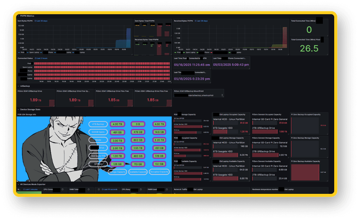
Gabriel Rios turned his homelab into a fully instrumented observability playground. His dashboard includes music listening metrics from a Google Nest Mini, the health of Docker and Prometheus, network telemetry, VPN usage, smart plug electricity tracking, device storage, backup systems, and even remote monitoring of devices at his parents’ house. Nearly every service and device in his digital life emits metrics, many powered by custom scripts feeding Prometheus or PostgreSQL.
But what makes Gabriel’s project especially impressive is how far he pushed it technically. He wrote custom jailbreak tweaks for an old iPhone to export battery metrics and built automation to control charging thresholds via smart plugs; and all surfaced in Grafana. What began as curiosity became a backend lab that directly enabled him to build production dashboards professionally. It’s a masterclass in learning by instrumenting everything.
Learn more about Gabriel’s dashboard here
Niklas Lücke: Earth as a distributed system
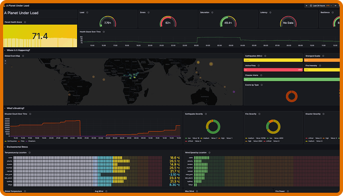
Niklas Lücke asked a bold question: What if Earth was a distributed system? His dashboard, “A Planet Under Load,” applies classic SRE signals—load, errors, saturation, latency, and resilience—to global planetary data. Earthquakes, wildfires, geomagnetic disturbances, disaster alerts, weather events, and internet health are synthesized into a real-time "planet health score."
Running on a single Debian VM that pulls from public APIs and pushes to Grafana Cloud, the project is technically lean but conceptually powerful. It reframes climate events through an observability lens, making planetary data instantly legible. When the score drops, you instinctively want to investigate and sometimes you discover that something is literally on fire.
Niklas’ full dashboard can be found here
Guillermo Ruiz: heart attack recovery
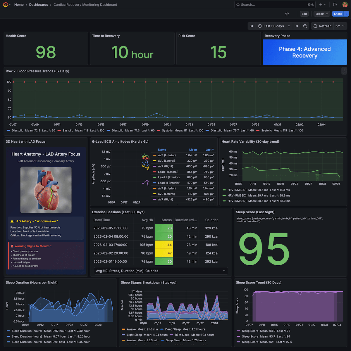
After surviving a double heart attack with roughly 20% survival odds, Guillermo Ruiz turned to the discipline he knew best: observability. His cardiac recovery dashboard tracks blood pressure, ECG amplitudes, HRV trends, exercise strain, sleep stages, and recovery scores—all designed to catch small changes before they become real risks.
Running locally on a Raspberry Pi with InfluxDB and Grafana, the system treats his body like critical infrastructure. Over time, the dashboard transformed anxiety into clarity and measurable progress. It helped him rebuild confidence, regulate effort, and trust recovery trends instead of reacting to bad days. More than a dashboard, it became a lifeline.
Aaron Zamora: debugging marathon training
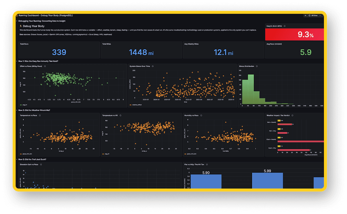
Training for the Tokyo and New York City marathons, Aaron Zamora built a dashboard to answer a frustrating question: Why do some runs just feel terrible? Pulling 339 runs and over 1,400 miles of data from Strava, Garmin, and Oura, he structured the dashboard like a production root-cause investigation–isolating effort, terrain, weather, fueling, sleep, and even beer.
The results were eye-opening. His "easy zone percentage" metric revealed he was running far too hard on recovery days. Fueling analysis showed he was under-replacing carbs. Weather correlations quantified performance impacts. Instead of guessing, Aaron now diagnoses. It’s a powerful example of applying engineering rigor to personal performance.
Aaron’s full dashboard can be viewed here
Mohamed Adem: aurora chaser
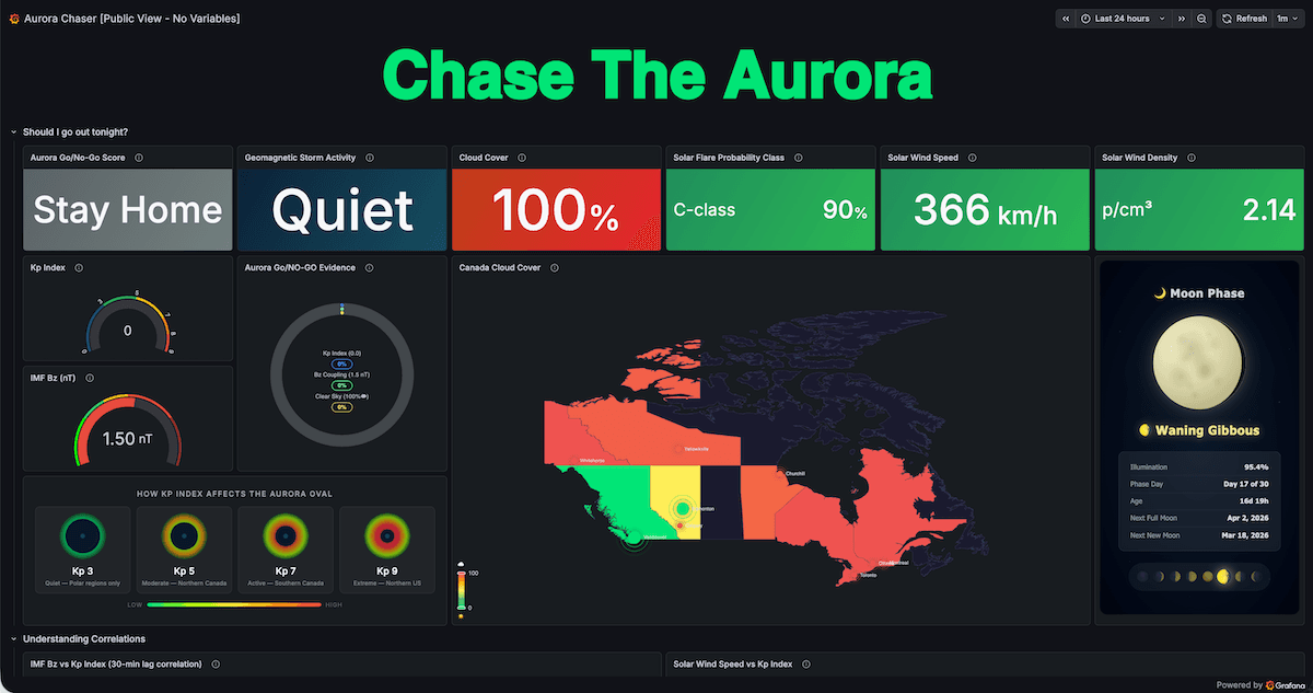
Living in Canada, Mohamed Adem was tired of missing aurora borealis displays. Instead of juggling a dozen websites, he built a dashboard that tracks the entire chain from solar flare to visible sky conditions. It monitors NOAA space weather data, IMF Bz magnetic field shifts, Kp index geomagnetic activity, cloud cover forecasts, and moon phase—combining them into a composite Go/No-Go score.
The system runs entirely on public APIs using Telegraf and InfluxDB Cloud, proving powerful insight doesn’t require paid data feeds. By visualizing correlations between solar wind, geomagnetic disturbance, and visibility conditions, Mohamed gained both deeper understanding and better timing. It’s science, astronomy, and observability converging into a simple answer to the question: Should I go outside tonight?
Mohamed’s full dashboard can be viewed here
Finalists in the Professional category
Manuel Montes de Oca, Supra Networks
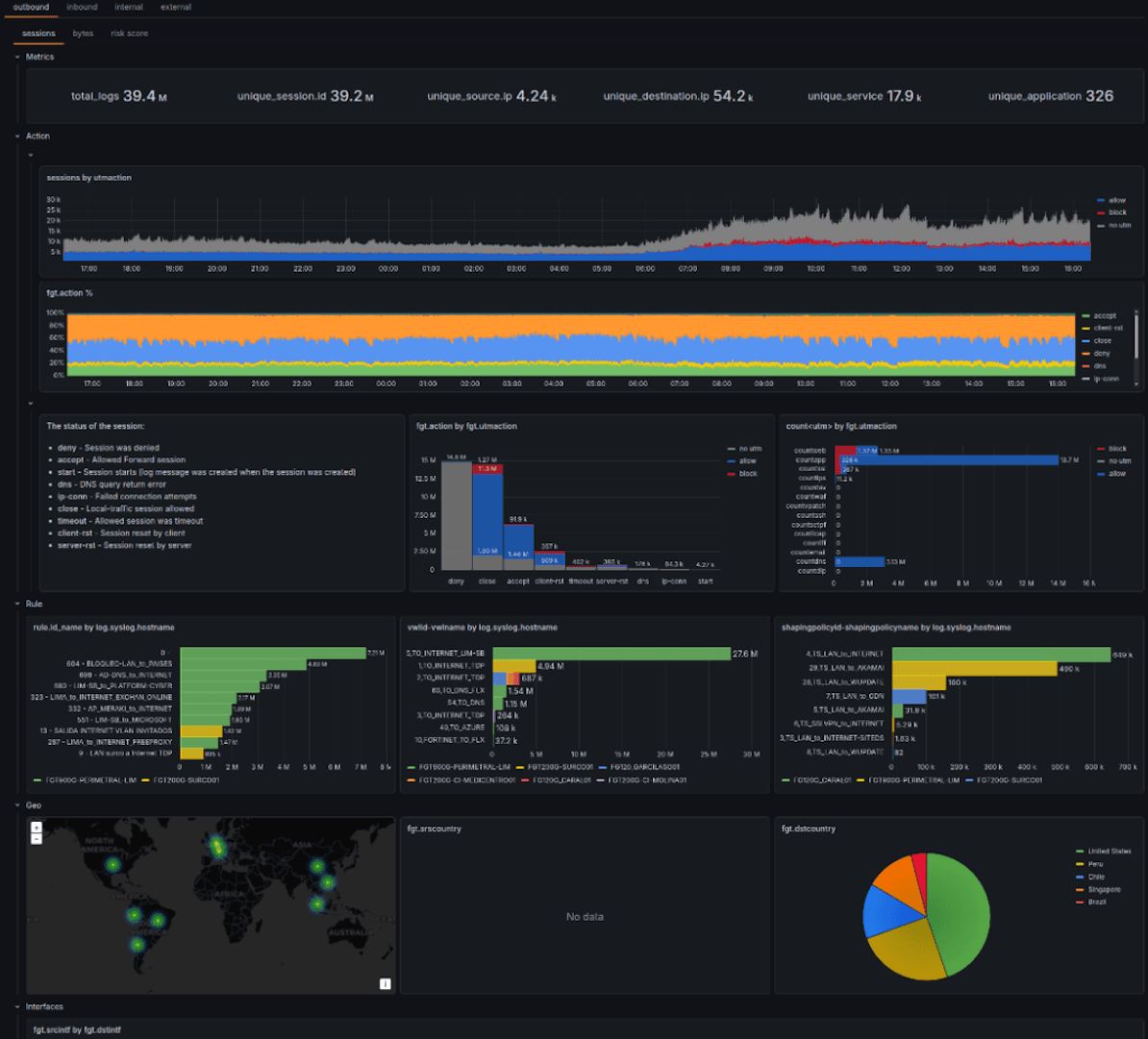
Manuel Montes de Oca built FortiDragon to solve a persistent problem: firewall logs treated as second-class citizens in traditional SIEM systems. Using Vector.dev pipelines, VictoriaLogs, and Grafana v2 dynamic dashboards, FortiDragon delivers scalable, high-volume firewall analytics optimized for real-world threat hunting.
Now used by SOC teams globally, the platform supports deep exploration across Fortinet and Palo Alto technologies. Its interactive dashboards enable scalable investigation while remaining open source and cost-effective. Manuel is especially proud that FortiDragon competes with (and often outperforms) traditional SIEM platforms at a fraction of the resource footprint.
Abby Dickinson, Orca Scan Ltd
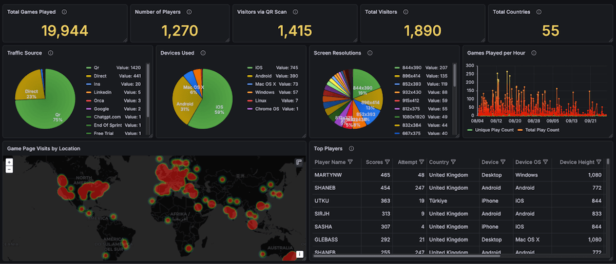
When Orca Scan launched OrcaCam—an arcade-style game outside their core barcode product—Abby Dickinson built the dashboard that made scaling possible. The system tracks real-time and historical engagement metrics including games played, geography, traffic sources, device types, screen resolutions, and top players.
This visibility enabled confident expansion from a single installation in Cambridge’s Grand Arcade to a global audience. By combining behavioral insights into a single pane of glass, the team can detect anomalies, prevent cheating, and optimize gameplay in real time. It’s a data-driven foundation for innovation beyond their traditional domain.
Jackson Sweeney, Firefly Aerospace
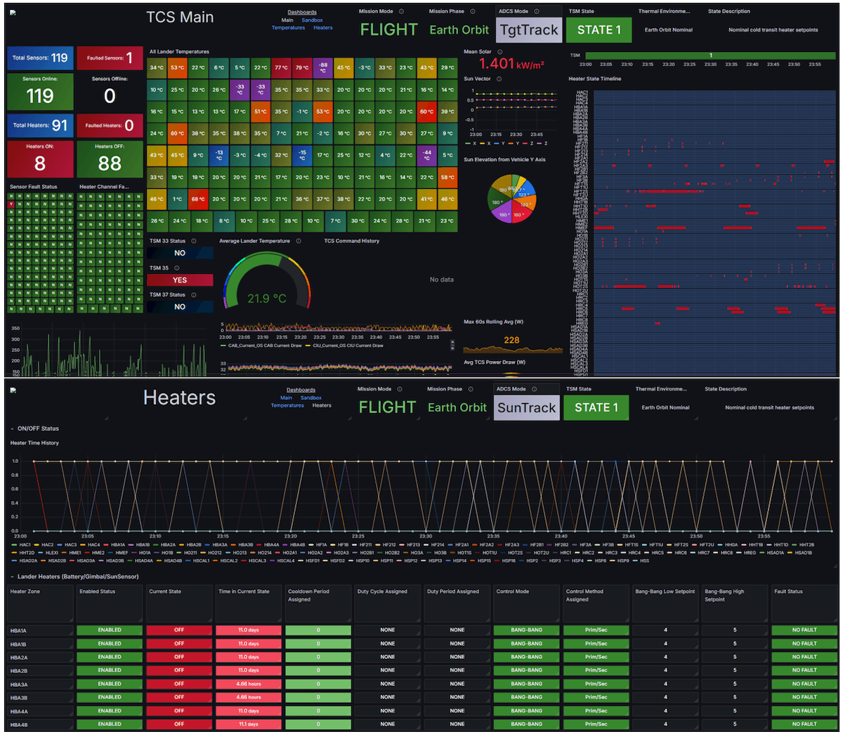
Jackson Sweeney’s dashboard monitored over 500 telemetry points during Firefly Aerospace’s Blue Ghost Mission 1 lunar lander mission. It tracked temperature sensors, heater states, power usage, battery storage, and vehicle orientation throughout the 60-day journey from Earth to the Moon.
Accessible to the entire mission team, the dashboard provided critical visibility into thermal health and risk conditions during operations. It served as a primary decision-support tool during lunar landing procedures. This wasn’t just observability—it was mission-critical infrastructure helping land a spacecraft on the Moon.
Stefan Nikic, demicon GmbH

Stefan Nikic tackled “tool chaos” in automotive NVH engineering, where slow, siloed tools delay root-cause discovery. His high-performance AWS-powered Grafana dashboard integrates 18 data sources and transforms raw test bench time-series data into a real-time, interactive diagnostic environment.
Used by internal and external engineers at leading OEMs, the platform accelerates anomaly detection and improves understanding of complex sound and vibration interactions. It replaces fragmented workflows with a single scalable UI designed specifically for engineers who can’t afford delays. Observability here directly drives innovation.
Diego Franceschi, INGV

Diego Franceschi built an ecosystem of 10+ interconnected dashboards to monitor Italy’s Integrated Seismic Network at the National Institute of Geophysics and Volcanology. The system combines multiple databases and web services to monitor station health, latency, availability, data quality, and infrastructure performance in the Seismic and Tsunami Monitoring Room.
By emphasizing anomalies within high-volume seismic data streams, the dashboards allow operators to focus immediately on potential problems. The solution unifies legacy and modern data without forcing costly migrations. Diego is proud that his work supports infrastructure critical to public safety across an entire nation.
Ting Lik Ming, Core Consulting
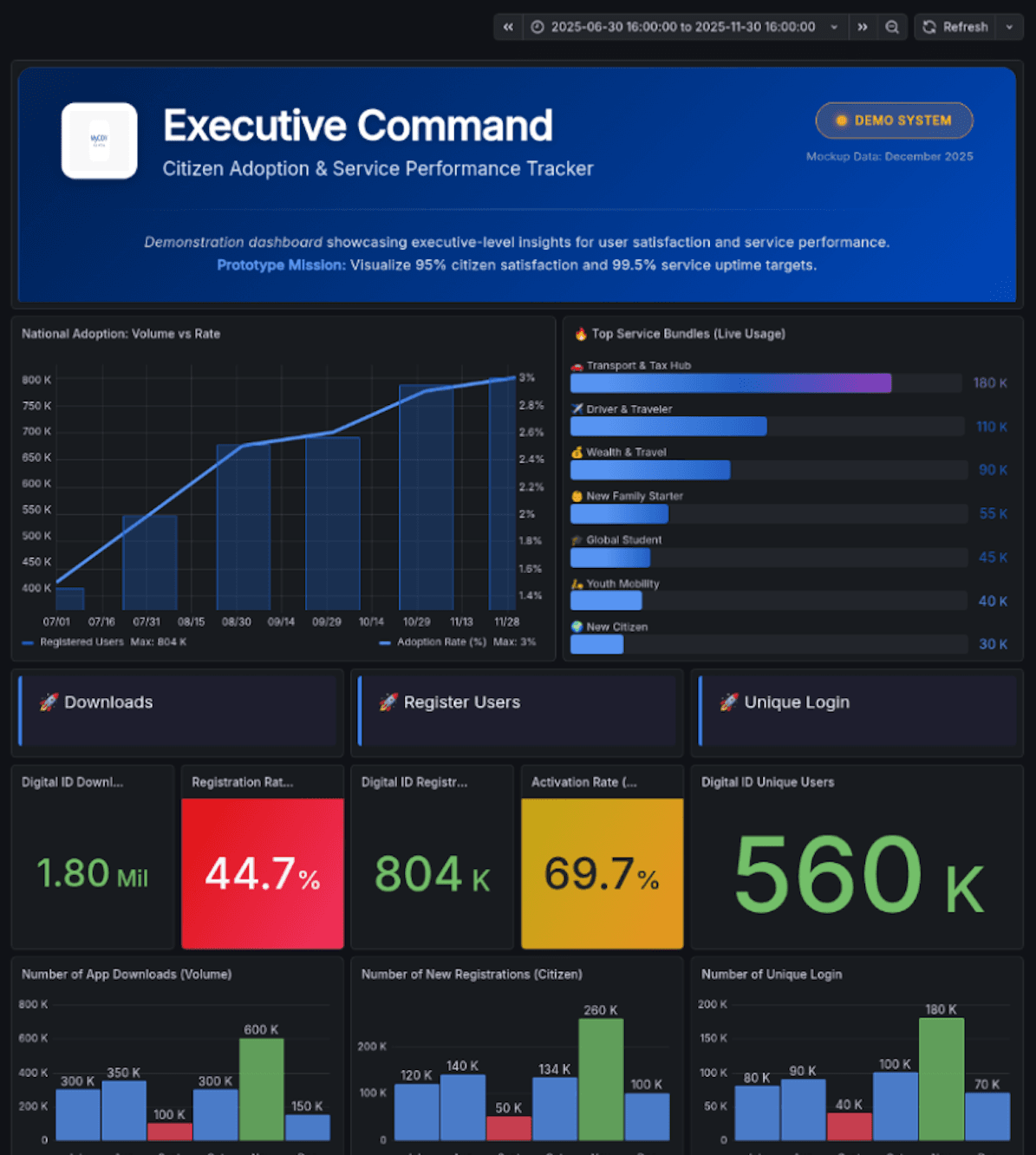
Ting Lik Ming’s “Executive Command: Citizen Adoption & Service Performance Tracker” provides Malaysian government leadership with a single-pane-of-glass view of the MyGov app. It tracks adoption gaps, onboarding funnel drop-offs, service processing times across ministries, regional digital divides, and citizen sentiment, including surfacing a visible “Crisis” in satisfaction.
By correlating backend performance with citizen experience metrics, the dashboard shifts governance from vanity metrics to accountability. Leaders can identify eKYC bottlenecks, benchmark ministries, and allocate resources precisely where friction exists. It’s observability applied at national scale, where the system being optimized is digital citizenship itself.

