Revamped gauge visualization
We’ve reimagined the gauge visualization to provide more options and several new variations to make your dashboards more informative and more appealing.
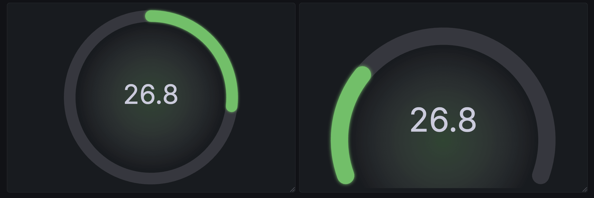
The Circular shape has been introduced as an alternative to the existing Arc gauge under the new Style option.
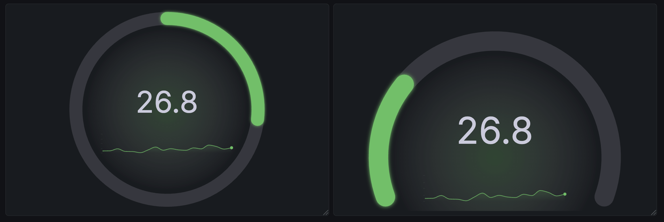
We’ve also added sparkline support to the gauge, which improves the its usefulness as an alternative to the stat visualization for time series data.
Gradient support was also added. Gradients don’t just look nice—they help users interpret panels with thresholds, or with series that use a continuous color scheme.
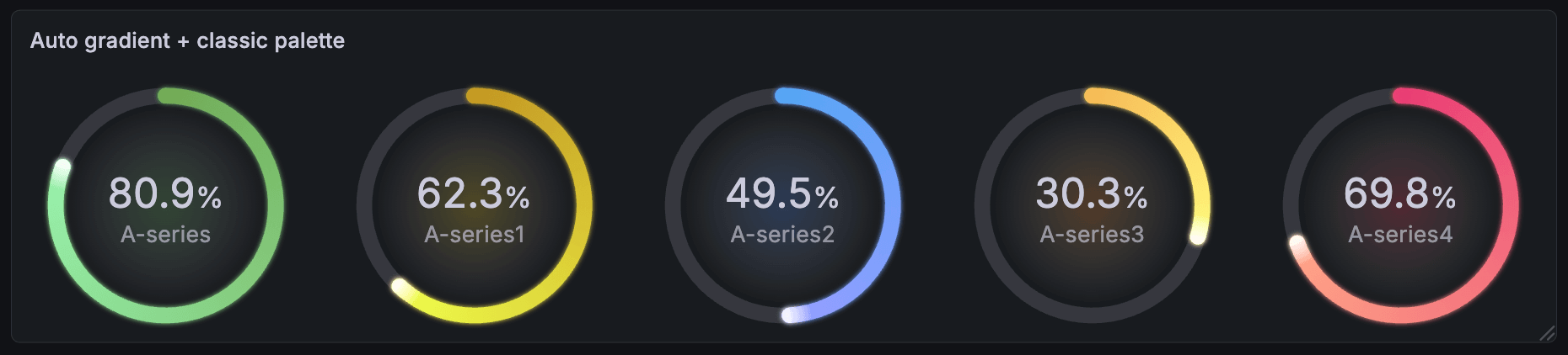
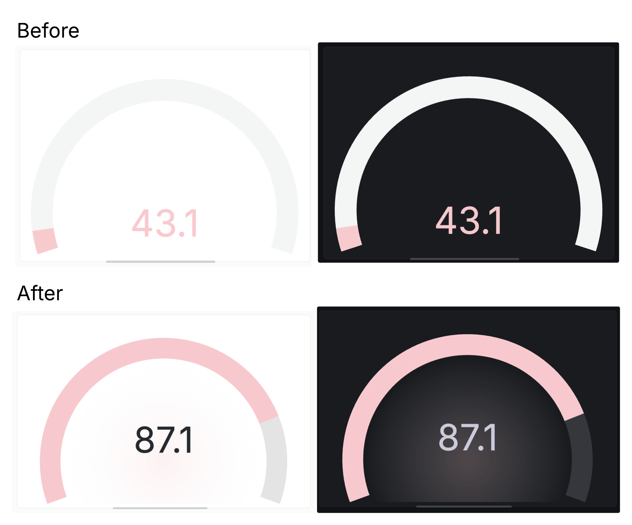
The new gauge also has accessibility improvements. The Center glow option renders the gauge’s current color value as a transparent glow behind the gauge’s text. This replaces the previous behavior of changing the color of the text itself. This change helps avoid situations where text can become illegible due to an individual user’s theme.
There are several more new configuration options, including:
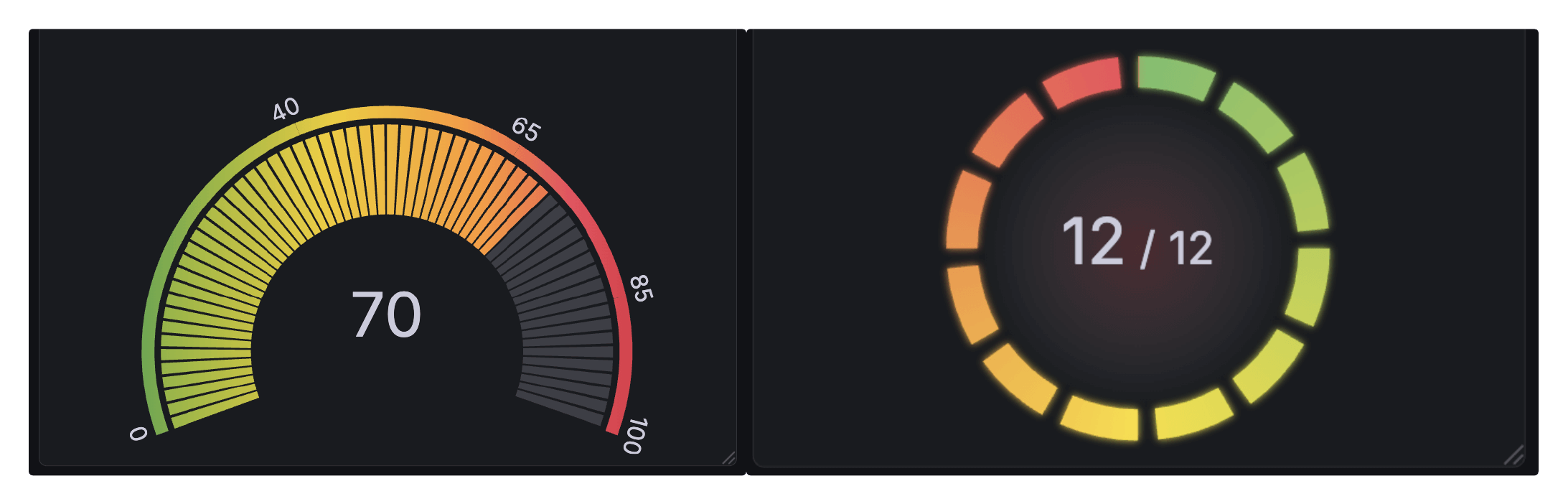
- Rounded bars (under Bar style)
- Configurable bar thickness
- Endpoint markers for readability
- New text display modes to precisely configure the information presented in your visualization
To try out the revamped gauge visualization, enable the newGauge feature toggle.