Plugins 〉FlowX

FlowX


FlowX


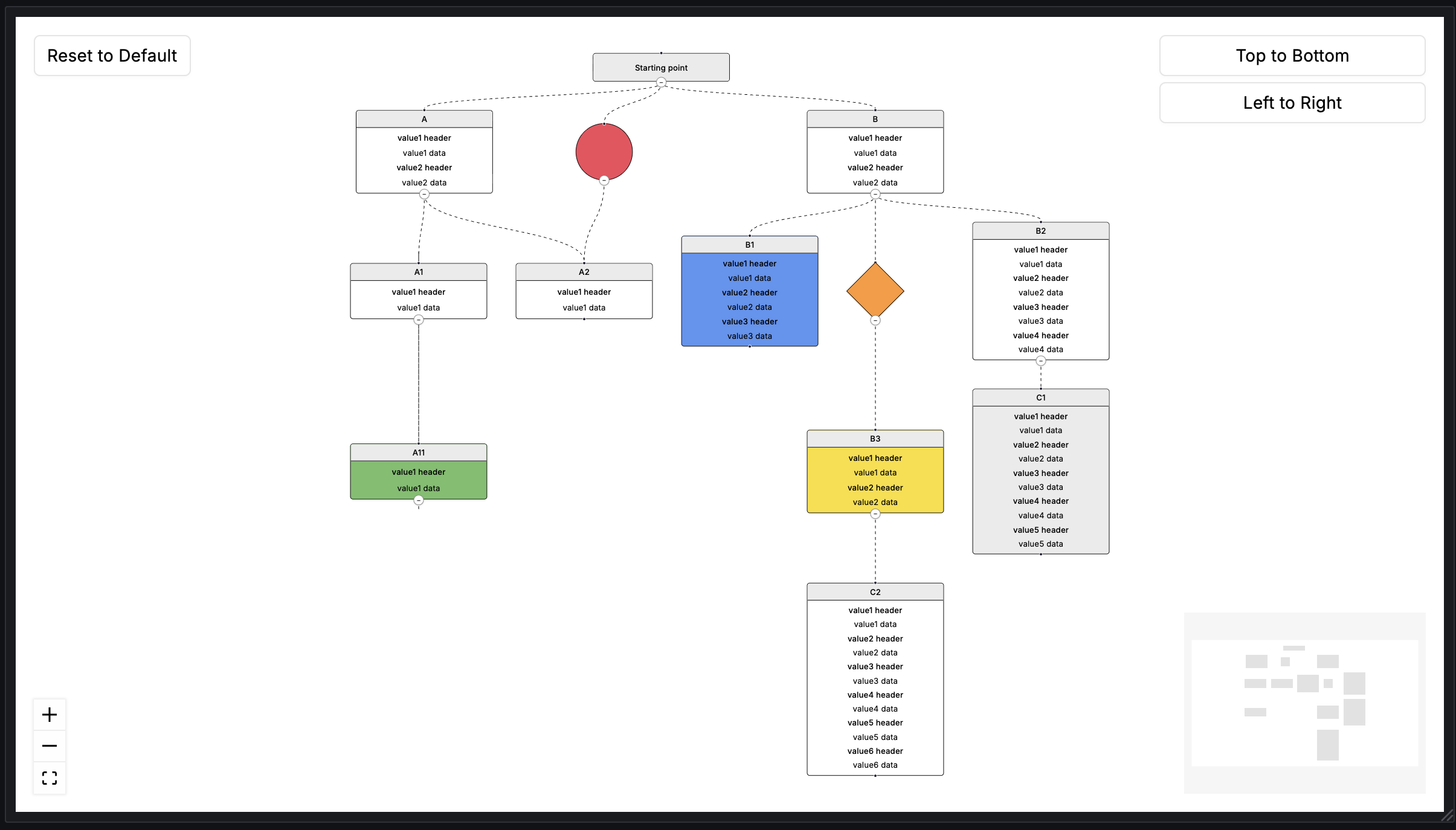
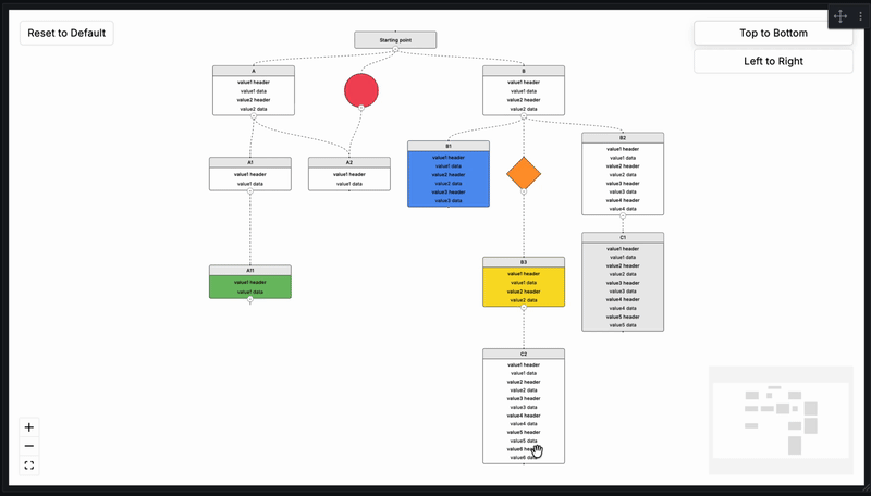
The FlowX Grafana panel enables the rendering of interactive flowcharts derived from directed graph data, consisting of nodes and edges. FlowX supports a variety of node types, each designed for specific use cases. Grafana provides a Node Graph panel for visualizing directed graph data, but its visualization capabilities are quite limited. To address the need for more advanced and rich visualizations of directed graphs, this panel has been developed. It leverages ReactFlow and DagreJS to deliver enhanced visualization features.
Demo
Requirements
| FlowX Version | Minimum Grafana Version |
|---|---|
| 2.0.0+ | 11.6.11 |
| 1.0.3 and below | 10.1.0 |
Note: FlowX 2.0.0+ requires Grafana 11.6.11 or higher due to React 19 compatibility changes introduced in Grafana 13. If you are running Grafana 10.x, please use FlowX version 1.0.3.
Installation
Installing plugin on Grafana Cloud / Local Grafana - https://grafana.com/docs/grafana/latest/plugins/installation/
Configuration
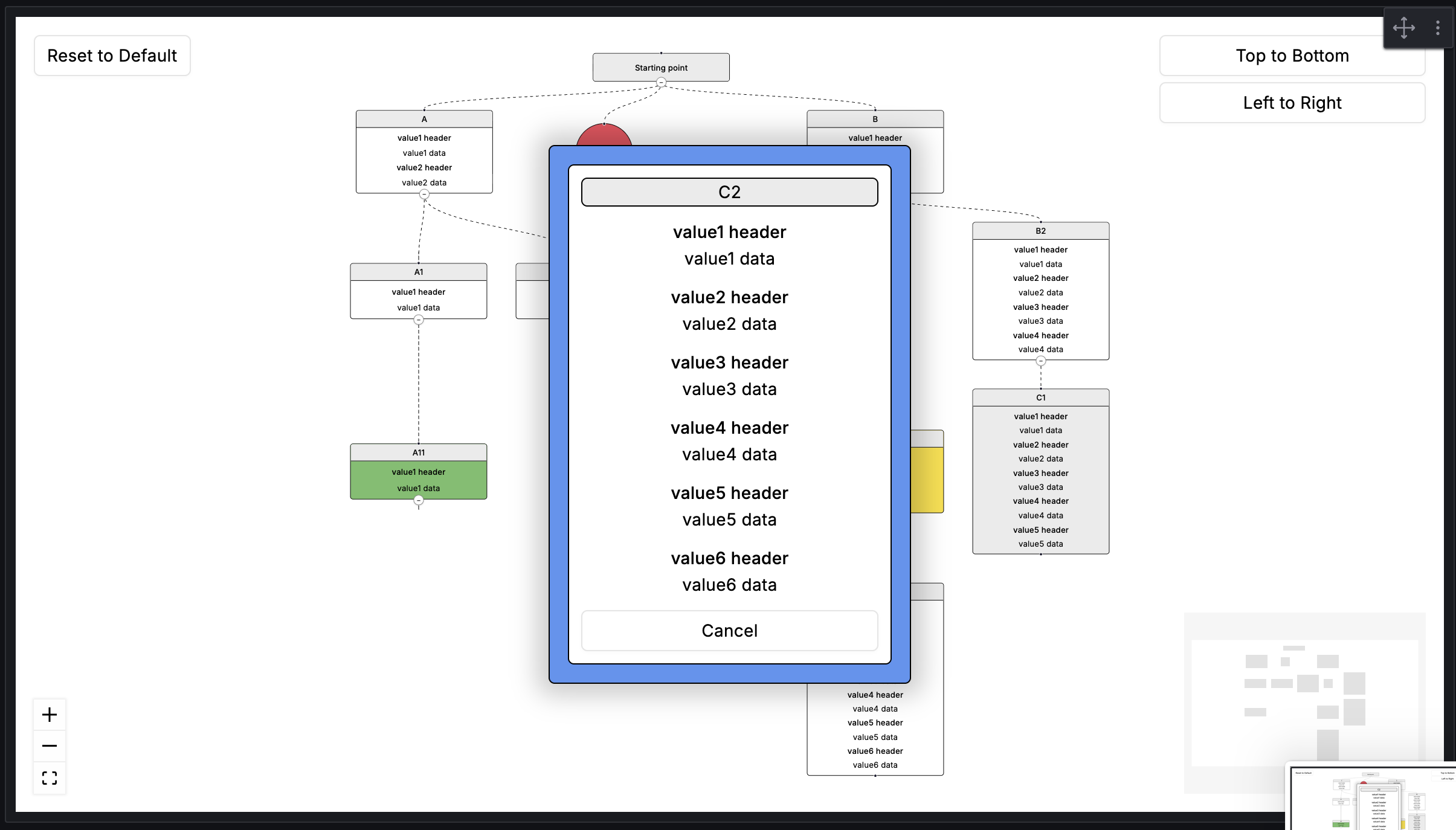
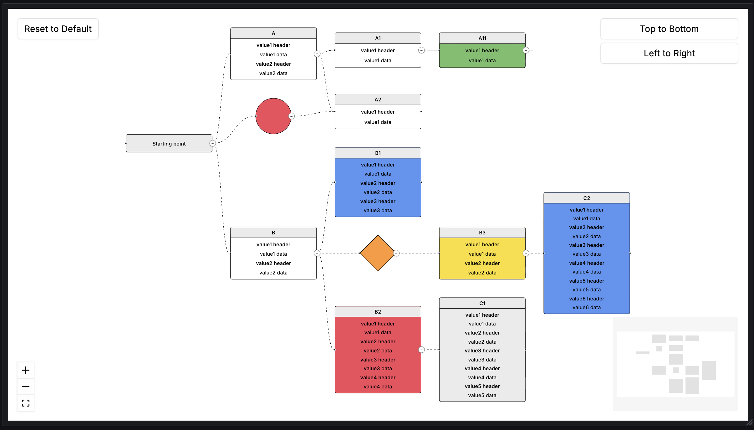
To use the FlowX panel, 2 different queries called "Node" and "Edge" must be added. The "Node" query is for determining the boxes, circles and diamonds we will draw. The "Edge" query is for determining the relationship between the nodes we draw. The expected columns in Node and Edge queries are as shared below. All data to come to the columns are optional (yes, including IDs, if an empty row comes, an empty node with no relationship will be drawn.) The expected data type is string for all columns.
Node
The following table describes expected columns of the Node query:
| Columns | Supported Values | Description |
|---|---|---|
| id | Unique identifier of the Node. Each Node to be drawn must have a unique ID. These ID's will be used in the Source or Target fields in the "Edge" query. | |
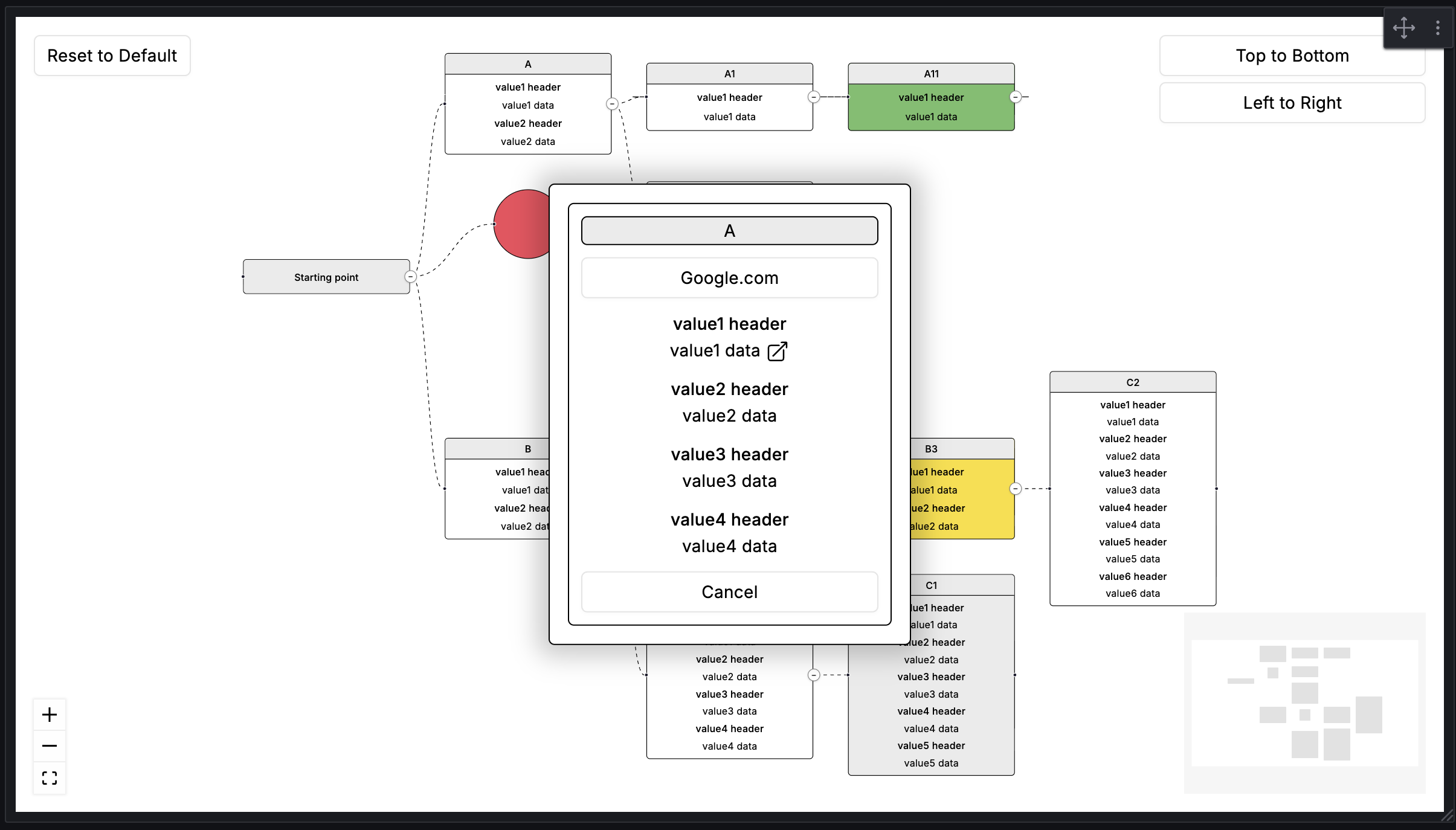
| type | title one two three four five six circle diamond | Determines the type of Node. The Node is drawn according to this data. However, if the popup is active, all values will appear there. Default: four |
| title | Title of the Node. | |
| value1_header | The header that will come for the first value of the node. | |
| value1_data | The data that will come for the first value of the node. | |
| value1_url | The URL that will come for the first value of the node. "Show Popup" must be on to use. | |
| value2_header | The header that will come for the second value of the node. | |
| value2_data | The data that will come for the second value of the node. | |
| value2_url | The URL that will come for the second value of the node. "Show Popup" must be on to use. | |
| value3_header | The header that will come for the third value of the node. | |
| value3_data | The data that will come for the third value of the node. | |
| value3_url | The URL that will come for the third value of the node. "Show Popup" must be on to use. | |
| value4_header | The header that will come for the fourth value of the node. | |
| value4_data | The data that will come for the fourth value of the node. | |
| value4_url | The URL that will come for the fourth value of the node. "Show Popup" must be on to use. | |
| value5_header | The header that will come for the fifth value of the node. | |
| value5_data | The data that will come for the fifth value of the node. | |
| value5_url | The URL that will come for the fifth value of the node. "Show Popup" must be on to use. | |
| value6_header | The header that will come for the sixth value of the node. | |
| value6_data | The data that will come for the sixth value of the node. | |
| value6_url | The URL that will come for the sixth value of the node. "Show Popup" must be on to use. | |
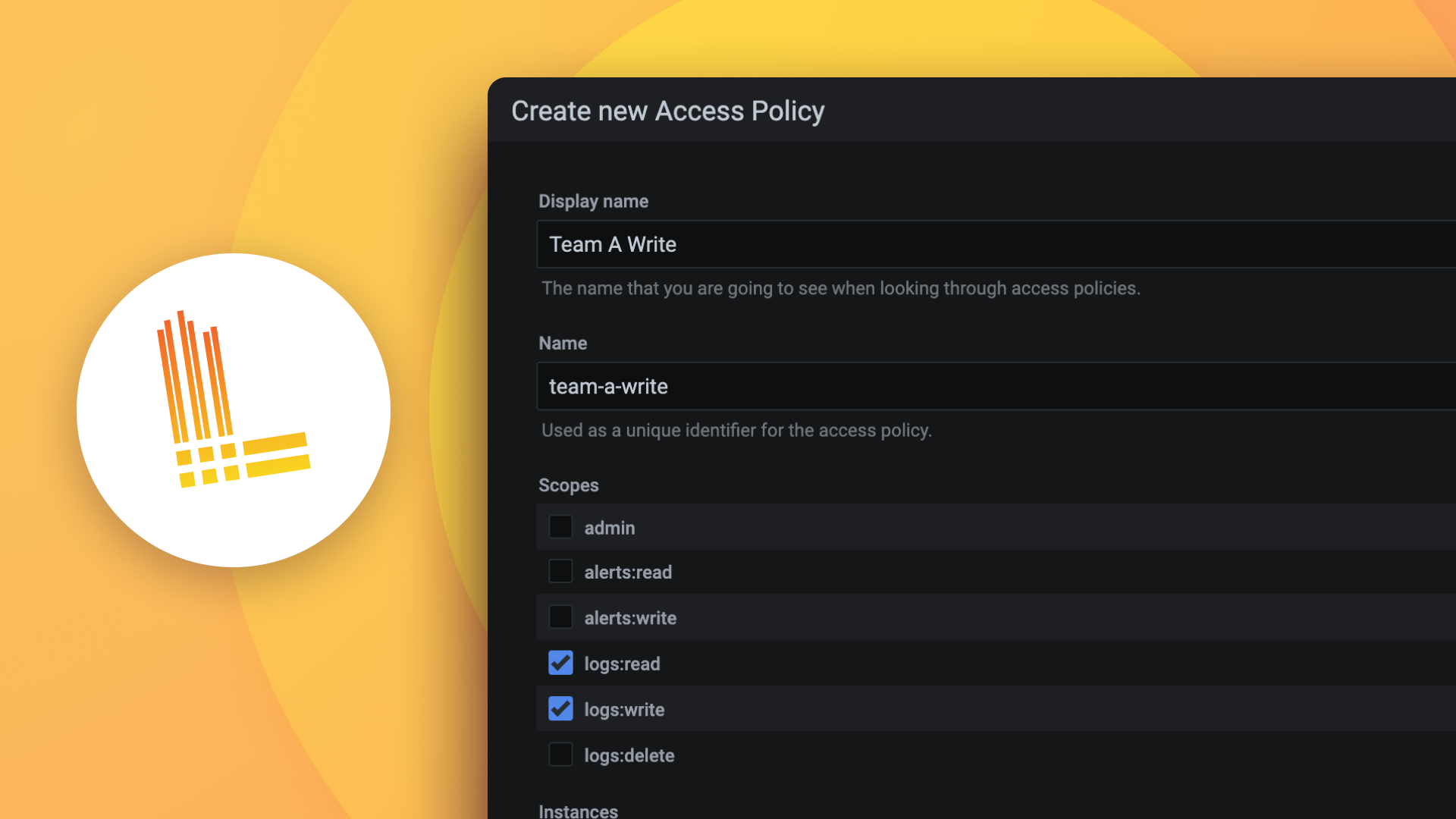
| color_condition | red red_blink orange orange_blink yellow yellow_blink green green_blink blue blue_blink gray gray_blink | Field that determines the background color of the node. Blink ones flash. Default: null |
| url | Field that can be used for the node's own URL. "Show Popup" must be on to use. | |
| url_label | The label that will replace the node's own URL. |
Edge
The following table describes expected columns of the Edge query:
| Columns | Description |
|---|---|
| id | Unique identifier of the Edge. Each Edge to be drawn must have a unique ID. |
| source | Source Node ID |
| target | Target Node ID |
Supported Types of Node
| type | Description |
|---|---|
| null | Default, node type will be set as four. |
| title | Node showing only title column. |
| one | Node showing title, value1_header, value1_data. |
| two | Node showing title, value1_header, value1_data, value2_header, value2_data. |
| three | Node showing title and value rows 1–3. |
| four | Node showing title and value rows 1–4. |
| five | Node showing title and value rows 1–5. |
| six | Node showing title and value rows 1–6. |
| circle | A node with circle shape that does not display value columns on the node itself. |
| diamond | A node with diamond shape that does not display value columns on the node itself. |
If "Show Popup" is enabled, all fields (title, values 1–6, URL) are shown in the popup regardless of node type.
Supported Colors of Node
| color_condition | Description |
|---|---|
| null | Default, paints the background white. |
| red | Paints the background #f2495c. |
| red_blink | Blinks between #f2495c and white. |
| orange | Paints the background #ff9830. |
| orange_blink | Blinks between #ff9830 and white. |
| yellow | Paints the background #fade2a. |
| yellow_blink | Blinks between #fade2a and white. |
| green | Paints the background #73bf69. |
| green_blink | Blinks between #73bf69 and white. |
| blue | Paints the background #5794f2. |
| blue_blink | Blinks between #5794f2 and white. |
| gray | Paints the background #ebebeb. |
| gray_blink | Blinks between #ebebeb and white. |
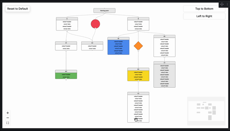
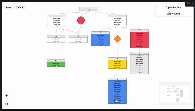
Collapse / Expand
Every node that has children displays a small collapse/expand button at the point where its outgoing edge begins. Clicking it hides or reveals the subtree beneath that node.
- Collapsing a node hides all of its descendants and collapses them automatically.
- Expanding a node shows only its direct children. Grandchildren remain collapsed until manually expanded.
- Nodes with multiple parents remain visible as long as at least one parent is open.
- Cycles in the graph (A → B → A) are handled safely.
The Initial Depth panel option controls how many levels are visible when the panel first loads:
| Value | Behavior |
|---|---|
0 | All nodes expanded (default) |
1 | Only root nodes visible |
2 | Roots and their direct children visible |
n | Nodes up to depth n visible, rest collapsed |
The Reset to Default button (top-left corner, visible when "Show Layout Options" is on) clears all manually dragged positions and resets the collapse state back to the configured Initial Depth.
FlowX Panel Options
The following table describes FlowX panel options:
| Category | Option | Values | Default | Description |
|---|---|---|---|---|
| Background Settings | Background Color | Grafana Color Palette | #ffffff | |
| Background Settings | Background Type | None Dots Cross Lines | None | |
| Background Settings | Type Gap | 1 – 50 | 28 | |
| Background Settings | Type Size | 1 – 10 | 1 | |
| Background Settings | Type Color | Grafana Color Palette | #000000 | |
| Layout Settings | Layout Direction | Top to Bottom Left to Right | Top to Bottom | |
| Layout Settings | Show Layout Options | on off | on | |
| Layout Settings | Show Mini Map | on off | on | |
| Layout Settings | Show Controls | on off | on | |
| Layout Settings | Hide Attribution (Pro) | on off | off | Please only hide the attribution if you are subscribed to React Flow Pro: https://reactflow.dev/pro |
| Layout Settings | Maximum Zoom | 1 – 10 | 4 | |
| Layout Settings | Minimum Zoom | 0.1 – 1 | 0.1 | |
| Node Settings | Draggable Nodes | on off | off | Drag positions are preserved across data refreshes. Reset to Default clears them. |
| Node Settings | Fit View on Collapse/Expand | on off | off | Automatically fits the view whenever a node is collapsed or expanded. |
| Node Settings | Show Popup | on off | off | Must be enabled to use Node or Value URLs. |
| Node Settings | Initial Depth | integer ≥ 0 | 0 | Number of levels visible on load. 0 = all expanded. See Collapse / Expand section above. |
| Edge Settings | Edge Animation | on off | on | |
| Edge Settings | Edge Type | Default Straight Step Smoothstep Simplebezier | Default | |
| Edge Settings | Edge Stroke | 1 – 10 | 1 | |
| Edge Settings | Edge Color | Grafana Color Palette | #000000 | |
| Node Field Mapping | ID | string | id | Maps a custom column name to the id field. Leave empty to use default. |
| Node Field Mapping | Type | string | type | Maps a custom column name to the type field. Leave empty to use default. |
| Node Field Mapping | Title | string | title | Maps a custom column name to the title field. Leave empty to use default. |
| Node Field Mapping | Color Condition | string | color_condition | Maps a custom column name to the color_condition field. Leave empty to use default. |
| Node Field Mapping | URL | string | url | Maps a custom column name to the url field. Leave empty to use default. |
| Node Field Mapping | URL Label | string | url_label | Maps a custom column name to the url_label field. Leave empty to use default. |
| Node Field Mapping | Value 1 Header | string | value1_header | Maps a custom column name to the value1_header field. Leave empty to use default. |
| Node Field Mapping | Value 1 Data | string | value1_data | Maps a custom column name to the value1_data field. Leave empty to use default. |
| Node Field Mapping | Value 1 URL | string | value1_url | Maps a custom column name to the value1_url field. Leave empty to use default. |
| Node Field Mapping | Value 2 Header | string | value2_header | Maps a custom column name to the value2_header field. Leave empty to use default. |
| Node Field Mapping | Value 2 Data | string | value2_data | Maps a custom column name to the value2_data field. Leave empty to use default. |
| Node Field Mapping | Value 2 URL | string | value2_url | Maps a custom column name to the value2_url field. Leave empty to use default. |
| Node Field Mapping | Value 3 Header | string | value3_header | Maps a custom column name to the value3_header field. Leave empty to use default. |
| Node Field Mapping | Value 3 Data | string | value3_data | Maps a custom column name to the value3_data field. Leave empty to use default. |
| Node Field Mapping | Value 3 URL | string | value3_url | Maps a custom column name to the value3_url field. Leave empty to use default. |
| Node Field Mapping | Value 4 Header | string | value4_header | Maps a custom column name to the value4_header field. Leave empty to use default. |
| Node Field Mapping | Value 4 Data | string | value4_data | Maps a custom column name to the value4_data field. Leave empty to use default. |
| Node Field Mapping | Value 4 URL | string | value4_url | Maps a custom column name to the value4_url field. Leave empty to use default. |
| Node Field Mapping | Value 5 Header | string | value5_header | Maps a custom column name to the value5_header field. Leave empty to use default. |
| Node Field Mapping | Value 5 Data | string | value5_data | Maps a custom column name to the value5_data field. Leave empty to use default. |
| Node Field Mapping | Value 5 URL | string | value5_url | Maps a custom column name to the value5_url field. Leave empty to use default. |
| Node Field Mapping | Value 6 Header | string | value6_header | Maps a custom column name to the value6_header field. Leave empty to use default. |
| Node Field Mapping | Value 6 Data | string | value6_data | Maps a custom column name to the value6_data field. Leave empty to use default. |
| Node Field Mapping | Value 6 URL | string | value6_url | Maps a custom column name to the value6_url field. Leave empty to use default. |
| Edge Field Mapping | ID | string | id | Maps a custom column name to the edge id field. Leave empty to use default. |
| Edge Field Mapping | Source | string | source | Maps a custom column name to the source field. Leave empty to use default. |
| Edge Field Mapping | Target | string | target | Maps a custom column name to the target field. Leave empty to use default. |
Field Mapping
If your data source uses different column names than the FlowX defaults (e.g. Elasticsearch, custom SQL), you can remap them using the Node Field Mapping and Edge Field Mapping panel option categories.
Example: Your Elasticsearch index has a field called status instead of color_condition. Set Color Condition to status in Node Field Mapping and FlowX will read from that column automatically.
- All mapping fields are optional. Leave them empty to use the default column names.
- Only the fields you configure are overridden — the rest continue to use defaults.
- Grafana's built-in field rename transformations still work alongside this feature.
Support
Support the continued development of FlowX for Grafana. Your contribution helps fund new features, improvements, bug fixes, and long-term maintenance. ☕
Contact
Credits and References
Grafana Cloud Free
- Free tier: Limited to 3 users
- Paid plans: $55 / user / month above included usage
- Access to all Enterprise Plugins
- Fully managed service (not available to self-manage)
Self-hosted Grafana Enterprise
- Access to all Enterprise plugins
- All Grafana Enterprise features
- Self-manage on your own infrastructure
Install on Grafana Cloud
Plugins can be installed directly from within your Grafana instance or automated using the Cloud API or Terraform.
Learn more about plugin installationMarketplace plugins
This is a paid plugin developed by a marketplace partner. To purchase an entitlement, sign in first, then fill out the contact form.
Get this plugin
This is a paid for plugin developed by a marketplace partner. To purchase entitlement please fill out the contact us form.
What to expect:
- Grafana Labs will reach out to discuss your needs
- Payment will be taken by Grafana Labs
- Once purchased the plugin will be available for you to install (cloud) or a signed version will be provided (on-premise)
Thank you! We will be in touch.
For more information, visit the docs on plugin installation.
Installing on a local Grafana:
For local instances, plugins are installed and updated via a simple CLI command. Plugins are not updated automatically, however you will be notified when updates are available right within your Grafana.
1. Install the Panel
Use the grafana-cli tool to install FlowX from the commandline:
grafana-cli plugins install The plugin will be installed into your grafana plugins directory; the default is /var/lib/grafana/plugins. More information on the cli tool.
Alternatively, you can manually download the .zip file for your architecture below and unpack it into your grafana plugins directory.
Alternatively, you can manually download the .zip file and unpack it into your grafana plugins directory.
2. Add the Panel to a Dashboard
Installed panels are available immediately in the Dashboards section in your Grafana main menu, and can be added like any other core panel in Grafana.
To see a list of installed panels, click the Plugins item in the main menu. Both core panels and installed panels will appear.
Changelog
2.0.4
Fixes
- Scoped @xyflow/react styles inside the panel container using nested Emotion CSS selectors — no direct CSS imports remain.
2.0.3
Fixes
- Replaced
injectGlobalwith component-scoped Emotion styles usinguseStyles2to comply with Grafana plugin guidelines. - Restored
@xyflow/react/dist/style.cssimport for standard library styling.
2.0.2
Fixes
- Upgraded serialize-javascript dependency override to 7.0.5 to resolve high severity OSV vulnerability.
2.0.1
Fixes
- Converted CSS imports to emotion
injectGlobalto comply with Grafana plugin marketplace requirements. - Replaced
@ts-ignorecomments with proper type casts. - Updated README demo images to use absolute GitHub raw URLs.
- Added sponsor link to plugin metadata.
- Added build provenance attestation to release workflow.
2.0.0
Breaking Changes
- Minimum Grafana version updated to 11.6.11. Grafana 10.x is no longer supported. This change was required to ensure React 19 compatibility ahead of Grafana 13. If you are using Grafana 10.x, please stay on version 1.0.3.
New Features
- Collapse / Expand Nodes: Each node that has children now shows a collapse/expand button at its source edge. Clicking it hides or reveals the subtree beneath that node. The feature correctly handles cycles and multiple-parent scenarios using BFS reachability.
- Initial Depth: New
Initial Depthpanel option controls how many levels are visible when the panel first loads.0means all nodes are expanded;1shows only root nodes;2shows roots and their direct children, and so on. - Fit View on Collapse/Expand: New panel option that automatically fits the view every time a node is collapsed or expanded.
- Reset to Default Button: A "Reset to Default" button is now shown in the top-left corner (alongside the layout direction buttons) that clears all manual drag positions and resets the collapse state to the configured Initial Depth.
- State Preserved on Data Refresh: Collapse/expand state and manually dragged node positions are now preserved across data refresh cycles. Only removed nodes are cleaned up.
- TypeFive & TypeSix Node Types: Two new rectangular node types (
five,six) supporting 5 and 6 value rows respectively, consistent with the existing type sizing pattern. - Custom Field Mapping: Added "Node Field Mapping" and "Edge Field Mapping" panel option categories. Users can now map any column name from their data source to the expected FlowX field names. All mapping fields are optional — leaving a field empty falls back to the default column name.
- Value 5 & Value 6 in Popup: The node popup now displays value5 and value6 fields (header, data, and URL) in addition to the existing four.
Changes
- React 19 compatibility: externalized
react/jsx-runtimeto prevent bundling conflicts with Grafana 13+. - Auto fit-view now triggers when clicking "Top to Bottom", "Left to Right", and "Reset to Default" buttons.
1.0.3
- CSS classes have been made specific.
- Root URL flag deleted.
1.0.0
Initial release.