About dashboards and visualizations
Observability is a cornerstone of site reliability engineering (SRE). It enables engineers to gain deep insights into the health, performance, and behavior of complex systems. By collecting and analyzing telemetry data such as logs, metrics, and traces, observability helps identify and resolve issues before they impact users.
Dashboards and visualizations are critical tools in this process. They provide a clear, real-time view of system performance, making it easier to detect anomalies, track trends, and correlate events. For example:
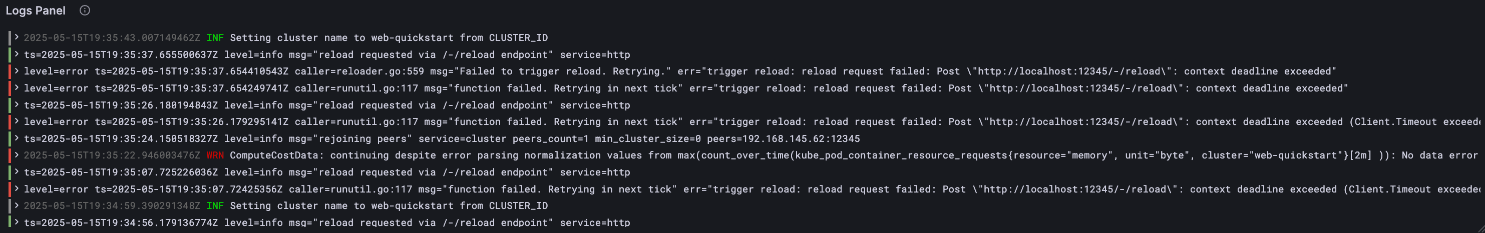
Log panel visualizations provide a raw list of system logs that you can search and filter when troubleshooting.
![A logs panel visualization]()
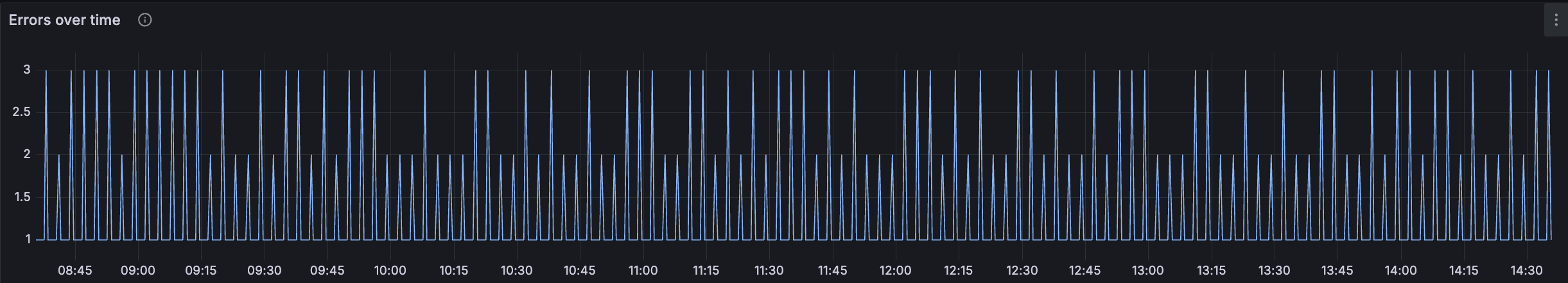
Log aggregation visualizations provide insight into the behavior and performance of your systems, offering a higher-level view compared to examining raw log lines. These types of visualizations extract and aggregate numerical data from logs, such as error counts, request durations, or processing rates. From this data you create dashboards that offer a quick and easily digestible view of your system’s overall health and performance trends over time.
![A time-series visualization error logs]()
Dashboards and visualizations transform raw data into actionable insights, empowering SREs to maintain high availability, optimize resource allocation, and deliver a seamless user experience—all while saving the business money by minimizing disruptions and operational inefficiencies. By leveraging these visualizations, businesses can prevent costly downtime and maintain customer trust.