Heatmap
Heatmaps allow you to view histograms over time. While histograms display the data distribution that falls in a specific value range, heatmaps allow you to identify patterns in the histogram data distribution over time. For more information about heatmaps, refer to Introduction to histograms and heatmaps.
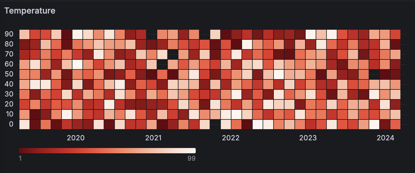
For example, if you want to understand the temperature changes for the past few years, you can use a heatmap visualization to identify trends in your data:
With Grafana Play, you can explore and see how it works, learning from practical examples to accelerate your development. This feature can be seen on Grafana Heatmaps.
You can use a heatmap visualization if you need to:
- Visualize a large density of your data distribution.
- Condense large amounts of data through various color schemes that are easier to interpret.
- Identify any outliers in your data distribution.
- Provide statistical analysis to see how values or trends change over time.
Configure a heatmap visualization
Once you’ve created a dashboard, the following video shows you how to configure a heatmap visualization:
Supported data formats
Heatmaps support time series data.
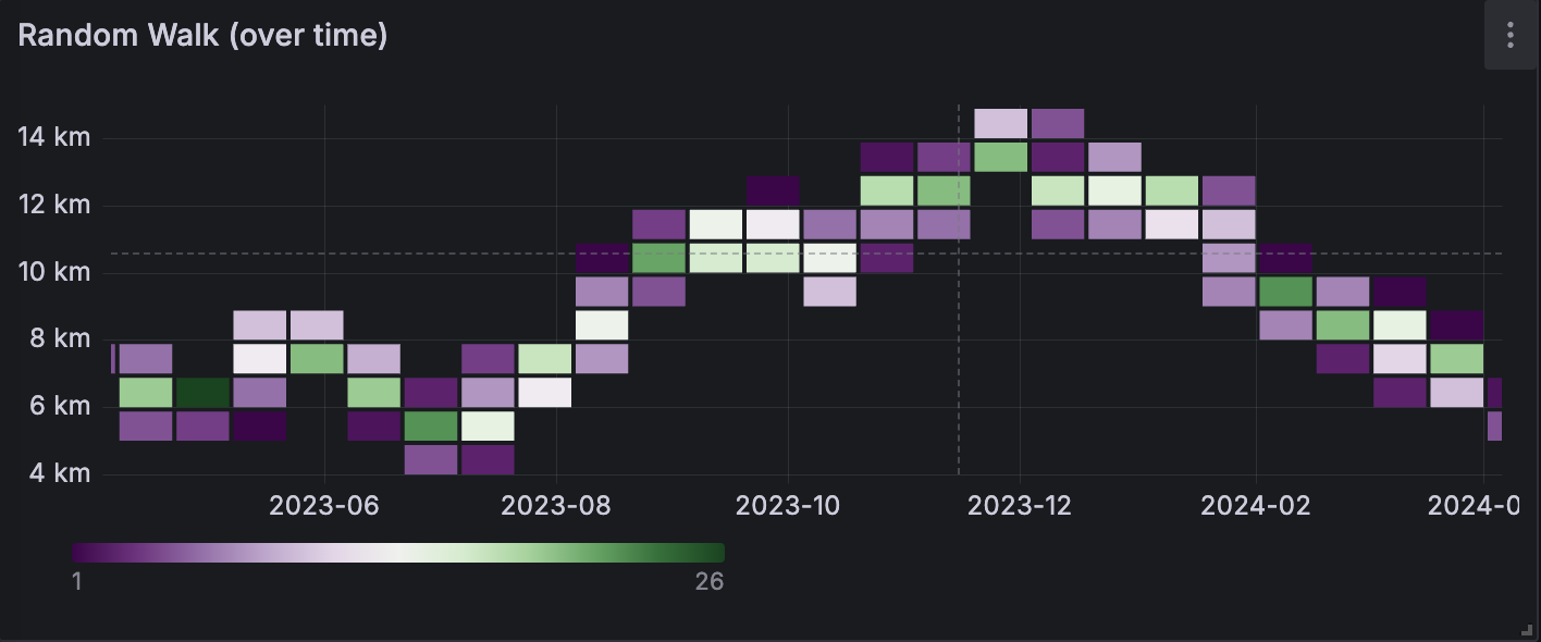
Example
The table below is a simplified output of random walk distribution over time:
The data is converted as follows:
Pan and zoom panel time range
You can pan the panel time range left and right, and zoom it and in and out. This, in turn, changes the dashboard time range.
Zoom in - Click and drag on the panel to zoom in on a particular time range.
Zoom out - Double-click anywhere on the panel to zoom out the time range.
When you zoom out, the range doubles with each double-click, adding equal time to each side of the range. For example, if the original time range is from 9:00 to 9:59, the time range changes as follow with each double-click:
- Next range: 8:30 - 10:29
- Next range: 7:30 - 11:29
Pan - Click and drag the x-axis area of the panel to pan the time range.
The time range shifts by the distance you drag. For example, if the original time range is from 9:00 to 9:59 and you drag 30 minutes to the right, the time range changes to 9:30 to 10:29.
For screen recordings showing these interactions, refer to the Panel overview documentation.
Configuration options
The following section describes the configuration options available in the panel editor pane for this visualization. These options are, as much as possible, ordered as they appear in Grafana.
Panel options
In the Panel options section of the panel editor pane, set basic options like panel title and description, as well as panel links. To learn more, refer to Configure panel options.
Heatmap options
The following options control how data in the heatmap is calculated and grouped.
Y-Axis options
The following options define the display of the y-axis.
Multiple y-axes
In some cases, you might want to display multiple y-axes. For example, if you have a dataset showing both temperature and humidity over time, you might want to show two y-axes with different units for the two series.
You can configure multiple y-axes and control where they’re displayed in the visualization by adding field overrides. This example of a dataset that includes temperature and humidity describes how you can configure that. Repeat the steps for every y-axis you wish to display.
Colors options
The color spectrum controls the mapping between value count (in each bucket) and the color assigned to each bucket. The leftmost color on the spectrum represents the minimum count and the color on the right most side represents the maximum count. Some color schemes are automatically inverted when using the light theme.
You can also change the color mode to Opacity. In this case, the color will not change but the amount of opacity will change with the bucket count
Mode
Use the following options to define the heatmap colors.
- Scheme - Bucket value represented by cell color.
- Scheme - If the mode is Scheme, then select a color scheme.
- Opacity - Bucket value represented by cell opacity. Opaque cell means maximum value.
- Color - Cell base color.
- Scale - Scale for mapping bucket values to the opacity.
- Exponential - Power scale. Cell opacity calculated as
value ^ k, wherekis a configured Exponent value. If exponent is less than1, you will get a logarithmic scale. If exponent is greater than1, you will get an exponential scale. In case of1, scale will be the same as linear.- Exponent - Value of the exponent, greater than
0.
- Exponent - Value of the exponent, greater than
- Linear - Linear scale. Bucket value maps linearly to the opacity.
- Exponential - Power scale. Cell opacity calculated as
Steps
Set a value between 1 and 128.
Reverse
Toggle the switch to reverse the color scheme. This option only applies the Scheme color mode.
Start/end color scale from value
By default, Grafana calculates cell colors based on minimum and maximum bucket values. With Start color scale from value and End color scale at value, you can overwrite those values. Consider a bucket value as a z-axis, with the start and end values as z-min and z-max.
- Start color scale from value - Minimum value used for cell color calculation. The placeholder Auto (min) uses the series minimum value. If the bucket value is less than this value, then it’s mapped to the minimum color.
- End color scale at value - Maximum value used for cell color calculation. The placeholder Auto (max) uses the series maximum value. If the bucket value is greater than this value, then it’s mapped to the maximum color.
Cell display options
Use these settings to control the display of heatmap cells.
Tooltip options
Tooltip options control the information overlay that appears when you hover over data points in the visualization.
Tooltip mode
When you hover your cursor over the visualization, Grafana can display tooltips. Choose how tooltips behave.
- Single - The hover tooltip shows only a single series, the one that you are hovering over on the visualization.
- All - The hover tooltip shows all series in the visualization. Grafana highlights the series that you are hovering over in bold in the series list in the tooltip.
- Hidden - Do not display the tooltip when you interact with the visualization.
Use an override to hide individual series from the tooltip.
Show color scale
When you set the Tooltip mode to Single, this option is displayed. This option controls whether or not the tooltip includes the color scale that’s also represented in the legend. When the color scale is included in the tooltip, it shows the hovered value on the scale:

Legend options
Choose whether you want to display the heatmap legend on the visualization by toggling the Show legend switch.
Annotation options
Exemplars
Set the color used to show exemplar data.
Data links and actions
Data links allow you to link to other panels, dashboards, and external resources while maintaining the context of the source panel. You can create links that include the series name or even the value under the cursor.
Note
Actions are not supported for this visualization.
For each data link, set the following options:
- Title
- URL
- Open in new tab
To learn more, refer to Configure data links and actions.
Field overrides
Overrides allow you to customize visualization settings for specific fields or series. When you add an override rule, it targets a particular set of fields and lets you define multiple options for how that field is displayed.
Choose from the following override options:
To learn more, refer to Configure field overrides.


