Gauge
Gauges are single-value visualizations that allow you to quickly visualize where a value falls within a defined or calculated min and max range. With repeat options, you can display multiple gauges, each corresponding to a different series, column, or row.
You can use gauges if you need to track:
- Service level objectives (SLOs)
- How full a piece of equipment is
- How fast a vehicle is moving within a set of limits
- Network latency
- Equipment state with set point and alarm thresholds
- CPU consumption (0-100%)
- RAM availability
Configure a gauge visualization
The following video provides beginner steps for creating gauge panels. You’ll learn the data requirements and caveats, special customizations, and much more:
With Grafana Play, you can explore and see how it works, learning from practical examples to accelerate your development. This feature can be seen on Grafana Gauge Visualization.
Supported data formats
To create a gauge visualization you need a dataset containing at least one numeric field. These values are identified by the field name. Additional text fields aren’t required but can be used for identification and labeling.
Example - One row, multiple values
The gauge visualization can support multiple fields in a dataset.
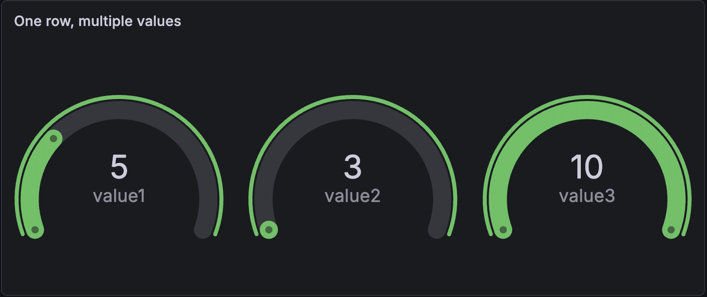
When there are multiple values in the dataset, the visualization displays multiple gauges and automatically defines the minimum and maximum. In this case, those are 3 and 10. Because the minimum and maximum values are defined, each gauge is shaded in to show that value in relation to the minimum and maximum.
Example - Multiple rows and values
The gauge visualization can display datasets with multiple rows of data or even multiple datasets.
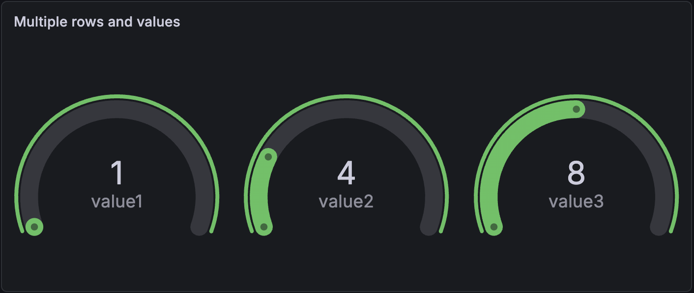
By default, the visualization calculates a single value per column or series and displays only the last row of data. However, it derives the minimum and maximum from the full dataset, even if those values aren’t visible.
In this example, that means only the last row of data, row C, is displayed in the gauges and the minimum and maximum values are 1 and 15. The value 1 is displayed because it’s in the last row, while 15 is not.
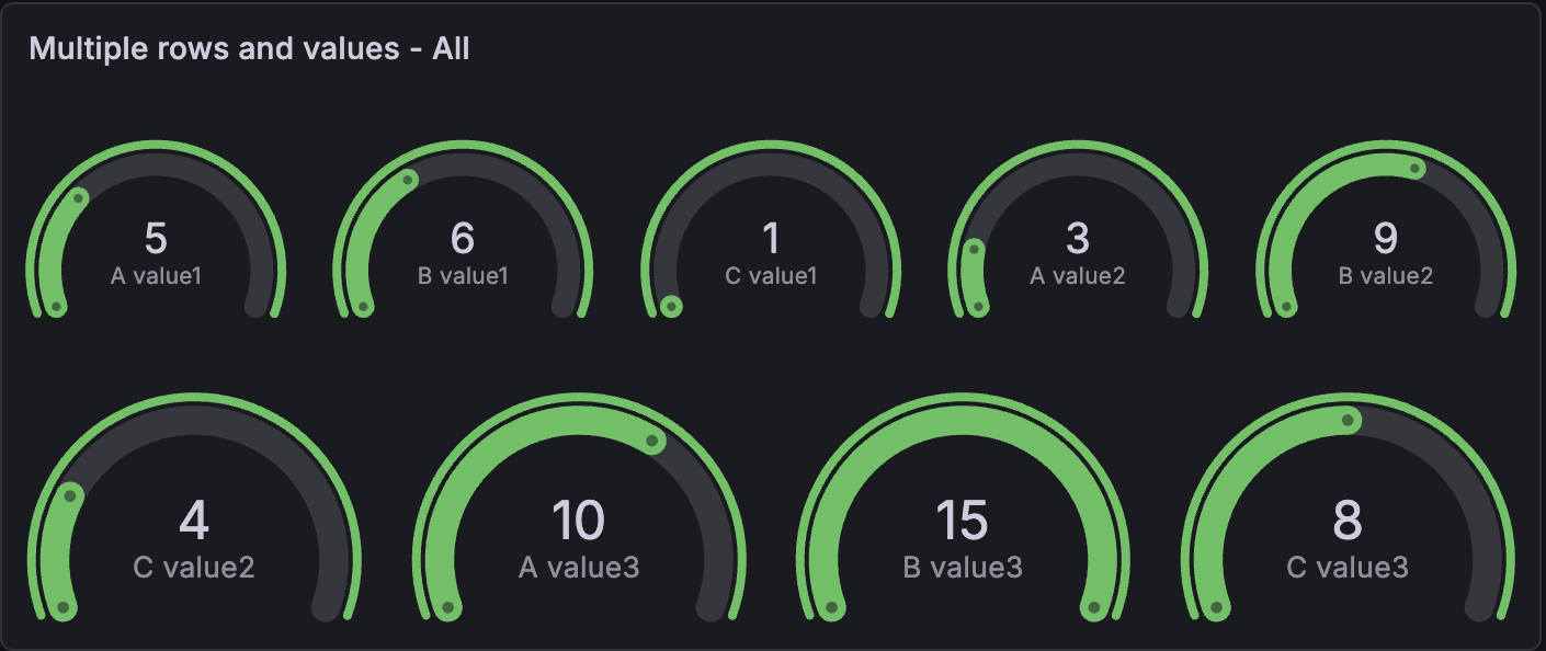
If you want to show one gauge per table cell, under Value options, change the Show setting from Calculate to All values. Each gauge label is a concatenation of the text column with each value’s column name.
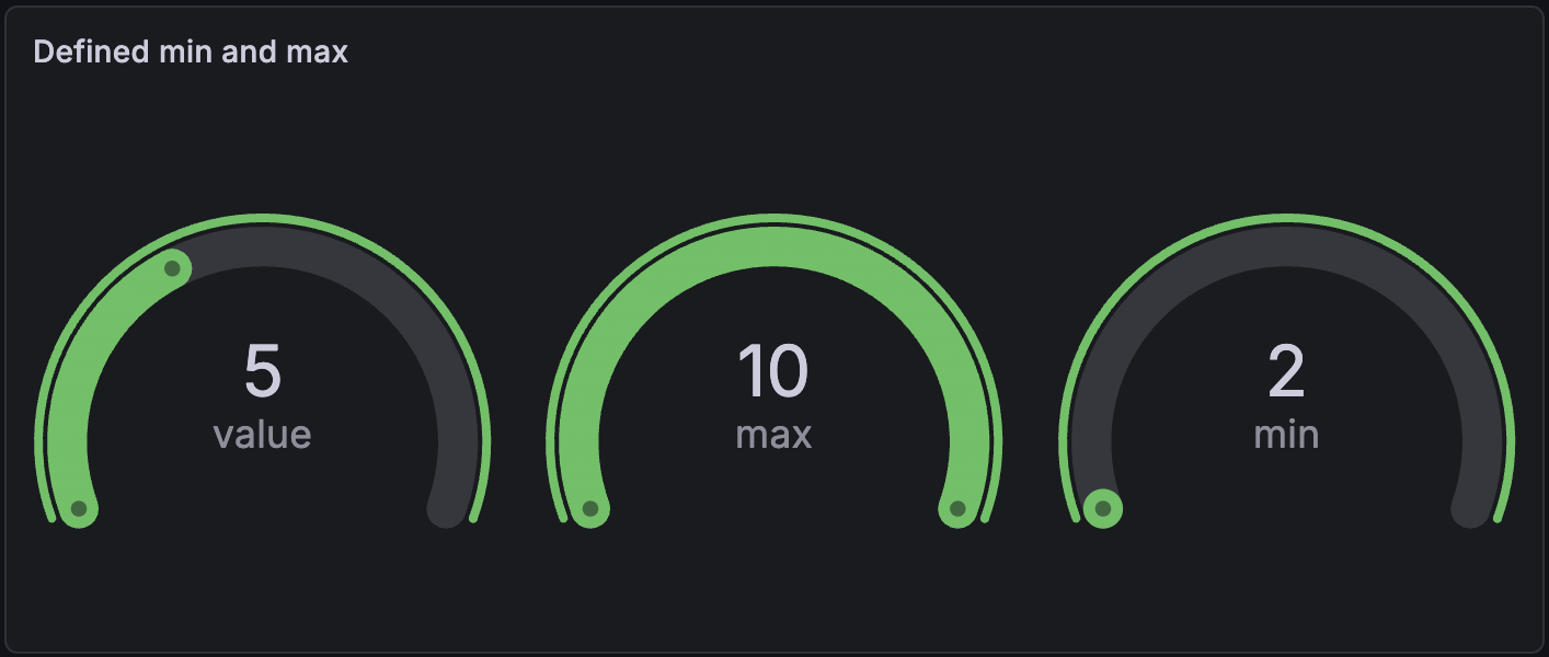
Example - Control min and max
You can control the minimum and maximum values by defining them directly in your dataset. This is an alternative to setting it manually in the field options.
In this example, to hide the min and max fields, select the “value” field in Value options > Fields.
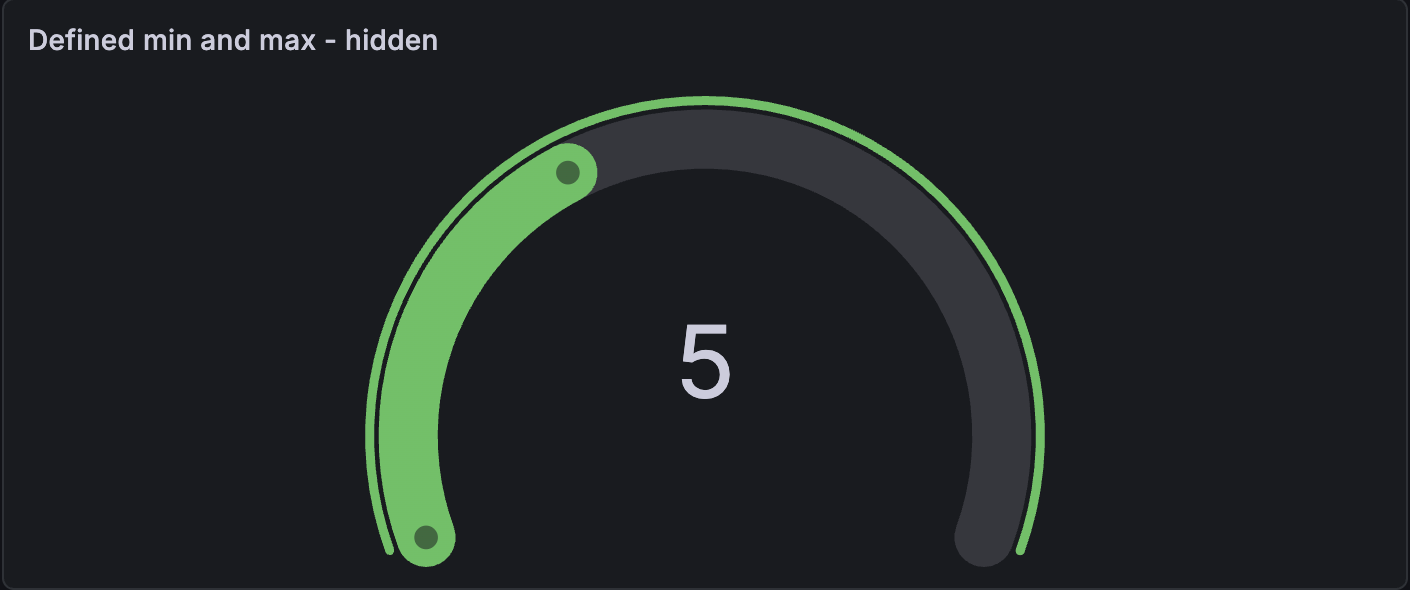
Even when minimum and maximum values aren’t displayed, the visualization still pulls the range from them.
Configuration options
The following section describes the configuration options available in the panel editor pane for this visualization. These options are, as much as possible, ordered as they appear in Grafana.
Panel options
In the Panel options section of the panel editor pane, set basic options like panel title and description, as well as panel links. To learn more, refer to Configure panel options.
Value options
Use the following options to refine how your visualization displays the value:
Gauge options
Adjust how the gauge is displayed.
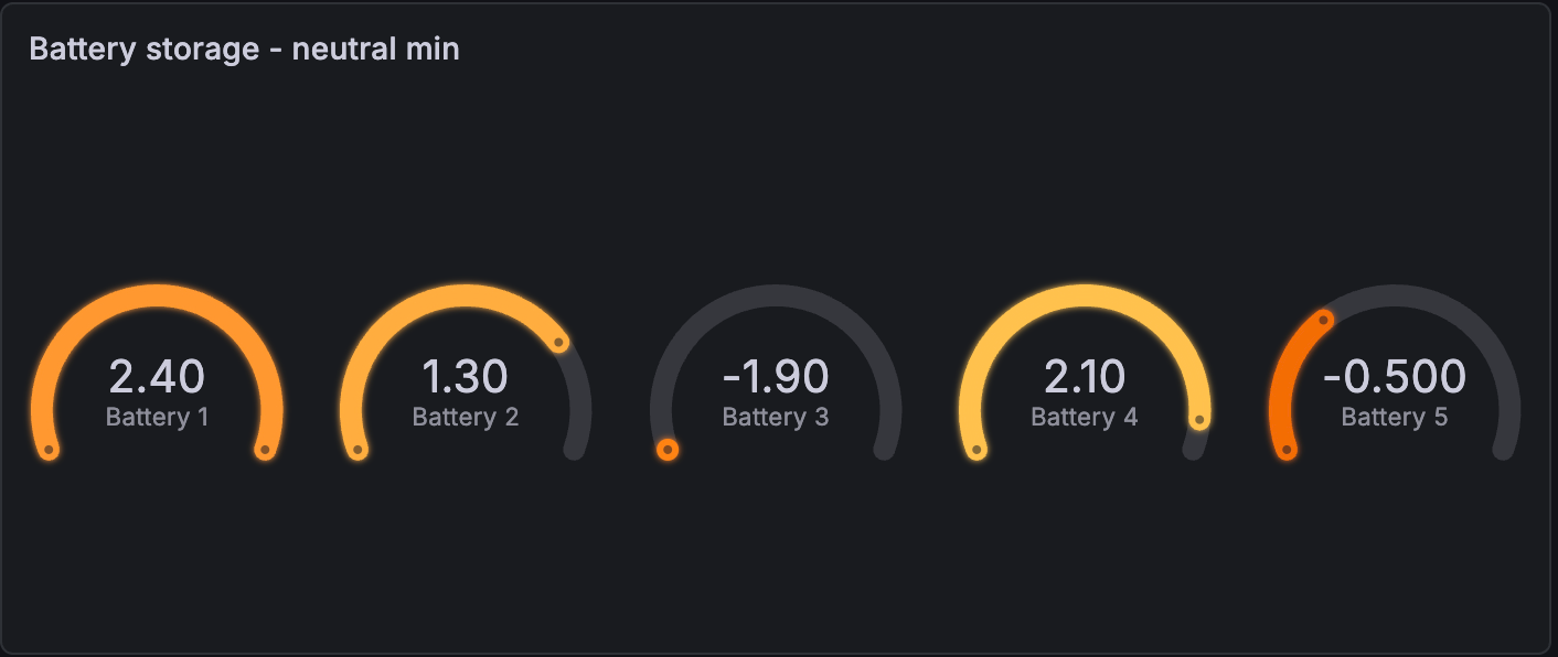
Neutral value
Set the starting value from which every gauge will be filled when it shouldn’t be the minimum value. This option is especially useful in cases where the range of data values includes negative numbers.
For example, you want to display the storage of several batteries and the power range is from -2.5 kW (discharging) to 2.5 kW. When the minimum value is used as the starting point for the gauges, the visualization looks like this:
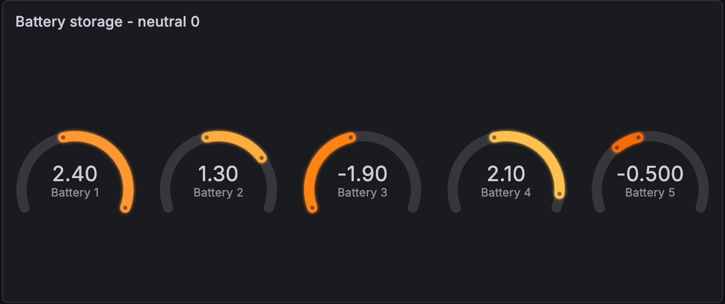
If you enter a neutral value of 0, the visualization looks like this and is easier to reason about:
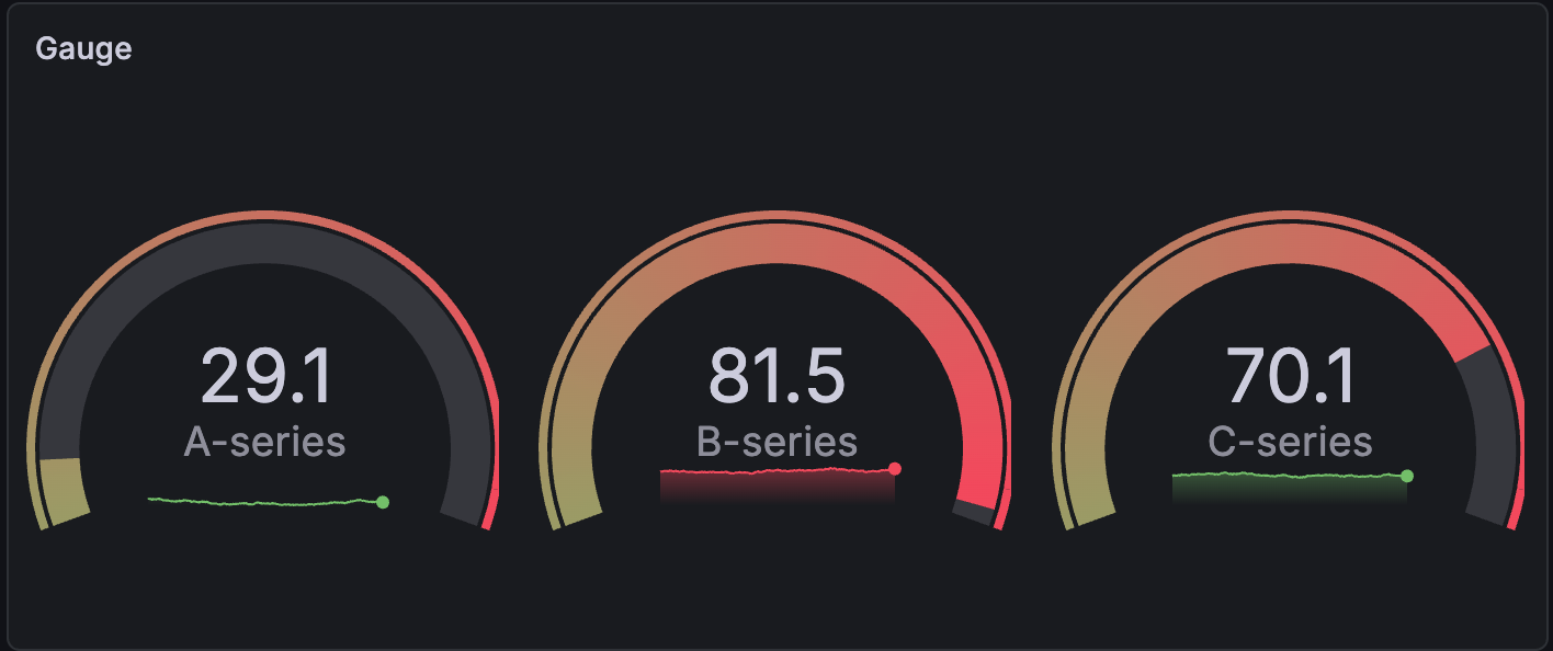
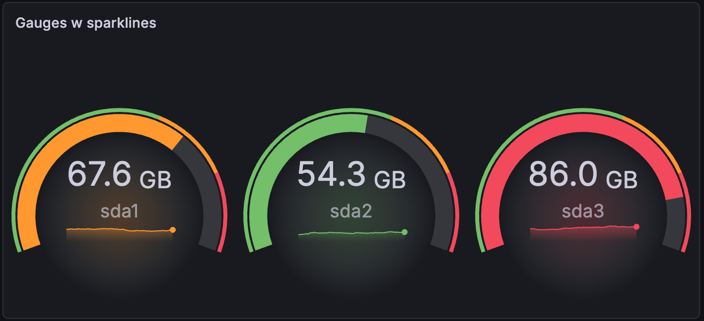
Show sparkline
If you want to visualize the list of values as a time series along with the calculated gauge value, toggle on the Show sparkline switch. Each gauge displays the sparkline inside the circle or arc:
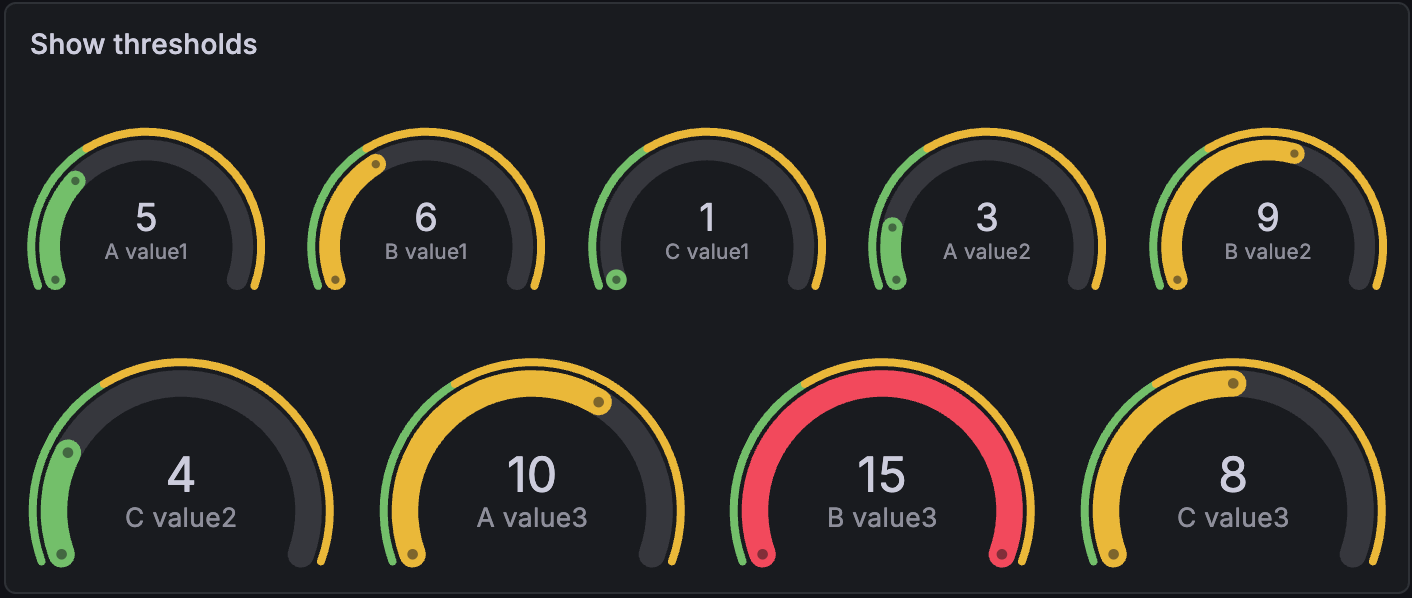
Show thresholds
Control whether a threshold band is shown outside the inner gauge value band.
Text size options
Adjust the sizes of the gauge text.
- Title - Enter a numeric value for the gauge title size.
- Value - Enter a numeric value for the gauge value size.
Standard options
Standard options in the panel editor pane let you change how field data is displayed in your visualizations. When you set a standard option, the change is applied to all fields or series. For more granular control over the display of fields, refer to Configure overrides.
To learn more, refer to Configure standard options.
Data links and actions
Data links allow you to link to other panels, dashboards, and external resources while maintaining the context of the source panel. You can create links that include the series name or even the value under the cursor. To learn more, refer to Configure data links and actions.
Note
Actions are not supported for this visualization.
For each data link, set the following options:
- Title
- URL
- Open in new tab
Data links for this visualization don’t include the One click switch, however, if there’s only one data link configured, that data link has single-click functionality. If multiple data links are configured, then clicking the visualization opens a menu that displays all the data links.
Value mappings
Value mapping is a technique you can use to change how data appears in a visualization.
For each value mapping, set the following options:
- Condition - Choose what’s mapped to the display text and (optionally) color:
- Value - Specific values
- Range - Numerical ranges
- Regex - Regular expressions
- Special - Special values like
Null,NaN(not a number), or boolean values liketrueandfalse
- Display text
- Color (Optional)
- Icon (Canvas only)
To learn more, refer to Configure value mappings.
Thresholds
A threshold is a value or limit you set for a metric that’s reflected visually when it’s met or exceeded. Thresholds are one way you can conditionally style and color your visualizations based on query results.
For each threshold, set the following options:
To learn more, refer to Configure thresholds.
Field overrides
Overrides allow you to customize visualization settings for specific fields or series. When you add an override rule, it targets a particular set of fields and lets you define multiple options for how that field is displayed.
Choose from the following override options:
To learn more, refer to Configure field overrides.


