 Grafana Cloud
Visualize data
Dashboards
Build dashboards
Create dashboards
Dashboard groupings
Grafana Cloud
Visualize data
Dashboards
Build dashboards
Create dashboards
Dashboard groupingsDashboard panel groupings
To help create meaningful sections in your dashboard, you can group panels into rows or tabs. Rows and tabs let you break up big dashboards or make one dashboard out of several smaller ones.
You can think of the dashboard as a series of nested containers: the dashboard is the largest container and it contains panels, rows, or tabs. Rows and tabs are the next largest containers, and they contain panels or other rows and tabs.
You can nest:
- Rows in a row
- Rows in a tab
- Tabs in a row
You can nest up to three levels deep, which means a dashboard can have a maximum of five configuration levels:
- Dashboard
- Grouping 1 - Row or tab
- Grouping 2 - Row or tab
- Grouping 3 - Row or tab
- Panels
The following screenshot demonstrates how groupings work:
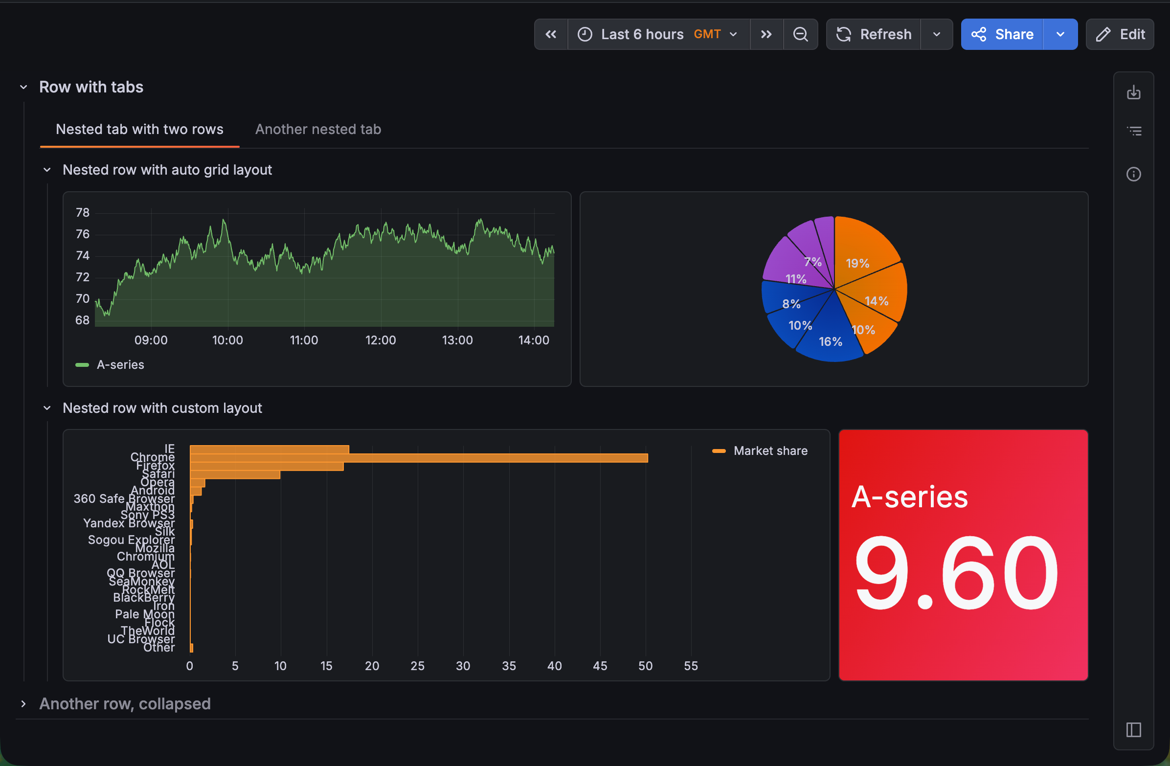
- You can only have one type of grouping at the first level. In this case, that’s two rows: Row with tabs and Another row, collapsed.
- Inside of those first-level groupings however, you have the freedom to add different dashboard elements. There are tabs nested in Row with tabs, but you could nest rows, tabs, or panels inside Another row, collapsed.
- Also, you can have different panel layouts in within a row or tab. In this dashboard, one tab contains two rows that have two different layouts.
In addition to the option to add groupings from the sidebar, when you hover your cursor over relevant parts of the dashboard, + Add panel, + New row, + New tab, Group panels, and ungroup buttons are visible.
The following sections describe:
Grouping configuration options
The following table describes the options you can set for a row or tab:
Grouping layouts
When you have panels grouped into rows or tabs, the Layout options available depend on which dashboard element is selected and the nesting level of that element.
You can nest up to three levels deep, which means a dashboard can have a maximum of five configuration levels, with the following layout options:
- Dashboard: Layout options allow you to choose between rows and tabs or custom and auto layouts.
- Grouping 1 (outer): Layout options allow you to choose between rows and tabs.
- Grouping 2 (middle): Layout options allow you to choose between rows and tabs.
- Grouping 3 (inner): Layout options allow you to choose between custom and auto grid (refer to Panel layouts).
- Panels: No layout options
You can switch between rows and tabs or update the panel layout by clicking the parent container and changing the layout selection.
Group panels
To group panels already on a dashboard, follow these steps:
Navigate to the dashboard you want to update.
Click Edit.
Do one of the following:
- Click the Add new element icon (blue plus sign) and select Group into rows or Group into tabs.
- Under a panel or group of panels, hover your mouse to reveal the Group panels button, click it and select Group into row or Group into tab.
All the panels are moved into the grouping, and a dotted blue line surrounds the row or tab. The sidebar opens, displaying the relevant options.
Tip
While grouping is typically used for multiple panels, you can start a grouping with just one panel.
Set the grouping configuration options in the sidebar.
(Optional) Add one or both of the following:
Click Save.
(Optional) Enter a description of the changes you’ve made.
Click Save.
Click Exit edit.
You can also start a grouping by adding a row or tab from the sidebar and then adding panels to that grouping.
Add more groupings at the same level
To add more groupings at the same level, follow these steps:
- Click the dashboard or grouping where you want to more groupings, and click + New row or + New tab (only one option will be available).
- Set the configuration options for the new grouping.
- Click + Add panel to begin adding panels to the new grouping.
- Click Save.
- (Optional) Enter a description of the changes you’ve made.
- Click Save.
- Click Exit edit.
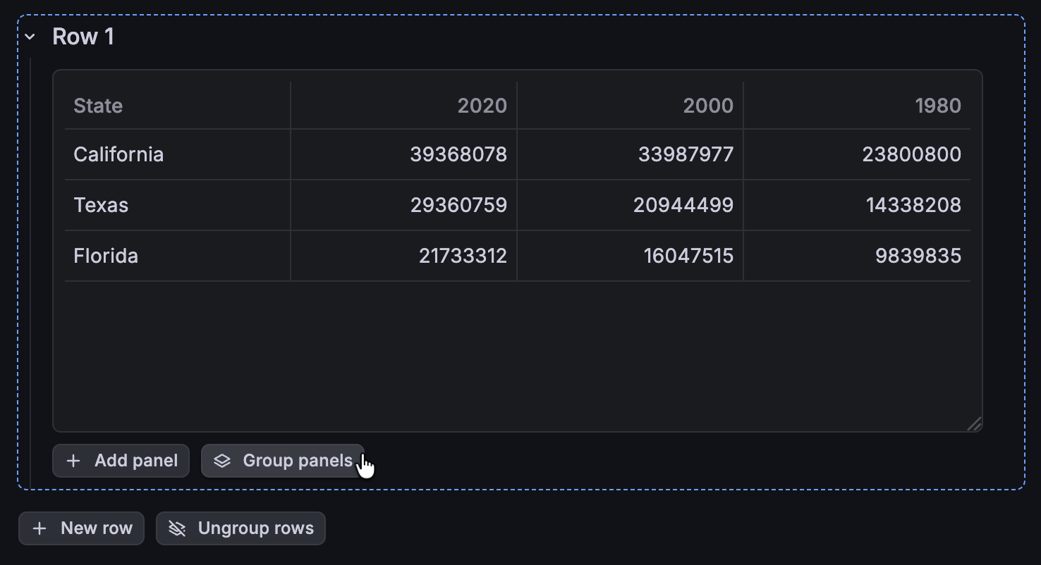
Add nested groupings
To add a nested grouping, follow these steps:
Click the grouping where you want to add the nested grouping.
Under a panel or group of panels in the grouping, click Group panels and select Group into row or Group into tab (Group into tab is only available if the parent grouping is a row).
![Adding a nested grouping]()
The new grouping is added inside the first grouping, and the panels are moved into the nested grouping. The sidebar opens displaying the relevant configuration options.
Set the configuration options for the nested grouping.
Click Save.
(Optional) Enter a description of the changes you’ve made.
Click Save.
Click Exit edit.
You can add more one more level of grouping if needed.
Ungroup panels
You can ungroup some or all of the dashboard groupings without losing your panels.
When you ungroup a row or tab, all the groupings inside it are ungrouped and the panels are moved into the next higher-level grouping. If there are no more groupings left, the panels are moved onto the dashboard.
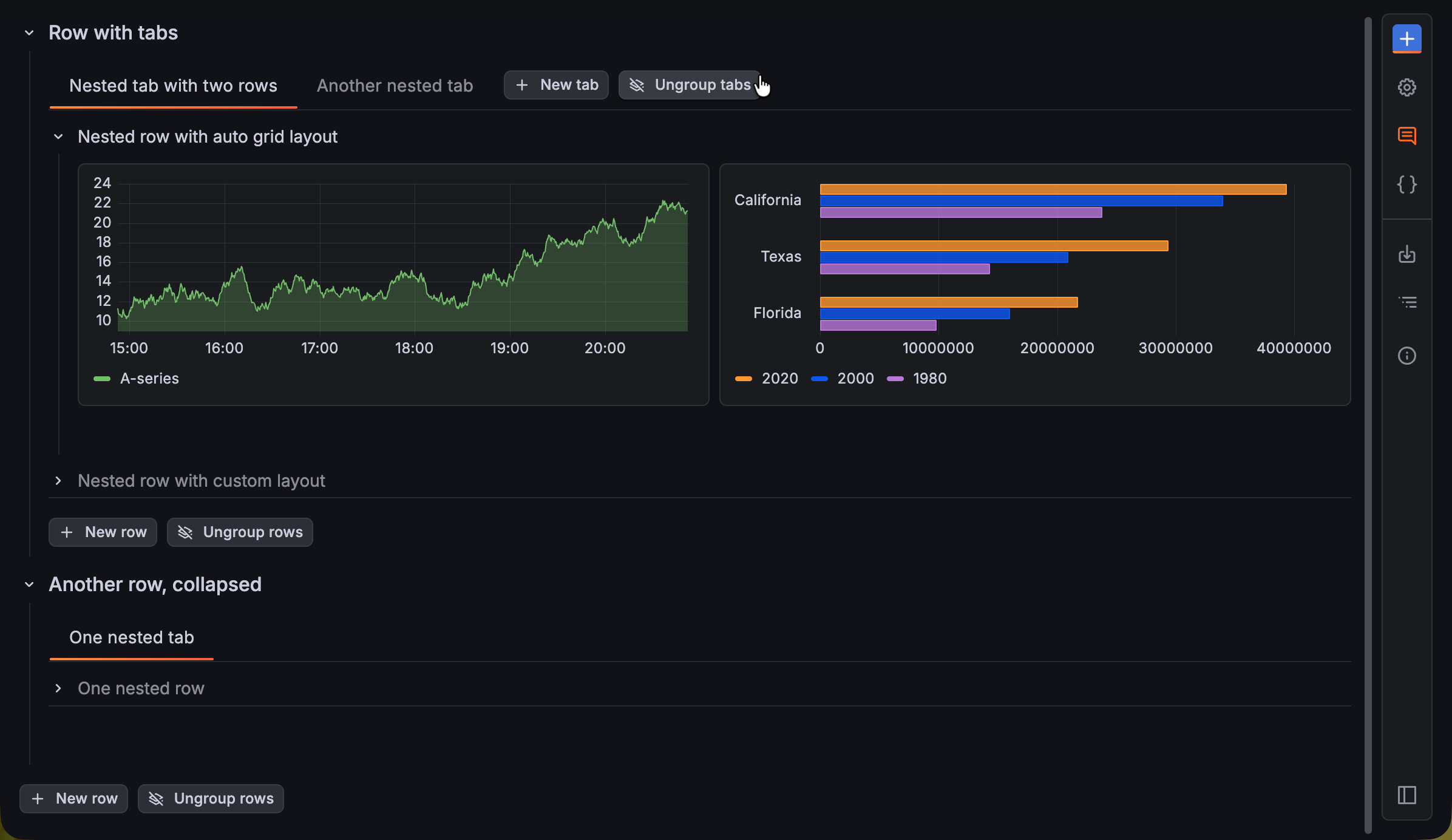
- Ungroups all the rows inside Nested tab with rows leaving the panels in that tab.
- Ungroups all the tabs inside Row with tabs, leaving the panels in that row.
- Removes all groupings on the dashboard, leaving just the panels on the dashboard.
The Ungroup rows and Ungroup tabs buttons are only visible when you hover your mouse over the relevant part of the dashboard
Caution
If you delete a grouping, rather than ungrouping it, its panels are deleted as well.
To remove groupings, follow these steps:
- Navigate to the dashboard you want to update.
- Click Edit.
- (Optional) Click the Content outline icon to quickly navigate to the grouping you want to remove.
- Hover your mouse over the relevant area to show the Ungroup rows or Ungroup tabs button, then click it to ungroup all rows or tabs, including any nested groupings.
- If you’ve ungrouped panels that were previously in different panel layouts, you’ll be prompted to select a common layout type for all the panels; click Convert to Auto grid or Convert to Custom.
- Click Save.
- (Optional) Enter a description of the changes you’ve made.
- Click Save.
- Click Exit edit.
Drag tabs between rows
In dashboards that include multiple rows with nested tabs, you can drag and drop nested tabs between rows. To do this, the receiving row just needs to have one nested tab already.
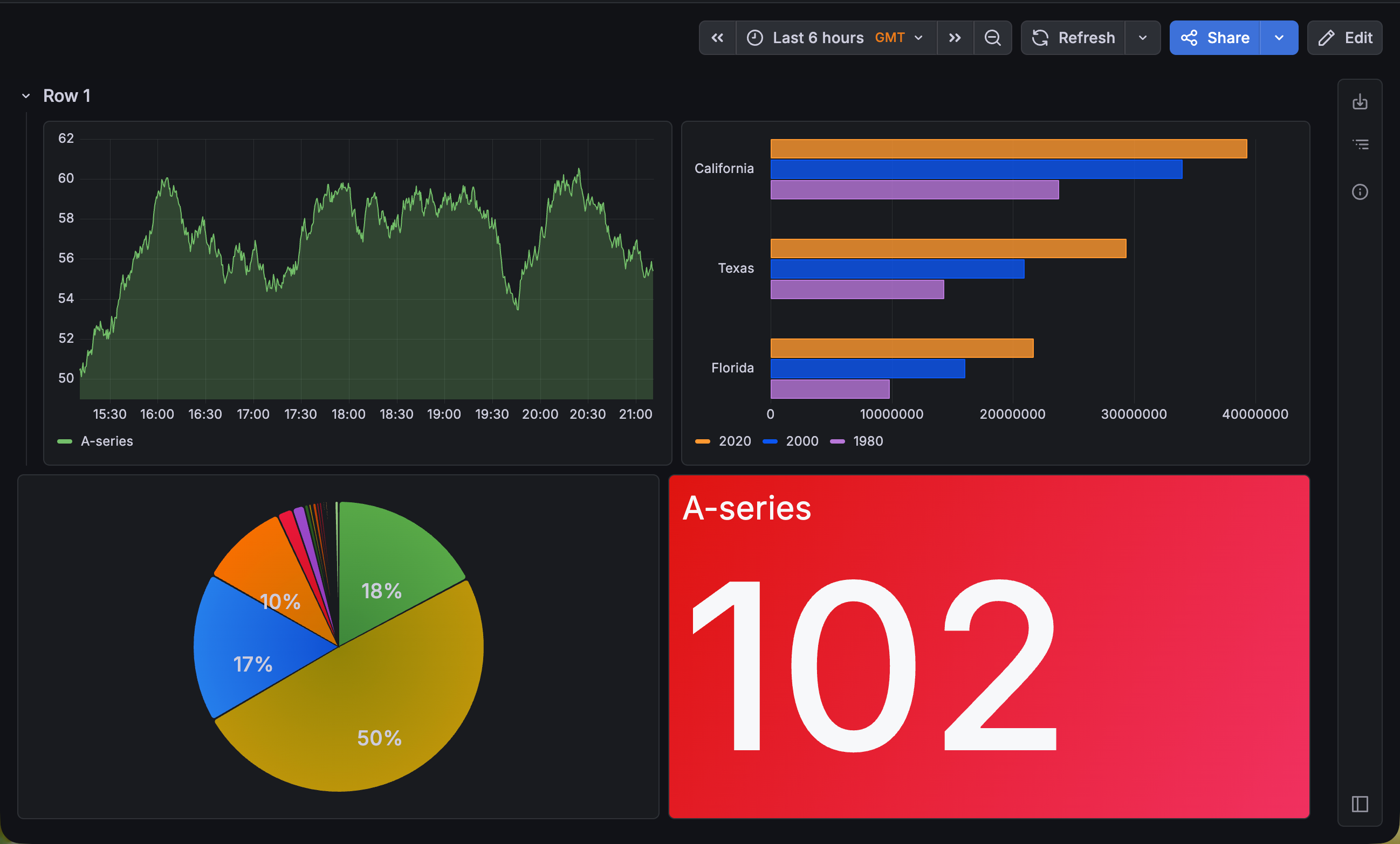
Place panels outside of groupings with headerless rows
If you have a row with panels, but you want the panels to appear ungrouped, you can use the Hide row header switch in the row configuration to achieve this.
In view mode, the row header is hidden, so that the panels in that row appear ungrouped. In the following image, the panels are grouped into two rows, but the header of the second row is hidden:
When you hide the header of a row, you can’t collapse the row.
Grouping-level variables
Note
Grouping-level variables is currently in public preview. Grafana Labs offers limited support, and breaking changes might occur prior to the feature being made generally available.
To use this feature, enable the
dashboardSectionVariablesfeature toggle in your Grafana configuration file.
You can add variables to groupings that apply only to the panels in that grouping.
For example, if your dashboard includes both an API gateway and a database, you might want to apply two different $instance variables.
Grouping-level variables address this by letting each row or tab have its own independent filters.
In the API gateway and database scenario, the API gateway grouping can use one set of instances, while a database grouping uses another set.
However, both groupings still share the same time range, and the underlying dashboard remains unchanged.
The following image shows an example using two rows of panels:
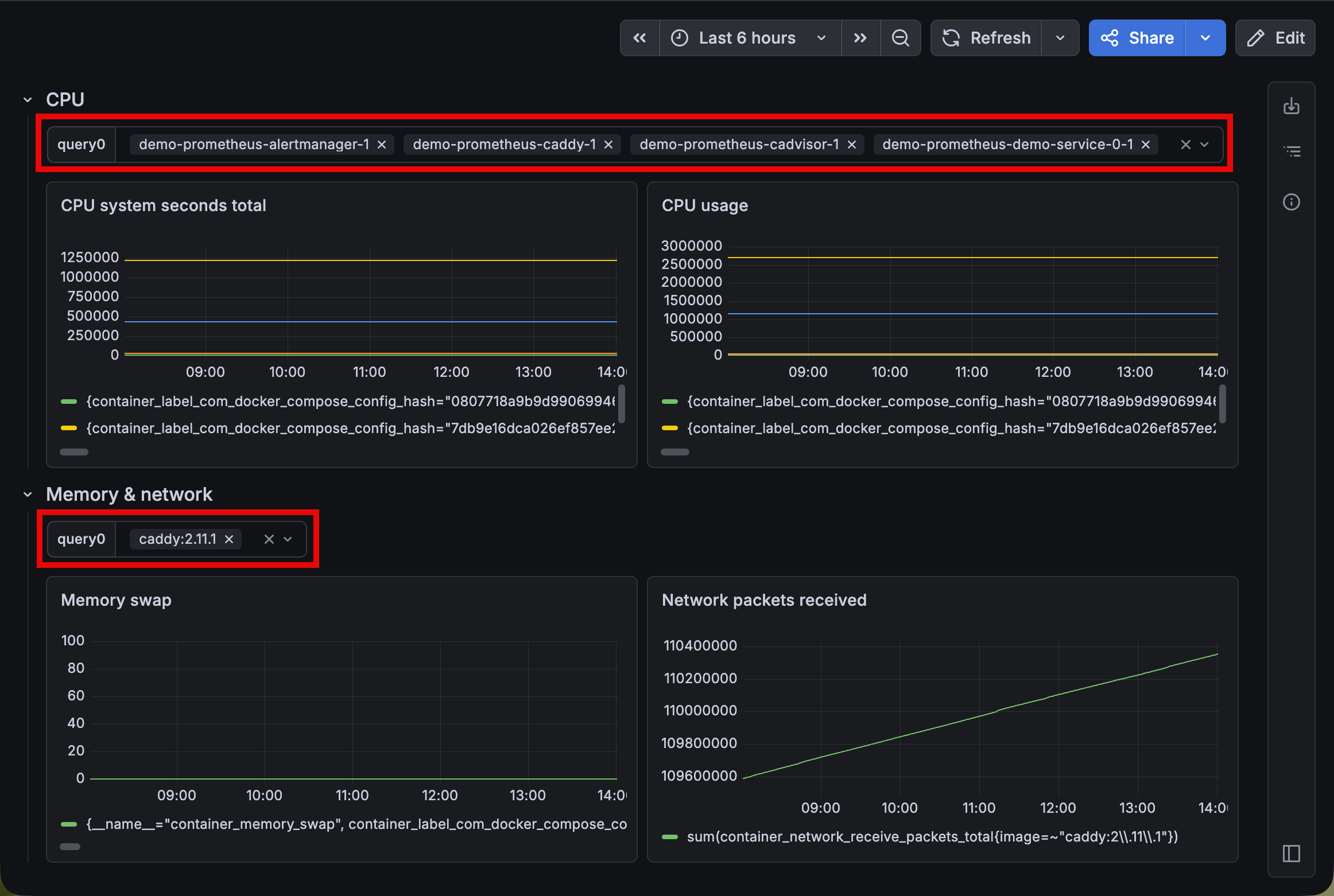
Panels in the grouping resolve grouping-level variables first, then fall back to dashboard-level variables.
The panel query editor is context-aware, so the autocomplete only shows the variables available to the panel you’re editing. Also, grouping-level variables carry over when you convert between rows and tabs, change layouts, and work with repeating rows and tabs.
Grouping-level variables are supported for all variable types except Filter and group by (formerly ad hoc variables).


