 Dynamic dashboards in public preview
Dynamic dashboards in public preview
Last year, we launched Dynamic dashboards as an experimental feature. Today, we’re pleased to announce that it is now in public preview. This change includes new functionality and a revamped user experience.
New functionality
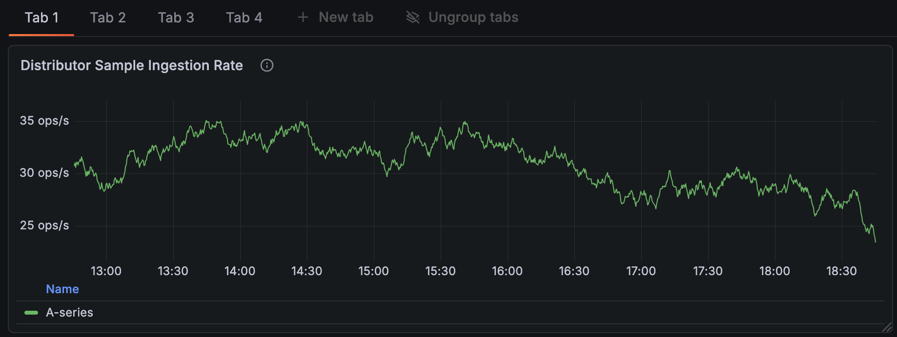
Tabs
Structure your dashboards horizontally, as well as vertically, to organise the content for different contexts and user groups.
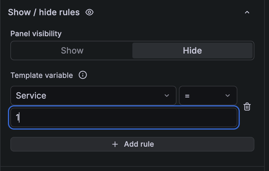
Show / hide functionality
Show or hide panels, rows, or tabs based on the selected variable or whether the panel returns data, so viewers only see what’s relevant to their context.
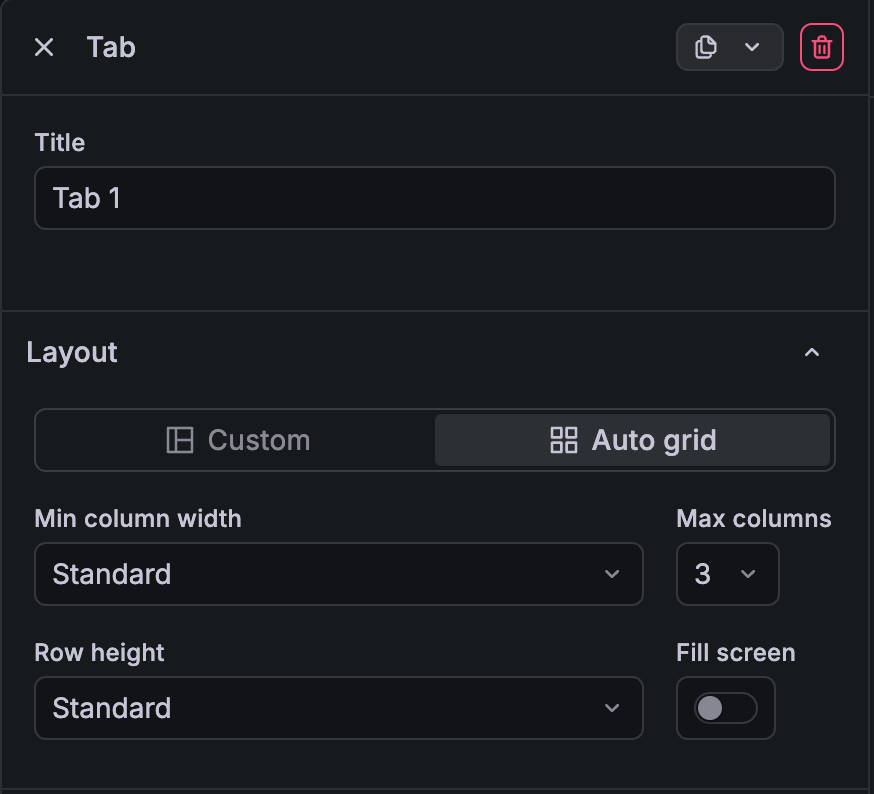
Auto grid layout
Set your row, tab, or dashboard to Auto grid so the panel size adapts to the space available in the display. Configure minimum column width, row height, and the maximum number of columns per row to meet your requirements. If you prefer setting different panel widths and heights within the same row, you can use the Custom layout option, which is the same as the pre-Dynamic dashboards grid. Auto grid also enables the show/hide functionality. (To avoid leaving unsightly gaps in the dashboard, we require you to set the layout to auto grid before configuring any show/hide rules.)
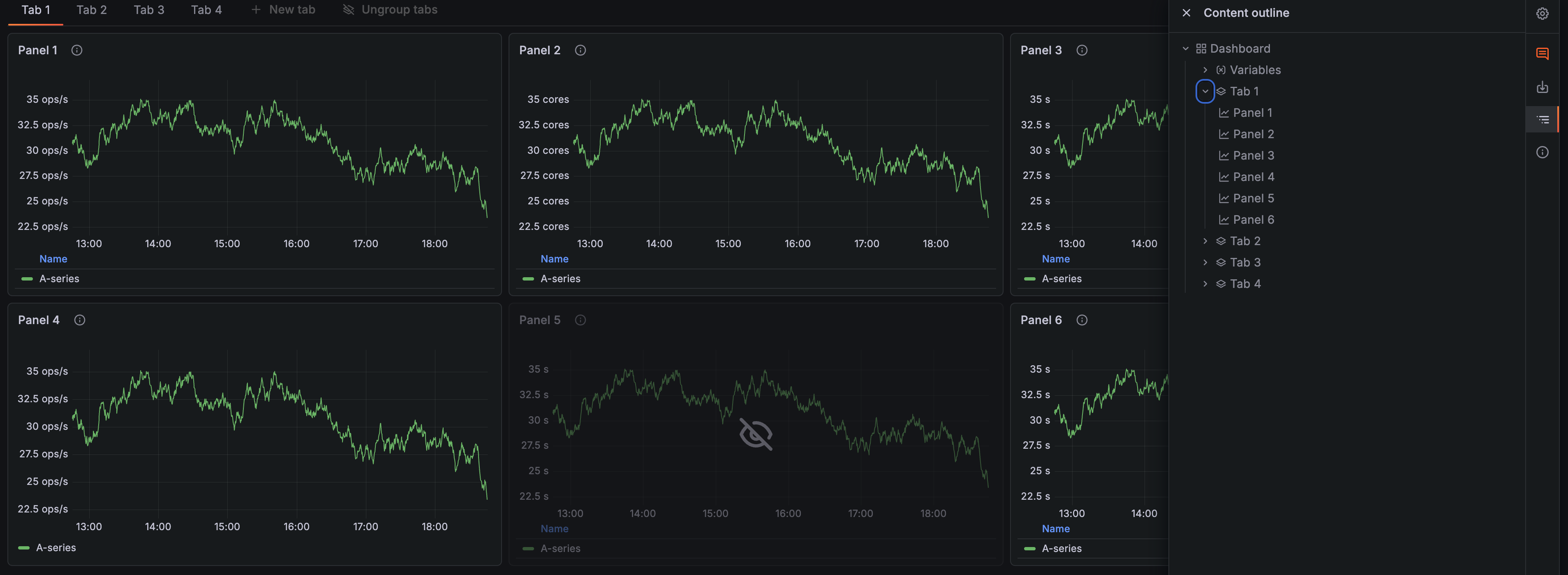
Dashboard content outline
Find the content you need in your dashboards easily through a clickable outline. As an editor, click on an element in the outline to scroll to it and select it to make quick changes to the title or description. As a viewer, click on a panel, row, or tab to navigate to it instantly and find the information you’re looking for.
User experience changes
Side toolbar instead of a second top toolbar
To provide additional vertical space, we’ve removed the second top toolbar in favour of a toolbar on the right side of the screen. This helps both viewers and editors see more information at once. You can find the dashboard content outline and alert rules in the side toolbar, and editors can also access dashboard settings there.
Context-aware editing from the dashboard
Quickly update a panel’s title and description from the dashboard sidebar without entering panel edit mode. This sidebar also lets you quickly edit rows, tabs, and template variables.