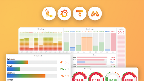
Isilon Data Insights Cluster Capacity Utilization Table
Color coded table showing cluster capacity utilization. Good to see the clusters with the highest capacity utilization.
This dashboard to provide a view of the capacity utilization across multiple clusters monitored using the Isilon Data Insights Connector available at https://github.com/Isilon/isilon_data_insights_connector.
The dashboard provides a sortable table showing clusters and their current capacity utilization.
Questions, suggestions, enhancements are welcome at https://github.com/Isilon/isilon_data_insights_connector and/or the Slack channel at https://codecommunity.slack.com/archives/isilon.
Thanks from the Isilon SDK team.
Data source config
Collector config:
Upload an updated version of an exported dashboard.json file from Grafana
| Revision | Description | Created | |
|---|---|---|---|
| Download |
