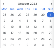
Date and time
The Date and Time element provides access to the built-in Grafana date time component where users can select a date and time using familiar controls.
This element has the following specific options:
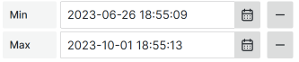
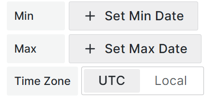
- Min: Sets the allowed minimum.
- Max: Sets the allowed maximum.
Note
The Time Zone option is available starting from version 4.0.0.
- UTC. The date-time value is saved in the UTC zone,
- Local. The date-time value is saved following the browser’s time zone.
Change elements model
Note
Use this model to set elements if you use the
context.panel.onChangeElements([])method.Dynamic element creation and manipulation through the panel fetches the complete element model and sets it through a method. The elements aren’t saved in the panel options.
{
  uid:'',
  id: '',
  title: '',
  type: 'datetime',
  min: '',
  max: '',
  isUseLocalTime: true,
  labelWidth: 10,
  width: 30,
  tooltip: '',
  section: '',
  unit: '',
  value: '',
  disabled: false,
  background: '',
  labelBackground:'',
  labelColor: '',
  helpers: {
    showIf: () => true,
    disableIf: () => false,
    getOptions: () => [],
  }
}
Code example
/**
 * Hardcoded element
 */
const element = {
  uid: "uid-123",
  id: "element-123",
  title: "Element",
  type: "datetime",
  min: "",
  max: "",
  isUseLocalTime: true,
  labelWidth: 15,
  width: 150,
  tooltip: "",
  section: "",
  unit: "",
  value: "",
  background: "",
  labelBackground: "",
  labelColor: "",
  helpers: {
    showIf: () => true,
    disableIf: () => false,
    getOptions: () => [],
  },
};

const elementsForUI = [];
elementsForUI.push(element);

context.panel.onChangeElements(elementsForUI);
Code example with query action for initial request
/**
 * Convert JSON to form elements array
 */
const formElements = JSON.parse(
  context.panel.data.series[0].fields[0].values[0]
);
/**
 * Set elements with helpers
 */
context.panel.onChangeElements(
  formElements.map((element) => {
    const elementInForm = context.panel.elements.find(
      (item) => item.uid === element.uid
    );
    let value = element.value;

    if (element.uid === "comment" && elementInForm) {
      value = elementInForm.value;
    }

    return {
      ...element,
      value,
      helpers: {
        showIf: () => true,
        disableIf: () => false,
        getOptions: () => element.options,
      },
    };
  })
);
Element parameters
valuestring. Optional.
Current element value. Format: ‘2025-01-28T08:07:37.359Z’typestring. Required.
Element type: ‘datetime’.minstring. Optional.
Min available date. Format: ‘2025-01-28T08:07:37.359Z’maxstring. Optional.
Max available date. Format: ‘2025-01-28T08:07:37.359Z’isUseLocalTimeboolean. Required.
Use local time for output value or transform to UTC.
uidstring. Required.
A unique identifier used for correct mapping on the UI.idstring. Required.
The unique identifier of the element.titlestring. Required.
The title or label of the element. Equivalent to the ‘Label’ in the UI editor.
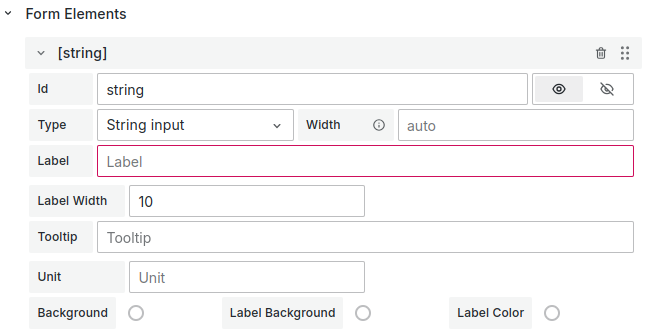
labelWidthNumber | null . Required.
The element label width.widthNumber | null. Required.
The element width.tooltipstring. Required.
The element tooltip. Leave as an empty string (’’) if not displayed.sectionstring. Required.
The unique section identifier (section ID). Specify this if the element is in a section. Leave as an empty string (’’) if the element has no section.unitstring. Required.
The units of measurement. Located to the right of the element. Leave as an empty string (’’) if the element has no unit.

backgroundstring. Optional.
The background color as a hex color code.labelBackgroundstring. Optional. The label background color as a hex color code.
labelColorstring. Optional.
The label color as a hex color code.helpersHelpers provide information about the item display or its disabled state and return options.
 {
  showIf: () => true,
  disableIf: () => false,
  getOptions: () => options || [],
}helpers.showIfFunction. Required. Returns true or false. Controls whether the element displays on the UI.
helpers.disableIfFunction. Required. Returns true or false. Controls whether the element is disabled on the UI.
helpers.getOptionsFunction. Required. Returns an array of options.
Each option contains the following properties:
value.
string. Required. The option value.label.
string. Required. The option label.
The Date-Time element does not support options for selection. However, they must be specified in the element object
Change options model
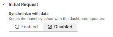
Note
Use this model to set elements if you use the
context.panel.onOptionsChange({})method.Elements added through this method are added to the panel options. The element’s operation might not match the expected behavior.
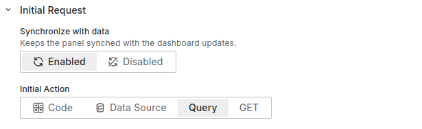
If you use this method in the initial request, disable the Synchronize option. Enabling the Synchronize option with
context.panel.onOptionsChange()in the Initial Request causes the panel to reload constantly.
{
  uid:'',
  id: '',
  title: '',
  type: 'datetime',
  min: '',
  max: '',
  isUseLocalTime: true,
  labelWidth: 10,
  width: 35,
  tooltip: '',
  section: '',
  unit: '',
  value: '',
  showIf: '',
  disableIf: '',
  fieldName: '',
  queryField: {},
  background: '',
  labelBackground:'',
  labelColor: '',
}
Code example
context.panel.onOptionsChange({
  ...context.panel.options,
  elements: context.panel.options.elements.map((element) => {
    return element.id === "name" ? { ...element, value: "test" } : element;
  }),
});const formElements = JSON.parse(
context.panel.data.series[0].fields[0].values[0]
);
context.panel.onOptionsChange({
...context.panel.options,
elements: formElements,
});valuestring. Optional.
Current element value. Format: ‘2025-01-28T08:07:37.359Z’typestring. Required.
Element type: ‘datetime’.minstring. Optional.
Min available date. Format: ‘2025-01-28T08:07:37.359Z’maxstring. Optional.
Max available date. Format: ‘2025-01-28T08:07:37.359Z’isUseLocalTimeboolean. Required.
Use local time for output value or transform to UTC.
uidstring. Required.
A unique identifier used for correct mapping on the UI.idstring. Required.
The unique identifier of the element.titlestring. Required.
The title or label of the element. Equivalent to the ‘Label’ in the UI editor.![Label field]()
labelWidthNumber | null . Required.
The element label width.widthNumber | null. Required.
The element width.tooltipstring. Required.
The element tooltip. Leave as an empty string (’’) if not displayed.sectionstring. Required.
The unique section identifier (section ID). Specify this if the element is in a section. Leave as an empty string (’’) if the element has no section.unitstring. Required.
The units of measurement. Located to the right of the element. Leave as an empty string (’’) if the element has no unit.![Unit of measurement]()
backgroundstring. Optional.
The background color as a hex color code.labelBackgroundstring. Optional.
The label background color as a hex color code.labelColorstring. Optional.
The label color as a hex color code.showIfstring. Optional.
The “Show if” function of the element returns true or false. Controls whether the element displays on the UI.{ showIf: "if (condition) {\n return true\n}\n return false"; }disableIfstring. Optional.
The “Disable if” function of the element returns true or false. Controls whether the element is disabled on the UI.{ disableIf: "if (condition) {\n return true\n}\n return false"; }fieldNamestring. Optional.
The name field from the DataSource initial request. Use for the initial value. We recommend usingvalueinstead.queryFieldobject. Optional.
The name query from the Query initial request. Use for the initial value. We recommend usingvalueinstead.Parameters:
refId
string. The frame refId.value
string. The field name.label
string. The format:refId:value(for example,A:time).