
Important: This documentation is about an older version. It's relevant only to the release noted, many of the features and functions have been updated or replaced. Please view the current version.
Pie chart
A pie chart is a graph that displays data as segments of a circle proportional to the whole, making it look like a sliced pie. Each slice corresponds to a value or measurement.
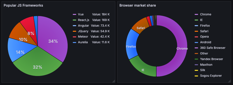
The pie chart visualization is ideal when you have data that adds up to a total and you want to show the proportion of each value compared to other slices, as well as to the whole of the pie.
You can use a pie chart if you need to compare:
- Browser share distribution in the market
- Incident causes per category
- Network traffic sources
- User demographics
Configure a pie chart visualization
The following video guides you through the creation steps and common customizations of pie chart visualizations and is great for beginners:
With Grafana Play, you can explore and see how it works, learning from practical examples to accelerate your development. This feature can be seen on Grafana Bar Charts and Pie Charts.
Supported data formats
The pie chart is different from other visualizations in that it will only display one pie, regardless of the number of datasets, fields, or records queried in it.
To create a pie chart visualization, you need a dataset containing a set of numeric values either in rows, columns, or both.
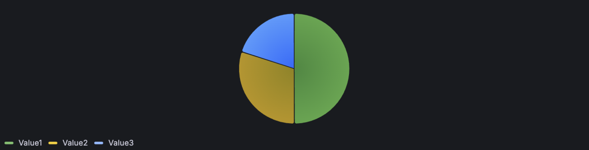
Example - One row
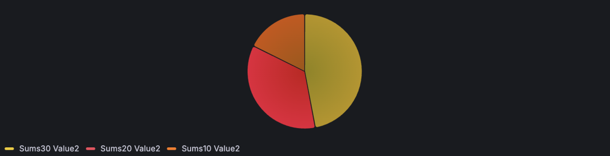
The easiest way to provide data for a pie chart visualization is in a dataset with a single record (or row) containing the fields (or columns) that you want in the pie, as in the following example. The default settings of the pie chart visualization automatically display each column as a slice of the pie.
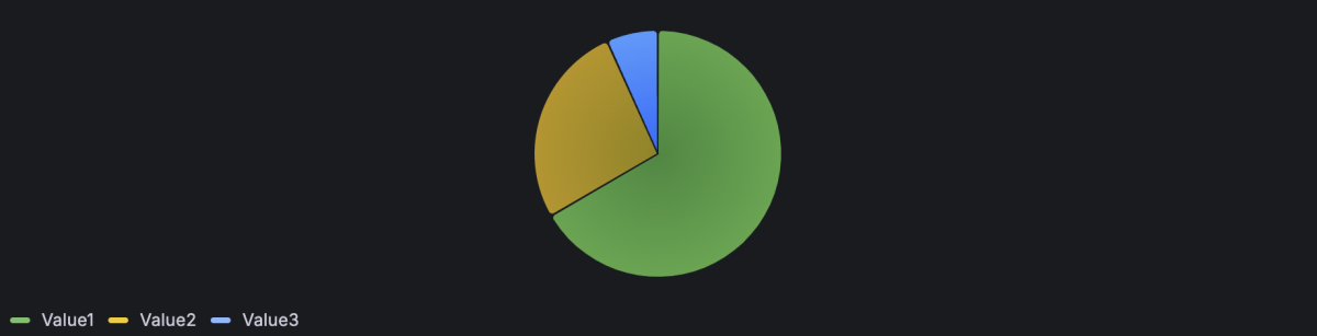
Example - Multiple rows
If you need to use numeric data that’s in multiple rows, the default Show parameter of the visualization Value options is set to Calculate and use data from the last row.

By default, the visualization is configured to calculate a single value per column or series and to display only the last row of data.
To allow values in multiple rows to be displayed, change the Show setting in the Value options from Calculate to All values.

Example - Multiple rows and columns
If your dataset contains multiple rows and columns with numeric data, by default only the last row’s values are summed.
If you want to display all the cells, change the Show setting in the Value options from Calculate to All values. This also labels the elements by concatenating all the text fields (if you have any) with the column name.
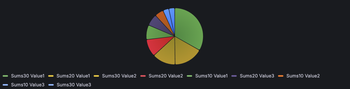
If you want to display only the values from a given field (or column), once the Show setting in the Value options is set to All values, set the Fields option to the column you wish to sum in the display. The value labels are also concatenated as indicated before.
Configuration options
The following section describes the configuration options available in the panel editor pane for this visualization. These options are, as much as possible, ordered as they appear in Grafana.
Panel options
In the Panel options section of the panel editor pane, set basic options like panel title and description, as well as panel links. To learn more, refer to Configure panel options.
Value options
Use the following options to refine the value in your visualization.
Pie chart options
Use these options to refine how your visualization looks.
Pie chart type
Select the pie chart display style. Choose from Pie or Donut.

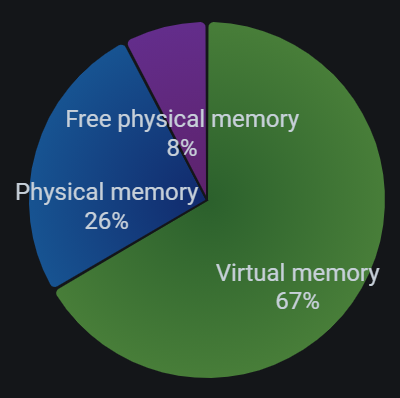
Labels
Select labels to display on the pie chart. You can select more than one.
- Name - The series or field name.
- Percent - The percentage of the whole.
- Value - The raw numerical value.
Labels are displayed in white over the body of the chart. You might need to select darker chart colors to make them more visible. Long names or numbers might be clipped.
The following example shows a pie chart with Name and Percent labels displayed:
Tooltip options
Tooltip options control the information overlay that appears when you hover over data points in the visualization.
Tooltip mode
When you hover your cursor over the visualization, Grafana can display tooltips. Choose how tooltips behave.
- Single - The hover tooltip shows only a single series, the one that you are hovering over on the visualization.
- All - The hover tooltip shows all series in the visualization. Grafana highlights the series that you are hovering over in bold in the series list in the tooltip.
- Hidden - Do not display the tooltip when you interact with the visualization.
Use an override to hide individual series from the tooltip.
Values sort order
When you set the Tooltip mode to All, the Values sort order option is displayed. This option controls the order in which values are listed in a tooltip. Choose from the following:
- None - Grafana automatically sorts the values displayed in a tooltip.
- Ascending - Values in the tooltip are listed from smallest to largest.
- Descending - Values in the tooltip are listed from largest to smallest.
Max width
Set the maximum width of the tooltip box.
Max height
Set the maximum height of the tooltip box. The default is 600 pixels.
Legend options
Use these settings to define how the legend appears in your visualization. For more information about the legend, refer to Configure a legend.
Standard options
Standard options in the panel editor pane let you change how field data is displayed in your visualizations. When you set a standard option, the change is applied to all fields or series. For more granular control over the display of fields, refer to Configure overrides.
To learn more, refer to Configure standard options.
Data links
Data links allow you to link to other panels, dashboards, and external resources while maintaining the context of the source panel. You can create links that include the series name or even the value under the cursor.
For each data link, set the following options:
- Title
- URL
- Open in new tab
To learn more, refer to Configure data links and actions.
Value mappings
Value mapping is a technique you can use to change how data appears in a visualization.
For each value mapping, set the following options:
- Condition - Choose what’s mapped to the display text and (optionally) color:
- Value - Specific values
- Range - Numerical ranges
- Regex - Regular expressions
- Special - Special values like
Null,NaN(not a number), or boolean values liketrueandfalse
- Display text
- Color (Optional)
- Icon (Canvas only)
To learn more, refer to Configure value mappings.
Field overrides
Overrides allow you to customize visualization settings for specific fields or series. When you add an override rule, it targets a particular set of fields and lets you define multiple options for how that field is displayed.
Choose from the following override options:
To learn more, refer to Configure field overrides.


