Important: This documentation is about an older version. It's relevant only to the release noted, many of the features and functions have been updated or replaced. Please view the current version.
Panels and visualizations
Overview
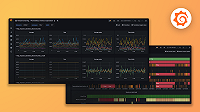
Panels are the basic building block in Grafana dashboards, composed of a query and a visualization, a graphical representation of query results.
Visualizations provide you several different ways to present your data within a panel, depending on what best suits the data and your needs. Grafana’s growing suite of visualizations, ranging from time series graphs to heatmaps to cutting-edge 3D charts, help you decode complex datasets.
Panels offer a wide variety of formatting and styling options from applying colors based on field values to custom units. Each visualization also comes with options specific to it that give you further control over how your data is displayed. With Grafana panels and visualizations, you can easily get the information you need from your data and optimize performance.


