
Node graph
Node graphs are useful when you need to visualize elements that are related to each other. This is done by displaying circles—or nodes—for each element you want to visualize, connected by lines—or edges. By default, the visualization uses a layered layout that positions the nodes into a network of connected circles.
Node graphs display useful information about each node, as well as the relationships between them, allowing you to visualize complex infrastructure maps, hierarchies, or execution diagrams.

The appearance of nodes and edges can also be customized in several ways including color, borders, and line style.
You can use a node graph visualization if you need to show:
- Solution topologies
- Networks
- Infrastructure
- Organizational charts
- Critical path diagrams
- Family trees
- Mind maps
Configure a node graph visualization
The following video provides beginner steps for creating node panel visualizations. You’ll learn the data requirements and caveats, special customizations, and much more:
With Grafana Play, you can explore and see how it works, learning from practical examples to accelerate your development. This feature can be seen on Node graph panel.
Supported data formats
To create node graphs, you need two datasets: one containing the records for the displayed elements (nodes) and one dataset containing the records for the connections between those elements (edges).
Nodes dataset
The nodes dataset must contain one alphanumeric ID field that gives each element a unique identifier. The visualization also accepts other options fields for titles, subtitles, main and secondary stats, arc information for how much of the circle border to paint, details, colors, icons, node size, and indicators for element highlighting. For more information and naming conventions for these fields, refer to the Nodes data frame structure section.
Example
If the icon field contains a value, it’s displayed instead of the title and subtitle. For a list of of available icons, refer to Icons Overview.
Edges dataset
Similar to the nodes dataset, the edges dataset needs one unique ID field for each relationship, followed by two fields containing the source and the target nodes of the edge; that is, the nodes the edge connects. Other optional fields are main and secondary stats, context menu elements, line thickness, highlight indications, line colors, and configurations to turn the connection into a dashed line. For more information and naming conventions for these fields, refer to the Edges data frame structure section.
Example
If a node lacks edge connections, it’s displayed on its own outside of the network.
Data requirements
A node graph requires a specific shape of the data to be able to display its nodes and edges. This means not every data source or query can be visualized with this graph. If you want to use this as a data source developer see the section about data API.
A node graph consists of nodes and edges.
- A node is displayed as a circle. A node might represent an application, a service, or anything else that is relevant from an application perspective.
- An edge is displayed as a line that connects two nodes. The connection might be a request, an execution, or some other relationship between the two nodes.
Both nodes and edges can have associated metadata or statistics. The data source defines what information and values is shown, so different data sources can show different type of values or not show some values.
Nodes
Note
Node graphs can show only 1,500 nodes. If this limit is crossed a warning will be visible in upper right corner, and some nodes will be hidden. You can expand hidden parts of the graph by clicking on the “Hidden nodes” markers in the graph.
Usually, nodes show two statistical values inside the node and two identifiers just below the node, usually name and type. Nodes can also show another set of values as a color circle around the node, with sections of different color represents different values that should add up to 1.
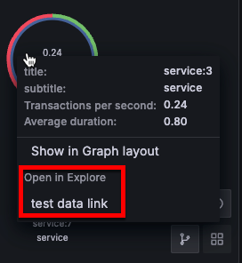
For example, you can have the percentage of errors represented by a red portion of the circle. Additional details can be displayed in a context menu which is displayed when you click on the node. There also can be additional links in the context menu that can target either other parts of Grafana or any external link.
Edges
Edges can also show statistics when you hover over the edge. Similar to nodes, you can open a context menu with additional details and links by clicking on the edge.
The first data source supporting this visualization is X-Ray data source for its Service map feature. For more information, refer to the X-Ray plugin documentation.
Node graph navigation
You can use pan, zoom, and other functions to navigate a node graph.
Pan
You can pan the view by clicking outside any node or edge and dragging your mouse.
Zoom
Use the buttons in the lower right corner to zoom in or out. You can also use the mouse wheel or touchpad scroll, together with either Ctrl or Cmd key to do so.
Switch layouts
Switch quickly between displaying the visualization in graph or grid layout.
Click a node and select either Show in Grid layout or Show in Graph layout, depending on the current layout of the visualization:
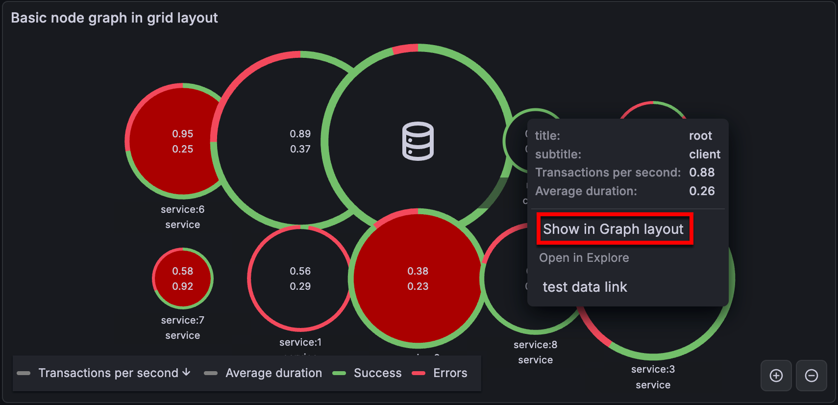
In grid layout, you can sort nodes by clicking on the stats inside the legend. The marker next to the stat name shows which stat is currently used for sorting and the sorting direction:

Switching between grid and other layouts this way only changes the layout temporarily. The visualization maintains the layout algorithm selected in the panel editor, and reverts to it when the dashboard refreshes.
For more information about layouts, refer to Layout algorithm.
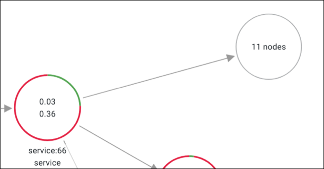
Hidden nodes
The number of nodes shown at a given time is limited to maintain a reasonable visualization performance. Nodes that are not currently visible are hidden behind clickable markers that show an approximate number of hidden nodes that are connected by a particular edge. You can click on the marker to expand the graph around that node.
Configuration options
The following section describes the configuration options available in the panel editor pane for this visualization. These options are, as much as possible, ordered as they appear in Grafana.
Panel options
In the Panel options section of the panel editor pane, set basic options like panel title and description, as well as panel links. To learn more, refer to Configure panel options.
Node graph options
Use the following options to refine your node graph visualization.
Zoom mode
Choose how the node graph should handle zoom and scroll events:
- Cooperative - Allows you to scroll the visualization normally.
- Greedy - Reacts to all zoom gestures.
Layout algorithm
Choose how the visualization layout is generated:
Layered - Default. Creates a predictable and orderly layout, especially useful for service graphs.
Force - Uses a physics-based force layout algorithm that’s useful with a large number of nodes (500+).
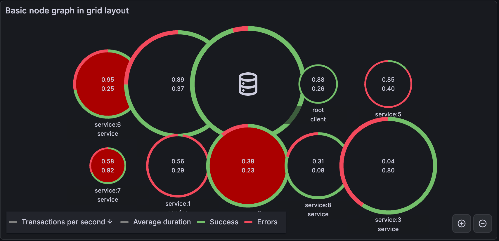
Grid - Arranges nodes into a grid format to provide a better overview of the most interesting nodes in the graph. This layout shows nodes in a grid without edges and can be sorted by the stats shown inside the node or by the ones represented by the a colored border of the nodes.
![Node graph in grid layout]()
For more information about using the graph in grid layout, refer to Switch layouts.
Nodes options
The Nodes options section provides configurations for node behaviors.
- Main stat unit - Choose which unit the main stat displays in the graph’s nodes.
- Secondary stat unit - Choose which unit the secondary stat displays in the graph’s nodes.
- Arc sections - Configure which fields define the size of the colored circle around the node and select a color for each. You can add multiple fields.
Note
Defining arc sections overrides the automatic detection of
arc__*andcolorfields described in the Optional fields section of Nodes data frame structure.
Edges options
The Edges options section provides configurations for node edges behaviors.
- Main stat unit - Choose which unit the main stat displays in the graph’s edges.
- Secondary stat unit - Choose which unit the secondary stat displays in the graph’s edges.
Data links
Data links allow you to link to other panels, dashboards, and external resources while maintaining the context of the source panel. You can create links that include the series name or even the value under the cursor.
Note
Actions are not supported for this visualization.
For each data link, set the following options:
- Title
- URL
- Open in new tab
To learn more, refer to Configure data links and actions.
In node graphs, some data fields may have pre-configured data links. To add a different data link in those cases, use a field override.
Field overrides
Overrides allow you to customize visualization settings for specific fields or series. When you add an override rule, it targets a particular set of fields and lets you define multiple options for how that field is displayed.
Choose from the following override options:
To learn more, refer to Configure field overrides.
Data API
This visualization needs a specific shape of the data to be returned from the data source in order to correctly display it.
Node graphs, at minimum, require a data frame describing the edges of the graph. By default, node graphs will compute the nodes and any stats based on this data frame. Optionally a second data frame describing the nodes can be sent in case there is need to show more node specific metadata. You have to set frame.meta.preferredVisualisationType = 'nodeGraph' on both data frames or name them nodes and edges respectively for the node graph to render.
Edges data frame structure
Required fields:
Optional fields:
Caution
Starting with 10.5,
highlightedis deprecated. It will be removed in a future release. Usecolorto indicate a highlighted edge state instead.
Nodes data frame structure
Required fields:
Optional fields:


