
 Grafana documentation
Visualize data
Panels and visualizations
Visualizations
Bar chart
Grafana documentation
Visualize data
Panels and visualizations
Visualizations
Bar chartBar chart
A bar chart is a visual representation that uses rectangular bars, where the length of each bar represents each value. You can use the bar chart visualization when you want to compare values over different categories or time periods. The visualization can display the bars horizontally or vertically, and can be customized to group or stack bars for more complex data analysis.

You can use the bar chart visualization if you need to show:
- Population distribution by age or location
- CPU usage per application
- Sales per division
- Server cost distribution
Configure a bar chart
The following video shows you how to create and configure a bar chart visualization:
With Grafana Play, you can explore and see how it works, learning from practical examples to accelerate your development. This feature can be seen on Grafana Bar Charts and Pie Charts.
Supported data formats
To create a bar chart visualization, you need a dataset containing one string or time field (or column) and at least one numeric field, though preferably more than one to make best use of the visualization.
The text or time field is used to label the bars or values in each row of data and the numeric fields are represented by proportionally sized bars.
Example 1
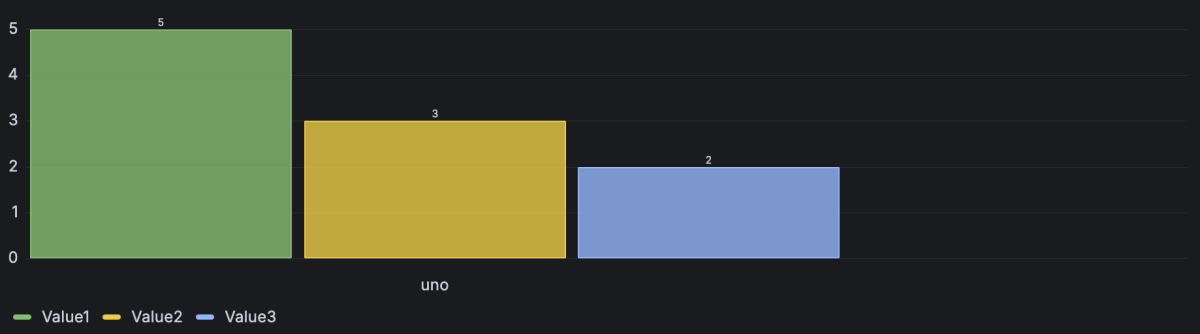
If you have more than one text or time field, by default, the visualization uses the first one, but you can change this in the x-axis option as described in the Bar chart options section.
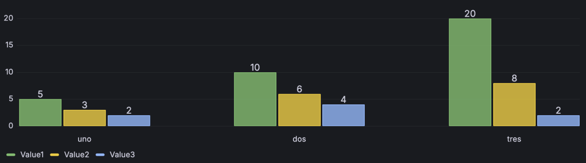
Example 2
If your dataset contains multiple rows, the visualization displays multiple bar chart groups where each group contains multiple bars representing all the numeric values for a row.
While the first field can be time-based and you can use a bar chart to plot time-series data, for large amounts of time-series data, we recommend that you use the time series visualization and configure it to be displayed as bars.
We recommend that you only use one dataset in a bar chart because using multiple datasets can result in unexpected behavior.
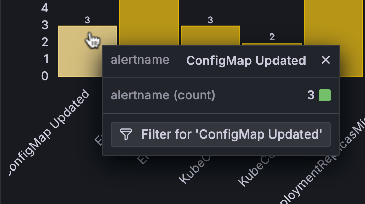
Apply ad hoc filters from the bar chart
In bar charts, you can apply ad hoc filters directly from the visualization.
To display the filter button, hover your cursor over the bar that has the value for which you want to filter and click the bar:
For more information about applying ad hoc filters this way, refer to Dashboard drilldown with ad hoc filters.
Configuration options
The following section describes the configuration options available in the panel editor pane for this visualization. These options are, as much as possible, ordered as they appear in Grafana.
Panel options
In the Panel options section of the panel editor pane, set basic options like panel title and description, as well as panel links. To learn more, refer to Configure panel options.
Bar chart options
Use these options to refine your visualization.
Gradient mode
Set the mode of the gradient fill. Fill gradient is based on the line color. To change the color, use the standard color scheme field option. Gradient appearance is influenced by the Fill opacity setting. Choose from:
- None - No gradient fill. This is the default setting.
- Opacity - Transparency of the gradient is calculated based on the values on the y-axis. Opacity of the fill is increasing with the values on the Y-axis.
- Hue - Gradient color is generated based on the hue of the line color.
- Scheme - The bar receives a gradient color defined by the Standard options > Color scheme selection.
From thresholds - If the Color scheme selection is From thresholds (by value), then each bar is the color of the defined threshold.

Color scheme: From thresholds Gradient color schemes - The following image shows a bar chart with the Green-Yellow-Red (by value) color scheme option selected.

Color scheme: Green-Yellow-Red


Tooltip options
Tooltip options control the information overlay that appears when you hover over data points in the visualization.
Tooltip mode
When you hover your cursor over the visualization, Grafana can display tooltips. Choose how tooltips behave.
- Single - The hover tooltip shows only a single series, the one that you are hovering over on the visualization.
- All - The hover tooltip shows all series in the visualization. Grafana highlights the series that you are hovering over in bold in the series list in the tooltip.
- Hidden - Do not display the tooltip when you interact with the visualization.
Use an override to hide individual series from the tooltip.
Values sort order
When you set the Tooltip mode to All, the Values sort order option is displayed. This option controls the order in which values are listed in a tooltip. Choose from the following:
- None - Grafana automatically sorts the values displayed in a tooltip.
- Ascending - Values in the tooltip are listed from smallest to largest.
- Descending - Values in the tooltip are listed from largest to smallest.
Legend options
Legend options control the series names and statistics that appear under or to the right of the graph. For more information about the legend, refer to Configure a legend.
Text size
Enter a Value to change the size of the text on your bar chart.
Axis
Use the following field settings to refine how your axes display.
For guidance on configuring more than one y-axis, refer to Multiple y-axes.
Some field options will not affect the visualization until you click outside of the field option box you are editing or press Enter.
Soft min and soft max
Set a Soft min or soft max option for better control of Y-axis limits. By default, Grafana sets the range for the Y-axis automatically based on the dataset.
Soft min and soft max settings can prevent blips from turning into mountains when the data is mostly flat, and hard min or max derived from standard min and max field options can prevent intermittent spikes from flattening useful detail by clipping the spikes past a defined point.
You can set standard min/max options to define hard limits of the Y-axis. For more information, refer to Standard options definitions.
Multiple y-axes
In some cases, you might want to display multiple y-axes. For example, if you have a dataset showing both temperature and humidity over time, you might want to show two y-axes with different units for the two series.
You can configure multiple y-axes and control where they’re displayed in the visualization by adding field overrides. This example of a dataset that includes temperature and humidity describes how you can configure that. Repeat the steps for every y-axis you wish to display.
Standard options
Standard options in the panel editor pane let you change how field data is displayed in your visualizations. When you set a standard option, the change is applied to all fields or series. For more granular control over the display of fields, refer to Configure overrides.
To learn more, refer to Configure standard options.
Data links and actions
Data links allow you to link to other panels, dashboards, and external resources and actions let you trigger basic, unauthenticated, API calls. In both cases, you can carry out these tasks while maintaining the context of the source panel.
For each data link, set the following options:
- Title
- URL
- Open in new tab
- One click - Opens the data link with a single click. Only one data link can have One click enabled at a time.
For each action, define the following API call settings:
To learn more, refer to Configure data links and actions.
Value mappings
Value mapping is a technique you can use to change how data appears in a visualization.
For each value mapping, set the following options:
- Condition - Choose what’s mapped to the display text and (optionally) color:
- Value - Specific values
- Range - Numerical ranges
- Regex - Regular expressions
- Special - Special values like
Null,NaN(not a number), or boolean values liketrueandfalse
- Display text
- Color (Optional)
- Icon (Canvas only)
To learn more, refer to Configure value mappings.
Thresholds
A threshold is a value or limit you set for a metric that’s reflected visually when it’s met or exceeded. Thresholds are one way you can conditionally style and color your visualizations based on query results.
For each threshold, set the following options:
To learn more, refer to Configure thresholds.
Field overrides
Overrides allow you to customize visualization settings for specific fields or series. When you add an override rule, it targets a particular set of fields and lets you define multiple options for how that field is displayed.
Choose from the following override options:
To learn more, refer to Configure field overrides.


