What's new from Grafana Labs
Grafana Labs products, projects, and features can go through multiple release stages before becoming generally available. These stages in the release life cycle can present varying degrees of stability and support. For more information, refer to release life cycle for Grafana Labs.
Loading...
Area of interest:
Cloud availability:
Cloud editions:
Self-managed availability:
Self-managed editions:
No results found. Please adjust your filters or search criteria.
There was an error with your request.
Standardized tooltips
As a continuation of our efforts to standardize tooltips across visualizations, we’ve updated canvas visualization tooltips to be supported for all elements tied to data. Besides the element name and data, the tooltip now also displays the timestamp. This is a step forward from the previous implementation where tooltips were shown only if data links were configured.
A new home page, Kubernetes Overview, gives you a snapshot of both healthy objects and potential issues.
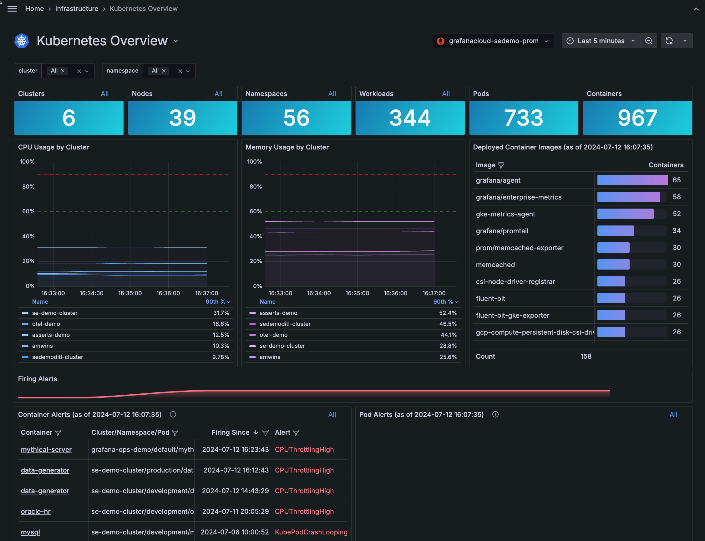
Additional user experience enhancements include:
- Overview and network tabs
- Deep links into Clusters
- More linking into root cause analysis
- Visual indicators for every Kubernetes object, including workload type, Pod, Cluster, and namespace
For more enhanced ways to navigate, refer to Navigation tips.
For the past few months, we’ve been working on stabilizing the k6-browser module and its API, as well as improving the performance of Grafana Cloud k6 in handling browser tests with a high number of VUs.
You can now view a detailed timeline for a Grafana k6 browser test when executing it in Grafana Cloud k6, as well as any screenshots taken during that test run.
To be more aligned with the OpenTelementry specification, Grafana Cloud Traces will return RetryInfo to correctly indicate retryable errors.
For more information, refer to Retry on RESOURCE_EXHAUSTED failure.
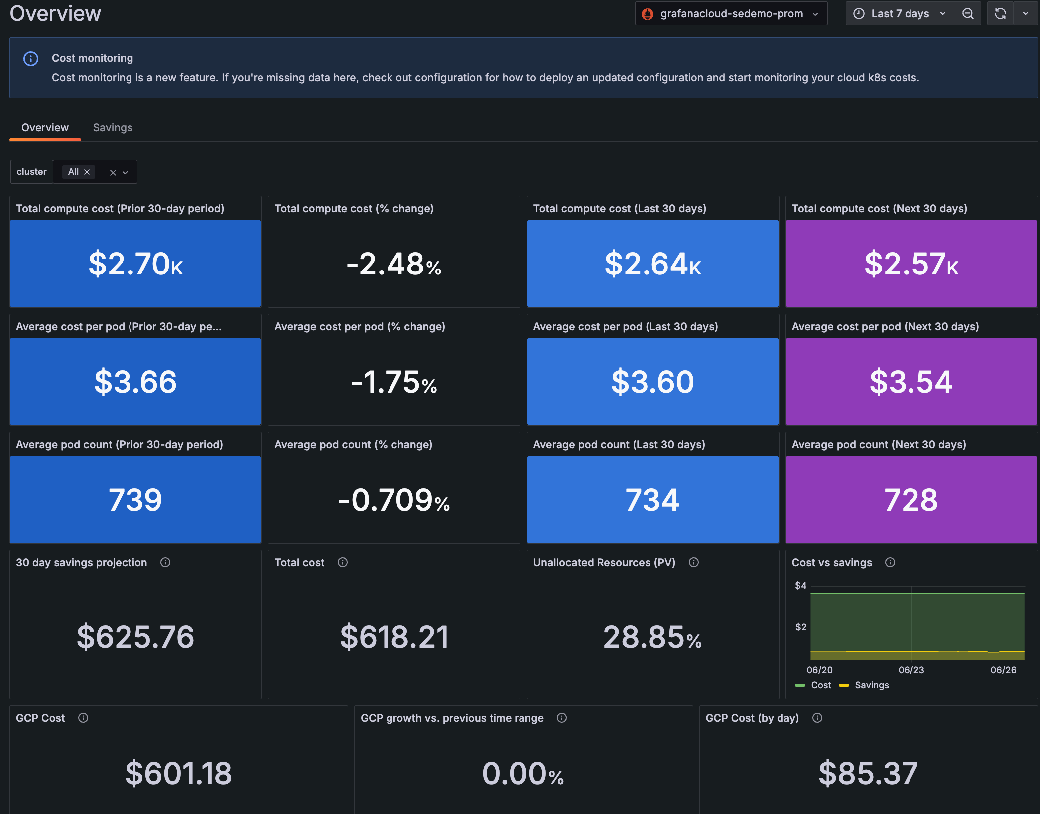
Cost overview tab
Use the Cost Overview tab to see a 90-day view of total compute cost, average cost per Pod, and average Pod count. This 90-day period is divided into the prior 30 days, the last 30 days from the current date, and an estimate of the next 30 days.
For the past few months we’ve been working on a major update of our Dashboards architecture and migrated it to the Scenes library. This migration provides us with more stable, dynamic, and flexible dashboards as well as setting the foundation for what we envision the future of Grafana dashboards will be. Here are four of the improvements that are being introduced as part of this work:
GeoMap keyboard support
The GeoMap panel can now be used with a keyboard! Focus the map area, move around with the arrows keys and zoom in and out using + and -.
We have recently released v2 of the GitLab data source plugin. The plugin was updated to the latest GitLab API version which unfortunately comes with some potential breaking changes to the Projects queries
Kubernetes Monitoring has added more troubleshooting tools:
- Find deleted Clusters, Nodes, Pods, containers, workloads, and namespace
- Zoom into an area on the graph to narrow the time range
- Jump directly to the list of Clusters, Nodes, and workloads from the home page
Find deleted objects
You can find deleted objects, such as a Node shown in this example:

Kubernetes Monitoring has added more troubleshooting tools:
- Find deleted Clusters, Nodes, Pods, containers, workloads, and namespaces
- Zoom into an area on the graph to narrow the time range
- Jump directly to the list of Clusters, Nodes, workloads, and alerts from the home page
Find deleted objects
It’s easier to give your network access to Synthetic Monitoring public probes using https://allowlists.grafana.com/synthetics. This publishes up-to-date CIDR ranges of all public probe locations from a single URL, with data in JSON format to support machine readability and automation.
Introducing Grafana Cloud Frontend Observability private source map uploads. Frontend Observability in Grafana Cloud can use source maps to convert stack traces from JavaScript browser errors back into their original representation. That way, users can see the line of code that caused the issue.
– & —-> https://drive.google.com/file/d/17R-_NULt74aSVqidCMZS9Y5Y1dIJ-f8Z/view?usp=drive_link internal_information: ‘contact #grafana-dataviz slack channel’
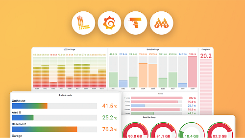
We’ve made a number of small improvements to the data visualization experience in Grafana.
Table cell text wrapping
A longstanding feature request for the table visualization is to allow wrapping of text within cells. In Grafana 11.1 we’ve added this capability! By default, the column with the longest text is selected for wrapping. You can also configure wrapping manually using field overrides.
We’re promoting XY chart out of public preview and into general availability.
XY charts provide a way to visualize arbitrary x and y values in a graph so that you can easily show the relationship between two variables. XY charts are typically used to create scatter plots. You can also use them to create bubble charts where field values determine the size of each bubble:
