
Create dashboards
Note
Dynamic dashboards is currently in public preview. Grafana Labs offers limited support, and breaking changes might occur prior to the feature being made generally available.
For information on the generally available dashboard creation experience, refer to the documentation for the latest self-managed version of Grafana.
Dashboards and panels allow you to show your data in visual form. Each panel needs at least one query to display a visualization.
Before you begin:
- Ensure that you have the proper permissions. For more information about permissions, refer to About users and permissions.
- Understand the query language of the target data source.
Create a dashboard
To create a dashboard, follow these steps:
Click Dashboards in the main menu.
Click New and select New Dashboard.
Click + Add visualization.
In the dialog box that opens, do one of the following:
- Select one of your existing data sources.
- Select one of the Grafana built-in special data sources.
- Click Configure a new data source to set up a new one (Admins only).
![Select data source modal]()
The Edit panel view opens with your data source selected. You can change the panel data source later using the drop-down in the Query tab of the panel editor if needed.
For more information about data sources, refer to Data sources for specific guidelines.
To create a query, do one of the following:
- Write or construct a query in the query language of your data source.
- Open the Saved queries drop-down menu and click Replace query to reuse a saved query.
(Optional) To save the query for reuse, open the Saved queries drop-down menu and click the Save query option.
Note
Saved queries is currently in public preview in Grafana Enterprise and Grafana Cloud only.
Click Refresh to query the data source.
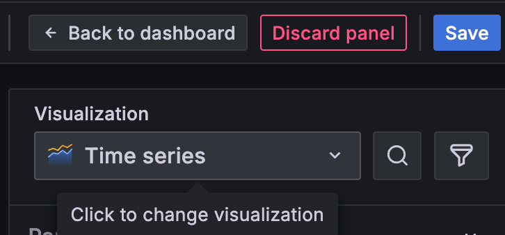
In the visualization list, select a visualization type.
![Visualization selector]()
Grafana displays a preview of your query results with the visualization applied.
For more information about configuring individual visualizations, refer to Visualizations options.
Under Panel options, enter a title and description for the panel or have Grafana create them using generative AI features.
Refer to the following documentation for ways you can adjust panel settings.
While not required, most visualizations need some adjustment before they properly display the information that you need.
When you’ve finished editing the panel, click Save.
Enter a title and description for the dashboard if you haven’t already or have Grafana create them using generative AI features.
Select a folder, if applicable.
Click Save
Click Back to dashboard.
(Optional) Continue building the dashboard by clicking one or more of the following options:
- + Add panel: Set panel options in the edit pane or click Configure to complete panel setup.
- + Add variable: Follow the steps to add a variable to the dashboard.
- Group panels: Choose from Group into row or Group into tab. For more information on groupings, refer to Panel groupings.
- Dashboard options icon: Open the edit pane to access panel layout options.
When you’ve finished making changes, click Save.
(Optional) Enter a description of the changes you’ve made.
Click Save.
Click Exit edit.

Dashboard edit
Now that you’ve created a basic dashboard, you can augment it with more options. You can make several updates without leaving the dashboard by using the edit pane, which is explained in the next section.
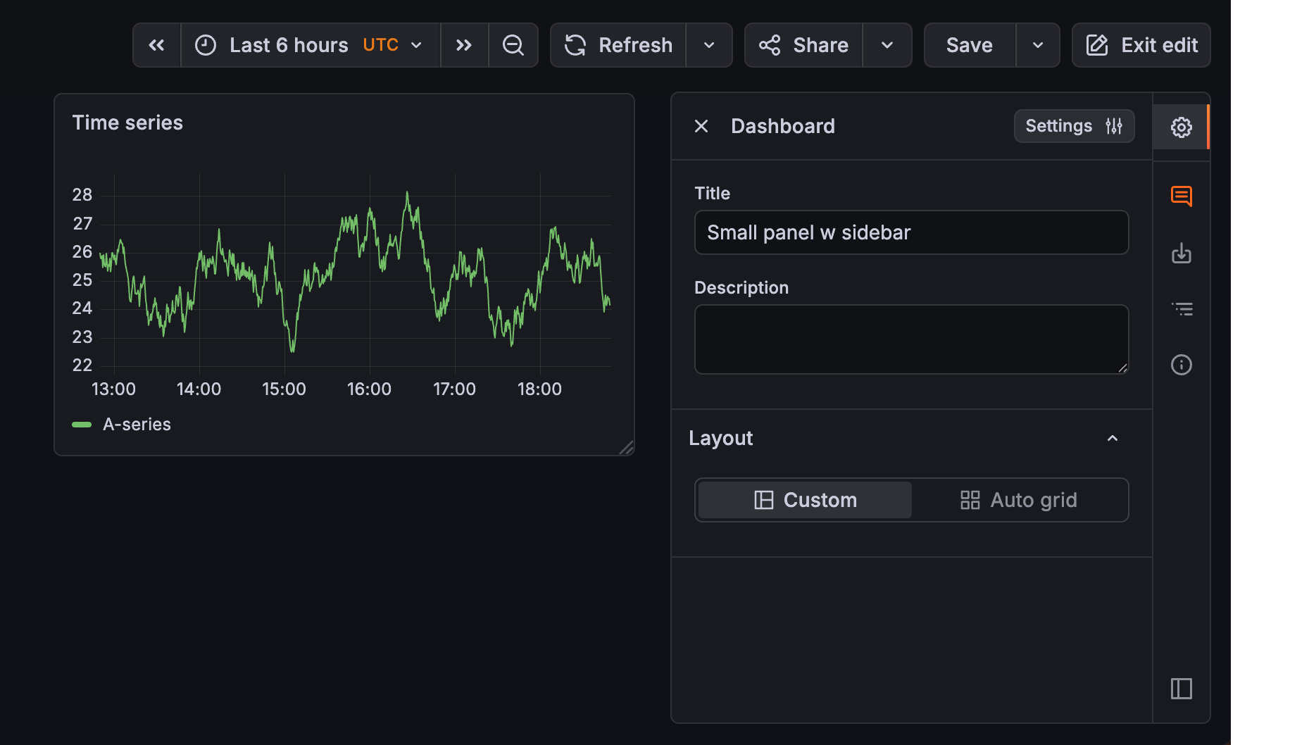
The edit pane and sidebar
The edit pane allows you to make changes without leaving the dashboard, by displaying options associated with the part of the dashboard that’s in focus. The sidebar is on the next to the edit pane, and it includes options that are useful to have available all the time.
The following image shows the parts of the edit pane and the sidebar. Hover your cursor over the numbers to display descriptions of the sidebar options (descriptions also follow the image):
Dashboard options
Click the icon to open the edit pane. Edit mode only.
Feedback
Submit feedback on the new editing experience. Edit mode only.
Export
Click to display export options.
Content outline
Navigate a dashboard using the Content outline.
Dashboard insights
View dashboard analytics including information about users, activity, and query counts.
Note
The sidebar is displayed in both edit and view mode, but the Dashboard options and Feedback icons aren’t available in view mode.
You can dock, undock, and resize the edit pane. When the edit pane is closed, you can resize the sidebar so the icon names are visible.
The available configuration options in the edit pane differ depending on the selected dashboard element:
- Dashboards: High-level options are in the edit pane and further configuration options are in the Settings page.
- Groupings (rows and tabs): All configuration options are available in the edit pane.
- Panels: High-level options are in the edit pane and further configuration options are in the Edit panel view.
Navigate using the content outline
The Content outline provides a tree-like structure that shows you all the parts of the dashboard and their relationships to each other, including panels, rows, tabs, and variables. The outline also lets you quickly navigate the dashboard and is available in both view and edit modes (note that variables are only included in edit mode).
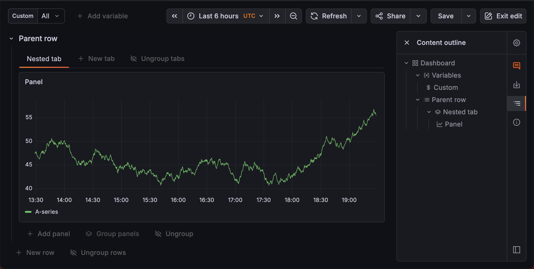
To navigate the dashboard using the outline, follow these steps:
- Navigate to the dashboard you want to view or update.
- In the right sidebar, click the Content outline icon to open it.
- Expand the outline to find the part of the dashboard you want to view or update.
- Click the tree item to navigate that part of the dashboard.
Edit a dashboard
To edit a dashboard, follow these steps:
Navigate to the dashboard you want to update.
Click Edit.
Click the part of the dashboard you want to update to open the edit pane, or click the Dashboard options icon to open it.
If the dashboard is large, open the Content outline and use it to navigate to the part of the dashboard you want to update.
Update the dashboard as needed.
When you’ve finished making changes, click Save.
(Optional) Enter a description of the changes you’ve made.
Click Save.
Click Back to dashboard, if needed.
Click Exit edit
Panel layouts
Panel layouts control the size and arrangement of panels in the dashboard. There are two panel layout options:
- Custom: You can position and size panels individually. This is the default selection for a new dashboard. Show/hide rules are not supported.
- Auto grid: Panels resize and fit automatically to create a uniform grid. You can’t make manual changes to this layout. Show/hide rules are supported.
You can use both layouts in row or tab groupings.
Auto grid layout
In the auto grid layout, panels are automatically sized and positioned as you add them. There are default parameters to constrain the layout, and you can update these to have more control over the display:
- Min column width: Choose from Standard, Narrow, Wide, or Custom, for which you can enter the minimum width in pixels.
- Max columns: Set a number up to 10.
- Row height: Choose from Standard, Short, Tall, and Custom, for which you can enter the row height in pixels.
- Fill screen: Toggle the switch on to have the panel fill the entire height of the screen. If the panel is in a row, the Fill screen toggle for the row must also be enabled (refer to grouping configuration options).
Update panel layout
To update the panel layout, follow these steps:
- Navigate to the dashboard you want to update.
- Click Edit.
- Click the dashboard or the grouping that contains the panel layout you want to update.
- Click the Dashboard options icon to open the edit pane, if needed.
- Under Layout, select Custom or Auto grid.
- Click Save.
- (Optional) Enter a description of the changes you’ve made.
- Click Save.
- Click Exit edit
Panel groupings
To help create meaningful sections in your dashboard, you can group panels into rows or tabs. Rows and tabs let you break up big dashboards or make one dashboard out of several smaller ones.
You can think of the dashboard as a series of nested containers: the dashboard is the largest container and it contains panels, rows, or tabs. Rows and tabs are the next largest containers, and they contain panels.
You can also nest:
- Rows in a row
- Rows in a tab
- Tabs in a row
You can nest up to two levels deep, which means a dashboard can have a maximum of four configuration levels:
- Dashboard
- Grouping 1 - Row or tab
- Grouping 2 - Row or tab
- Panels
You can only have one type of grouping at each level. Inside of those groupings however, you have to freedom to add different elements. Also, custom and auto grid panel layouts are supported for rows and tabs, so each grouping can have a different panel layout.
The following sections describe:
Grouping configuration options
The following table describes the options you can set for a row or tab:
Grouping layouts
When you have panels grouped into rows or tabs, the Layout options available depend on which dashboard element is selected and the nesting level of that element.
You can nest up to two levels deep, which means a dashboard can have a maximum of four configuration levels, with the following layout options:
- Dashboard: Layout options allow you to choose between rows or tabs.
- Grouping 1 (outer): Layout options allow you to choose between rows or tabs.
- Grouping 2 (inner): Layout options allow you to choose between custom and auto grid (refer to Panel layouts).
- Panels: No layout options
You can switch between rows and tabs or update the panel layout by clicking the parent container and changing the layout selection.
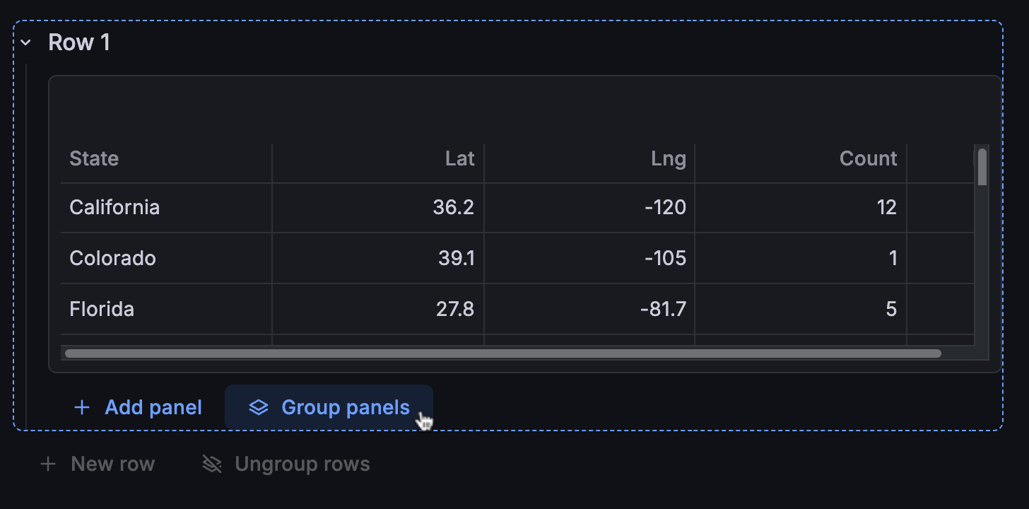
Group panels
To group panels, follow these steps:
Navigate to the dashboard you want to update.
Click Edit.
Under a panel, click Group panels.
While grouping is typically used for multiple panels, you can start a grouping with just one panel.
Select Group into row or Group into tab.
All the panels are moved into the grouping, and a dotted blue line surrounds the row or tab. The edit pane opens, displaying the relevant options.
Set the grouping configuration options in the edit pane.
(Optional) Add one or both of the following:
Click Save.
(Optional) Enter a description of the changes you’ve made.
Click Save.
Click Exit edit.
Add nested groupings
To add a second-level (or nested) grouping, follow these steps:
In the existing grouping, under the panels, click Group panels.
![Adding a nested grouping]()
Click Group into row or Group into tab (Group into tab is only available if the parent grouping is a row).
The new grouping is added inside the first grouping, and the panels are moved into the nested grouping. The edit pane opens displaying the relevant options.
Set the configuration options for the nested grouping.
Click Save.
(Optional) Enter a description of the changes you’ve made.
Click Save.
Click Exit edit.
Add more groupings at the same level
To add more first-level groupings, follow these steps:
On the dashboard, outside the existing first-level grouping, click New row or New tab (only one option will be available).
![Adding a nested grouping]()
Set the configuration options for the new grouping.
Click + Add panel to begin adding panels.
Click Save.
(Optional) Enter a description of the changes you’ve made.
Click Save.
Click Exit edit.
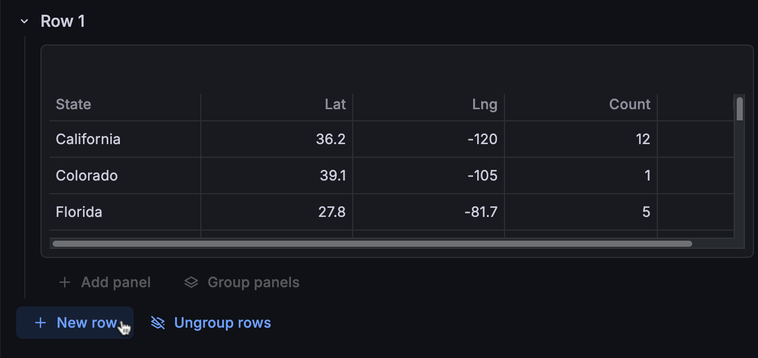
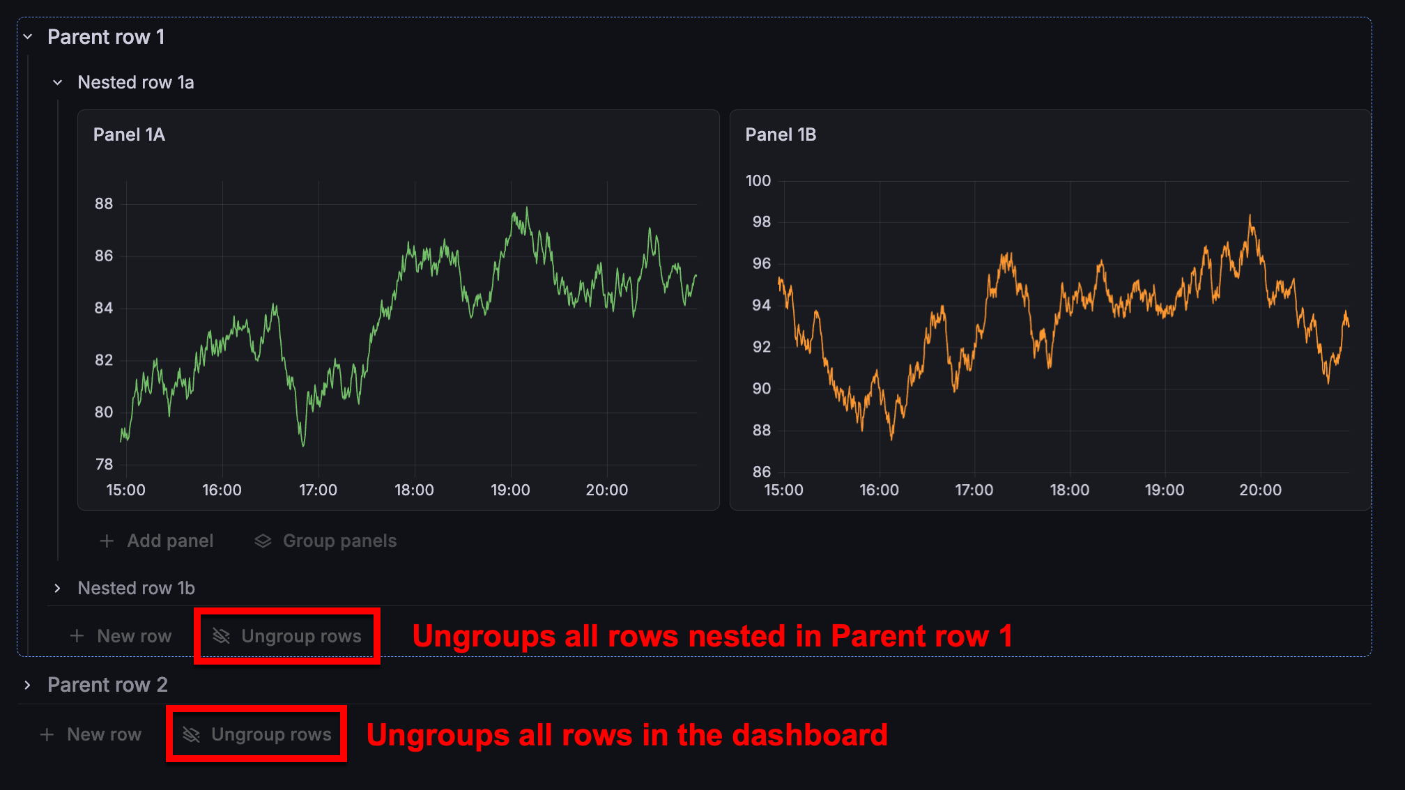
Ungroup panels
You can ungroup some or all of the dashboard groupings without losing your panels. Ungrouping behavior depends on whether you’re working with first-level or nested groupings:
Caution
If you delete a grouping, rather than ungrouping it, its panels are deleted as well.
To remove groupings, follow these steps:
Navigate to the dashboard you want to update.
Click Edit.
(Optional) Click the Content outline icon to quickly navigate to the grouping you want to remove.
Do one of the following:
- Click Ungroup rows or Ungroup tabs at the bottom of the dashboard to ungroup all rows or tabs, including any nested groupings.
- Click in a grouping and click Ungroup rows or Ungroup tabs to ungroup only the tabs or rows nested in that grouping.
If you’ve ungrouped panels that were previously in different panel layouts, you’ll be prompted to select a common layout type for all the panels; click Convert to Auto grid or Convert to Custom.
Click Save.
(Optional) Enter a description of the changes you’ve made.
Click Save.
Click Exit edit.
Configure repeat options
You can configure Grafana to dynamically add panels, rows, or tabs to a dashboard based on the value of a variable. Variables dynamically change your queries across all panels, rows, or tabs in a dashboard.
This only applies to queries that include a multi-value variable.
To configure repeats, follow these steps:
Navigate to the dashboard you want to update.
Click Edit.
Click the panel, row, or tab you want to update to open the edit pane, or click the Dashboard options icon to open it.
If the dashboard is large, open the Content outline and use it to navigate to the part of the dashboard you want to update.
Expand the Repeat options section.
Select the Repeat by variable.
For panels in a custom layout, set the following options:
- Under Repeat direction, choose one of the following:
- Horizontal - Arrange panels side-by-side. Grafana adjusts the width of a repeated panel. You can’t mix other panels on a row with a repeated panel.
- Vertical - Arrange panels in a column. The width of repeated panels is the same as the original, repeated panel.
- If you selected Horizontal, select a value in the Max per row drop-down list to control the maximum number of panels that can be in a row.
- Under Repeat direction, choose one of the following:
(Optional) To provide context to dashboard users, add the variable name to the panel, row, or tab title.
When you’ve finished setting the repeat option, click Save.
(Optional) Enter a description of the changes you’ve made.
Click Save.
Click Exit edit.
Repeating rows and tabs and the Dashboard special data source
If a row includes panels using the special Dashboard data source—the data source that uses a result set from another panel in the same dashboard—then corresponding panels in repeated rows will reference the panel in the original row, not the ones in the repeated rows. The same behavior applies to tabs.
For example, in a dashboard:
Row 1includesPanel 1AandPanel 1BPanel 1Buses the results fromPanel 1Aby way of the-- Dashboard --data source- Repeating row,
Row 2, includesPanel 2AandPanel 2B Panel 2BreferencesPanel 1A, notPanel 2A
Show/hide rules
You can configure panels, rows, and tabs to be shown or hidden based on rules. For example, you can set a panel to be hidden if there’s no data returned by a query or a tab to only be shown if a specific variable value is present.
There are three types of show/hide rules to choose from:
For steps on how to create show/hide rules, refer to Configure show/hide rules.
Note
You can only configure show/hide rules for panels in the Auto grid layout. Set the panel layout at the dashboard, row, or tab-level.
Query result rule
Show or hide a panel based on whether or not the query returns any results. The rule provides Has data and No data options, so you can choose to show or hide the panel based on the presence or absence of data.
For example, if you have a dashboard with several panels and only want panels that return data to appear, set the rule as follows:
- Panel visibility > Show
- Query result > Has data
Alternatively, you might also want to troubleshoot a dashboard with several panels to see which ones contain broken queries that aren’t returning any results. In this case, you’d set the rule as follows:
- Panel visibility > Show
- Query result > No data
Template variable rule
Show or hide a panel, row, or tab dynamically based on the variable value. You can select any variable that’s configured for the dashboard and choose from the following operators for maximum flexibility:
- Equals
- Not equals
- Matches (regular expression values)
- Not matches (regular expression values)
You can add more variables if you need to without leaving the dashboard.
Time range less than rule
Show or hide a panel, row, or tab if the dashboard time range is shorter than the selected time range. This ensures that as you change the time range of the dashboard, you only see data relevant to that time period.
For example, a dashboard is tracking adoption of a feature over time has the following setup:
- Dashboard time range is Last 7 days
- One panel tracks weekly stats
- One panel tracks daily stats
For the panel tracking weekly stats, a rule is set up to hide it if the dashboard time range is less than 7 days. For the panel tracking daily stats, a rule is set up to hide it if the dashboard time range is less 24 hours. This configuration ensures that these time-based panels are only displayed when enough time has passed to make them relevant.
For this rule type, you can select time ranges from 5 minutes to 5 years.
Configure show/hide rules
To configure show/hide rules, follow these steps:
Navigate to the dashboard you want to update.
Click Edit.
Click the panel, row, or tab you want to update to open the edit pane, or click the Dashboard options icon to open it.
If the dashboard is large, open the Content outline and use it to navigate to the part of the dashboard you want to update.
Expand the Show / hide rules section.
Select Show or Hide to set whether the panel, row, or tab is shown or hidden based on the rules outcome.
Click + Add rule.
Select a rule type:
- Query result: Show or hide a panel based on query results. Choose from Has data and No data.
- Template variable: Show or hide the panel, row, or tab dynamically based on the variable value. Select a variable and operator and enter a value.
- Time range less than: Show or hide the panel, row, or tab if the dashboard time range is shorter than the selected time range. Select a time range from 5 minutes to 5 years.
If you’ve configured more than rule, under Match rules, select one of the following:
- Match all: The panel, row, or tab is shown or hidden only if all the rules are matched.
- Match any: The panel, row, or tab is shown or hidden if any of the rules are matched.
This option is only displayed if you add multiple rules.
When you’ve finished setting rules, click Save.
(Optional) Enter a description of the changes you’ve made.
Click Save.
Click Exit edit
Hidden panels, rows, or tabs aren’t visible when the dashboard is in view mode. In edit mode, hidden dashboard elements are displayed with an icon or overlay indicating this.
Move a panel
To move a panel, follow these steps:
Navigate to the dashboard you want to update.
Click Edit.
Navigate to the panel you want to move.
If the dashboard is large, open the Content outline and use it to navigate to the panel.
Click the panel title and drag the panel to another row or tab, or to a new position on the dashboard.
If the dashboard has groupings, you can only move the panel to another grouping.
Click Save.
(Optional) Enter a description of the changes you’ve made.
Click Save.
Click Exit edit
Resize a panel
When your dashboard or grouping has a Custom layout, you can manually resize a panel.
To resize a panel, follow these steps:
Navigate to the dashboard you want to update.
Click Edit.
Navigate to the panel you want to resize.
If the dashboard is large, open the Content outline and use it to navigate to the panel.
Click and drag the lower-right corner of the panel to change the size of the panel.
Click Save.
(Optional) Enter a description of the changes you’ve made.
Click Save.
Click Exit edit
Add variables
To add variables without leaving the dashboard, follow these steps:
- Navigate to the dashboard you want to update.
- Click Edit.
- Click + Add variable at the top of the dashboard.
- Choose a variable type from the list.
- Set the options for the variable.
- Click Save.
- (Optional) Enter a description of the changes you’ve made.
- Click Save.
- Click Exit edit
Add variables using the content outline
You can also add variables without leaving the dashboard using the content outline.
To access the variables creation flow this way, follow these steps:
- Navigate to the dashboard you want to update.
- Click Edit.
- Click the Content outline icon.
- Click Variables in the outline.
- Click + Add variable.
- Complete the rest of the steps to add a variable without leaving the dashboard.
Copy or duplicate dashboard elements
You can copy and paste or duplicate panels, rows, and tabs.
To copy or duplicate dashboard elements, follow these steps:
Navigate to the dashboard you want to update.
Click Edit.
Click the panel, row, or tab you want to update to open the edit pane, or click the Dashboard options icon to open it.
If the dashboard is large, open the Content outline and use it to navigate to the part of the dashboard you want to update.
In the top-corner of the edit pane, click the Copy or Duplicate icon and do one of the following:
- Click Copy.
- Click Duplicate. The duplicated element is added next to the original one. Proceed to step 6.
If you selected Copy, navigate to the part of the dashboard where you want to add the copied element, and click Paste panel, Paste row, or Paste tab.
Update the copied or duplicated element if needed.
Click Save.
(Optional) Enter a description of the changes you’ve made.
Click Save.
Click Exit edit
Copy a dashboard
To make a copy of a dashboard, follow these steps:
Navigate to the dashboard you want to update.
Click Edit.
Click the Save drop-down list and select Save as copy.
(Optional) Specify the name, folder, description, and whether or not to copy the original dashboard tags for the copied dashboard.
By default, the copied dashboard has the same name as the original dashboard with the word “Copy” appended and is in the same folder.
Click Save.


