Application Observability service map
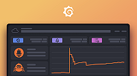
The service map uses the Tempo Metrics-generator and the Node Graph panel to display a graph of related services.
Nodes represent services, for example, an API or database. Edges represent relationships between services.

Nodes
Select a node to view details about the service:
- Service name
- Average response time
- Average request rate
Right-click a node to view a context menu of options to:
- Navigate to the service inventory list and show the service
- Navigate to the service overview
- View the traces for the service in Explore
The node color represents the percentage of requests in each state:
| Color | State |
|---|---|
| Green | Success |
| Red | Error |
Edges
Select an edge to view details about the service relationship:
- Source and target service names
- Average response time
- Average request rate
- View the traces in Explore


