Service overview
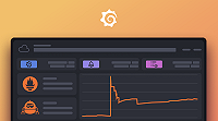
The service overview tab provides a comprehensive view of a service’s health and performance. When you click a service in the entity catalog, the service overview opens showing RED metrics visualizations, active insights, and threshold breaches.
Open entity details
From the entity catalog, click any service name to open its detail view. The detail view appears in a drawer on the right side of the screen, with the service overview tab selected by default.
The drawer remains open as you navigate, allowing you to quickly compare multiple services or investigate related entities without losing your place.
Service overview layout
The service overview tab is divided into several sections:
Entity header
At the top, you’ll see:
- Service name and entity type
- Insight rings showing current health status
- Key properties like cluster, namespace, and version
- Time range selector to adjust the metrics window
RED metrics visualization
The main section displays three core metrics with threshold indicators:
Request rate
Shows requests per second over the selected time range. The visualization includes:
- Line graph tracking request volume
- Threshold band indicating expected normal range
- Breach indicators when the metric exceeds thresholds
A sudden drop in request rate may indicate traffic routing issues or service unavailability. A spike might suggest increased load or a retry storm.
Error ratio
Displays the percentage of failed requests. Key elements:
- Percentage visualization showing error rate
- Threshold line for acceptable error levels
- Trend over time to identify error patterns
Error ratio spikes often correlate with deployments, dependency failures, or resource saturation. The knowledge graph automatically highlights these correlations in RCA workbench.
Latency (P95)
Shows 95th percentile response time, meaning 95% of requests complete faster than this value. Features include:
- Latency graph with millisecond precision
- SLO indicators if service-level objectives are configured
- Pattern detection for gradual degradation
Increased P95 latency can indicate database slowness, external dependency issues, or resource contention.
Threshold interpretation
Each metric displays colored threshold bands:
- Green zone - Metric within expected healthy range
- Yellow zone - Metric approaching problematic levels (warning)
- Red zone - Metric breached critical threshold
Thresholds are automatically calculated based on historical patterns, or you can configure custom thresholds in the knowledge graph settings.
Active insights
Below the metrics, you’ll see a list of active insights for this service:
- Insight category (Saturation, Amend, Anomaly, Failure, Error)
- Severity (Critical, Warning, Info)
- Time when the insight first appeared
- Description explaining what was detected
Click an insight to see its full details, including:
- Affected metrics and their values
- Related entities that may be impacted
- Suggested investigation steps
Related entities
At the bottom, the Service overview shows entities related to this service:
- Upstream services that call this service
- Downstream dependencies this service calls
- Infrastructure (pods, nodes) running the service
Click any related entity to view its details without leaving the current context.
Use service overview for troubleshooting
The service overview tab is designed for rapid assessment:
- Check insight rings - Immediate visual health status
- Scan RED metrics - Identify which metrics are degraded
- Review threshold breaches - Understand severity and timing
- Examine active insights - See what the knowledge graph detected
- Investigate related entities - Trace impact across dependencies
If you need deeper investigation:
- Switch to the Logs tab to see log events during the incident window
- Use the Traces tab to analyze slow requests
- Add the service to RCA workbench for multi-entity correlation
Next steps
- Explore telemetry data - Access logs, traces, Kubernetes metrics, and profiles
- Use RCA workbench - Correlate insights across multiple entities
- Navigate the entity graph - Visualize dependencies and trace impact
Was this page helpful?
Related resources from Grafana Labs


