
Insights categories
Existing taxonomies for time-series data including The Four Golden Signals, The RED Method, and The USE Method are most concerned about the nature of each type of data. The knowledge graph terminology is slightly different, as it aspires to help you focus on what they imply and not where they come from. After receiving raw time-series data, the knowledge graph analyzes the data using its domain knowledge. It extracts and presents crucial insights. Additionally, the knowledge graph offers a user interface (UI) that enables you to effectively monitor and troubleshoot using these insights.
Insights are categorized based on their implications for the system. This model includes Saturation, Amend, Anomaly, Failure, and Error categories. Additionally, insights can be assigned one of three severity levels: info, warning, or critical. These severity levels are visually represented in the UI with blue, yellow, and red colors respectively.
Insight rings and severity
The knowledge graph uses insight rings in the UI to summarize both what the insight means (category) and how urgent it is (severity):
- Inner ring: The insight category (Saturation, Amend, Anomaly, Failure, Error).
- Outer ring: The insight severity.
Severity levels
When an entity has multiple insights, the rings stack to show multiple categories and severity levels at once. Use the ring colors to quickly prioritize where to investigate first.
The following sections describe each insight category.
Saturation
The knowledge graph monitors hardware resources like CPU, memory, and disk. It also monitors software objects like client connections that come with built-in limits. When their usage is close to their limits, a saturation insight occurs. A saturation insight doesn’t necessarily indicate an immediate problem, but is a cause for concern.
The detection mechanism of saturation resembles the following PromQL rule:
resource:usage > resource:usage:thresholdThe knowledge graph quantifies resource usage either as a percentage or an absolute value. Either way, the knowledge graph compares the usage value to two static thresholds. One is for warning, and the other for critical. These thresholds don’t overlap, so when the critical saturation fires, the knowledge graph suppresses the warning insight.
The following dashboard shows warning and critical CPU load.

Different types of resources need different thresholds. Even for the same resource type, like CPU, its usage measured by cAdvisor or Node Exporter can be different. As a result, they might need different threshold values. The knowledge graph provides default values per resource type, and in some cases, per source/exporter. You can modify these thresholds. For more fine-grained control, you can also supply threshold values on the container level.
To simplify the customization, the resource type, metric source, and container thresholds are hierarchical and in this order. For example, you can define a global threshold of 85% for memory usage, but if reported from the Redis exporter, 80%, and if it’s on a Redis instance for a particular memory-critical application, 70%.
For more information on how to customize thresholds, refer to Suppress insights.
Amend
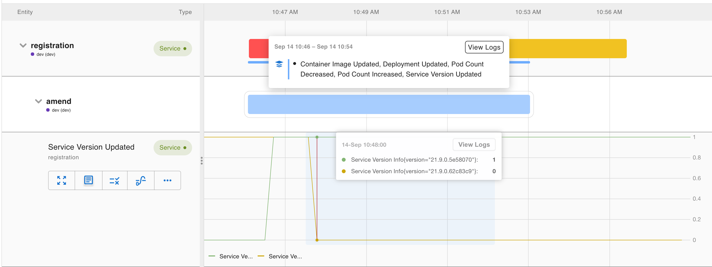
When there is a change, either directly as a new deployment or indirectly such as auto-scaling, it often impacts the health of the system. The knowledge graph captures these changes as amend insights. Amend insights are usually on the info level, and represented as blue marks in the entity view or RCA workbench. They are helpful for correlation analysis.
By default, the knowledge graph detects the following amends:
- Version updates for services, exporters, and run times
- Kubernetes Deployment events like container image updates, deployment updates, configuration map updates, and secret updates
- Scaling events like node count changes and Pod count changes
- Other domain-specific change events like shard re-balancing in elastic search, configuration reload in Nginx, and so on
As domain coverage expands, the knowledge graph includes more amend insights.
Anomaly
Anomalies detect pattern changes related to traffic. Modern cloud-native applications are built for elasticity, so they often handle traffic changes gracefully. Still, they provide context for understanding system behavior. The knowledge graph captures anomaly insights on the warning level.
Anomaly insights typically pertain to metrics such as request rate, latency, and resource consumption rate. The knowledge graph uses statistics to determine the normal ranges for these metrics, taking into account daily and weekly patterns. When the current metric falls outside of this range, it is flagged as an anomaly. Additionally, the knowledge graph applies a sparseness check to minimize noise caused by sparse requests. It’s important to note that, in contrast to saturation, even a breach below the lower bound is considered an anomaly insight. This can be useful in identifying traffic loss, which may indicate more significant underlying issues.
(request:rate5m < request:rate5m:anomaly_lower_threshold
or
request:rate5m > request:rate5m:anomaly_upper_threshold)
unless request:erratic_and_sparse > 0
The following dashboard shows an example of an amend insight that identifies a change that causes a latency spike. Additionally, an anomaly insight is triggered specifically for the rule-engine service.
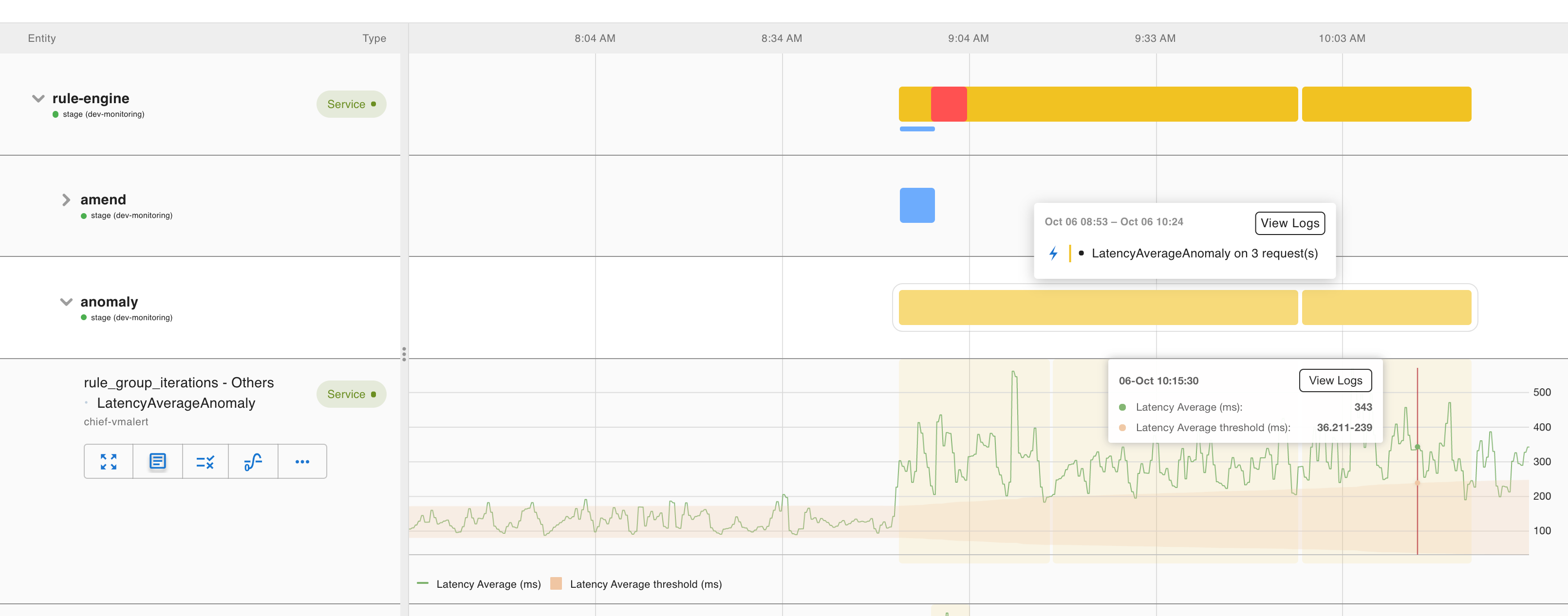
For these anomaly insights, you don’t need to provide much input on thresholds, but you can customize the size of the range and the sensitivity for detecting sparse requests.
Failure
A software system has many moving parts, each of which is expected to function in a certain way. For example:
- Each service instance or Pod should be up and responding
- A primary or standby system should only have one active at any time
- Each Kafka partition should have its replication count maintained to the specified setting
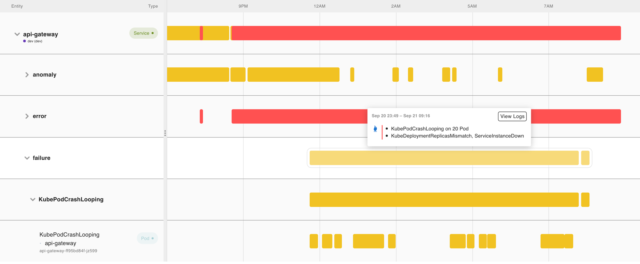
Sometimes significant or complete application degradation might occur. The knowledge graph identifies these scenarios as failure insights. Failure insights are different from saturation and anomaly insights because they’re clear-cut critical issues without arbitrary thresholds.
The following failure insight shows a Kafka cluster violating the expectation that there is only one active controller:
sum by (job) (kafka_controller_kafkacontroller_activecontrollercount) != 1Failure insights are domain-specific, so the list of failure insight names is long. They come directly from an understanding of the basic building blocks of modern cloud-native applications. The knowledge graph includes a curated list of failure conditions that cover Kubernetes, Flux, Elastic Search, Kafka, MySql, Postgres, Nginx, Redis, Traefik, and many more.
The following dashboard shows an example of failures (Pod crash looping) triggered by Traffic Spike detected via request anomaly insight.
Error
In addition to failures, there are other erroneous events in the system about how the software handles real-world traffic. 5xx HTTP codes or error logs are classic examples of such events, and the knowledge graph considers them error insights. Error insights are not catastrophic, can be tolerated, and to some extent are expected in a production environment. Despite these issues, the system continues to operate effectively for the most part.
Errors are usually measured not in absolute terms, but as ratios relative to successful ones. For instance, for a REST API server, the knowledge graph calculates the server error ratio as 5xx requests divided by the total requests.
rate(http_server_requests_seconds_count{status=~"5.."}[5m])
/
rate(http_server_requests_seconds_count[5m])
For Prometheus rule evaluations, the knowledge graph determines the error ratio as:
rate(prometheus_rule_evaluation_failures_total[5m])
/
rate(prometheus_rule_evaluations_total[5m])
The knowledge graph prioritizes identifying error insights as they often provide crucial insights into identifying design defects or code bugs within your software. The knowledge graph attempts to identify all potential situations that qualify as error insights.
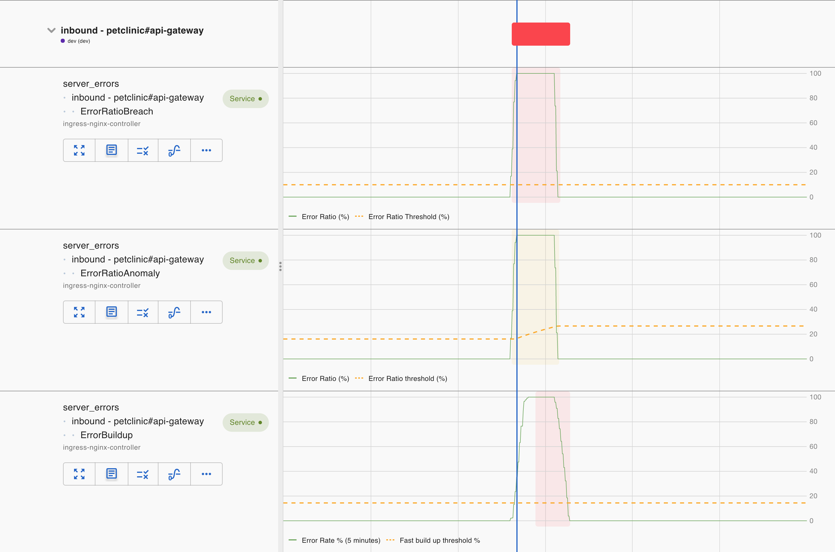
The knowledge graph supports two basic types of error insights:
- ErrorRatioBreach compares the current error ratio against a static threshold to capture acute error conditions that demand immediate attention.
- ErrorBuildup captures chronic error conditions that otherwise can’t be captured by ErrorRatioBreach. The knowledge graph uses a multi-burn-rate approach to monitor errors building up. A fast build-up is considered critical, while a slow build-up is a warning.
We then supplement them with two warning insights to detect pattern changes in errors:
- ErrorRatioAnomaly warns against elevated overall error ratio above the normal range.
- InboundClientErrorAnomaly warns against elevated client error ratio (4xxs,etc) above the normal range.
These insights complement each other, but they sometimes overlap.
In addition, we’ve also expanded the concept of errors to latency. Even though we have latency anomaly insights already, we understand latency impacts user experience. When a user-facing request latency is big enough, we’d like to treat it as an error condition. Latency distribution is known to have long tails, so the knowledge graph tries not to miss out by building a couple of different insights:
- LatencyAverageBreach captures the overall elevated latency.
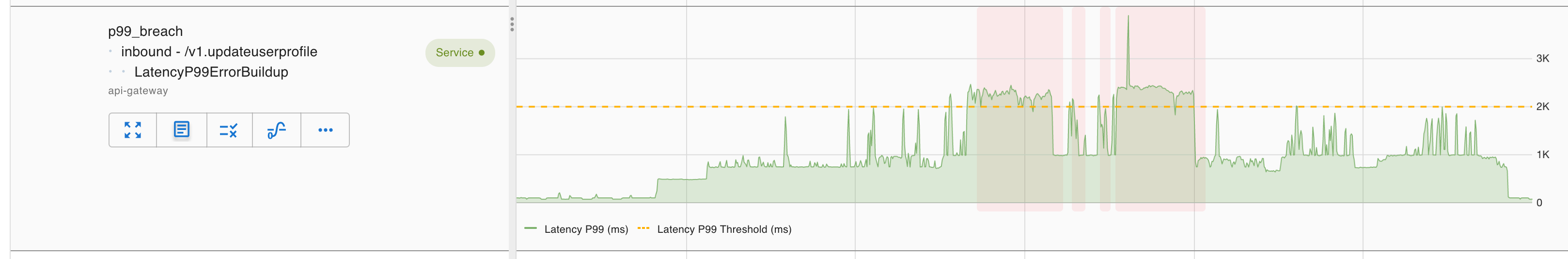
- LatencyP99ErrorBuildup captures chronic deterioration of latency. Unlike the average measurement, the underlying requests for P99 latency are usually sporadic, so the knowledge graph uses the same fast build-up approach as is used for ErrorBuildup.
Because these insights capture user experience impact, they’re all deemed critical.


