What's new from Grafana Labs
Grafana Labs products, projects, and features can go through multiple release stages before becoming generally available. These stages in the release life cycle can present varying degrees of stability and support. For more information, refer to release life cycle for Grafana Labs.
Loading...
Area of interest:
Cloud availability:
Cloud editions:
Self-managed availability:
Self-managed editions:
No results found. Please adjust your filters or search criteria.
There was an error with your request.
Use the Grafana Alerting - MQTT integration to send notifications to an MQTT broker when your alerts are firing.
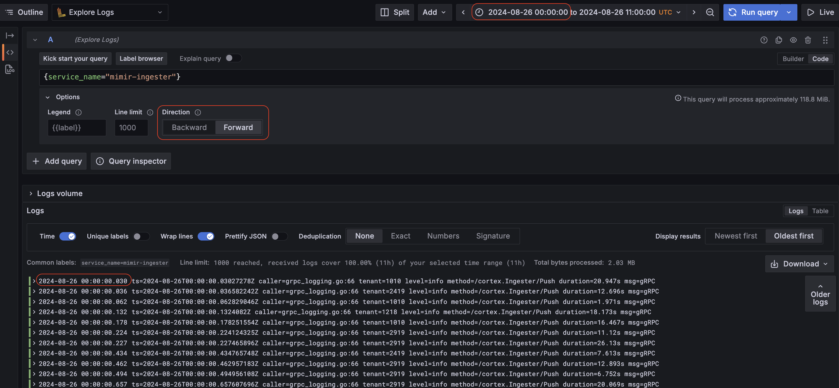
Explore now supports forward direction search for Loki logs searches. This allows users to seamlessly browse logs in a time range in forward chronological order (for example, tracing a specific user’s actions using logs).
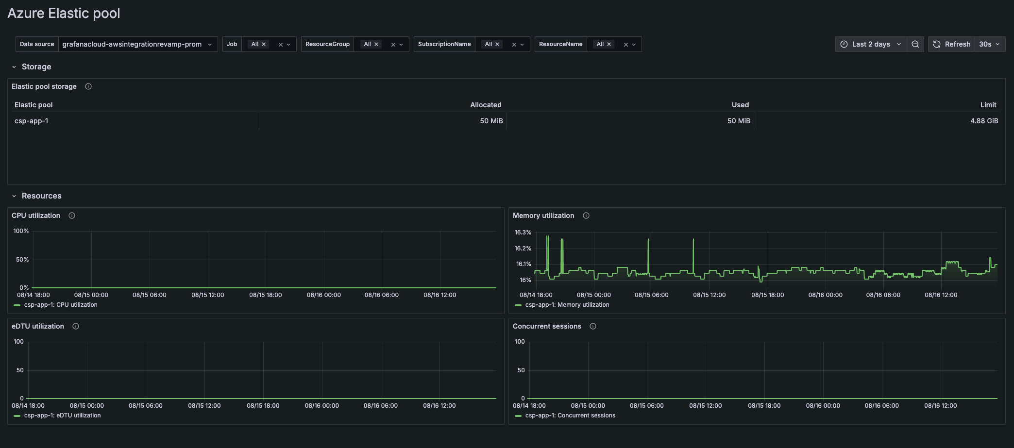
Cloud Provider Observability provides a unified experience to manage multiple cloud environments and streamline your monitoring and troubleshooting.
In addition to AWS, you can easily set up Azure and Google Cloud Platform to view:
New Azure On-behalf-of Authentication for the Grafana Databricks Datasource.
Databricks recommends that you use Microsoft Entra ID managed service principals in cases where you must authenticate with Azure Databricks and other Azure resources at the same time, and now this feature is available on v1.7.2 of the Databricks datasource.
We have released the two most requested features for Grafana Cloud k6 Private Load Zones: support for custom images and cloud environment variables.
With custom images, you can run tests using a custom k6 binary. For example, if you have a k6 build with extensions, you can test protocols that are not supported by default in k6.
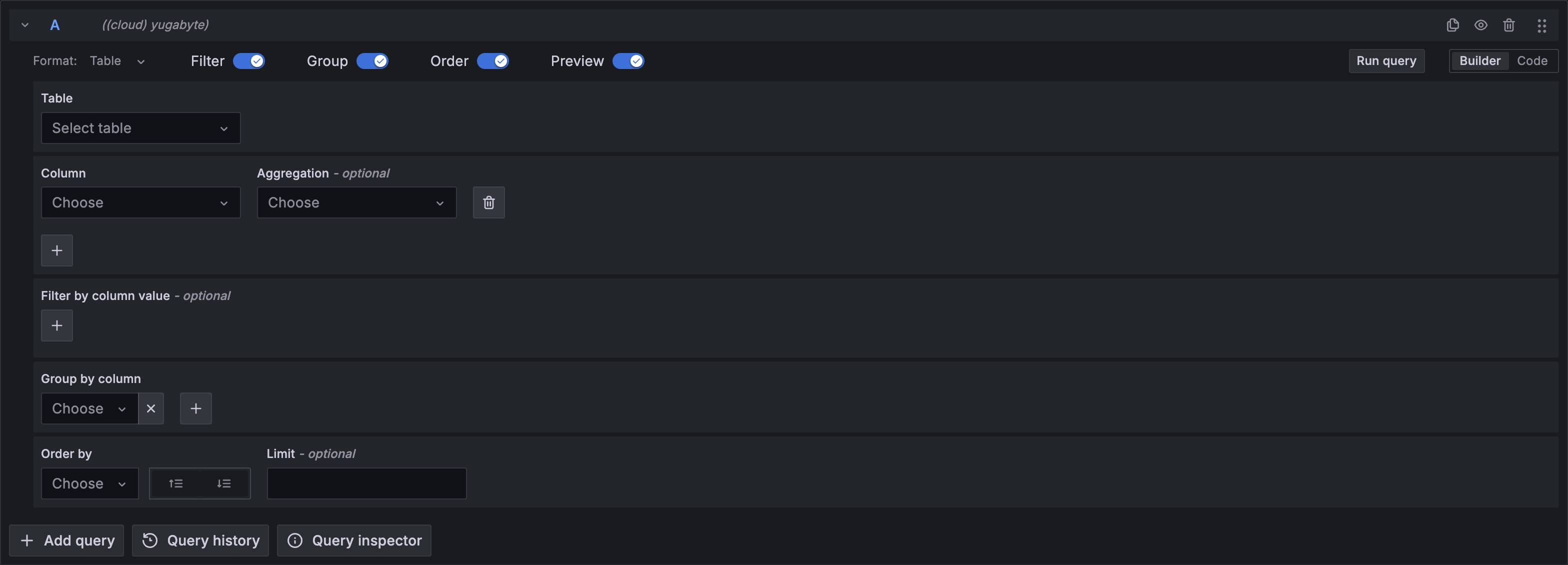
We are excited to announce the release of a new data source for Grafana: Yugabyte. This addition extends Grafana’s capabilities, enabling seamless integration with YugabyteDB.
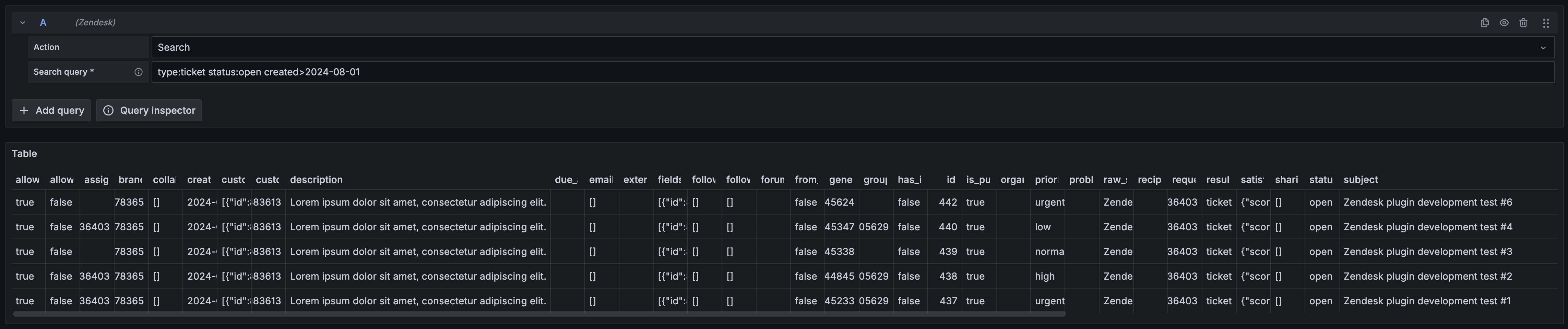
We are excited to announce the release of a new Zendesk data source for Grafana.
This addition extends Grafana’s capabilities, enabling seamless integration with Zendesk.
We’re excited to announce the release of the Grafana Netlify Datasource plugin, designed to seamlessly monitor your Netlify build data and deployments directly into Grafana. You can also visualize form responses and setup alerts on SSL certificates expirations. Find out more about in the Netlify data source documentation.

Introducing Atlassian Statuspage data source plugin.
The Atlassian Statuspage data source plugin allows querying Summary, Status, Components, Unresolved incidents, All incidents, Upcoming scheduled maintenances, Active scheduled maintenances, All scheduled maintenances
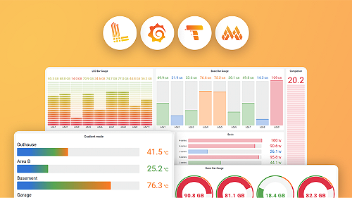
The state timeline visualization now supports pagination. The Page size option lets you paginate the state timeline visualization to limit how many series are visible at once. This is useful when you have many series. Previously, all the series in a state timeline were made to fit within the single window of the panel, which could make it hard to read.
We’ve made a number of exciting updates to transformations!
You can now use variables in some transformations
Template variables are now supported for the Limit, Sort by, Filter data by values, Grouping to matrix (a community contribution ⭐️), Heatmap, and Histogram transformations. This enables dynamic transformation configurations based on panel data and dashboard variables.
The Drone data source plugin allows you to retrieve data for repositories and builds from your Drone instance.

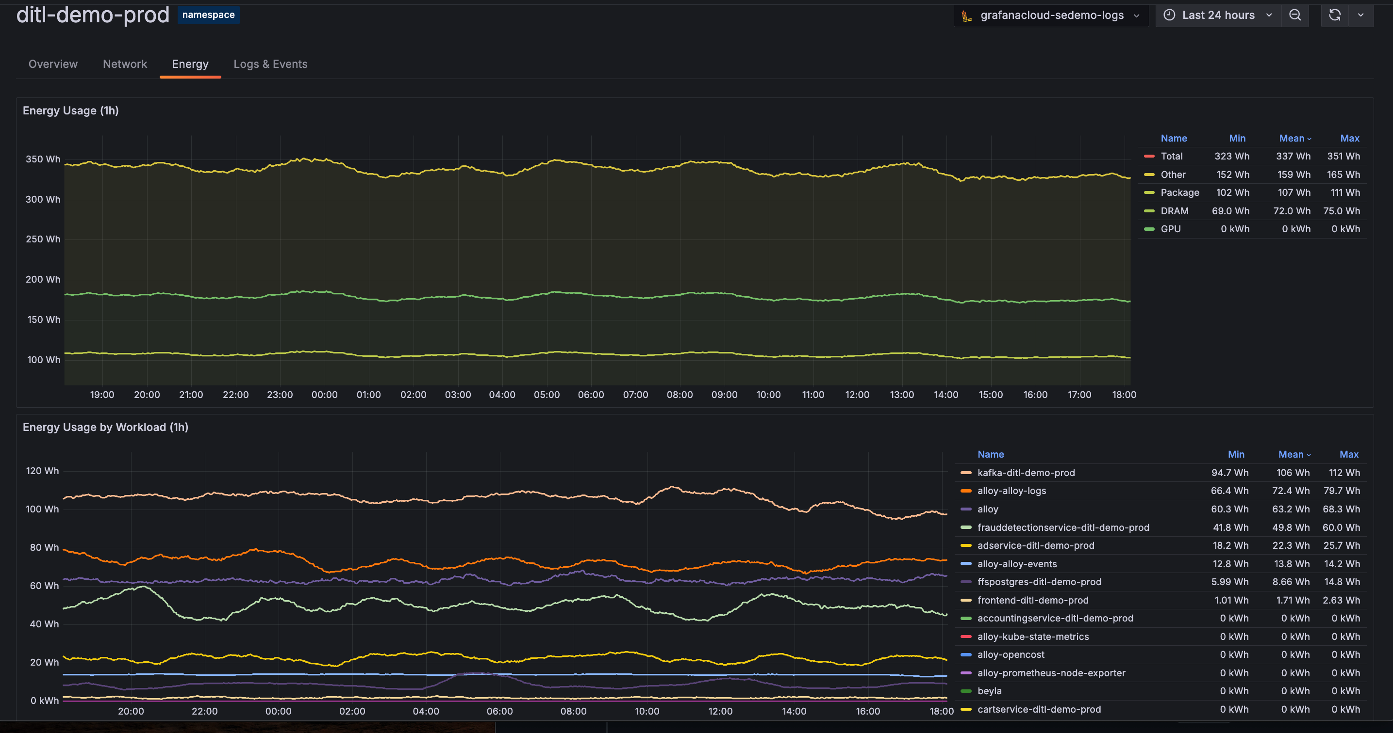
View energy data for your Kubernetes infrastructure components through Kubernetes Monitoring.
Native histograms are a data type in Prometheus that can produce, store, and query high-resolution histograms of observations. It usually offers higher resolution and more straightforward instrumentation than classic histograms.
We are excited to announce support for cross-account querying in Metric Insights query builder for AWS Cloudwatch Plugin. This enables building SQL queries to monitor across multiple accounts in the same region in AWS Cloudwatch.
This feature introduces an account dropdown for selecting one or all of your source accounts and builds a query that targets them. Furthermore, results can be grouped by account ID by selecting “Account ID” in the Group By dropdown.
For more complex queries that are not covered by the options in the builder you can switch to the manual Code editor and edit the query.
To set up cross-account querying for AWS Cloudwatch Plugin, see instructions here.