Plugins 〉Split Flap
Split Flap
Split Flap Panel for Grafana
A retro-style Split Flap display panel for Grafana.
It brings the classic mechanical look of airport departure boards (Solari boards) to your dashboards. I built this to offer a high-quality, animated visualization that feels "real"—with proper physics for the flaps and smooth animations. Perfect for status boards, KPIs, or just making your dashboard look awesome.
Features
🕒 Clock Mode
Turn your dashboard into a stylish world clock.
- Standalone: Does not require any data source.
- Timezones: Support for all major world timezones (400+ timezones available).
- Formats: 12h/24h options, show/hide seconds.
- Time Separator: Choose between Colon (:), Dot (.), Dash (-), Space ( ), or None.
- Date Format: Optional date display (DD/MM/YYYY, MM/DD/YYYY, YYYY-MM-DD, DD.MM.YYYY).
- Day of Week: Optionally display the current day name (short format).
🔄 Smart Animation
The flip logic isn't just random:
- Numbers: Flip fast using a numeric-only path (e.g., 1 -> 2 is quick).
- Text: Goes through the full alphabet cycle, just like the real mechanical ones.
- Physics: Long flips accelerate and then slow down at the end (easing).
🎨 Themes
Comes with a bunch of built-in styles so you don't have to write CSS:
| Theme | Description | Best For |
|---|---|---|
| Classic | Standard dark grey, flat look. | General use |
| Classic 3D | Like Classic but with more depth and shadows. | Realistic look |
| Aviation: Departure | Classic airport board style with yellow text on black. | Flight departure boards |
| Aviation: Cockpit | Technical instrument style with cyan text. | Aircraft cockpits |
| Aviation: Tarmac | Orange/amber high-visibility style. | Ground operations |
| Swiss SBB: Black | Swiss railway black display style. | Transportation |
| Swiss SBB: White | Swiss railway white display style. | Transportation |
| Swiss SBB: Blue | Swiss railway blue with red border. | Transportation |
| Airport | Gold text on black background. | Flight boards |
| Mechanical | White/Metal industrial style. | IoT / Machinery |
| Cyberpunk | Neon cyan with CRT scanlines. | Sci-fi dashboards |
| Matrix | Actual digital rain animation in the background. | Hacker vibes |
| Neon | Dark background with heavy text glow. | Night mode |
| E-Ink | High contrast, paper-like with vignette. | E-readers look |
| Glass | Frosted glass effect with transparency. | Modern UI |
| Blue Glass | Blue-tinted glass effect. | Modern UI |
| Rainbow | Colorful gradient display. | Colorful dashboards |
| Newspaper | Halftone newspaper print style. | Vintage look |
| iOS Light | Apple iOS light mode style. | Modern Apple-style UI |
| iOS Dark | Apple iOS dark mode style. | Modern Apple-style UI |
| Wood | Wooden texture style. | Natural/organic look |
| Red 3D | Red 3D gradient style. | Alerts / Warnings |
📊 Data Options
| Option | What it does |
|---|---|
| Value Aggregation | Pick what to show from the series: Last, First, Min, Max, Mean, Sum, Count, etc. |
| Main Content | Choose what goes on the flaps: Value, Name, Name + Value, or Value + Name. |
| Auto Fit | Automatically calculates the best card size to fit the panel. Turn off for fixed size. |
| Name Position | Position of series name: Top, Bottom, Left, or Right. |
| Name Alignment | Alignment of series name: Start, Center, or End. |
| Name Font Size | Custom font size for series name (8-100px). |
| Unit Position | Position of unit: Top, Bottom, Left, Right, or None. |
| Unit Alignment | Alignment of unit: Start, Center, or End. |
| Unit Rotation | Rotate unit text 90 degrees. |
| Custom Unit | Override the unit with custom text. |
| Unit Font Size | Custom font size for unit (8-100px). |
Examples
See the panel in action with different configurations:
Default View
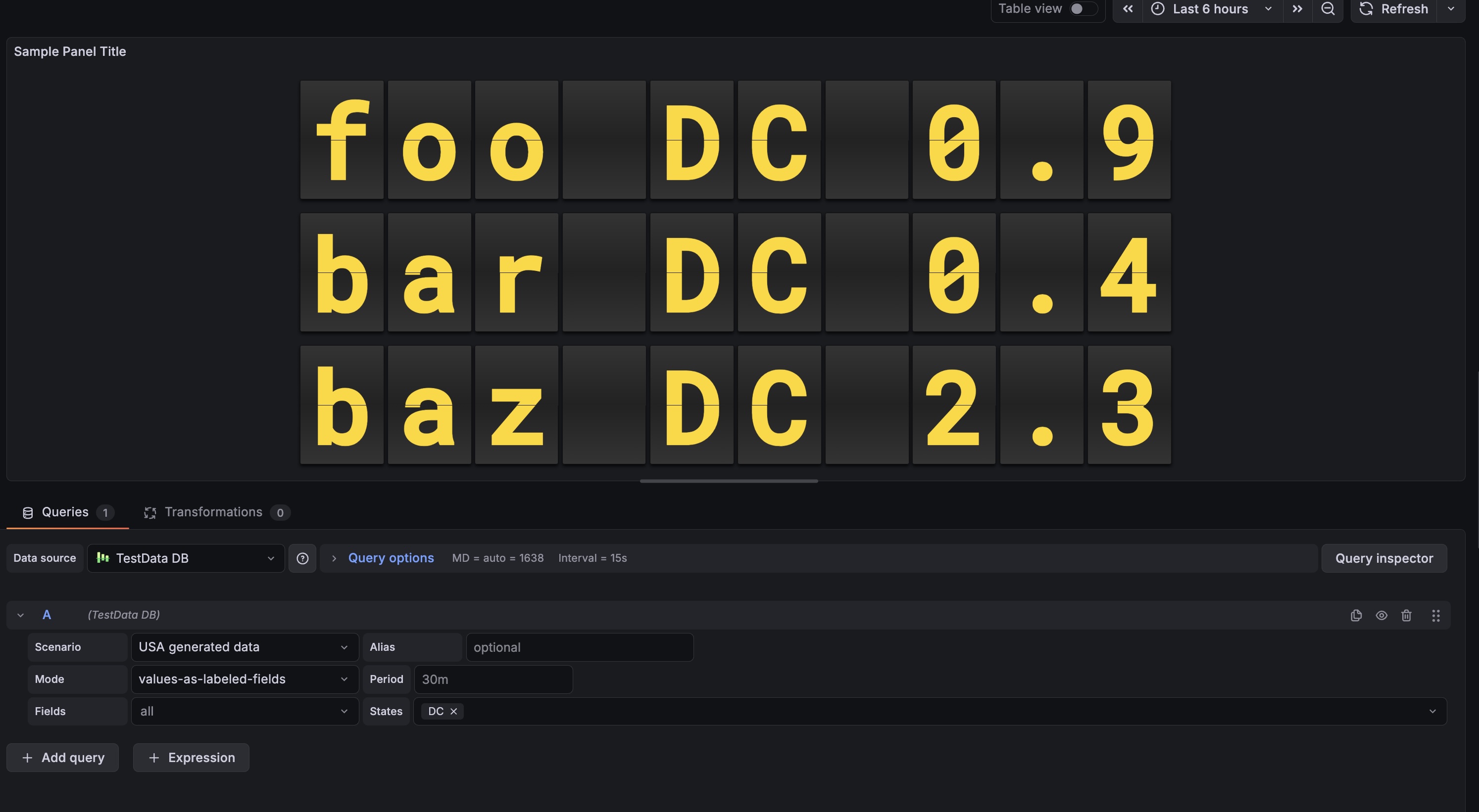 Shows numeric values with the classic airport look.
Usage
- Add it: Find "Split Flap" in the visualization list.
- Choose Mode:
- Data Series: Connect a data source to visualize metrics.
- Clock: Display current time for any timezone (no data source needed).
- Tweak it:
- Change layout (Vertical/Horizontal).
- Pick a theme that fits your dashboard.
- Set up Thresholds to change colors dynamically (e.g., red when value > 80).
Configuration
Panel Options
| Setting | Description | Default |
|---|---|---|
| Mode | Choose between Data Series or Clock. | Data Series |
| Layout | Direction of the series grid (Horizontal / Vertical). | Horizontal |
| Show Separators | Draw lines between different series. | Off |
| Theme | Visual style of the flaps (see Themes section above). | Classic |
| Show Name | Display series name outside the flaps. | On |
| Name Position | Where to place the name: Top, Bottom, Left, or Right. | Top |
| Name Alignment | How to align the name: Start, Center, or End. | Center |
| Name Font Size | Font size for the name (8-100px). | 18 |
| Show Unit | Display unit outside the flaps. | On |
| Unit Position | Where to place the unit: Top, Bottom, Left, Right, or None. | Right |
| Unit Alignment | How to align the unit: Start, Center, or End. | Center |
| Unit Rotation | Rotate unit text 90 degrees. | Off |
| Custom Unit | Override the unit with custom text. | (empty) |
| Unit Font Size | Font size for the unit (8-100px). | 24 |
| Threshold Target | What to colorize: Text, Tile (card background), or Panel background. | None |
Clock Options (Clock Mode Only)
| Setting | Description | Default |
|---|---|---|
| 12-Hour Format | Use 12-hour format (AM/PM) instead of 24-hour. | Off |
| Show Seconds | Display seconds in the time. | On |
| Timezone | Select timezone (400+ available) or use browser local time. | Browser Local |
| Show Timezone | Display timezone name (e.g., "EST", "PST", "UTC") outside the clock. | Off |
| Timezone Position | Where to place the timezone: Top, Bottom, Left, or Right. | Bottom |
| Timezone Alignment | How to align the timezone: Start, Center, or End. | Center |
| Timezone Font Size | Font size for the timezone (8-100px). | 18 |
| Time Separator | Character between hours, minutes, seconds: Colon (:), Dot (.), Dash (-), Space ( ), or None. | Colon |
| Date Format | Optional date display format: DD/MM/YYYY, MM/DD/YYYY, YYYY-MM-DD, DD.MM.YYYY, or None. | None |
| Show Day of Week | Display abbreviated day name (Mon, Tue, etc.). | Off |
| AM/PM Position | Position of AM/PM indicator: In Text (Default), Left, or Right. | In Text |
| AM/PM Orientation | Orientation of AM/PM: Horizontal or Vertical. | Horizontal |
| AM/PM Font Size | Font size for AM/PM indicator. | 18 |
| AM/PM Gap | Spacing between AM/PM and the clock digits. | 12 |
Flip Options
| Setting | Description | Default |
|---|---|---|
| Digits | Minimum number of characters/cards to show. | 6 |
| Rounding | Decimal places for numbers. | 1 |
| Auto Fit | Auto-scale card size to fill the panel. | On |
| Size (px) | Fixed card height (if Auto Fit is off). | 50 |
| Gap | Space between individual cards. | 4 |
| Speed | Animation speed multiplier (0.1-2.0). | 0.49 |
| Fast Speed | Speed for quick number transitions (0.05-0.5). | 0.1 |
Grafana Cloud Free
- Free tier: Limited to 3 users
- Paid plans: $55 / user / month above included usage
- Access to all Enterprise Plugins
- Fully managed service (not available to self-manage)
Self-hosted Grafana Enterprise
- Access to all Enterprise plugins
- All Grafana Enterprise features
- Self-manage on your own infrastructure
Installing Split Flap on Grafana Cloud:
Installing plugins on a Grafana Cloud instance is a one-click install; same with updates. Cool, right?
Note that it could take up to 1 minute to see the plugin show up in your Grafana.
Warning
Plugin installation from this page will be removed in February 2026. Use the Plugin Catalog in your Grafana instance instead. Refer to Install a plugin in the Grafana documentation for more information.
Installing plugins on a Grafana Cloud instance is a one-click install; same with updates. Cool, right?
Note that it could take up to 1 minute to see the plugin show up in your Grafana.
Installing plugins on a Grafana Cloud instance is a one-click install; same with updates. Cool, right?
Note that it could take up to 1 minute to see the plugin show up in your Grafana.
Warning
Plugin installation from this page will be removed in February 2026. Use the Plugin Catalog in your Grafana instance instead. Refer to Install a plugin in the Grafana documentation for more information.
Installing plugins on a Grafana Cloud instance is a one-click install; same with updates. Cool, right?
Note that it could take up to 1 minute to see the plugin show up in your Grafana.
For more information, visit the docs on plugin installation.
Installing on a local Grafana:
For local instances, plugins are installed and updated via a simple CLI command. Plugins are not updated automatically, however you will be notified when updates are available right within your Grafana.
1. Install the Panel
Use the grafana-cli tool to install Split Flap from the commandline:
grafana-cli plugins install The plugin will be installed into your grafana plugins directory; the default is /var/lib/grafana/plugins. More information on the cli tool.
Alternatively, you can manually download the .zip file for your architecture below and unpack it into your grafana plugins directory.
Alternatively, you can manually download the .zip file and unpack it into your grafana plugins directory.
2. Add the Panel to a Dashboard
Installed panels are available immediately in the Dashboards section in your Grafana main menu, and can be added like any other core panel in Grafana.
To see a list of installed panels, click the Plugins item in the main menu. Both core panels and installed panels will appear.
Changelog
2.2.7 (2026-01-09)
Fixes
- Provisioning: Fixed Docker Compose configuration to use correct plugin ID (
dzaczek-splitflap-panel), enabling proper provisioning and testing of the plugin.
2.2.1 (2026-01-08)
Fixes
- CI/CD: Fixed dependency installation issues in GitHub Actions by switching
react-data-gridto HTTPS protocol. - Linting: Fixed missing dependency in
useEffecthook inFlipDigitcomponent.
2.2.0 (2026-01-08)
Features
- AM/PM Customization: Added full control over AM/PM indicator in 12-hour clock mode:
- Position: Can be placed Left, Right, or Inline (In Text).
- Orientation: Support for Vertical (stacked characters) or Horizontal layout.
- Styling: Independent control over font size and gap/spacing.
- Independent Rendering: AM/PM is now rendered as a separate FlipDisplay component even in "In Text" mode, allowing for consistent styling and animation.
Improvements
- Clock Logic: Optimized clock animation to use a dedicated 0-9 numeric drum for seconds/minutes, eliminating lag and "scrolling" through special characters during time changes.
- Layout: Improved layout engine for FlipItem to better handle "shrink-wrap" sizing, ensuring the clock stays centered regardless of timezone or AM/PM alignment.
2.1.38 (2025-12-12)
Fixes
- Flip Animation Logic: Fixed a synchronization issue where the bottom half of the digit changed too early (before the flap finished falling). Now implements correct split-flap physics:
- Top half reveals the new character immediately.
- Bottom half keeps the old character until covered by the falling flap.
- Falling flap transitions from old character (front) to new character (back).
- Animation Speed: Adjusted default flip duration from 0.6s to 0.49s for snappier, more realistic mechanical movement.
Documentation
- Intro Rewrite: Made the README introduction more accessible and developer-friendly.
2.1.37 (2025-12-12)
Summary
This release represents a major evolution of the Split Flap Panel, with significant improvements across security, architecture, themes, and documentation. The journey from 1.1.31 to 2.1.37 has been organized into three main development stages:
- Etap 1: Security & Architecture Overhaul (1.1.32) - Complete security hardening and React migration
- Etap 2: Theme Expansion & Visual Enhancements (1.2.x - 2.0.x) - Major theme expansion from 9 to 22 themes
- Etap 3: Final Polish & Documentation (2.1.x) - Comprehensive documentation updates
Statistics
- Themes: Expanded from 9 to 22 themes (+144% increase)
- Security: Eliminated all XSS vulnerabilities, full CSP compliance
- Code Quality: Migrated 754 lines of legacy code to modern React architecture
- Documentation: Complete rewrite covering all features and options
Statistics
- Themes: Expanded from 9 to 22 themes (+144% increase)
- Security: Eliminated all XSS vulnerabilities, full CSP compliance
- Code Quality: Migrated 754 lines of legacy code to modern React architecture
- Documentation: Complete rewrite covering all features and options
Documentation
- Complete README overhaul: Comprehensive update documenting all 22 available themes, all configuration options, Clock Mode features, and layout customization options
- CHANGELOG expansion: Added detailed changelog entries for all versions from 1.1.31 to 2.1.37, organized by development stages
- Configuration documentation: Fully documented Clock Mode options (time separator, date format, day of week)
- Layout documentation: Complete documentation of name and unit positioning, alignment, rotation, and font size options
- Animation documentation: Added Fast Speed option documentation
Etap 3: Final Polish & Documentation (2.1.x)
2.1.32 (2025-12-08)
Documentation
- Complete README update: Added all 22 available themes to documentation with descriptions and use cases:
- Aviation themes (Departure, Cockpit, Tarmac)
- Swiss SBB themes (Black, White, Blue)
- iOS themes (Light, Dark)
- Specialty themes (Wood, Red 3D, Blue Glass, Rainbow, Newspaper)
- Configuration options: Documented all Clock Mode options:
- Time separator options (Colon, Dot, Dash, Space, None)
- Date format options (DD/MM/YYYY, MM/DD/YYYY, YYYY-MM-DD, DD.MM.YYYY)
- Day of week display option
- Layout options: Documented name and unit positioning, alignment, rotation, and font size options
- Animation options: Added Fast Speed option documentation
- Data options: Documented value aggregation, main content display modes, and auto-fit functionality
Etap 2: Theme Expansion & Visual Enhancements (1.2.x - 2.0.x)
2.0.0 (2025-12-04)
Features
- Major Theme Expansion: Added 13 new professional themes bringing total to 22 themes:
- Aviation Collection (3 themes):
aviation-departure: Classic airport board style with yellow text (#f7d100) on black background, uses Oswald fontaviation-cockpit: Technical instrument style with cyan text (#00ffcc) on dark gray, uses Share Tech Mono fontaviation-tarmac: Orange/amber high-visibility style (#fdcb6e) for ground operations
- Swiss SBB Collection (3 themes):
swiss-sbb-black: Black background with white textswiss-sbb-white: White background with black textswiss-sbb-blue: Dark blue with red border (added in 1.2.0)
- iOS Collection (2 themes):
ios-light: Apple iOS light mode style with white backgroundios-dark: Apple iOS dark mode style with dark background
- Specialty Themes (5 themes):
wood: Natural wooden texture with brown tonesred-3d: Red 3D gradient style for alerts/warningsblue-glass: Blue-tinted glass effect with transparencyrainbow: Colorful gradient display with rainbow effectnewspaper: Halftone newspaper print style with vintage look
- Aviation Collection (3 themes):
Improvements
- Font System: Updated logo and theme fonts to use system fonts for improved cross-platform compatibility
- Aviation themes automatically load Google Fonts (Oswald, Share Tech Mono) when available
- Graceful fallback to system fonts for offline/air-gapped environments
- Theme Organization: Better categorization and naming of themes for easier discovery
- Visual Polish: Enhanced gradients, shadows, and effects across all new themes
1.2.0 (2025-12-11)
Features
- Swiss SBB Blue Theme: Added official Swiss railway blue theme (
swiss-sbb-blue) with:- Dark blue background (
#0B1E3C) - White text
- Red border accent (
#EB0000) matching SBB branding - Gradient effects for depth
- Dark blue background (
Improvements
- Theme Refinements: Improved visual consistency across all themes
- Theme Organization: Better categorization of themes in the selector
Etap 1: Security & Architecture Overhaul (1.1.32)
1.1.32 (2025-12-11)
Security
- XSS Protection: Removed XSS vulnerabilities by replacing
innerHTML(lines 328, 584 in old flip-engine) with React rendering - Character Escaping: Added character escaping in FlipDigit to only allow safe characters (numbers, letters, and specific symbols)
- Safe DOM Updates: All DOM updates now use React's safe rendering mechanisms
CSP Compatibility
- Removed Google Fonts: Removed Google Fonts
@importstatements (lines 330-331) that violated Content Security Policy - System Font Fallbacks: Replaced with system font fallbacks (e.g.,
-apple-system,BlinkMacSystemFont,'Segoe UI',sans-serif) - Local Fonts Only: All fonts now use local/system fonts that work with strict CSP policies
Architecture Overhaul
- React Migration: Complete migration from custom elements to React components
- Created
FlipDigit.tsx— React component for individual flip digits with animation logic - Created
FlipDisplay.tsx— Component managing multiple digits - Removed custom element (
FlipSensorCard) in favor of React components - Updated
FlipBoard.tsxto use the new React components
- Created
- Styling Modernization:
- Converted all styles to Emotion CSS-in-JS (Grafana best practice)
- Removed shadow DOM and inline styles
- All themes preserved with the same visual appearance
- Code Cleanup:
- Removed deprecated
src/core/flip-engine.ts(754 lines removed) - Removed duplicate
src/core/flip-engine.txfile - Improved code organization and maintainability
- Removed deprecated
Impact
- Security: Plugin is now safe from XSS attacks and CSP-compliant
- Maintainability: React-based architecture is easier to maintain and extend
- Performance: Better React optimization and rendering performance
- Compatibility: Works in environments with strict CSP policies
1.1.31 (2025-11-30)
Maintenance
- Fixed incorrect path for
grafana/plugin-actions/build-pluginin release workflow (reverted to explicit tag path).
1.1.30 (2025-11-30)
Maintenance
- Reverted to official
grafana/plugin-actions/build-pluginworkflow, now that signing issues are resolved via CLI flags. - Kept
softprops/action-gh-releasefor artifact publishing.
1.1.29 (2025-11-30)
Maintenance
- Official release (removed
-betasuffix). - Stabilized build workflow with manual signing and packaging steps.
1.1.28-beta.26 (2025-11-30)
Maintenance
- Fixed release artifact naming by using git tag version instead of parsing JSON.
- Marked release as full release (not prerelease).
1.1.28-beta.25 (2025-11-30)
Maintenance
- Replaced opaque
package-pluginaction with manualzipcommand to ensure artifact creation and correct naming for release upload.
1.1.28-beta.24 (2025-11-30)
Maintenance
- Switched to
softprops/action-gh-releasefor reliable GitHub Release creation.
1.1.28-beta.23 (2025-11-30)
Maintenance
- Added manual MD5 checksum generation step to release workflow.
1.1.28-beta.22 (2025-11-30)
Maintenance
- Corrected artifact path pattern for GitHub Release upload (checking root directory instead of
dist/).
1.1.28-beta.21 (2025-11-30)
Maintenance
- Added GitHub Release step to upload plugin artifacts (.zip and .md5) to the release page.
1.1.28-beta.20 (2025-11-30)
Maintenance
- Added
id-token: writeandattestations: writepermissions to workflow for build provenance attestation.
1.1.28-beta.19 (2025-11-30)
Maintenance
- Removed
rootUrlsfromplugin.jsonto satisfy plugin validator (using command line flag for signing instead). - Cleaned up build workflow.
1.1.28-beta.18 (2025-11-30)
Maintenance
- Added
--rootUrlsflag toyarn signcommand as a fallback for JSON configuration.
1.1.28-beta.17 (2025-11-30)
Maintenance
- Fixed GitHub Action path for
package-plugin. - Added forced injection of
rootUrlsintodist/plugin.jsonbefore signing to ensure field presence.
1.1.28-beta.16 (2025-11-30)
Maintenance
- Switched to manual build workflow in GitHub Actions to debug signing issues.
1.1.28-beta.15 (2025-11-30)
Maintenance
- Added debug step to CI to verify
plugin.jsoncontent.
1.1.28-beta.14 (2025-11-30)
Maintenance
- Bump version to retry build process.
1.1.28-beta.13 (2025-11-30)
Maintenance
- Added
rootUrlstoplugin.jsonto fix signing error for private plugin token.
1.1.28-beta.12 (2025-11-30)
Maintenance
- Re-trigger release build with correct secrets configuration.
1.1.28-beta.11 (2025-11-30)
Maintenance
- Fixed Github Action reference for
grafana/plugin-actions/build-plugin.
1.1.28-beta.10 (2025-11-30)
Maintenance
- Fixed yarn registry configuration to resolve installation issues in CI.
- Updated workflow configurations.
1.0.0 (2025-11-30)
Features
- Smart Flip Logic: Numbers spin fast using a numeric drum, while text uses the full alphanumeric drum for realistic effect.
- Animation Easing: Added physics-based easing (acceleration/deceleration) for long flip sequences.
- New Themes: Added
Matrix(digital rain),Cyberpunk(CRT effect),Airport,Mechanical,Glass, andNeonstyles. - Data Aggregation: Added selector for Last, First, Min, Max, Mean, Sum, Count value reduction.
- Display Content: Option to show Value, Name, or both directly on the flaps (e.g. "London 20").
- Performance: Added
will-change: transformfor GPU acceleration and optimized React re-renders. - Accessibility: Added ARIA labels and roles for screen readers.
Fixes
- Thresholds: Fixed conflict where themes overrode Grafana threshold colors (removed
!importantfrom styles). - Text Formatting: Fixed issue where "Name + Value" ignored rounding settings (now formats numbers before combining).
- Visual Glitches: Fixed "TTkyo" glitch by preventing animation on disconnected DOM elements.
- Spacing: Added proper spacing for "Name + Value" display mode.
- Memory: Added cleanup logic to stop animations when panel is unmounted.
- Timestamp: Fixed logic to prioritize value fields over time fields.