EDA license utilization
EDA license utilization summary with average and peak usage. This dashboard uses data from FLEXlm Exporter utility.
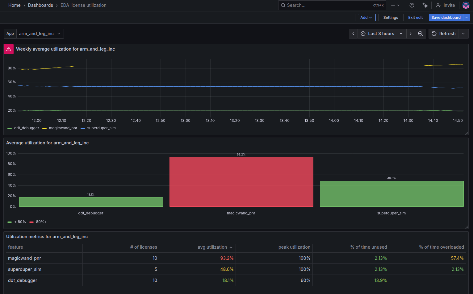
This dashboard assists with long-term EDA license utilization analysis. There are 3 sections:
- weekly average time-series that allows to filter-out the noise from nights/weekends and look for trends
- bar chart with average utilization over the whole plotting period, say the last 6 months
- utilization table with average, peak, zero and 100% usage metrics.
The data for this dashboard comes from flexlm_exporter developed by Mario Trangoni.
See this post with detailed installation instruction.
Data source config
Collector type:
Collector plugins:
Collector config:
Revisions
Upload an updated version of an exported dashboard.json file from Grafana
| Revision | Description | Created | |
|---|---|---|---|
| Download |