AWS ELB Application Load Balancer by Target Group
Visualize AWS ELB Application Load Balancer and Target Group metrics
This dashboard was modified from the most recent AWS Application Load Balancer dashboard currently available on the Grafana dashboards download page (ID:650) provided by the folks at monitoringartist. For our purposes, we also required Target Group specific metrics and I couldn't find a freely available dashboard that did this for us.
No collector is necessary. You simply need to have a valid, authenticated CloudWatch data source and at least one Application Load Balancer and associated TargetGroup.
Because TargetGroup CloudWatch metrics must be queried alongside their associated Application ELB, the $targetgroup variable is dependent upon the currently selected LoadBalancer ($loadbalancername). As such, only applicable Target Groups are displayed in the Target Group drop down, and they are updated when the user selects a different Load Balancer.
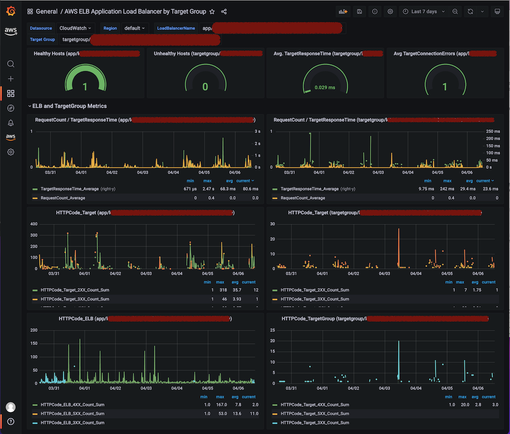
The gauges across the top are all Application ELB specific and have been added to the initial ELB template from which I started. The first three (Healthy and Unhealthy Hosts, Avg TargetResponseTime) are specific to the selected TargetGroup, whereas the fourth (Avg TargetConnectionErrors) is specific to the selected ELB.
The subsequent section of charts (ELB and TargetGroup Metrics) are two views of the same metrics; the chart on the left global to the selected ELB and the corresponding chart to the right the selected TargetGroup. The queried metric was changed where necessary (the 3xx, 4xx and 5xx metric names change from ELB to TargetGroup).
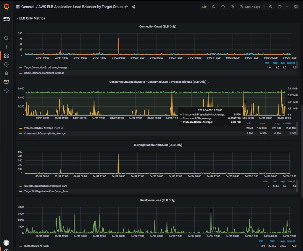
The final section (ELB Only Metrics) were existing charts in the source template (ID:650) which do not have corresponding TargetGroup Metrics. Some slight re-ordering was done to keep charts that were NaN/null for us at the bottom of the screen. If you use IPv6, good for you! Drag the charts around and edit at will!
The only other change worth mentioning is the that I have changed the behavior for null data points such that they are treated as null (and not zero, as in the original template). I would rather have an accurate point with no line, than a line between two valid datapoints that spans a period of nullness but implies values between. You may not like this behavior. In that case, I urge you to change it back! You'll have a continuous graph, though it may be misleading.
I hope you find this dashboard useful! Thanks again to the folks at monitoring artist, the authors of the dashboard from which this one was built.
NOTE: This dashboard is only very lightly tested and works very well for our environment and use-case. Your mileage, as you might expect, may vary.
No commercial support is offered or should be expected for this dashboard.
Data source config
Collector config:
Upload an updated version of an exported dashboard.json file from Grafana
| Revision | Description | Created | |
|---|---|---|---|
| Download |
AWS
Easily visualize and alert on more than 60 Amazon Web Services (AWS) resources using the fully managed Grafana Cloud platform.
Learn more
