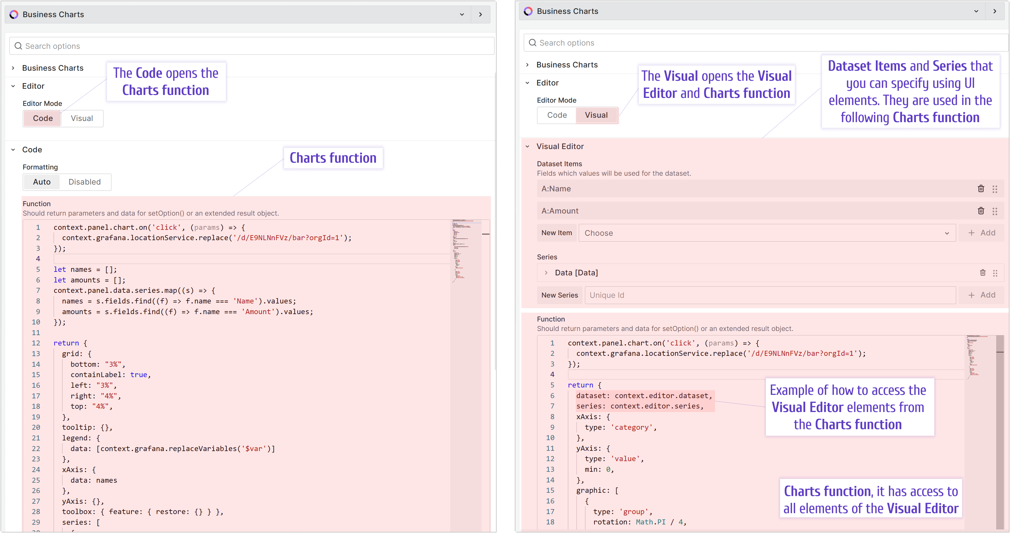
Visual editor
The Visual editor simplifies working with Grafana data frames and makes it easy to send data to the Charts function.
The Visual Editor helps you work with datasets, but you still need the Charts function for advanced use cases.
Visual Charts Editor tutorial for Business Charts 6.4.0
This feature is in beta. It works for all charts enabled in the Type drop-down list.
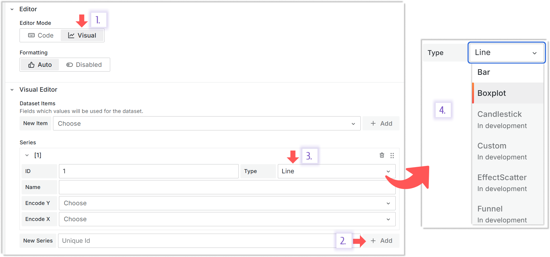
In development means that this type is coming soon. All other types are available for selection.
If your use case requires complex logic, use the Code mode.
Types
Below is a more detailed description of how the Visual Editor can be used for a particular series type.
Line
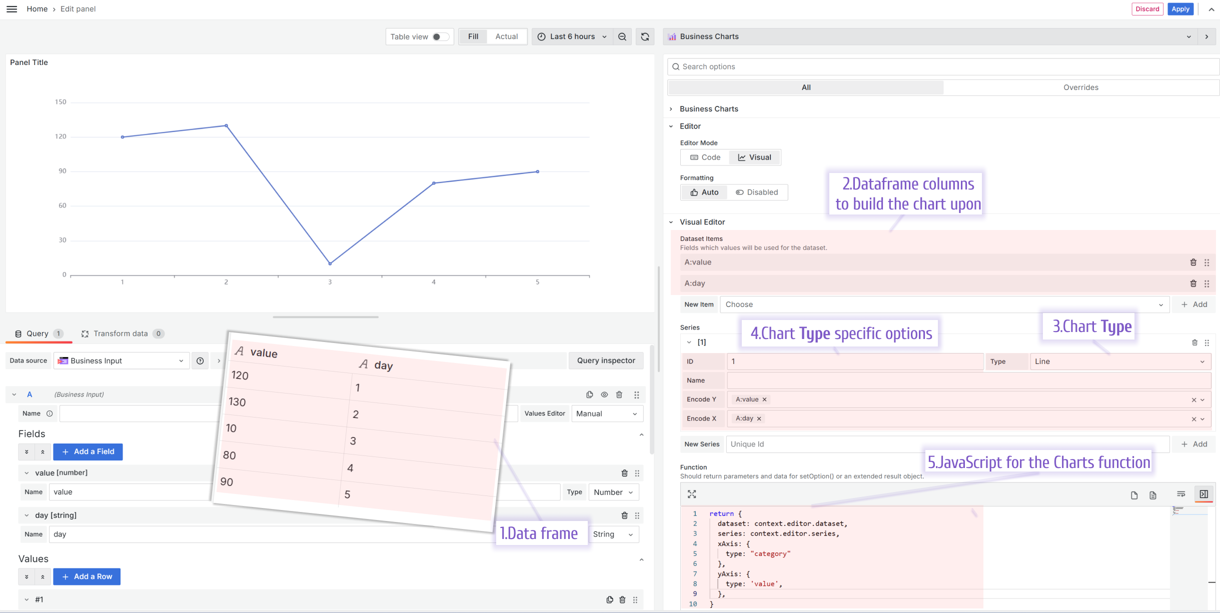
Required data frame. You need to have at least two columns of data. At least one column should be numerical.
Datasets. Create at least two datasets. Add at least two columns of data from your data frame into the Charts function input.
Chart Type. Set it to the Line.
Chart Type specific options. Ensure to specify Encode Y (values to be located on the vertical axis) and Encode X (values to be located on the horizontal axis).
Charts Function.
return {
  dataset: context.editor.dataset,
  series: context.editor.series,
  xAxis: {
    type: "category",
  },
  yAxis: {
    type: "value",
  },
};
Bar
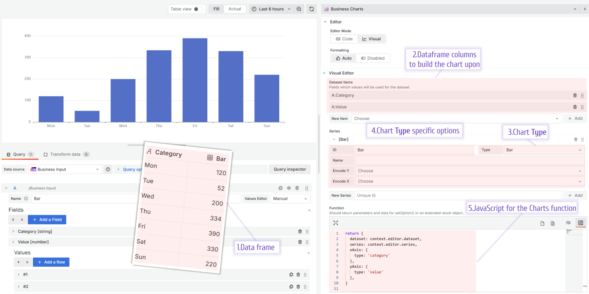
Required data frame. You need to have at least two columns of data. At least one column should be numerical.
Datasets. Create at least two datasets. Add at least two columns of data from your data frame into the Charts function input.
Chart Type. Set it to the Bar.
Chart Type specific options. For the Bar type, the only required option is ID.
Charts Function.
return {
  dataset: context.editor.dataset,
  series: context.editor.series,
  xAxis: {
    type: "category",
  },
  yAxis: {
    type: "value",
  },
};
Radar
A radar chart, also known as a spider chart, shows multivariate data stacked at an axis with the same central point. The chart usually displays two or more quantitative variables for comparison.
Here, we compare the allocated and actual budgets in six categories (company departments).
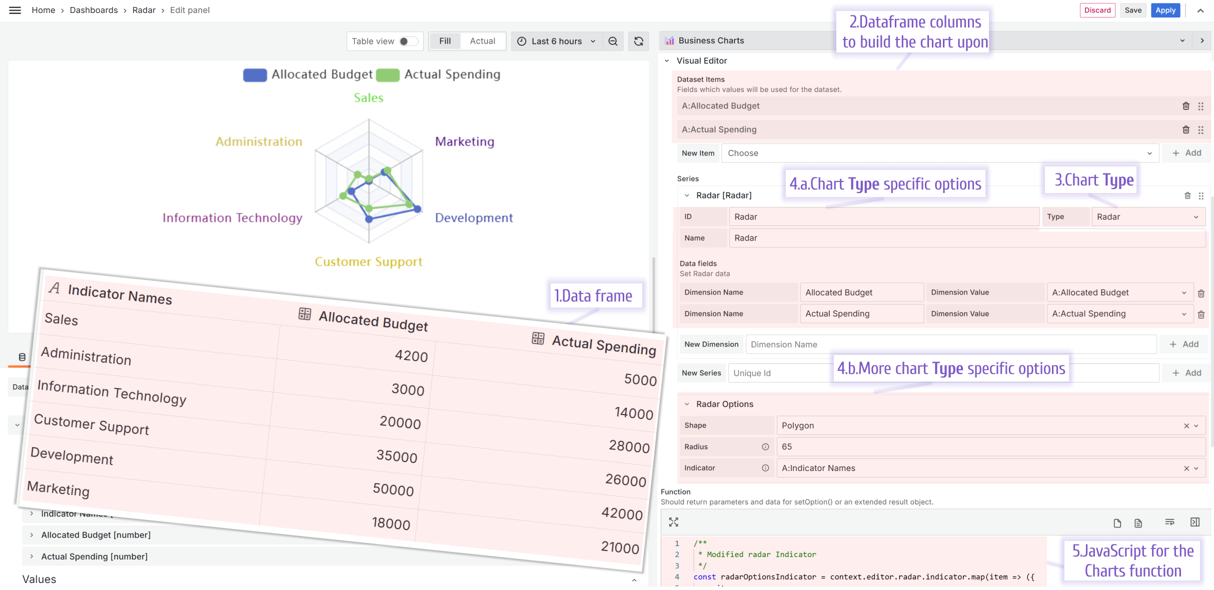
Required data frame. You need to have at least two columns of data. At least one column should be numerical. In this example, there are two numerical columns.
Datasets. Add numerical columns into your datasets.
Chart Type. Set it to the Radar.
Chart Type specific options. For the Radar type, specify dimensions where one dimension is one data series. In this example, there are two dimensions. One is for the allocated budget, and the other is for the actual spending.
Charts Function.
return {
  legend: {
    data: ["Allocated Budget", "Actual Spending"],
  },
  radar: context.editor.radar,
  series: context.editor.series,
};
Supported options
- Shape. It could be Circle or Polygon.
- Radius. The size of the radar in pixels.
- Indicator. It is a data frame column containing the radar category names (in this example, they are department names).
Sunburst
A sunburst chart is a circular diagram displaying pieces of a whole on multiple levels. It indicates the parts’ contribution to the whole, and each part can be further divided into smaller pieces.
Data for the sunburst chart should include levels. These levels represent the hierarchical structure of the data. The top level typically represents the set of main categories, and each further level decomposes the previous one, providing a more detailed view of the data.
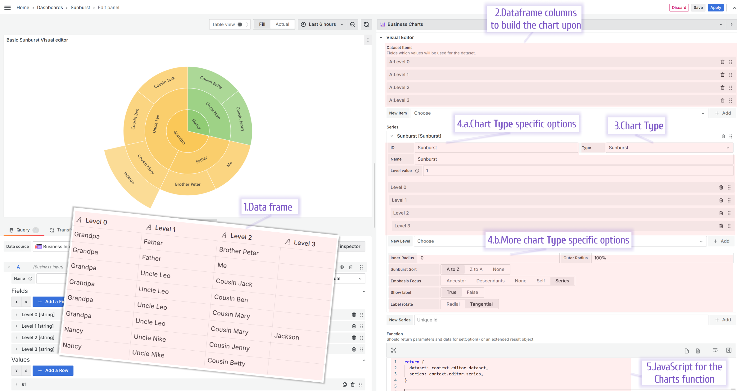
Required data frame. For a meaningful sunburst, you need at least two levels(two columns) of data.
Datasets. Add every level as a separate dataset. In this example, there are four levels; therefore, there are four datasets.
Chart Type. Set it to the Sunburst.
Chart Type specific options. Every column is a level for the Sunburst; ensure to rearrange them if needed.
Charts Function.
return {
  radar: context.editor.radar,
  series: context.editor.series,
};
Supported options
- Inner Radius and Outer Radius is the chart size relative to the panel’s in percentage.
- Sunburst sort. The label sorting.
- Emphasis Focus. What part of the chart is highlighted when a mouse hovers.
- Show label. Show or hide labels.
- Label rotate. Choose between two ways of label rotation.
Boxplot
The boxplot is a chart depicting a variable distribution in a compact way where you can compare it over time or between multiple entities.
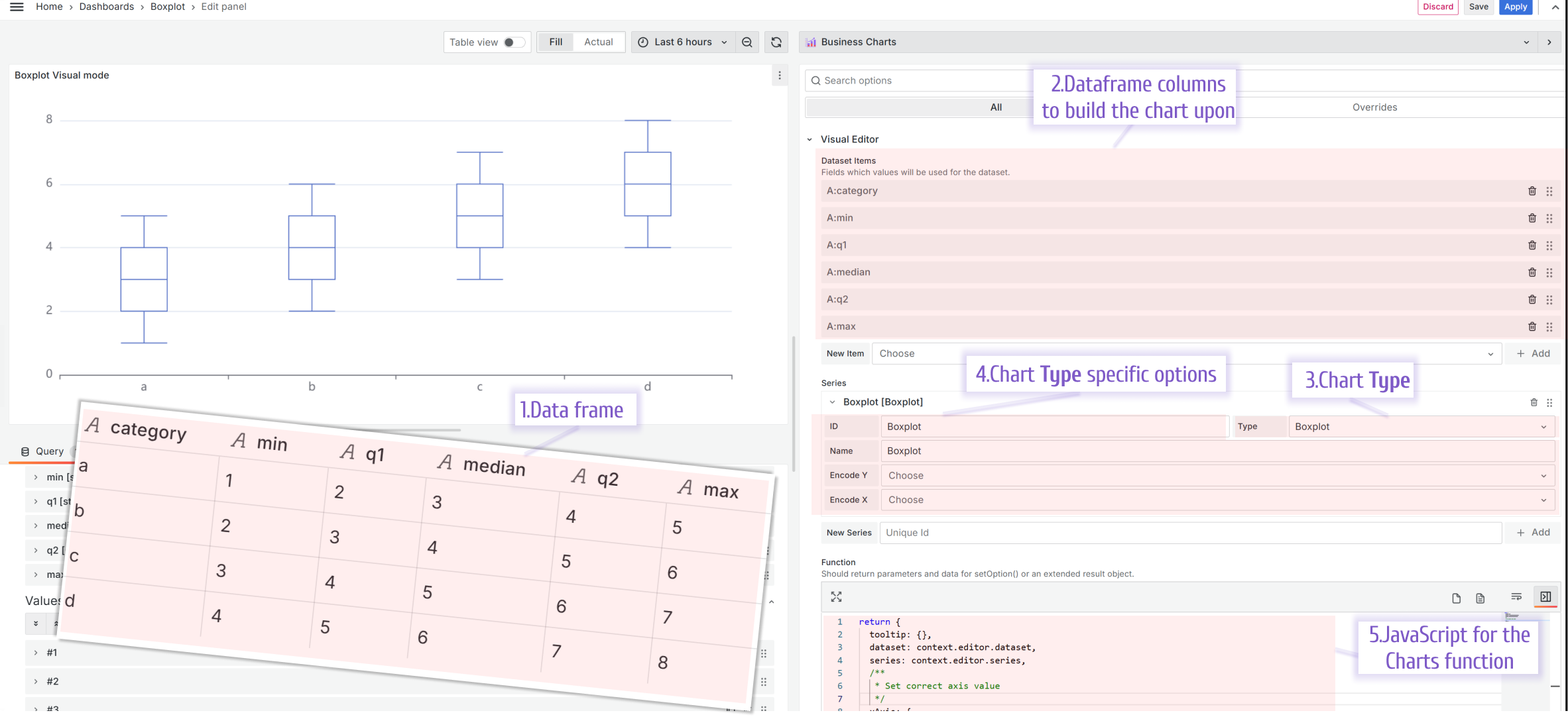
Required data frame. For each distribution, you provide the minimum, the first quartile (25% mark), the median, the third quartile (75% mark), and maximum values.
Datasets. For the Boxplot, you need to add six datasets, where the first dataset should contain the category, then minimum values, first quartile, median, third quartile, and maximum. The order of the datasets is important.
Chart Type. Set it to the Boxplot.
Chart Type specific options. There are no specific options to specify with the latest plugin release.
Charts Function.
return {
  tooltip: {},
  dataset: context.editor.dataset,
  series: context.editor.series,
  xAxis: {
    type: "category",
  },
  yAxis: {
    type: "value",
  },
};
Scatter
The scatter (also known as scatter graph, scatter plot, scattergram) is a chart that uses Cartesian coordinates to depict a value for two variables.
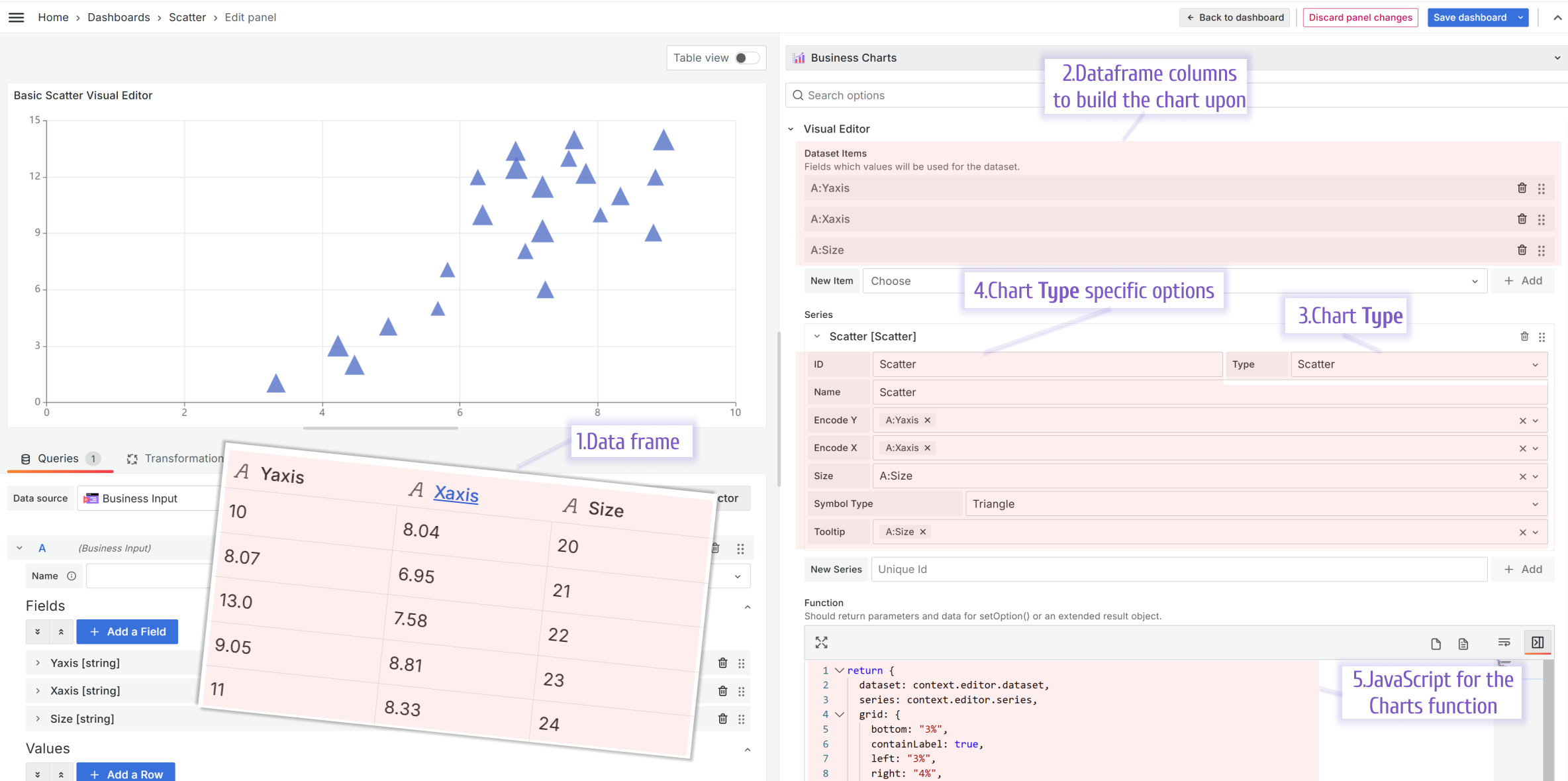
Required data frame. One data frame should consist of three columns, X and Y coordinates and then a value to display. For instance:
Datasets. For the Scatter, you need to add three datasets.
Chart Type. Set it to the Scatter.
Chart Type specific options. Specify which dataset should play the role of X coordinates, Y coordinates, and the value associated with each (x,y) coordinate.
Charts Function.
return {
  dataset: context.editor.dataset,
  series: context.editor.series,
  grid: {
    bottom: "3%",
    containLabel: true,
    left: "3%",
    right: "4%",
    top: "4%",
  },
  /**
   * Should be add to see tooltip
   */
  tooltip: {},
  xAxis: {
    type: "value",
  },
  yAxis: {
    type: "value",
  },
};
Examples
To get you started faster, there are many examples of how the Visual Editor can be used.
Please, check out the Examples section of the documentation.