Menu
Grafana Cloud
Enterprise
Open source
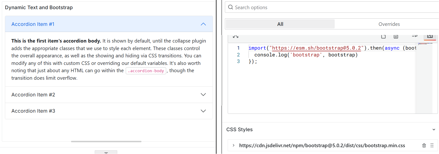
Bootstrap
Thanks to community member Josiah Solomon for the provided solution.
Use the following external Bootstrap and CSS libraries:
https://esm.sh/bootstrap@5.0.2

https://cdn.jsdelivr.net/npm/bootstrap@5.0.2/dist/css/bootstrap.min.css
Note
Grafana edit mode might prevent displaying the Bootstrap framework. Save your changes and check the result on the dashboard.
Code to copy
Into the Content or Default Content:
<div class="accordion" id="accordionExample">
  <div class="accordion-item">
    <h2 class="accordion-header" id="headingOne">
      <button
        class="accordion-button"
        type="button"
        data-bs-toggle="collapse"
        data-bs-target="#collapseOne"
        aria-expanded="true"
        aria-controls="collapseOne"
      >
        Accordion Item #1
      </button>
    </h2>
    <div
      id="collapseOne"
      class="accordion-collapse collapse show"
      aria-labelledby="headingOne"
      data-bs-parent="#accordionExample"
    >
      <div class="accordion-body">
        <strong>This is the first item's accordion body.</strong> It is shown by
        default, until the collapse plugin adds the appropriate classes that we
        use to style each element. These classes control the overall appearance,
        as well as the showing and hiding via CSS transitions. You can modify
        any of this with custom CSS or overriding default variables. It's
        also worth noting that just about any HTML can go within the
        <code>.accordion-body</code>, though the transition does limit overflow.
      </div>
    </div>
  </div>
  <div class="accordion-item">
    <h2 class="accordion-header" id="headingTwo">
      <button
        class="accordion-button collapsed"
        type="button"
        data-bs-toggle="collapse"
        data-bs-target="#collapseTwo"
        aria-expanded="false"
        aria-controls="collapseTwo"
      >
        Accordion Item #2
      </button>
    </h2>
    <div
      id="collapseTwo"
      class="accordion-collapse collapse"
      aria-labelledby="headingTwo"
      data-bs-parent="#accordionExample"
    >
      <div class="accordion-body">
        <strong>This is the second item's accordion body.</strong> It is hidden
        by default, until the collapse plugin adds the appropriate classes that
        we use to style each element. These classes control the overall
        appearance, as well as the showing and hiding via CSS transitions. You
        can modify any of this with custom CSS or overriding default
        variables. It's also worth noting that just about any HTML can go within
        the <code>.accordion-body</code>, though the transition does limit
        overflow.
      </div>
    </div>
  </div>
  <div class="accordion-item">
    <h2 class="accordion-header" id="headingThree">
      <button
        class="accordion-button collapsed"
        type="button"
        data-bs-toggle="collapse"
        data-bs-target="#collapseThree"
        aria-expanded="false"
        aria-controls="collapseThree"
      >
        Accordion Item #3
      </button>
    </h2>
    <div
      id="collapseThree"
      class="accordion-collapse collapse"
      aria-labelledby="headingThree"
      data-bs-parent="#accordionExample"
    >
      <div class="accordion-body">
        <strong>This is the third item's accordion body.</strong> It is hidden
        by default, until the collapse plugin adds the appropriate classes that
        we use to style each element. These classes control the overall
        appearance, as well as the showing and hiding via CSS transitions. You
        can modify any of this with custom CSS or overriding default
        variables. It's also worth noting that just about any HTML can go within
        the <code>.accordion-body</code>, though the transition does limit
        overflow.
      </div>
    </div>
  </div>
</div>
After Content Ready
Into the JavaScript > After Content Ready:
import("https://esm.sh/bootstrap@5.0.2");