Important: This documentation is about an older version. It's relevant only to the release noted, many of the features and functions have been updated or replaced. Please view the current version.
Configure a legend
A panel includes a legend that you can use to interpret data displayed in a visualization. Each legend option adds context and clarity to the data illustrated in a visualization.
Isolate series data in a visualization
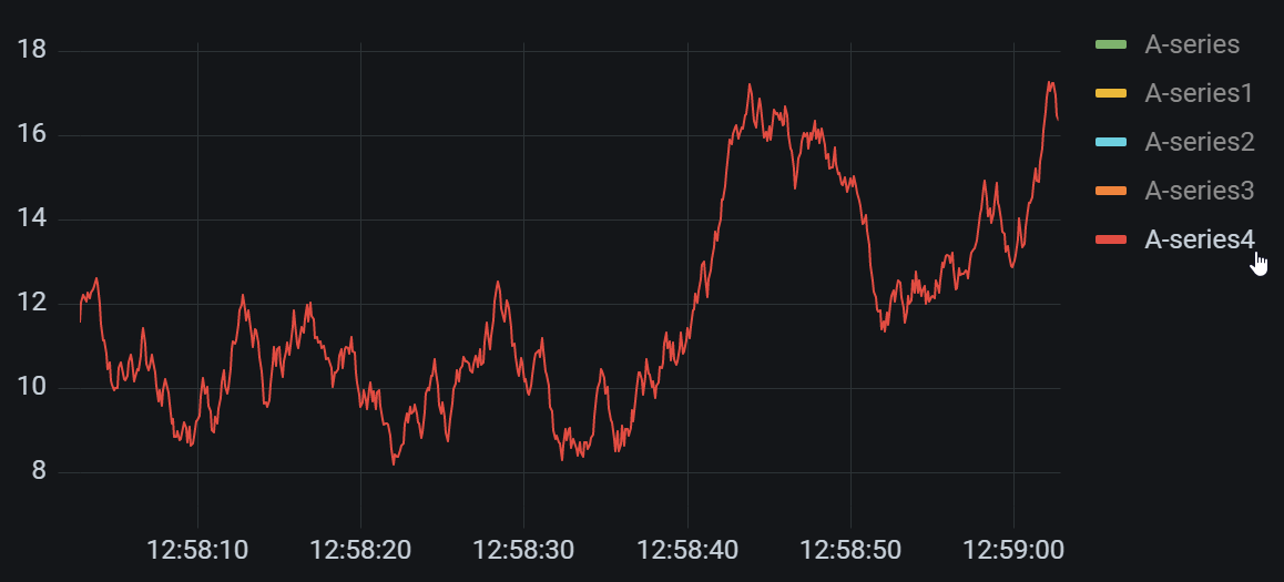
Visualizations can often be visually complex, and include many data series. You can simplify the view by removing series data from the visualization, which isolates the data you want to see. Grafana automatically creates a new override in the Override tab.
When you apply your changes, the visualization changes appear to all users of the panel.
Open the panel.
In the legend, click the label of the series you want to isolate.
The system removes from view all other series data.
To incrementally add series data to an isolated series, press the Ctrl or Command key and click the label of the series you want to add.
To revert back to the default view that includes all data, click any series label twice.
To save your changes so that they appear to all viewers of the panel, click Apply.
This topic currently applies to the following visualizations:
Add values to a legend
As way to add more context to a visualization, you can add series data values to a legend. You can add as many values as you’d like; after you apply your changes, you can horizontally scroll the legend to see all values.
Before you begin
- Add a panel
To add values to a legend:
Open a panel.
In the panel display options pane, locate the Legend section.
In the Legend values field, select the values you want to appear in the legend.
Click Apply to save your changes are navigate back to the dashboard.

Change a series color
By default, Grafana specifies the color of your series data, which you can change.
Before you begin
- Add a panel
To change a series color, perform the following steps:
Open the panel.
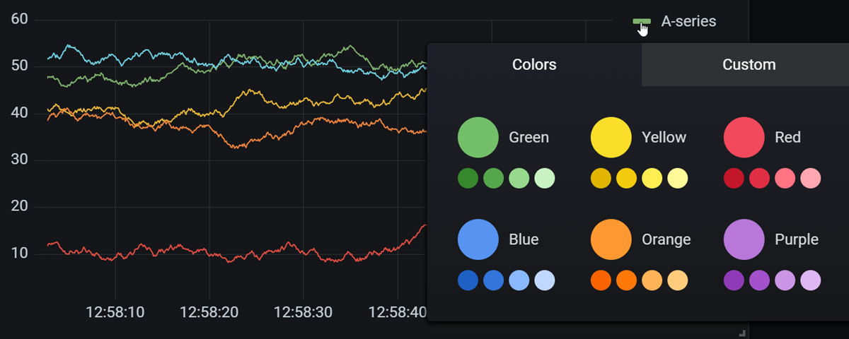
In the legend, click the color bar associated with the series.
Select a pre-set color or a custom color from the color palette.
Click Apply to save your changes are navigate back to the dashboard.

Sort series
Change legend mode to Table and choose calculations to be displayed in the legend. Click the calculation name header in the legend table to sort the values in the table in ascending or descending order.
The sort order affects the positions of the bars in the Bar chart panel as well as the order of stacked series in the Time series and Bar chart panels.
Note: This feature is only supported in these panels: Bar chart, Histogram, Time series, XY Chart.
 .
.


