Important: This documentation is about an older version. It's relevant only to the release noted, many of the features and functions have been updated or replaced. Please view the current version.
Status history
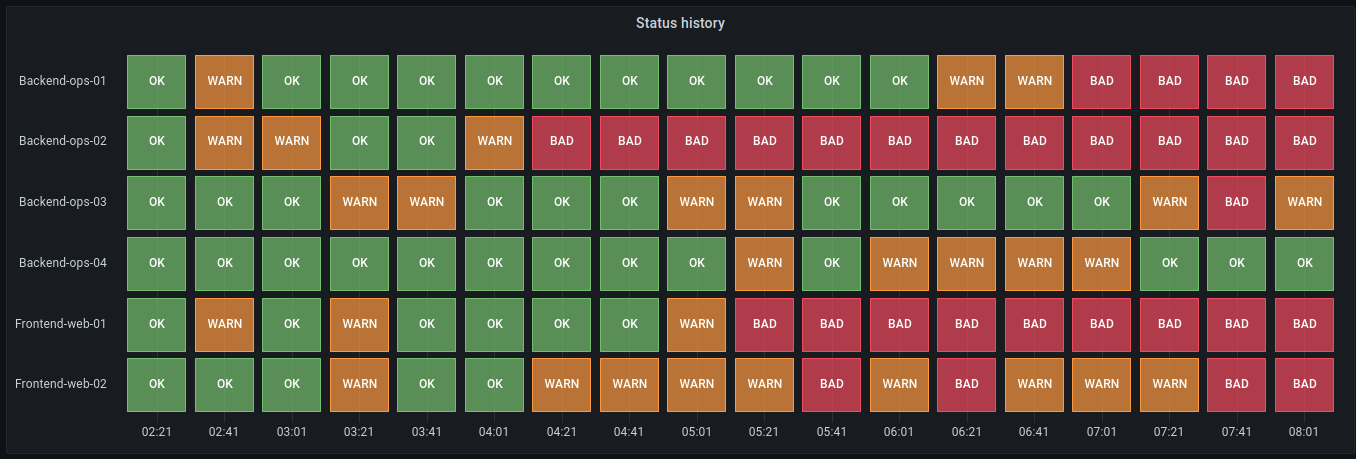
The Status history visualization shows periodic states over time. Each field or series is rendered as a horizontal row. Boxes are rendered and centered around each value.

Supported data
Status history visualization works with string, boolean and numerical fields or time series. A time field is required. You can use value mappings to color strings or assign text values to numerical ranges.
Display options
Use these options to refine the visualization.
Show values
Controls whether values are rendered inside the value boxes. Auto will render values if there is sufficient space.
Column width
Controls the width of boxes. 1 = maximum space and 0 = minimum space.
Line width
Controls line width of state regions.
Fill opacity
Controls the opacity of state regions.
Value mappings
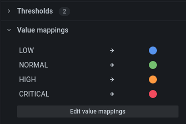
To assign colors to boolean or string values, use the Value mappings.

Time series data with thresholds
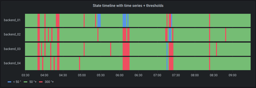
The panel can be used with time series data as well. In this case, the thresholds are used to color the boxes. You can also use gradient color schemes to color values.

Legend options
When the legend option is enabled it can show either the value mappings or the threshold brackets. To show the value mappings in the legend, it’s important that the Color scheme option under Standard options is set to Single color or Classic palette. To see the threshold brackets in the legend set the Color scheme to From thresholds.
Legend mode
Use these settings to refine how the legend appears in your visualization.
- List - Displays the legend as a list. This is a default display mode of the legend.
- Table - Displays the legend as a table.
- Hidden - Hides the legend.
Legend placement
Choose where to display the legend.
- Bottom - Below the graph.
- Right - To the right of the graph.
Was this page helpful?
Related resources from Grafana Labs


