Important: This documentation is about an older version. It's relevant only to the release noted, many of the features and functions have been updated or replaced. Please view the current version.
Troubleshoot dashboards
This page provides information to solve common dashboard problems.
Dashboard is slow
- Are you trying to render dozens (or hundreds or thousands) of time-series on a graph? This can cause the browser to lag and feel sluggish. Try using functions like
highestMax(in Graphite) to reduce the returned series. - Sometimes the series names can be very large. This causes larger response sizes. Try using
aliasto reduce the size of the returned series names. - Are you querying many time-series or for a long range of time? Both of these can cause Grafana or your data source to pull in a lot of data, which may slow it down.
- It could be high load on your network infrastructure. If the slowness isn’t consistent, this may be the problem.
Dashboard refresh rate issues
By default, Grafana queries your data source every 30 seconds. Setting a low refresh rate on your dashboards puts unnecessary stress on the backend. In many cases, querying this frequently makes no sense, because the data isn’t being sent to the system such that changes would be seen.
We recommend the following:
- Do not enable auto-refreshing on dashboards, panels, or variables unless you need it. Users can refresh their browser manually, or you can set the refresh rate for a time period that makes sense (every ten minutes, every hour, and so on).
- If it is required, then set the refresh rate to once a minute. Again, users can always refresh the dashboard manually.
- If your dashboard has a longer time period (such as a week), then you really don’t need automated refreshing.
Handling or rendering null data is wrong/confusing/weird
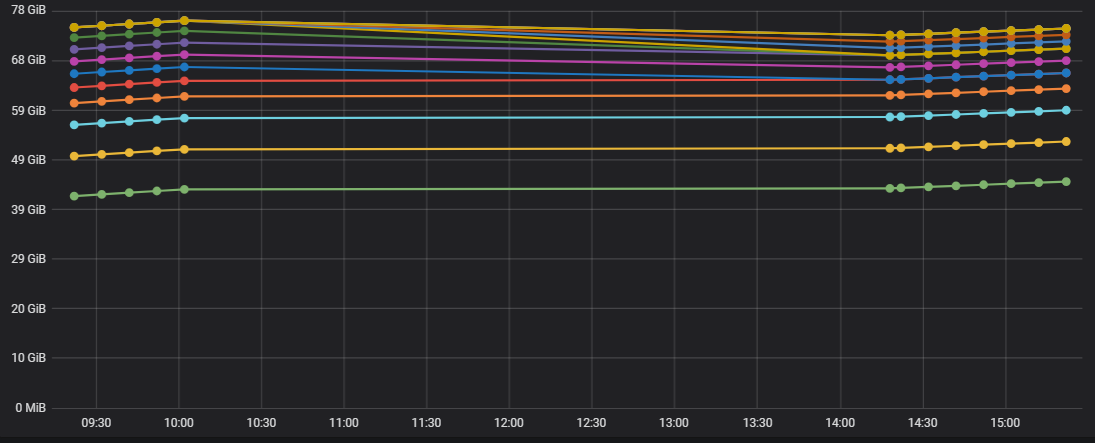
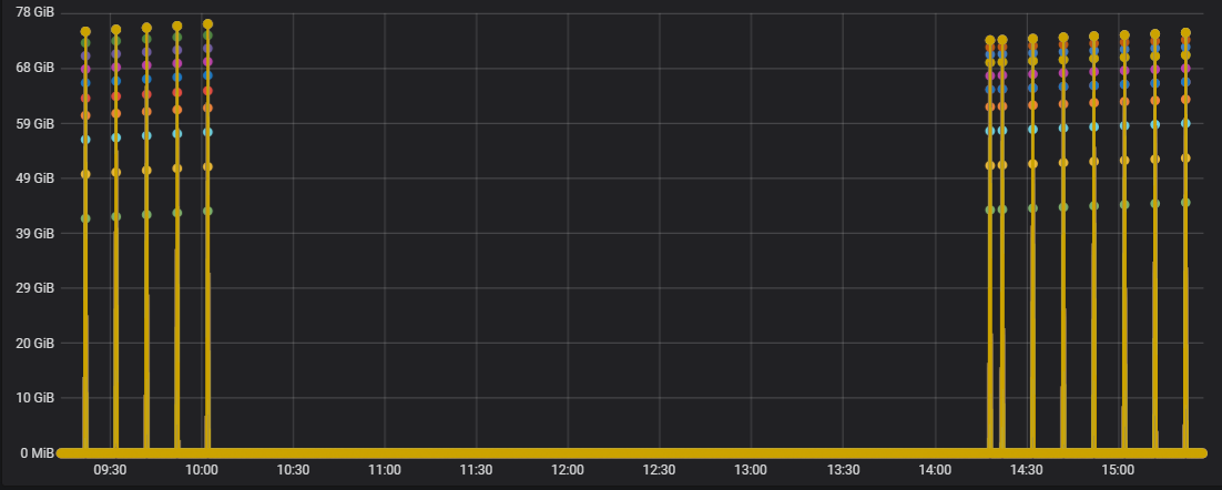
Some applications publish data intermittently; for example, they only post a metric when an event occurs. By default, Grafana graphs connect lines between the data points. This can be very deceiving.
In the picture below we have enabled:
- Points and 3-point radius to highlight where data points are actually present.
- Null value is set to connected.

In this graph, we set graph to show bars instead of lines and set the Null value to graph null as zero. There is a very big different in the visuals.

Was this page helpful?
Related resources from Grafana Labs


