
Important: This documentation is about an older version. It's relevant only to the release noted, many of the features and functions have been updated or replaced. Please view the current version.
Graph Panel
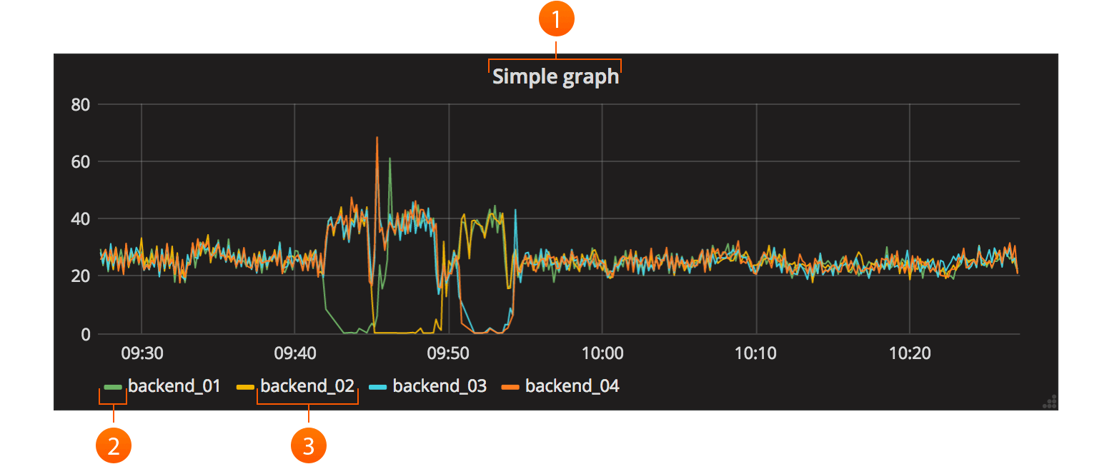
The main panel in Grafana is simply named Graph. It provides a very rich set of graphing options.
- Clicking the title for a panel exposes a menu. The
editoption opens additional configuration options for the panel. - Click to open color & axis selection.
- Click to only show this series. Shift/Ctrl + click to hide series.
General
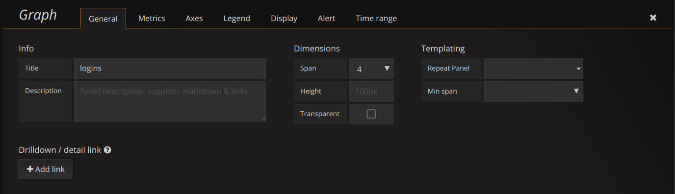
The general tab allows customization of a panel’s appearance and menu options.
General Options
- Title - The panel title on the dashboard
- Span - The panel width in columns
- Height - The panel contents height in pixels
Drilldown / detail link
The drilldown section allows adding dynamic links to the panel that can link to other dashboards or URLs.
Each link has a title, a type and params. A link can be either a dashboard or absolute links.
If it is a dashboard link, the dashboard value must be the name of a dashboard. If it is an
absolute link, the URL is the URL to the link.
params allows adding additional URL params to the links. The format is the name=value with
multiple params separated by &. Template variables can be added as values using $myvar.
When linking to another dashboard that uses template variables, you can use var-myvar=value to
populate the template variable to a desired value from the link.
Metrics
The metrics tab defines what series data and sources to render. Each datasource provides different options.
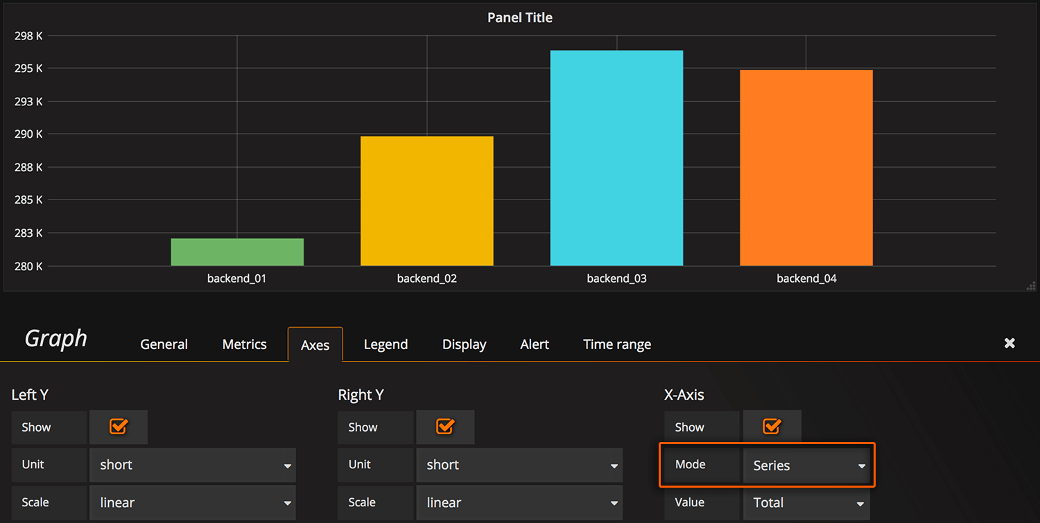
Axes
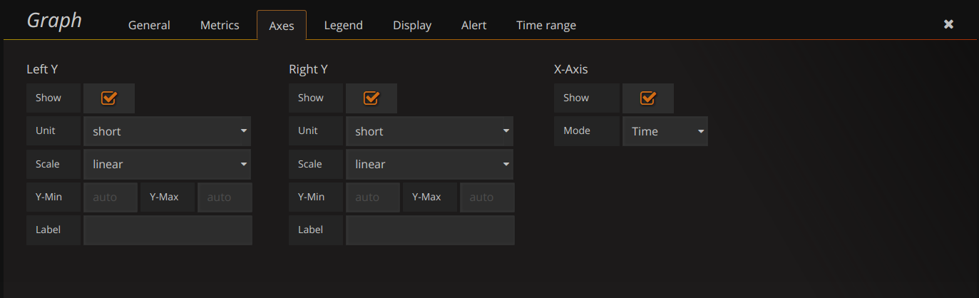
The Axes tab controls the display of axes, grids and legend. The Left Y and Right Y can be customized using:
- Unit - The display unit for the Y value
- Scale -
- Y-Min - The minimum Y value. (default auto)
- Y-Max - The maximum Y value. (default auto)
- Label - The Y axis label (default “”)
Axes can also be hidden by unchecking the appropriate box from Show.
X-Axis Mode
There are three options:
The default option is Time and means the x-axis represents time and that the data is grouped by time (for example, by hour or by minute).
The Series option means that the data is grouped by series and not by time. The y-axis still represents the value.
![]()
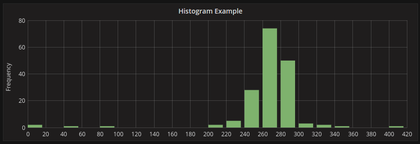
The Histogram option converts the graph into a histogram. A Histogram is a kind of bar chart that groups numbers into ranges, often called buckets or bins. Taller bars show that more data falls in that range. Histograms and buckets are described in more detail here.
Legend
The legend hand be hidden by checking the Show checkbox. If it’s shown, it can be displayed as a table of values by checking the Table checkbox. Series with no values can be hidden from the legend using the Hide empty checkbox.
Legend Values
Additional values can be shown along-side the legend names:
- Total - Sum of all values returned from metric query
- Current - Last value returned from the metric query
- Min - Minimum of all values returned from metric query
- Max - Maximum of all values returned from the metric query
- Avg - Average of all values returned from metric query
- Decimals - Controls how many decimals are displayed for legend values (and graph hover tooltips)
The legend values are calculated client side by Grafana and depend on what type of aggregation or point consolidation your metric query is using. All the above legend values cannot be correct at the same time. For example if you plot a rate like requests/second, this is probably using average as aggregator, then the Total in the legend will not represent the total number of requests. It is just the sum of all data points received by Grafana.
Display styles
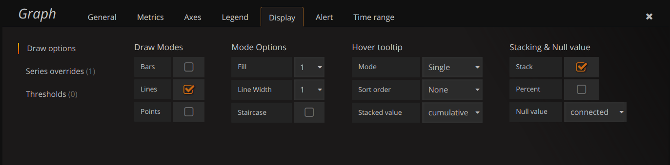
Display styles control visual properties of the graph.
Thresholds
Thresholds allow you to add arbitrary lines or sections to the graph to make it easier to see when the graph crosses a particular threshold.
Chart Options
- Bar - Display values as a bar chart
- Lines - Display values as a line graph
- Points - Display points for values
Line Options
- Line Fill - Amount of color fill for a series. 0 is none.
- Line Width - The width of the line for a series.
- Null point mode - How null values are displayed
- Staircase line - Draws adjacent points as staircase
Multiple Series
If there are multiple series, they can be displayed as a group.
- Stack - Each series is stacked on top of another
- Percent - Each series is drawn as a percentage of the total of all series
If you have stack enabled, you can select what the mouse hover feature should show.
- Cumulative - Sum of series below plus the series you hover over
- Individual - Just the value for the series you hover over
Rendering
- Flot - Render the graphs in the browser using Flot (default)
- Graphite PNG - Render the graph on the server using graphite’s render API.
Tooltip
- All series - Show all series on the same tooltip and a x crosshairs to help follow all series
Series Specific Overrides
The section allows a series to be rendered differently from the others. For example, one series can be given a thicker line width to make it stand out.
Dashes Drawing Style
There is an option under Series overrides to draw lines as dashes. Set Dashes to the value True to override the line draw setting for a specific series.
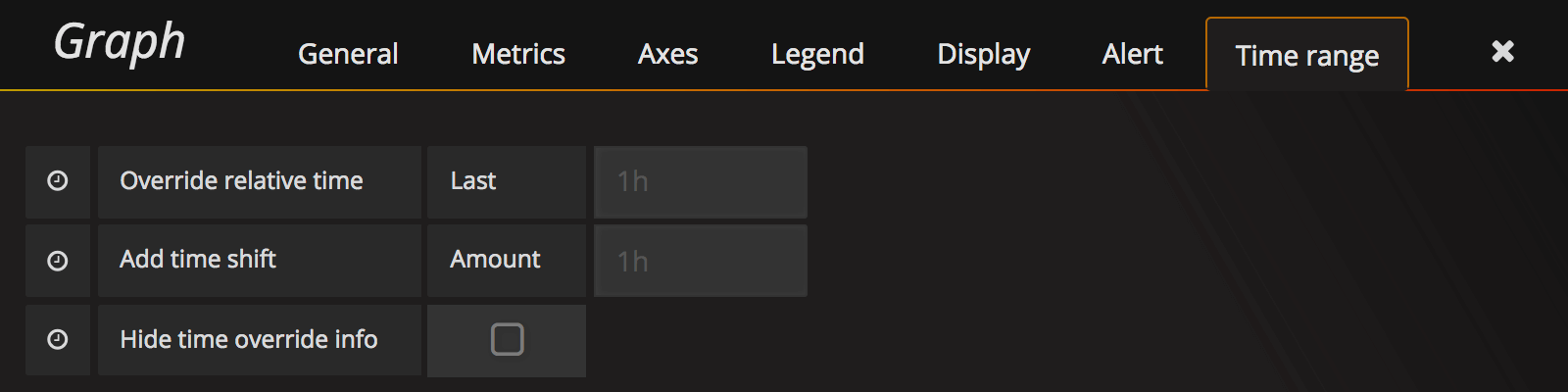
Time Range
The time range tab allows you to override the dashboard time range and specify a panel specific time. Either through a relative from now time option or through a timeshift.


