Important: This documentation is about an older version. It's relevant only to the release noted, many of the features and functions have been updated or replaced. Please view the current version.
State timeline
State timelines show discrete state changes over time. Each field or series is rendered as its unique horizontal band. State regions can either be rendered with or without values. This visualization works well with string or boolean states but can also be used with time series. When used with time series, the thresholds are used to turn the numerical values into discrete state regions.

State timeline options
Use these options to refine the visualization.
Merge equal consecutive values
Controls whether Grafana merges identical values if they are next to each other.
Show values
Controls whether values are rendered inside the state regions. Auto will render values if there is sufficient space.
Align values
Controls value alignment inside state regions.
Row height
Controls how much space between rows there are. 1 = no space = 0.5 = 50% space.
Line width
Controls line width of state regions.
Fill opacity
Controls the opacity of state regions.
Connect null values
Choose how null values, which are gaps in the data, appear on the graph. Null values can be connected to form a continuous line or set to a threshold above which gaps in the data are no longer connected.

- Never: Time series data points with gaps in the data are never connected.
- Always: Time series data points with gaps in the data are always connected.
- Threshold: Specify a threshold above which gaps in the data are no longer connected. This can be useful when the connected gaps in the data are of a known size and/or within a known range, and gaps outside this range should no longer be connected.
Disconnect values
Choose whether to set a threshold above which values in the data should be disconnected.

- Never: Time series data points in the data are never disconnected.
- Threshold: Specify a threshold above which values in the data are disconnected. This can be useful when desired values in the data are of a known size and/or within a known range, and values outside this range should no longer be connected.
Value mappings
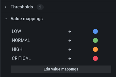
To assign colors to boolean or string values, you can use Value mappings.

Time series data with thresholds
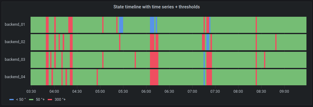
The visualization can be used with time series data as well. In this case, the thresholds are used to turn the time series into discrete colored state regions.

Legend options
When the legend option is enabled it can show either the value mappings or the threshold brackets. To show the value mappings in the legend, it’s important that the Color scheme as referenced in Color scheme is set to Single color or Classic palette. To see the threshold brackets in the legend set the Color scheme to From thresholds.
Legend mode
Use these settings to define how the legend appears in your visualization. For more information about the legend, refer to Configure a legend.
- List - Displays the legend as a list. This is a default display mode of the legend.
- Table - Displays the legend as a table.
- Hidden - Hides the legend.
Legend placement
Choose where to display the legend.
- Bottom - Below the graph.
- Right - To the right of the graph.
Legend values
Choose which of the standard calculations to show in the legend. You can have more than one.


