Grafana dashboard best practices
This section provides information about best practices for intermediate Grafana administrators and users about how to build and maintain Grafana dashboards.
For more information about the different kinds of dashboards you can create, refer to Grafana dashboards: A complete guide to all the different types you can build.
Common observability strategies
When you have a lot to monitor, like a server farm, you need a strategy to decide what is important enough to monitor. This page describes several common methods for choosing what to monitor.
A logical strategy allows you to make uniform dashboards and scale your observability platform more easily.
Guidelines for usage
- The USE method tells you how happy your machines are, the RED method tells you how happy your users are.
- USE reports on causes of issues.
- RED reports on user experience and is more likely to report symptoms of problems.
- The best practice of alerting is to alert on symptoms rather than causes, so alerting should be done on RED dashboards.
USE method
USE stands for:
- Utilization - Percent time the resource is busy, such as node CPU usage
- Saturation - Amount of work a resource has to do, often queue length or node load
- Errors - Count of error events
This method is best for hardware resources in infrastructure, such as CPU, memory, and network devices. For more information, refer to The USE Method.
RED method
RED stands for:
- Rate - Requests per second
- Errors - Number of requests that are failing
- Duration - Amount of time these requests take, distribution of latency measurements
This method is most applicable to services, especially a microservices environment. For each of your services, instrument the code to expose these metrics for each component. RED dashboards are good for alerting and SLAs. A well-designed RED dashboard is a proxy for user experience.
For more information, refer to Tom Wilkie’s blog post The RED method: How to instrument your services.
The Four Golden Signals
According to the Google SRE handbook, if you can only measure four metrics of your user-facing system, focus on these four.
This method is similar to the RED method, but it includes saturation.
- Latency - Time taken to serve a request
- Traffic - How much demand is placed on your system
- Errors - Rate of requests that are failing
- Saturation - How “full” your system is
With Grafana Play, you can explore and see how it works, learning from practical examples to accelerate your development. This feature can be seen on The Four Golden Signals.
Dashboard management maturity model
Dashboard management maturity refers to how well-designed and efficient your dashboard ecosystem is. It’s recommended that you periodically review your dashboard setup to gauge where you are and how you can improve.
Broadly speaking, dashboard maturity can be defined as low, medium, or high.
Much of the content for this topic was taken from the KubeCon 2019 talk Fool-Proof Kubernetes Dashboards for Sleep-Deprived Oncalls.
Low - default state
At this stage, you have no coherent dashboard management strategy. Almost everyone starts here.
How can you tell you are here?
- Everyone can modify your dashboards.
- Lots of copied dashboards, little to no dashboard reuse.
- One-off dashboards that hang around forever.
- No version control (dashboard JSON in version control).
- Lots of browsing for dashboards, searching for the right dashboard. This means lots of wasted time trying to find the dashboard you need.
- Not having any alerts to direct you to the right dashboard.
Medium - methodical dashboards
At this stage, you are starting to manage your dashboard use with methodical dashboards. You might have laid out a strategy, but there are some things you could improve.
How can you tell you are here?
Prevent sprawl by using template variables. For example, you don’t need a separate dashboard for each node, you can use query variables. Even better, you can make the data source a template variable too, so you can reuse the same dashboard across different clusters and monitoring backends.
Refer to the list of Variable examples if you want some ideas.
Methodical dashboards according to an observability strategy.
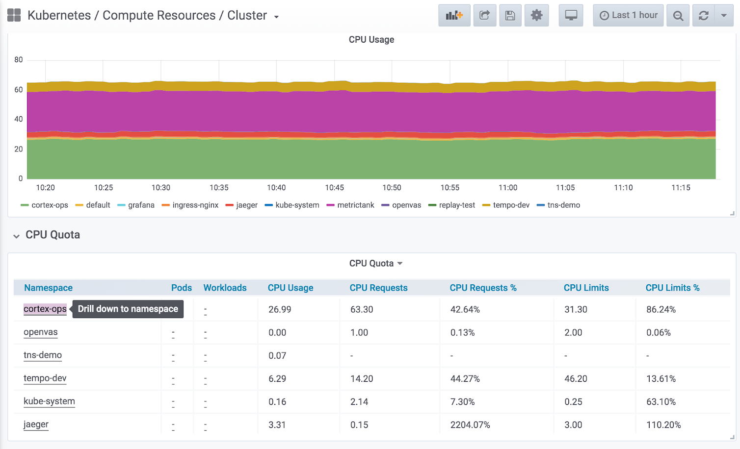
Hierarchical dashboards with drill-downs to the next level.
![Example of using drill-down Example of using drill-down]()
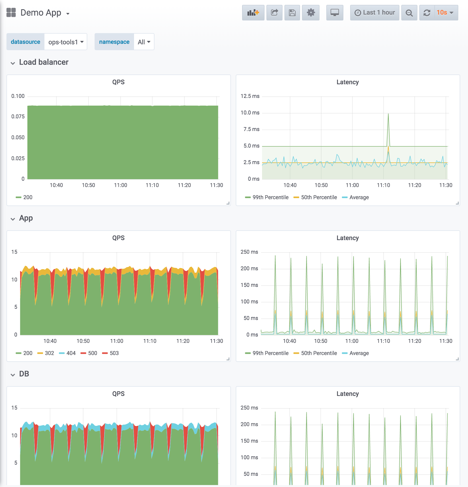
Example of using drill-down Dashboard design reflects service hierarchies. The example shown below uses the RED method (request and error rate on the left, latency duration on the right) with one row per service. The row order reflects the data flow.
![Example of a service hierarchy Example of a service hierarchy]()
Example of a service hierarchy Compare like to like: split service dashboards when the magnitude differs. Make sure aggregated metrics don’t drown out important information.
Expressive charts with meaningful use of color and normalizing axes where you can.
- Example of meaningful color: Blue means it’s good, red means it’s bad. Thresholds can help with that.
- Example of normalizing axes: When comparing CPU usage, measure by percentage rather than raw number, because machines can have a different number of cores. Normalizing CPU usage by the number of cores reduces cognitive load because the viewer can trust that at 100% all cores are being used, without having to know the number of CPUs.
Directed browsing cuts down on “guessing.”
- Template variables make it harder to “just browse” randomly or aimlessly.
- Most dashboards should be linked to by alerts.
- Browsing is directed with links. For more information, refer to Manage dashboard links.
Version-controlled dashboard JSON.
High - optimized use
At this stage, you have optimized your dashboard management use with a consistent and thoughtful strategy. It requires maintenance, but the results are worth it.
- Actively reducing sprawl.
- Regularly review existing dashboards to make sure they are still relevant.
- Only approved dashboards added to master dashboard list.
- Tracking dashboard use. If you’re an Enterprise user, you can take advantage of Usage insights.
- Consistency by design.
- Use scripting libraries to generate dashboards, ensure consistency in pattern and style.
- grafonnet (Jsonnet)
- grafanalib (Python)
- No editing in the browser. Dashboard viewers change views with variables.
- Browsing for dashboards is the exception, not the rule.
- Perform experimentation and testing in a separate Grafana instance dedicated to that purpose, not your production instance. When a dashboard in the test environment is proven useful, then add that dashboard to your main Grafana instance.
Best practices for creating dashboards
This page outlines some best practices to follow when creating Grafana dashboards.
Before you begin
Here are some principles to consider before you create a dashboard.
A dashboard should tell a story or answer a question
What story are you trying to tell with your dashboard? Try to create a logical progression of data, such as large to small or general to specific. What is the goal for this dashboard? (Hint: If the dashboard doesn’t have a goal, then ask yourself if you really need the dashboard.)
Keep your graphs simple and focused on answering the question that you are asking. For example, if your question is “which servers are in trouble?”, then maybe you don’t need to show all the server data. Just show data for the ones in trouble.
Dashboards should reduce cognitive load, not add to it
Cognitive load is basically how hard you need to think about something in order to figure it out. Make your dashboard easy to interpret. Other users and future you (when you’re trying to figure out what broke at 2 AM) will appreciate it.
Ask yourself:
- Can I tell what exactly each graph represents? Is it obvious, or do I have to think about it?
- If I show this to someone else, how long will it take them to figure it out? Will they get lost?
Have a monitoring strategy
It’s easy to make new dashboards. It’s harder to optimize dashboard creation and adhere to a plan, but it’s worth it. This strategy should govern both your overall dashboard scheme and enforce consistency in individual dashboard design.
Refer to Common observability strategies and Dashboard management maturity levels for more information.
Write it down
Once you have a strategy or design guidelines, write them down to help maintain consistency over time. Check out this Wikimedia runbook example.
Best practices to follow
- When creating a new dashboard, make sure it has a meaningful name.
- If you are creating a dashboard to play or experiment, then put the word
TESTorTMPin the name. - Consider including your name or initials in the dashboard name or as a tag so that people know who owns the dashboard.
- Remove temporary experiment dashboards when you are done with them.
- If you are creating a dashboard to play or experiment, then put the word
- If you create many related dashboards, think about how to cross-reference them for easy navigation. Refer to Best practices for managing dashboards for more information.
- Grafana retrieves data from a data source. A basic understanding of data sources in general and your specific is important.
- Avoid unnecessary dashboard refreshing to reduce the load on the network or backend. For example, if your data changes every hour, then you don’t need to set the dashboard refresh rate to 30 seconds.
- Use the left and right Y-axes when displaying time series with different units or ranges.
- Add documentation to dashboards and panels.
- To add documentation to a dashboard, add a Text panel visualization to the dashboard. Record things like the purpose of the dashboard, useful resource links, and any instructions users might need to interact with the dashboard. Check out this Wikimedia example.
- To add documentation to a panel, edit the panel settings and add a description. Any text you add appears if you hover your cursor over the small
iin the top left corner of the panel.
- Reuse your dashboards and enforce consistency by using templates and variables.
- Be careful with stacking graph data. The visualizations can be misleading, and hide important data. It’s recommended that you turn it off in most cases.
Best practices for managing dashboards
This page outlines some best practices to follow when managing Grafana dashboards.
Before you begin
Here are some principles to consider before you start managing dashboards.
Strategic observability
There are several common observability strategies. You should research them and decide whether one of them works for you or if you want to come up with your own. Either way, have a plan, write it down, and stick to it.
Adapt your strategy to changing needs as necessary.
Maturity level
What is your dashboard maturity level? Analyze your current dashboard setup and compare it to the Dashboard management maturity model. Understanding where you are can help you decide how to get to where you want to be.
Best practices to follow
- Avoid dashboard sprawl, meaning the uncontrolled growth of dashboards. Dashboard sprawl negatively affects time to find the right dashboard. Duplicating dashboards and changing “one thing” (worse: keeping original tags) is the easiest kind of sprawl.
- Periodically review the dashboards and remove unnecessary ones.
- If you create a temporary dashboard, perhaps to test something, prefix the name with
TEST:. Delete the dashboard when you are finished.
- Copying dashboards with no significant changes is not a good idea.
- You miss out on updates to the original dashboard, such as documentation changes, bug fixes, or additions to metrics.
- In many cases copies are being made to simply customize the view by setting template parameters. This should instead be done by maintaining a link to the master dashboard and customizing the view with URL parameters.
- When you must copy a dashboard, clearly rename it and do not copy the dashboard tags. Tags are important metadata for dashboards that are used during search. Copying tags can result in false matches.
- Maintain a dashboard of dashboards or cross-reference dashboards. This can be done in several ways:
- Create dashboard links, panel, or data links. Links can go to other dashboards or to external systems. For more information, refer to Manage dashboard links.
- Add a Dashboard list panel. You can then customize what you see by doing tag or folder searches.
- Add a Text panel and use markdown to customize the display.


