
Visualize check execution
A Synthetic Monitoring check consists of individual executions made by one or more probes. It can often prove useful to analyze individual executions on a check dashboard rather than looking at the aggregated metrics, as it can provide insight into detailed execution behavior, especially if executions are failing.
The time point explorer is a specialized visualization for Synthetic Monitoring that combines logs and metrics from your probes to give a detailed view of check executions.
To view the time point explorer:
- Log in to your Grafana Cloud account.
- Go to Testing & synthetics > Synthetics > Checks.
- Click View dashboard for a check.
The time point explorer is included in the default dashboard for every check.
Time point explorer anatomy
The time point explorer consists of three interactive components that work together to help you analyze your Synthetic Monitoring data:
- Time point mini map - A macro-level overview of your data across the selected time range
- Time point graph - A detailed view of individual time points with execution durations
- Time point viewer - In-depth logs and details for a single time point
These components let you drill down from a high-level overview to detailed execution logs.
Understand time points
A time point is a time-based abstraction that aligns with your check’s frequency:
- If your check runs every five minutes, each time point is five minutes long.
- If your check runs every minute, each time point is one minute long.
- Time points are clock-aligned (starting at round times like 00:00:00, 00:01:00, 00:02:00, and so on).
- Each probe execution is assigned to a time point based on when it started, not when it finished.
Note
Time points may vary in length across your time range if your check’s frequency changed. The time point explorer automatically detects these configuration changes and adjusts accordingly.
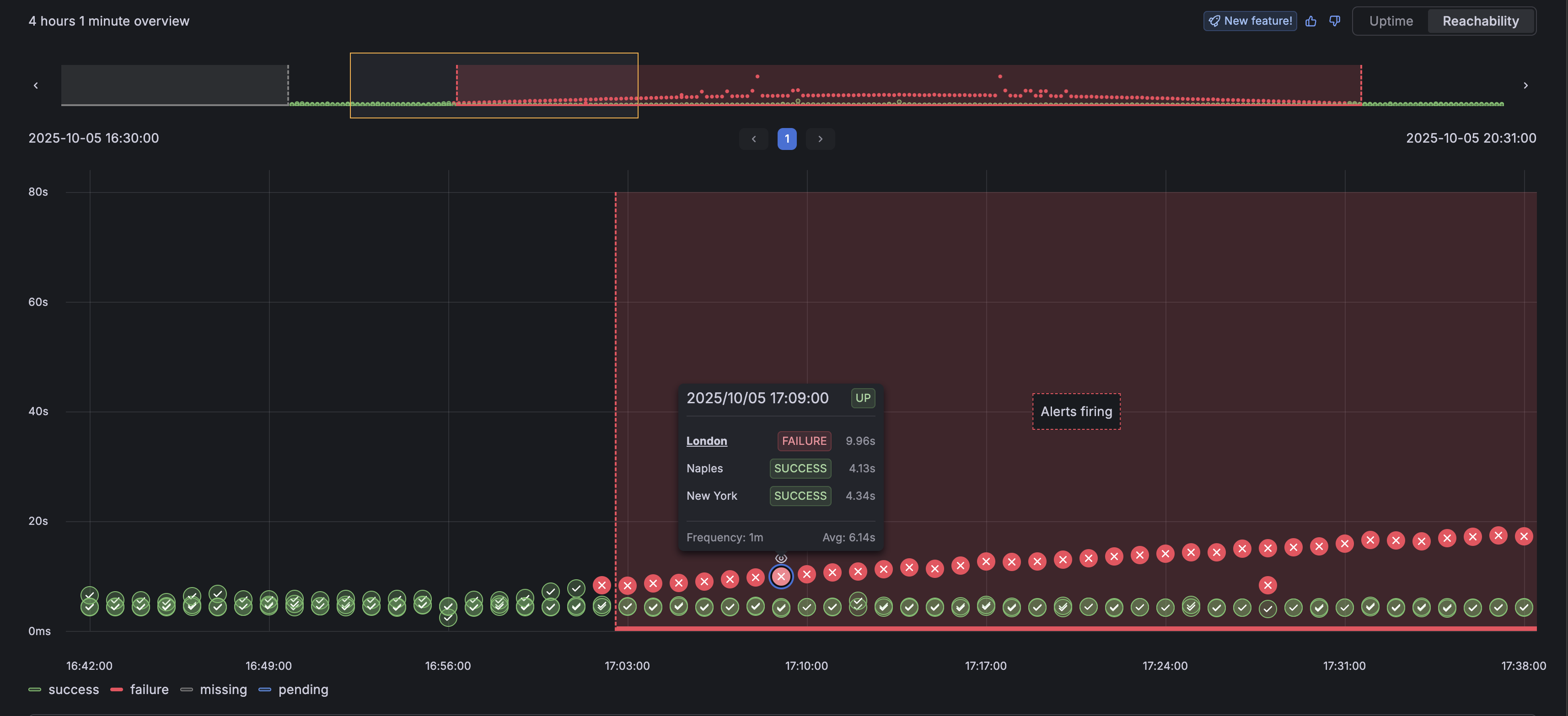
The time point mini map
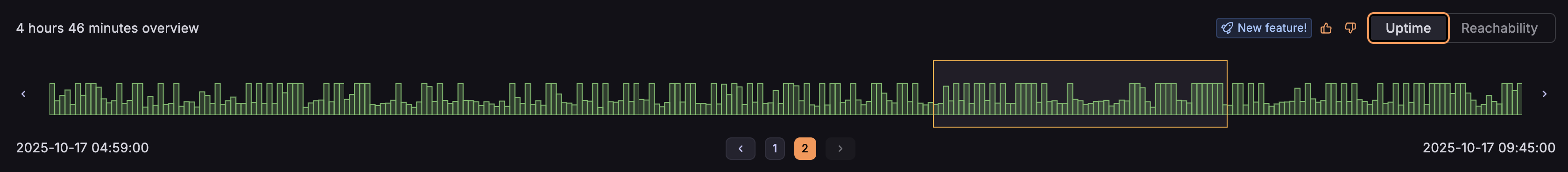
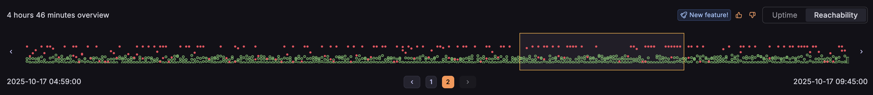
The mini map provides a high-level overview of all time points in your selected time range. It shows:
- A visual representation of uptime or reachability across time
- Quick navigation to specific sections of time points
- The time span currently displayed
- Pagination controls for large time ranges
Use the toggle in the top right to switch between Uptime and Reachability views:
- Uptime view - Shows whether at least one probe succeeded for each time point
- Reachability view - Shows individual probe executions and their durations
The time point graph
The graph shows the time points for the section selected in the mini map:
- X-axis - Individual time points, ordered chronologically
- Y-axis - Execution duration in seconds
- Hover tooltips - Detailed breakdown of all probe executions in a time point
- Click interaction - Select a time point to view its detailed logs
In uptime view, the bar height represents the maximum duration of successful executions. In reachability view, each individual execution is plotted separately.
The time point viewer
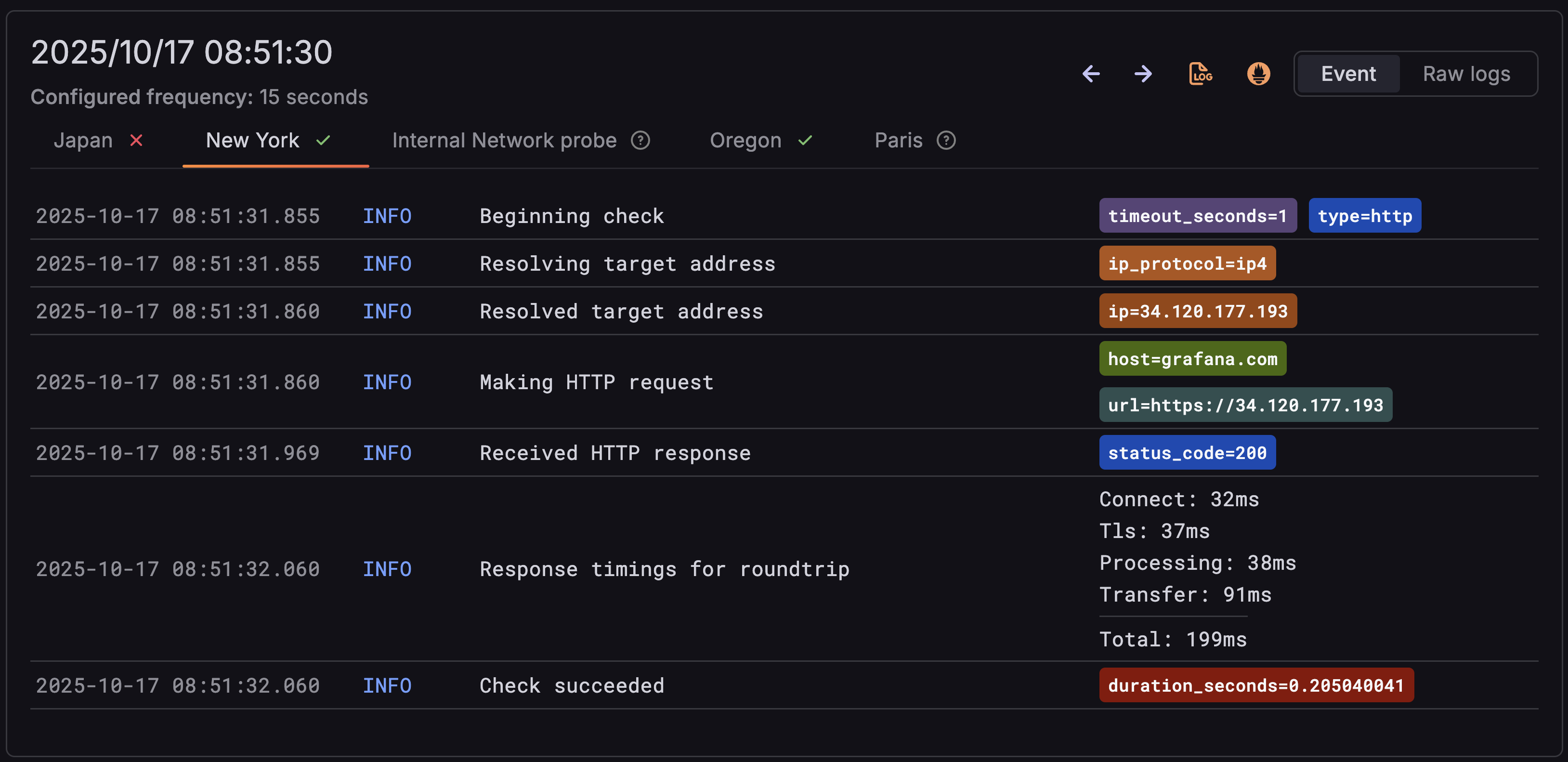
Click a time point to open the viewer, which shows detailed execution logs for each probe:
- Tabbed interface - One tab per probe with clear success/failure indicators
- Parsed logs - Logs are formatted as events with timestamps, levels, and messages
- Navigation controls - Move between previous and next time points
- Quick access - View logs or metrics in Explore for deeper investigation
Execution states
Each probe execution in a time point can have one of several states:
Tip
If you see multiple executions from the same probe in a single time point, the probe agent may have restarted or had scheduling issues.
Annotations
The time point explorer displays several types of annotations to provide additional context:
- Check created - Shows when the check was first created
- Check updated - Marks when the check configuration changed
- Alert annotations - Displays when alerts were firing, aligned with time points
- No data indicators - Explains why data may be missing (before creation, out of retention, etc.)
Visualization legend
The time point explorer includes a visibility legend that allows you to:
- Customize colors for different states (success, failure, pending, missing)
- Toggle states on and off to focus on specific issues
- Use keyboard shortcuts (meta key) to toggle multiple states
Error states are highlighted with solid colors by default as they typically require the most attention.
Automatic refresh
The time point explorer automatically refreshes when:
- Your time range includes pending executions
- The dashboard has a global refresh enabled
This ensures you always see the latest data as new executions complete.
Best practices
- Use the Reachability view when diagnosing probe-specific or regional issues.
- Check annotations to correlate execution failures with configuration changes.
- Hover over time points to identify which probes failed without opening the full viewer.
- Use the Explore links when you need to write custom queries or do a deeper analysis.


